


 本文深入探讨CSS的各种视觉效果,包括单侧和不规则投影、染色、毛玻璃效果以及创意的折角效果。通过box-shadow、filter和混合模式等技巧,实现丰富的界面设计。
1. 单侧投影
由box-shadow的第四个长度参数即扩张半径,可根据你指定的值去扩大或 (当指定负值时)缩小投影的尺寸。
可知单侧投影实现如下:
box-shadow: 0 5px 4px -4px black;
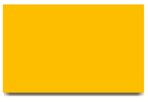
- 邻边投影
box-shadow: 3px 3px 6px -3px black;
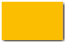
- 双侧投影
box-shadow: 5px 0 5px -5px black,
			-5px 0 5px -5px black;
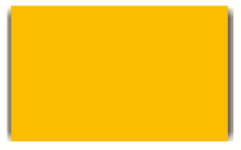
2. 不规则投影
drop-shadow()滤镜可接受的参数基本上跟box-shadow属性是一样的,但不包括扩张半径,不包括inset关键字,也不支持逗号分割的多层投影语法。
因此,不规则投影可实现如下:
filter: drop-shadow(2px 2px 10px rgba(0,0,0,.5));
最终效果为:
3. 染色效果
- 基于滤镜的方案
sepia():可给图片增加一种降饱和度的橙黄色染色效果;
saturate(): 可给每个像素提升饱和度;
hue-rotate():可把每个像素的色相以指定的度数进行偏移;
filter: sepia(1) saturate(4) hue-rotate(295deg);
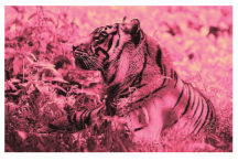
- 基于混合模式的方案
<div class="tinted-image" style="background-image:url(tiger.jpg)"></div>

.tinted-image {
	width: 640px;
	height: 440px;
	background-size: cover;
	background-color: hsl(335, 100%, 50%);
	background-blend-mode: luminosity;
	transition: .5s background-color;
}
.tinted-image:hover {
	background-color: transparent;
}
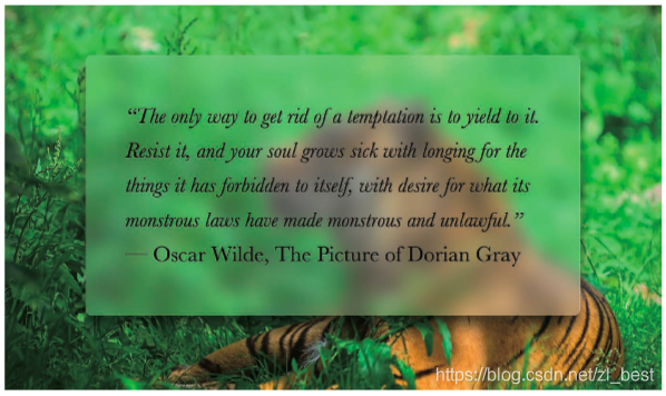
4. 毛玻璃效果
body, main::before {
	background: url("tiger.jpg") 0 / cover fixed;
}
main {
	position: relative;
	background: hsla(0,0%,100%,.3);
	overflow: hidden;
}
main::before {
	content: '';
	position: absolute;
	top: 0; right: 0; bottom: 0; left: 0;
	filter: blur(20px);
	margin: -30px;
}
最终效果为:
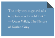
5. 折角效果
- 45度折角的解决方案
background: #58a; /* 回退样式 */
background: linear-gradient(to left bottom, transparent 50%, rgba(0,0,0,.4) 0) no-repeat 100% 0 / 2em 2em,
    		linear-gradient(-135deg, transparent 1.5em, #58a 0);
最终效果为:
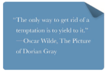
- 其它角度的解决方案
.note {
	position: relative;
	background: #58a; /* 回退样式 */
	background: linear-gradient(-150deg, transparent 1.5em, #58a 0);
	border-radius: .5em;
}
.note::before {
	content: '';
	position: absolute;
	top: 0;
	right: 0;
	background: linear-gradient(to left bottom, transparent 50%, rgba(0,0,0,.2) 0, rgba(0,0,0,.4)) 100% 0 no-repeat;
	width: 1.73em;
	height: 3em;
	transform: translateY(-1.3em) rotate(-30deg);
	transform-origin: bottom right;
	border-bottom-left-radius: inherit;
	box-shadow: -.2em .2em .3em -.1em rgba(0,0,0,.15);
}
最终效果为:


 扫一扫
扫一扫


 667
667

 被折叠的 条评论
为什么被折叠?
被折叠的 条评论
为什么被折叠?
 到【灌水乐园】发言


