


 本文指导如何使用纯CSS实现一个简单的按钮动画效果,涉及鼠标移入和移出时的颜色及样式变化,适合初学者快速上手。
在前端的开发中,我们都会用到很多种动画,按钮动画就是最基础和最简单的一种了。
例如像下面这种按钮的动画效果该怎么实现呢?
我们分析一下,其实无非就是鼠标移入和鼠标移走的CSS的样式
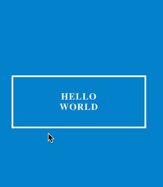
废话不多说,咱们直接上代码就完了
- html代码
<body>
		<div class="abc">
			<div>
				<button class="btn btn-1 btn-1a">hello world</button>
			</div>
		</div>
</body>- CSS代码
- class btn
.btn {
			    border: none;
			    font-family: inherit;
			    font-size: inherit;
			    color: inherit;
			    background: 0 0;
			    cursor: pointer;
			    padding: 25px 80px;
			    display: inline-block;
			    margin: 25px 80px;
			    text-transform: uppercase;
			    letter-spacing: 1px;
			    font-weight: 700;
			    outline: none;
			    position: relative;
			    transition: all .3s;
			}
			.btn:after {
			    content: '';
			    position: absolute;
			    z-index: -1;
			    transition: all .3s;
			}
2.class btn-1 btn-1a
.btn-1:hover {
			    color: #0e83cd;
				/* transform: scaleX(1.2); */
				 /* background: red; */
			}
			.btn-1 {
			    border: 3px solid #fff;
			    color: #fff;
			}
			.btn-1a:hover {
			    color: #0e83cd;
			    background: #fff;
			}
3.class abc body
body {
		margin: 0;
		padding: 0;
		background: #0e83cd;
	}
	.abc {
	margin-top: 6.25rem;
	/* background-color:red; */
	width: 180px;
	margin-left: 50px;

	}
是不是非常的简单,毫无技术难度,非常人性化,哈哈😁,感觉动手试一下吧 !!!


 扫一扫
扫一扫


 539
539

 被折叠的 条评论
为什么被折叠?
被折叠的 条评论
为什么被折叠?
 到【灌水乐园】发言


