


 本文详细介绍了如何自定义Android应用中的ProgressBar样式,包括水平进度条和圆形进度条的美化方法,通过修改样式属性和自定义XML资源文件,使得进度条更加美观且符合应用主题。
Android自带的ProgressBar其实也算不上丑陋,但是如果所有的App都使用一个模式的ProgressBar,那么估计用户就要崩溃了,打开任何一个App,擦,进度条都一模一样。。有鉴于此,我们今天就来谈谈ProgressBar的美化问题。学会了ProgressBar的美化,那么SeekBar和RatingBar的美化应该就不在话下了,因为SeekBar和RatingBar都是继承自ProgressBar。OK,废话不多说,我们来进入今天的正题。
进度条Style的两种设置方式
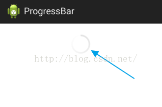
正常情况下,我们在布局文件中添加一个进度条是这样的:
- <ProgressBar
- android:id="@+id/pb1"
- android:layout_width="match_parent"
- android:layout_height="wrap_content"/>
显示效果是这样的:
这是系统默认的情况,如果有需要,我们可以修改进度条的样式,只需添加一个属性,如下:
- <ProgressBar
- android:id="@+id/pb1"
- style="?android:attr/progressBarStyleLarge"
- android:layout_width="match_parent"
- android:layout_height="wrap_content"/>
这个时候显示效果如下:
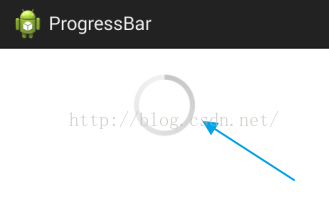
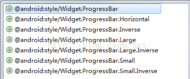
毫无疑问,进度条变大了。style属性就是我们用来设置进度条样式的,这种设置方式有好几种取值,如下:
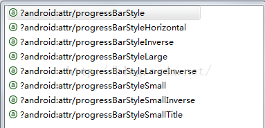
每一种取值都代表一种样式,我就不一一去试了,大家可以自行尝试,根据Google提供给我们的资料,我们知道,给ProgressBar设置style除了这一种方式之外,还有一种方式,那就是这样:
- <ProgressBar
- android:id="@+id/pb1"
- style="@android:style/Widget.ProgressBar"
- android:layout_width="match_parent"
- android:layout_height="wrap_content"/>
大家注意看取值的不同,那么这种方式的显示效果是什么样的呢?看下图:
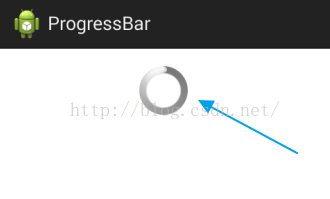
都是转圈,但是很明显第一个看起来更舒服一些,那么这种设置方式也有好几种取值,如下:
每一种取值都代表了一种样式,大家可以自行尝试。
OK,上面是给大家简单介绍了一下Google给我们提供的两种给ProgressBar设置Style的方式,下面我们就要探究怎么样来自定义Style。
自定义水平进度条样式
进度条我们可以让它转圈圈,也可以让它水平显示,水平显示我们可以通过下面任意一行代码来让我们的进度条水平显示:
- style="@android:style/Widget.ProgressBar.Horizontal"
- style="?android:attr/progressBarStyleHorizontal"
只不过这两行代码显示出来的水平进度条的样式有些许差异罢了,如下图:
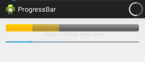
这是Google给我们提供的两种样式,下面我们就要看看怎样来自定义水平进度条的样式,通过自定义进度条来让我们的App与众不同。要自定义水平进度条的样式,我们首先要弄明白系统的这个样式是怎么显示出来的,我们追踪
- style="@android:style/Widget.ProgressBar.Horizontal"
这行代码所指向的位置,我们看到了这样一个Style:
- <style name="Widget.ProgressBar.Horizontal">
- <item name="android:indeterminateOnly">false</item>
- <item name="android:progressDrawable">@android:drawable/progress_horizontal</item>
- <item name="android:indeterminateDrawable">@android:drawable/progress_indeterminate_horizontal</item>
- <item name="android:minHeight">20dip</item>
- <item name="android:maxHeight">20dip</item>
- <item name="android:mirrorForRtl">true</item>
- </style>
- <?xml version="1.0" encoding="utf-8"?>
- <!-- Copyright (C) 2008 The Android Open Source Project
- Licensed under the Apache License, Version 2.0 (the "License");
- you may not use this file except in compliance with the License.
- You may obtain a copy of the License at
- http://www.apache.org/licenses/LICENSE-2.0
- Unless required by applicable law or agreed to in writing, software
- distributed under the License is distributed on an "AS IS" BASIS,
- WITHOUT WARRANTIES OR CONDITIONS OF ANY KIND, either express or implied.
- See the License for the specific language governing permissions and
- limitations under the License.
- -->
- <layer-list xmlns:android="http://schemas.android.com/apk/res/android">
- <item android:id="@android:id/background">
- <shape>
- <corners android:radius="5dip" />
- <gradient
- android:startColor="#ff9d9e9d"
- android:centerColor="#ff5a5d5a"
- android:centerY="0.75"
- android:endColor="#ff747674"
- android:angle="270"
- />
- </shape>
- </item>
- <item android:id="@android:id/secondaryProgress">
- <clip>
- <shape>
- <corners android:radius="5dip" />
- <gradient
- android:startColor="#80ffd300"
- android:centerColor="#80ffb600"
- android:centerY="0.75"
- android:endColor="#a0ffcb00"
- android:angle="270"
- />
- </shape>
- </clip>
- </item>
- <item android:id="@android:id/progress">
- <clip>
- <shape>
- <corners android:radius="5dip" />
- <gradient
- android:startColor="#ffffd300"
- android:centerColor="#ffffb600"
- android:centerY="0.75"
- android:endColor="#ffffcb00"
- android:angle="270"
- />
- </shape>
- </clip>
- </item>
- </layer-list>
- <?xml version="1.0" encoding="utf-8"?>
- <layer-list xmlns:android="http://schemas.android.com/apk/res/android">
- <item android:id="@android:id/background">
- <shape>
- <corners android:radius="5dip" />
- <gradient
- android:startColor="#ff9d9e9d"
- android:centerColor="#ff5a5d5a"
- android:centerY="0.75"
- android:endColor="#ff747674"
- android:angle="270"
- />
- </shape>
- </item>
- <item android:id="@android:id/secondaryProgress">
- <clip>
- <shape>
- <corners android:radius="5dip" />
- <gradient
- android:startColor="#EE5C42"
- android:centerColor="#EE5C42"
- android:centerY="0.75"
- android:endColor="#EE5C42"
- android:angle="270"
- />
- </shape>
- </clip>
- </item>
- <item android:id="@android:id/progress">
- <clip>
- <shape>
- <corners android:radius="5dip" />
- <gradient
- android:startColor="#EE0000"
- android:centerColor="#EE0000"
- android:centerY="0.75"
- android:endColor="#EE0000"
- android:angle="270"
- />
- </shape>
- </clip>
- </item>
- </layer-list>
OK,我只是修改了secondaryProgress的颜色,其他的东西都没有修改,然后我再模仿Google的Style,自定义一个Style,如下:
- <style name="m_progress_bar_style">
- <item name="android:indeterminateOnly">false</item>
- <item name="android:progressDrawable">@drawable/m_progress_horizontal</item>
- <item name="android:indeterminateDrawable">@android:drawable/progress_indeterminate_horizontal</item>
- <item name="android:minHeight">2dip</item>
- <item name="android:maxHeight">2dip</item>
- <item name="android:mirrorForRtl">true</item>
- </style>

progress和secondaryProgress的颜色已经被我成功修改为红色和浅红色了。如果我愿意,我也可以把剩余的灰色修改为其他颜色。事实上,我们可以省略上面一步,直接在布局文件中给progressBar添加progressDrawable属性,如下:
- <ProgressBar
- android:id="@+id/pb1"
- style="@android:style/Widget.ProgressBar.Horizontal"
- android:layout_width="match_parent"
- android:layout_height="wrap_content"
- android:max="100"
- android:maxHeight="2dp"
- android:minHeight="2dp"
- android:progress="20"
- android:progressDrawable="@drawable/m_progress_horizontal"
- android:secondaryProgress="40" />
这个时候显示效果和上面还是一样的。根据这个特性,我们可以实现下面这种歌词进度的效果,如图:

代码如下:
- <?xml version="1.0" encoding="utf-8"?>
- <layer-list xmlns:android="http://schemas.android.com/apk/res/android" >
- <item
- android:id="@android:id/background"
- android:drawable="@drawable/t1"/>
- <item
- android:id="@android:id/progress"
- android:drawable="@drawable/t2"/>
- </layer-list>
其实就是两张图片:


OK,这里就是我们对水平进度条样式的一个简单修改,使它更符合我们的审美。
自定义圆形进度条样式
当我们不知道我们的耗时操作究竟要执行多长时间的时候,我们通常都会采用圆形进度条来显示。安卓自带的圆形进度条如第一幅图所示,但更多情况下我们见到的圆形进度条都比较好看,比如一个小人在跑等等,那么这里我们先来看一个简单的原型进度条。
和上面一样,要想自定义一个圆形进度条,我们首先得知道android默认的圆形进度条的样式是怎么显示出来的,我们追踪
- style="@android:style/Widget.ProgressBar"
这一行代码的源码,如下:
- <style name="Widget.ProgressBar">
- <item name="android:indeterminateOnly">true</item>
- <item name="android:indeterminateDrawable">@android:drawable/progress_medium_white</item>
- <item name="android:indeterminateBehavior">repeat</item>
- <item name="android:indeterminateDuration">3500</item>
- <item name="android:minWidth">48dip</item>
- <item name="android:maxWidth">48dip</item>
- <item name="android:minHeight">48dip</item>
- <item name="android:maxHeight">48dip</item>
- <item name="android:mirrorForRtl">false</item>
- </style>
- <?xml version="1.0" encoding="utf-8"?>
- <rotate xmlns:android="http://schemas.android.com/apk/res/android"
- android:drawable="@drawable/loading_32dp"
- android:fromDegrees="0"
- android:pivotX="50%"
- android:pivotY="50%"
- android:toDegrees="359" >
- </rotate>

我们让这张图片绕自身的中心点旋转,OK,progressbar_rotate.xml文件写好之后,下一步就是自定义style了,我们可以模仿Widget.ProgressBar来自定义style,也可以直接在布局文件中设置indeterminateDrawable属性,我采用第二种方式,代码如下:
- <ProgressBar
- android:id="@+id/pb4"
- style="@android:style/Widget.ProgressBar"
- android:layout_width="match_parent"
- android:layout_height="wrap_content"
- android:layout_below="@id/pb1"
- android:layout_marginTop="20dp"
- android:indeterminateDrawable="@drawable/progressbar_rotate"/>
效果图如下:

我们看到有一个圆圈在不停的转动,就这么简单,我们自定义了一个圆形进度条样式。
就是这么简单。
原文链接:https://blog.youkuaiyun.com/u012702547/article/details/50669932


 扫一扫
扫一扫


 416
416

 被折叠的 条评论
为什么被折叠?
被折叠的 条评论
为什么被折叠?
 到【灌水乐园】发言


