


【c#】Border
一、基本样式设置
1、基本样式设置
BorderThickness、Margin、Padding值类型均是Thickness
<border>
BorderThickness="1"
BorderBrush = "#076ff5"
Background=""
Foreground=""
Margin=""
Padding=""
CornerRadius=""<!-- 圆角 -->
></border>
二、相关样式示例
1、开关
<Button Click="Button_ChangeTraceStatus">
   <Button.Template>
        <ControlTemplate>
            <Border x:Name="switchBor" Background="#E6E6E6"  CornerRadius="8" Width="30" Height="16">
                <Grid>
                    <Ellipse x:Name="spSwitchOff" HorizontalAlignment="Left" Margin="2,0" Width="12" Height="12" Fill="#FFF"/>
                    <Ellipse x:Name="spSwitchOn" HorizontalAlignment="Right" Margin="0,0,2,0" Width="12" Height="12" Fill="#FFF" Visibility="Collapsed"/>
                </Grid>
            </Border>
            <ControlTemplate.Triggers>
                <DataTrigger Binding="{Binding TraceTableStatus}" Value="1">
                    <Setter Property="Visibility" TargetName="spSwitchOff" Value="Collapsed"></Setter>
                    <Setter Property="Visibility" TargetName="spSwitchOn" Value="Visible"></Setter>
                    <Setter Property="Background" TargetName="switchBor" Value="#076ff5"></Setter>
                </DataTrigger>
                <DataTrigger Binding="{Binding TraceTableStatus}" Value="0">
                    <Setter Property="Visibility" TargetName="spSwitchOff" Value="Visible"></Setter>
                    <Setter Property="Visibility" TargetName="spSwitchOn" Value="Collapsed"></Setter>
                    <Setter Property="Background" TargetName="switchBor" Value="#E6E6E6"></Setter>
                </DataTrigger>
            </ControlTemplate.Triggers>
        </ControlTemplate>
    </Button.Template>
</Button>

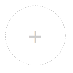
2、虚线 border
<Border Width="100" Height="100" CornerRadius="50" BorderThickness="1">
    <Border.BorderBrush>
        <VisualBrush>
            <VisualBrush.Visual>
            	<!-- 使用Rectangle则是矩形边框,StrokeDashArray设置的虚线/点的密度  -->
                <Ellipse StrokeDashArray="2 2" Stroke="#cccccc" StrokeThickness="1"
                    Width="{Binding RelativeSource={RelativeSource AncestorType={x:Type Border}}, Path=ActualWidth}"
                    Height="{Binding RelativeSource={RelativeSource AncestorType={x:Type Border}}, Path=ActualHeight}"/>
            </VisualBrush.Visual>
        </VisualBrush>
    </Border.BorderBrush>
    <TextBlock VerticalAlignment="Center" HorizontalAlignment="Center" Foreground="#cccccc" FontSize="40">+</TextBlock>
</Border>


 扫一扫
扫一扫


 1475
1475

 被折叠的 条评论
为什么被折叠?
被折叠的 条评论
为什么被折叠?
 到【灌水乐园】发言


