


 本文介绍了在Android开发中使用selector的相关内容,包括改变字体颜色、按钮背景的方法,以及在listview中设置selector的两种方式和不同效果。同时,还阐述了使用selector时的注意事项,如资源放置目录、属性引用规则、状态匹配规则等。
1、改变字体的颜色
1.1 常规属性
<selector xmlns:android="http://schemas.android.com/apk/res/android">
    <!-- 当前窗口失去焦点时 -->
    <item android:state_window_focused="false"  android:color="@android:color/black"/>
    <!-- 不可用时 -->
    <item android:state_enabled="false"  android:color="@android:color/background_light"/>
    <!-- 按压时 -->
    <item android:state_pressed="true"  android:color="@android:color/holo_blue_light"/>
    <!-- 被选中时 -->
    <item android:state_selected="true"  android:color="@android:color/holo_green_dark"/>
    <!-- 被激活时 -->
    <item android:state_activated="true"  android:color="@android:color/holo_green_light"/>
    <!-- 默认时 -->
    <item android:color="@android:color/white" />
</selector>
1.2 颜色选择器设置
res/drawable/tab_text_selector.xml内容为:
<?xml version="1.0" encoding="utf-8"?>

<!--选中和未选中的字体颜色-->
<selector xmlns:android="http://schemas.android.com/apk/res/android">
    <item android:state_selected="true" android:color="@color/white" />
    <item android:color="@color/white_trans50" />     <!--white_trans50值为#80FFFFFF-->
</selector>
然后,在需要设置字体颜色变化的控件上进行设置。见下:
 <TextView
        android:id="@+id/tab_item_textview"
        android:layout_width="match_parent"
        android:layout_height="match_parent"
        android:layout_gravity="center"
        android:layout_marginTop="10dp"
        android:gravity="center"
        android:textColor="@drawable/tab_text_selector"
        android:textSize="12sp"
        android:textStyle="normal" />
2、改变按钮的背景
2.1 常规属性
<?xml version="1.0" encoding="utf-8"?>
<selector xmlns:android="http://schemas.android.com/apk/res/android">
    <!-- 当前窗口失去焦点时 -->
    <item android:state_window_focused="false" android:drawable="@drawable/bg_btn_lost_window_focused" />
    <!-- 不可用时 -->
    <item android:state_enabled="false" android:drawable="@drawable/bg_btn_disable" />
    <!-- 按压时 -->
    <item android:state_pressed="true" android:drawable="@drawable/bg_btn_pressed" />
    <!-- 被选中时 -->
    <item android:state_selected="true" android:drawable="@drawable/bg_btn_selected" />
    <!-- 被激活时 -->
    <item android:state_activated="true" android:drawable="@drawable/bg_btn_activated" />
    <!-- 默认时 -->
    <item android:drawable="@drawable/bg_btn_normal" />
</selector>
2.2 背景选择XML文件
在res/drawable/tab_weather_bg_selector.xml,内容为:
<?xml version="1.0" encoding="utf-8"?>
<!--天气选中与未选中的图片-->
<selector xmlns:android="http://schemas.android.com/apk/res/android">
    <item android:state_selected="true" android:drawable="@drawable/tab_weather_select" />
    <item android:drawable="@drawable/tab_weather_unselect" />
</selector>
private TabHost.TabSpec GetTabView(String text, int img_id) {
        Drawable drawable = ContextCompat.getDrawable(this, img_id);     //获取图片ID
        drawable.setBounds(0, 0, drawable.getMinimumWidth(), drawable.getMinimumHeight());      //设置图片
        View item_bar = getLayoutInflater().inflate(R.layout.tab_item_fragment, null);          //实例化单个菜单
        TextView tv_item = (TextView) item_bar.findViewById(R.id.tab_item_textview);            //实例化TextView
        tv_item.setText(text);                                                                  //TextView赋值
        tv_item.setCompoundDrawables(null, drawable, null, null);                               //设置图片位置
        TabHost.TabSpec spec = tabhost.newTabSpec(text).setIndicator(item_bar);            //绑定TabSpec
        return spec;
    }
3、注意事项
那么,在使用过程中,有几点还是需要注意和了解的:
selector作为drawable资源时,item指定android:drawable属性,并放于drawable目录下;
selector作为color资源时,item指定android:color属性,并放于color目录下;
color资源也可以放于drawable目录,引用时则用@drawable来引用,但不推荐这么做,drawable资源和color资源最好还是分开;
android:drawable属性除了引用@drawable资源,也可以引用@color颜色值;但android:color只能引用@color;
item是从上往下匹配的,如果匹配到一个item那它就将采用这个item,而不是采用最佳匹配的规则;所以设置默认的状态,一定要写在最后,如果写在前面,则后面所有的item都不会起作用了。
另外,selector标签下有两个比较有用的属性要说一下,添加了下面两个属性之后,则会在状态改变时出现淡入淡出效果,但必须在API Level 11及以上才支持:
android:enterFadeDuration 状态改变时,新状态展示时的淡入时间,以毫秒为单位
android:exitFadeDuration 状态改变时,旧状态消失时的淡出时间,以毫秒为单位
4、listview中设置selector
最后,关于ListView的ListItem样式,有两种设置方式,一种是在ListView标签里设置android:listSelector属性,另一种是在ListItem的布局layout里设置android:background。但是,这两种设置的结果却有着不同。同时,使用ListView时也有些其他需要注意的地方,总结如下
android:listSelector设置的ListItem默认背景是透明的,不管你在selector里怎么设置都无法改变它的背景。所以,如果想改ListItem的默认背景,只能通过第二种方式,在ListItem的布局layout里设置android:background。
当触摸点击ListItem时,第一种设置方式下,state_pressed、state_focused和state_window_focused设为true时都会触发,而第二种设置方式下,只有state_pressed会触发。
当ListItem里有Button或CheckBox之类的控件时,会抢占ListItem本身的焦点,导致ListItem本身的触摸点击事件会无效。那么,要解决此问题,有三种解决方案:
将Button或CheckBox换成TextView或ImageView之类的控件
设置Button或CheckBox之类的控件设置focusable属性为false
设置ListItem的根布局属性android:descendantFocusability=“blocksDescendants”
第三种是最方便,也是推荐的方式,它会将ListItem根布局下的所有子控件都设置为不能获取焦点。android:descendantFocusability属性的值有三种,其中,ViewGroup是指设置该属性的View,本例中就是ListItem的根布局:
beforeDescendants:ViewGroup会优先其子类控件而获取到焦点
afterDescendants:ViewGroup只有当其子类控件不需要获取焦点时才获取焦点
blocksDescendants:ViewGroup会覆盖子类控件而直接获得焦点
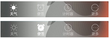
5、效果
当从天气切换到便签时,显示效果变化过程为:
6、参考文档
https://www.cnblogs.com/jeno-song/p/5545608.html
https://www.cnblogs.com/xinyibufang/p/8029917.html


 扫一扫
扫一扫


 523
523

 被折叠的 条评论
为什么被折叠?
被折叠的 条评论
为什么被折叠?
 到【灌水乐园】发言


