


 本文介绍如何在Vue项目中使用el-tooltip组件处理元素内容溢出问题,通过比较clientHeight和scrollHeight判断是否显示提示框,并利用text-overflow和display:-webkit-box实现省略效果,同时考虑了浏览器兼容性问题.
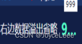
实现效果
效果如下, 文字溢出省略, 鼠标悬浮时显示提示框
思路
在元素的 mouseenter 事件中, 根据元素的 clientHeight 和 scrollHeight 大小比较来决定包裹元素的 el-tooltip 组件是否显示。在显示的情况下,即内容溢出时,利用 text-overflow: ellipsis; 和 display: -webkit-box; 来显示省略号。
代码
<template>
  <el-tooltip
    :disabled="tooltipDisabled"
    :content="content + ''"
    placement="top"
    :visible-arrow="false"
  >
    <div
      class="title-line-ellipsis"
      :style="setRow"
      @mouseenter="spanMouseenter($event)"
    >
      <span>{{ content }}</span>
    </div>
  </el-tooltip>
</template>

<script>
export default {
  name: 'TitleTip',
  props: {
    content: {
      type: [String, Number],
      default: '',
    },
    row: {
      type: [String, Number],
      default: 1,
    },
  },
  data() {
    return {
      tooltipDisabled: true,
    }
  },
  methods: {
    spanMouseenter(ev) {
      let clientHeight = ev.target.clientHeight
      let scrollHeight = ev.target.scrollHeight
      // 项目有时scrollHeight会比clientHeight多出了1px, 原因暂时不明
      this.tooltipDisabled = clientHeight == scrollHeight || clientHeight == scrollHeight - 1
    },
  },
  computed: {
    setRow() {
      return `-webkit-line-clamp: ${this.row};`
    },
  },
}
</script>

<style lang="less">
.title-line-ellipsis {
  text-overflow: ellipsis;
  overflow: hidden;
  display: -webkit-box;
  -webkit-box-orient: vertical;
  word-wrap: break-word; // 解决英文的情况下不出现省略号

  & > * {
    white-space: normal !important;
  }
}
</style>
在父组件中引入使用情况如下:
<title-tip :content="item.name" :row="1"/>
注:
- 若元素本身或其父元素样式属性有 white-space: nowrap, 会使 ellipsis 失效;
- tooltip组件外层容器应为block块, 且设置max-width或 width;
- 还可以在 el-descriptions 中使用, 使用情况如下:
<el-descriptions :column="1" border>
    <el-descriptions-item label="用电波动分析">
      <tooltip :content="'持续高用电波动(持续' + 26 + '天)'" />
    </el-descriptions-item>
</el-descriptions>

.el-descriptions-item__content {
  max-width: 245px;
}
- 考虑到 display: -webkit-box; 的兼容性不佳的问题(ie和firefox不兼容), 多行文字省略的样式可通过 max-height 和伪类元素来实现, 具体可参照: multiline ellipsis


 扫一扫
扫一扫


 2226
2226

 被折叠的 条评论
为什么被折叠?
被折叠的 条评论
为什么被折叠?
 到【灌水乐园】发言


