


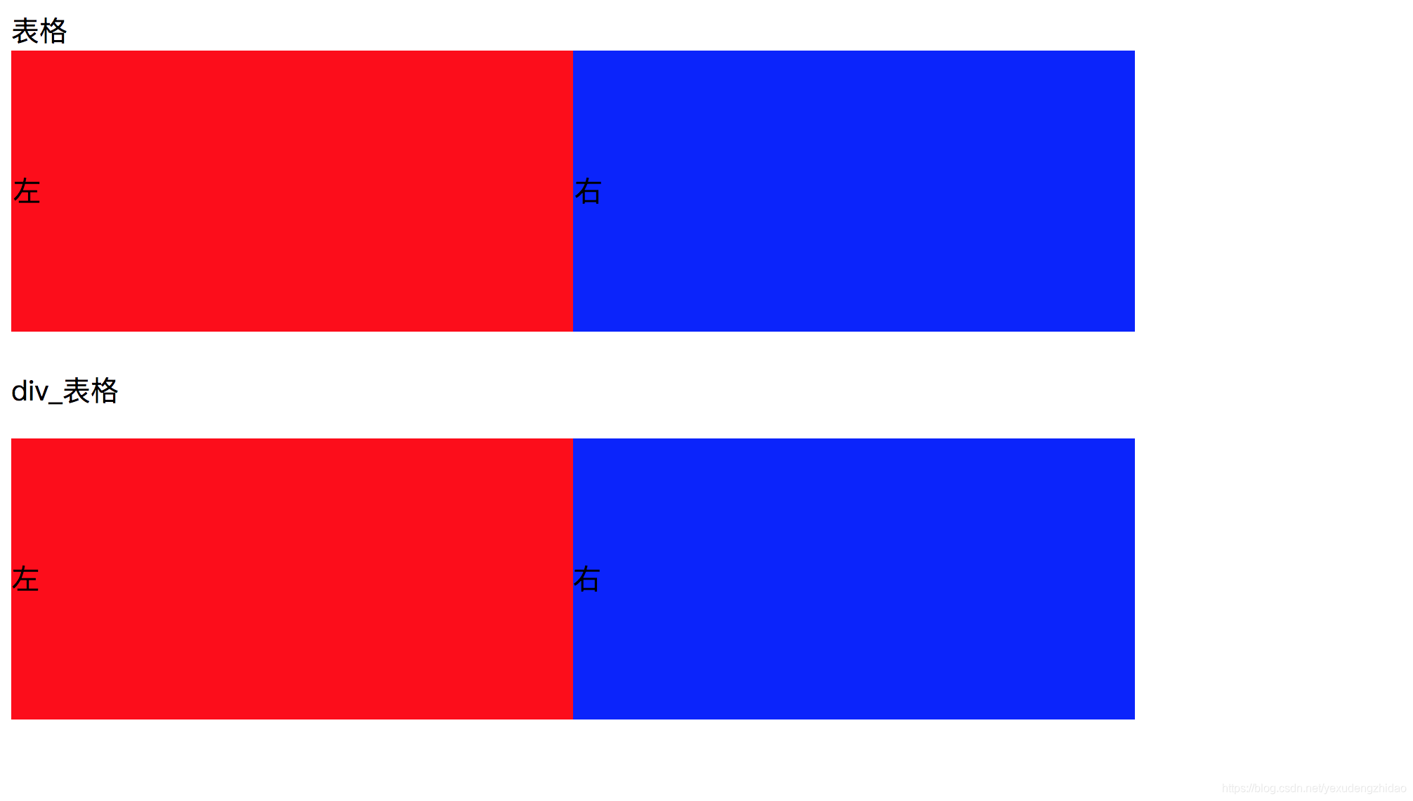
- table表格布局
- float浮动+margin
- inline-block布局
- flexbox布局
一. table表格布局
<!DOCTYPE html>
<html lang="en">
<head>
    <meta charset="UTF-8">
    <meta name="viewport" content="width=device-width, initial-scale=1.0">
    <meta http-equiv="X-UA-Compatible" content="ie=edge">
    <title>Document</title>
    <style>
        .left{
            background:red;
        }
        .right{
            background:blue;
        }
        table{
            width:800px;
            height:200px;
            border-collapse: collapse;  /* 塌陷 */
        }

        .table{
            margin-top:20px;
            display: table;
            width:800px;
            height:200px;
        }
        .table-row{
            display: table-row;
        }
        .table-cell{
            vertical-align: middle;
            display: table-cell;
        }
    </style>
</head>
<body>
    表格
    <table>
        <tr>
            <td class="left">左</td>
            <td class="right">右</td>
        </tr>
    </table>
    <br>
    div_表格
    <div class="table">
        <div class="table-row">
            <div class="left table-cell">
                左
            </div>
            <div class="right table-cell">
                右
            </div>
        </div>
    </div>
</body>
</html>
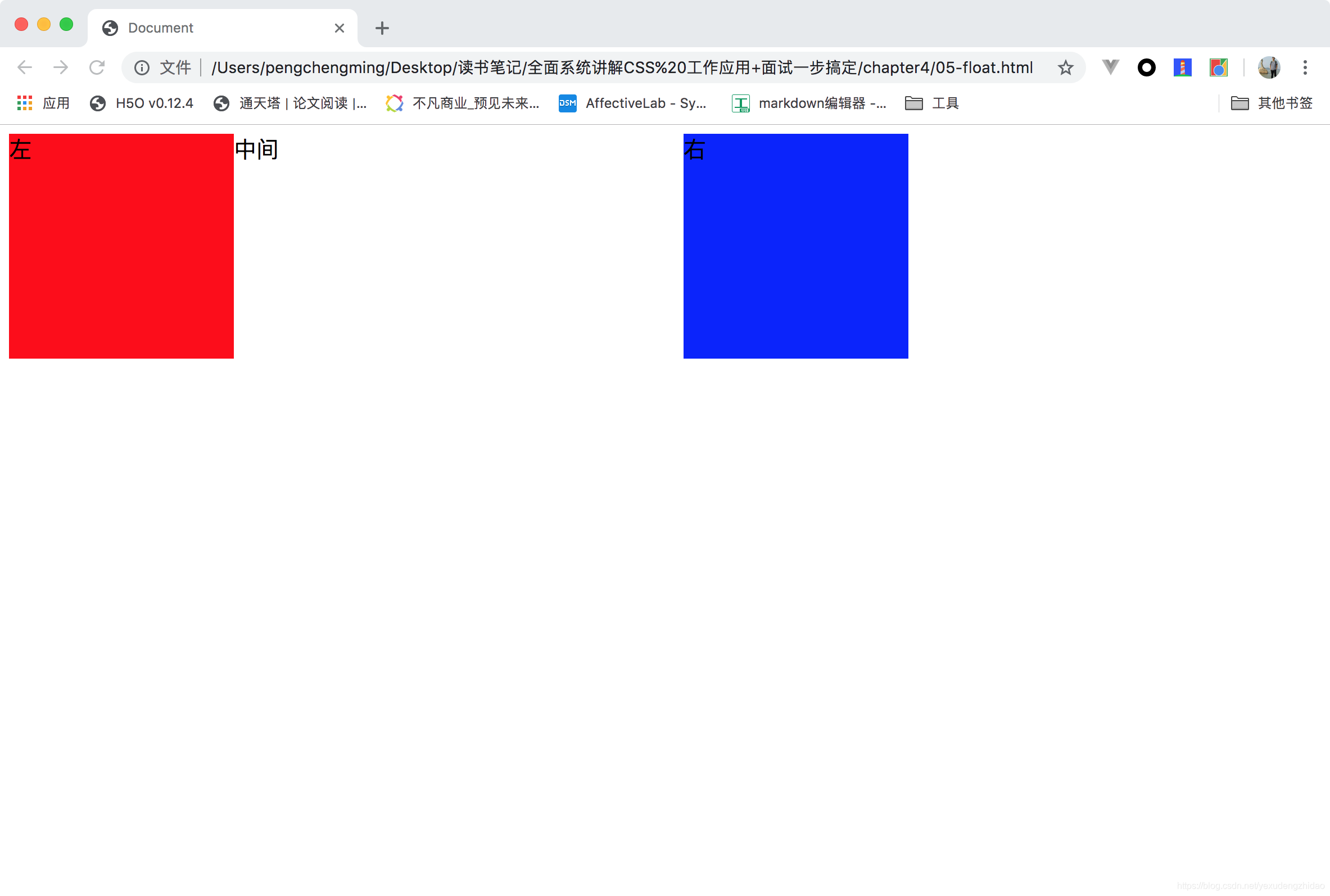
二. float浮动+margin
三栏布局
<!DOCTYPE html>
<html lang="en">
<head>
    <meta charset="UTF-8">
    <meta name="viewport" content="width=device-width, initial-scale=1.0">
    <meta http-equiv="X-UA-Compatible" content="ie=edge">
    <title>Document</title>
    <style>
        .container{
            width:800px;
            height:200px;
        }
        .left{
            background:red;
            float:left;
            height:100%;
            width:200px;
            /* position: absolute; */
            /* height:200px; */
        }
        .right{
            background:blue;
            float:right;
            width:200px;
            height:100%;
        }
        .middle{
            margin-left:200px;
            margin-right:200px;
        }

    </style>
</head>
<body>
    <div class="container">
        <div class="left">
            左
        </div>
        <div class="right">
            右
        </div>
        <div class="middle">
            中间
        </div>
    </div>
</body>
</html>
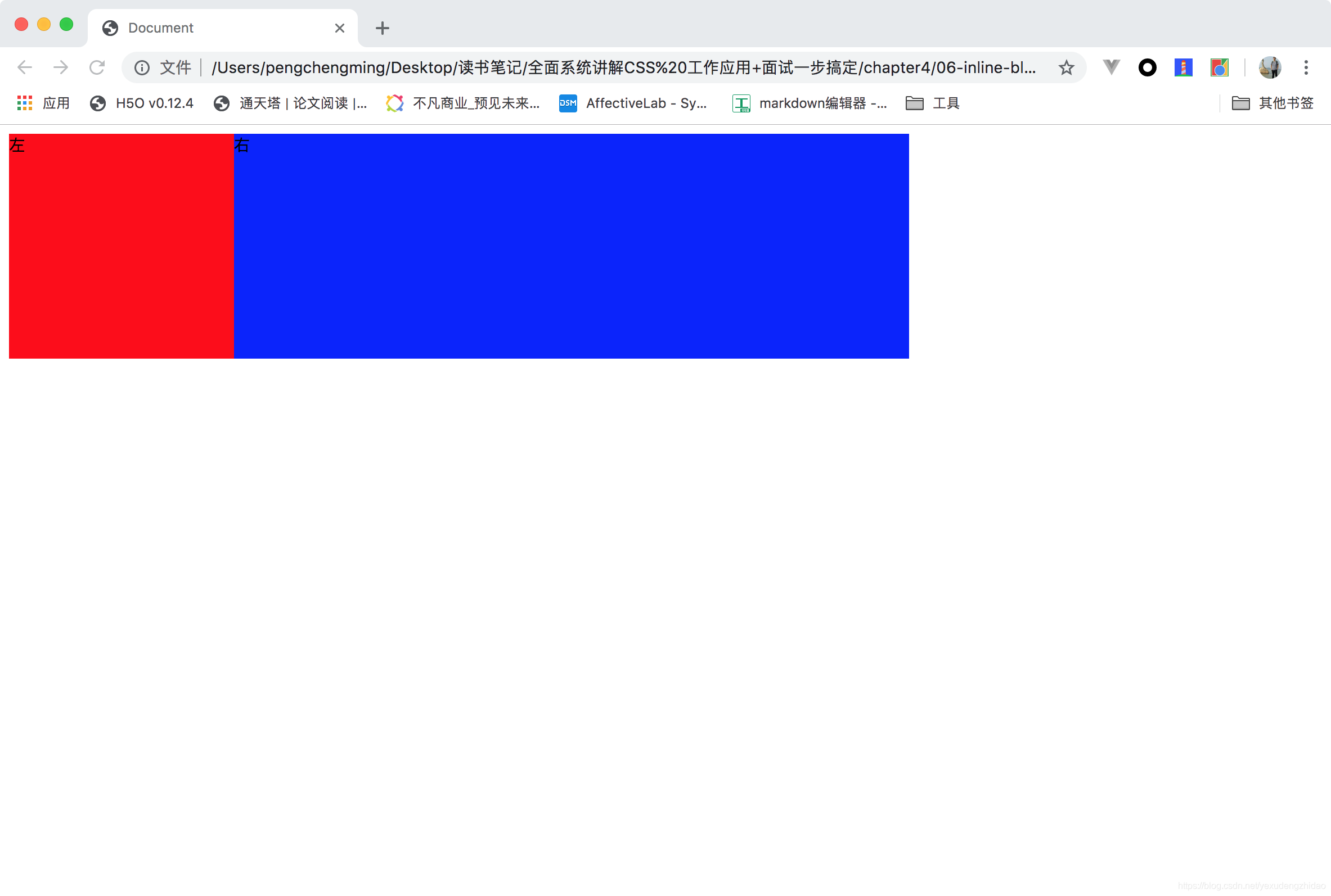
三. inline-block布局
注意问题,由于是inline-block,所以会有空白间隙问题,可以通过将font-size设置为0,然后再需要的时候在设置font-size来解决。
<!DOCTYPE html>
<html lang="en">
<head>
    <meta charset="UTF-8">
    <meta name="viewport" content="width=device-width, initial-scale=1.0">
    <meta http-equiv="X-UA-Compatible" content="ie=edge">
    <title>Document</title>
    <style>
        .container{
            width:800px;
            height:200px;
            font-size:0;
        }
        .left{
            font-size:14px;
            background:red;
            display: inline-block;
            width:200px;
            height:200px;
        }
        .right{
            font-size:14px;
            background:blue;
            display: inline-block;
            width:600px;
            height:200px;
        }

    </style>
</head>
<body>
    <div class="container">
        <div class="left">
            左
        </div>
        <div class="right">
            右
        </div>
    </div>
</body>
</html>
四. flexbox布局
<!DOCTYPE html>
<html lang="en">
<head>
    <meta charset="UTF-8">
    <meta name="viewport" content="width=device-width, initial-scale=1.0">
    <meta http-equiv="X-UA-Compatible" content="ie=edge">
    <title>Document</title>
    <style>
        .container{
            width:800px;
            height:200px;
            display: flex;
        }
        .left{
            background: red;
            display: flex;
            width:200px;
        }
        .right{
            background: blue;
            display: flex;
            flex:1;
        }

    </style>
</head>
<body>
    <div class="container">
        <div class="left">
            左
        </div>
        <div class="right">
            右
        </div>
    </div>
</body>
</html>


 扫一扫
扫一扫


 1659
1659

 被折叠的 条评论
为什么被折叠?
被折叠的 条评论
为什么被折叠?
 到【灌水乐园】发言


