js控制三根指针转动

本文介绍了如何使用HTML、CSS和JavaScript实现一个简单的钟面,通过CSS样式控制时针、分针和秒针的外观,并利用JavaScript实时更新指针位置,呈现动态效果。
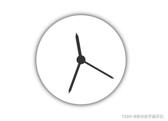
效果
在这里插入图片描述

html

<body>
    <div id="clock">
        <div class="hms">
            <!-- 时针 -->
            <div class="hour"></div>
            <!-- 分针 -->
            <div class="min"></div>
            <!-- 秒针 -->
            <div class="sec"></div>
        </div>
    </div>
</body>

css

    html,
    body {
        width: 100%;
        height: 100%;
    }

    body,
    ul {
        margin: 0;
    }

    ul {
        padding: 0;
        list-style: none;
    }

    /* clock */
    #clock {
        display: flex;
        -webkit-justify-content: center;
        -moz-justify-content: center;
        -ms-justify-content: center;
        justify-content: center;
        -webkit-align-items: center;
        -ms-align-items: center;
        -moz-align-items: center;
        align-items: center;
        width: 300px;
        height: 300px;
        margin: 60px auto;
        border-radius: 50%;
        box-shadow: 0 0 15px;
    }

    .hms {
        position: relative;
        display: inline-block;
        width: 30px;
        height: 30px;
        background-color: #333;
        border-radius: 50%;
    }

    .hms div {
        position: absolute;
        bottom: 50%;
        background-color: #333;
        transform-origin: center bottom;
    }

    .hms .hour {
        left: calc(50% - 10px/ 2);
        width: 10px;
        height: 80px;
    }

    .hms .hour::after {
        content: "";
        position: absolute;
        left: 0;
        bottom: 79px;
        border-width: 14px 5px;
        border-style: solid;
        border-color: transparent transparent #333 transparent;
    }

    .hms .min {
        left: calc(50% - 8px/ 2);
        width: 8px;
        height: 110px;
        /* transform: rotate(15deg); */
    }

    .hms .min::after {
        content: "";
        position: absolute;
        left: 0;
        bottom: 109px;
        border-width: 12px 4px;
        border-style: solid;
        border-color: transparent transparent #333 transparent;
    }

    .hms .sec {
        left: calc(50% - 6px/ 2);
        width: 6px;
        height: 120px;
        /* transform: rotate(30deg); */
    }

    .hms .sec::after {
        content: "";
        position: absolute;
        left: 0;
        bottom: 119px;
        border-width: 10px 3px;
        border-style: solid;
        border-color: transparent transparent #333 transparent;
    }
</style>

js

    var doc = document;
    var ele = {
        eleHour: doc.getElementsByClassName("hour")[0],
        eleMin: doc.getElementsByClassName("min")[0],
        eleSec: doc.getElementsByClassName("sec")[0],
    };

    // 控制指针随便转
    function rotating(val1,val2,val3) {
        ele.eleSec.style.transform = "rotate(" + val1 + "deg)";
        ele.eleMin.style.transform = "rotate(" + val2 + "deg)";
        ele.eleHour.style.transform = "rotate(" + val3 + "deg)";
    }
    rotating(120,200,350)
<think>好的,我现在需要帮助用户解决如何使用JavaScript实现时钟指针平滑转动的问题。用户之前的问题是关于JSP动态时钟指针无法转动的原因,现在他们想进一步优化,让指针转动更平滑。 首先,我得回想之前的对话。我之前已经给出了一些解决方案,比如检查CSS、JavaScript定时器、DOM元素获取等。现在用户明确询问平滑转动的方法,所以需要聚焦在这个点上。 根据引用内容,用户提供的引用中有提到使用setInterval,但可能没有涉及平滑动画。引用2和3提到了SVG和requestAnimationFrame,这可能与平滑动画有关。需要结合这些信息,但主要还是要基于JavaScript和CSS的最佳实践。 首先,平滑转动通常涉及两个方面:CSS过渡和JavaScript的动画循环。CSS方面,使用transition属性可以让旋转有平滑效果,比如transition: transform 0.3s ease-in-out。但用户可能需要更实时的控制,比如每帧更新角度,而不是依赖CSS过渡。这时候可能需要用requestAnimationFrame来替代setInterval,因为前者能提供更流畅的动画。 另外,角度计算是否需要更精细?比如,不是每秒更新一次,而是连续计算当前时间的小数部分,比如秒数加上毫秒的部分,这样指针转动会更连续。例如,计算秒的时候,用getSeconds() + getMilliseconds()/1000,这样角度计算会更平滑。 然后,考虑到用户提供的引用中有一个例子是使用setInterval(clock),但间隔时间没有指定,可能导致立即执行,或者间隔不正确。需要确保setInterval的时间间隔正确,比如每秒更新一次,但这样还是不够平滑。所以可能需要更频繁的更新,比如每50毫秒一次,或者使用requestAnimationFrame来同步屏幕刷新率。 还要检查CSS中的transform-origin是否正确设置,确保指针围绕正确的原点旋转,否则即使角度变化,指针可能不会正确旋转。 此外,引用3提到了SVG和变换控制,可能可以考虑使用SVG来绘制时钟,因为SVG的变换可能更平滑,但用户的问题是关于JavaScript的实现,所以可能不需要涉及SVG,除非有必要。 现在需要综合这些点,给出步骤: 1. 使用requestAnimationFrame替代setInterval,以实现更流畅的动画循环。 2. 在角度计算中包括毫秒,使角度变化更连续。 3. 应用CSS的transition属性或使用JavaScript逐帧更新transform属性。 4. 确保transform-origin正确设置。 5. 示例代码展示如何结合这些方法。 同时需要验证这些方法是否真的有效,比如,requestAnimationFrame的调用频率是否足够高,角度计算是否正确,是否会导致性能问题。 可能还需要考虑性能优化,比如避免在每一帧中进行复杂的DOM操作,或者使用硬件加速(如使用transform而不是left/top属性)。 最后,需要检查用户提供的代码示例中的问题,比如在引用1中,setInterval(clock)没有指定间隔时间,会导致立即重复执行,应该改为setInterval(clock, 1000),但这样每秒更新一次,不够平滑。所以需要修改为更频繁的更新,并使用更精确的时间计算。 总结解决方案的步骤,并给出代码示例,同时解释每个部分的作用,确保用户能够理解并实现平滑转动。</think>#### JavaScript实现时钟指针平滑转动的完整方案 --- ### 一、核心实现原理 1. **时间精度升级** 传统实现使用`setInterval(clock, 1000)`会导致每秒跳动一次,需改用`Date`对象的毫秒级时间计算: ```javascript const ss = now.getSeconds() + now.getMilliseconds()/1000; // 获取带毫秒的秒数 ``` 2. **动画引擎优化** 使用`requestAnimationFrame`替代`setInterval`,实现与屏幕刷新率同步(通常60fps): ```javascript function animate() { updateTime(); requestAnimationFrame(animate); } animate(); ``` 3. **CSS过渡增强** 通过`transition`属性实现物理惯性效果: ```css .pointer { transition: transform 0.5s cubic-bezier(0.4, 0, 0.2, 1); /* 贝塞尔曲线加速效果 */ } ``` --- ### 二、分步实现代码 #### 1. HTML结构 ```jsp <div class="clock-face"> <div id="hour-hand" class="pointer hour"></div> <div id="minute-hand" class="pointer minute"></div> <div id="second-hand" class="pointer second"></div> </div> ``` #### 2. CSS关键配置 ```css .pointer { position: absolute; left: 50%; bottom: 50%; transform-origin: bottom center; backface-visibility: hidden; /* 消除动画锯齿 */ } .second { width: 2px; height: 45%; background: red; transition: transform 0.5s cubic-bezier(0.4, 0, 0.2, 1); } ``` #### 3. JavaScript动态计算 ```javascript function getSmoothAngles() { const now = new Date(); return { // 毫秒级连续计算 hour: (now.getHours() % 12) * 30 + (now.getMinutes() / 60) * 30, minute: now.getMinutes() * 6 + (now.getSeconds() / 60) * 6, second: (now.getSeconds() + now.getMilliseconds()/1000) * 6 }; } function updateHands() { const angles = getSmoothAngles(); document.getElementById('hour-hand').style.transform = `rotate(${angles.hour}deg)`; document.getElementById('minute-hand').style.transform = `rotate(${angles.minute}deg)`; document.getElementById('second-hand').style.transform = `rotate(${angles.second}deg)`; } // 启动动画循环 function animate() { updateHands(); requestAnimationFrame(animate); } animate(); ``` --- ### 三、性能优化技巧 1. **硬件加速** 添加3D变换强制GPU加速: ```css .pointer { transform: translateZ(0); } ``` 2. **时间同步补偿** 修正`requestAnimationFrame`的时间偏差: ```javascript let lastTime = 0; function animate(timestamp) { if (timestamp - lastTime > 16) { // 约60fps updateHands(); lastTime = timestamp; } requestAnimationFrame(animate); } ``` 3. **暂停时内存释放** 添加动画开关控制: ```javascript let isAnimating = true; document.getElementById('toggle-anim').addEventListener('click', () => { isAnimating = !isAnimating; if (isAnimating) animate(); }); ``` --- ### 四、不同方案的对比 | 方法 | 流畅度 | CPU占用 | 实现复杂度 | 兼容性 | |---------------------|--------|---------|------------|----------| | `setInterval(16ms)` | 中 | 高 | 低 | IE9+ | | `requestAnimationFrame` | 高 | 低 | 中 | IE10+ | | CSS Transition | 低 | 最低 | 低 | 全兼容 | | WebGL | 最高 | 中 | 高 | 现代浏览器 | ---
评论 2
添加红包

请填写红包祝福语或标题

红包个数最小为10个

红包金额最低5元

当前余额3.43前往充值 >
需支付:10.00
成就一亿技术人!
领取后你会自动成为博主和红包主的粉丝 规则
hope_wisdom
发出的红包
实付
使用余额支付
点击重新获取
扫码支付
钱包余额 0

抵扣说明:

1.余额是钱包充值的虚拟货币,按照1:1的比例进行支付金额的抵扣。
2.余额无法直接购买下载,可以购买VIP、付费专栏及课程。

余额充值