


 这篇博客探讨了Android中不同图形元素的使用,包括矩形、圆角矩形和环形的绘制,以及状态选择器和颜色的应用。内容涵盖了stroke、corners属性的设置,以及自定义形状和尺寸的调整,展示了如何创建不同效果的UI组件。
<?xml version="1.0" encoding="utf-8"?>
<shape xmlns:android="http://schemas.android.com/apk/res/android">
    <stroke
        android:width="1dp"
        android:color="@color/timetable_finish" />
    <corners
        android:radius="10dp"
        />
</shape>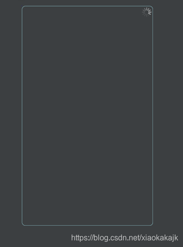

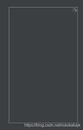
<?xml version="1.0" encoding="utf-8"?>
<shape xmlns:android="http://schemas.android.com/apk/res/android">
    <stroke
        android:width="1dp"
        android:color="@color/white" />
</shape>
<?xml version="1.0" encoding="utf-8"?>
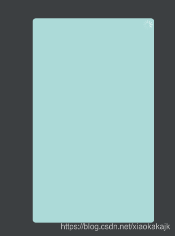
<shape xmlns:android="http://schemas.android.com/apk/res/android"
android:shape="rectangle">
<corners android:radius="10dp"/>
<solid android:color="#acdad8"/>
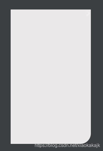
</shape><?xml version="1.0" encoding="utf-8"?>
<shape xmlns:android="http://schemas.android.com/apk/res/android"
android:shape="rectangle">
<solid android:color="#eae8e8" />
<corners
android:bottomRightRadius="50dp"
/>
</shape><?xml version="1.0" encoding="utf-8"?>
<selector xmlns:android="http://schemas.android.com/apk/res/android">
<item
android:state_enabled="true"
android:state_checked="true"
android:drawable="@drawable/radiobtn_unchecked_style"
/>
<item
android:state_enabled="true"
android:state_checked="false"
android:drawable="@drawable/radiobtn_checked_style"
/>
</selector><?xml version="1.0" encoding="utf-8"?>
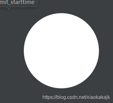
<shape xmlns:android="http://schemas.android.com/apk/res/android"
android:innerRadius="0dp"
android:shape="ring"
android:thickness="15dp"
android:useLevel="false" >
<solid android:color="#298961" />
<size
android:height="30dp"
android:width="30dp" />
</shape>


 扫一扫
扫一扫


 被折叠的 条评论
为什么被折叠?
被折叠的 条评论
为什么被折叠?
 到【灌水乐园】发言


