


 本文探讨了四种实现同一行元素顶端对齐的方法:1) inline-block元素的默认对齐及其缺点;2) 使用绝对定位进行精确对齐;3) 浮动元素以实现对齐及避免margin影响;4) 利用flex布局的简便性和灵活性。推荐对flex布局进一步学习。
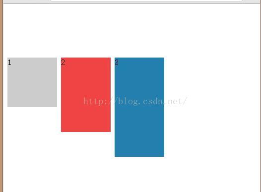
1.同一行的行内块状元素inline-block默认的都是顶端对齐
<style>
<span style="white-space:pre">	</span>.div1,.div2,.div3{display:inline-block;width:100px;height:}
	.div1{height:100px;background:#ccc;}
	.div2{height:150px;background:#e44;}
	.div3{height:200px;background:#237FAD;}
</style>
<body>
	<div class="div1">1</div>
	<div class="div2">2</div>
	<div class="div3">3</div>
</body>

但是这样有一个缺点,如果其中一个设置了margin,那么其他的都会随着一起动,例如给div2添加一个margin-top,其他的两个也都下来了
<style>
	.div1,.div2,.div3{display:inline-block;width:100px;height:}
	.div1{height:100px;background:#ccc;}
	.div2{height:150px;background:#e44;margin-top:100px;}
	.div3{height:200px;background:#237FAD;}
</style>
<body>
	<div class="div1">1</div>
	<div class="div2">2</div>
	<div class="div3">3</div>
</body>
2.利用绝对定位实现顶端对齐
通过调整上下左右的距离是的同一行的元素顶端对齐
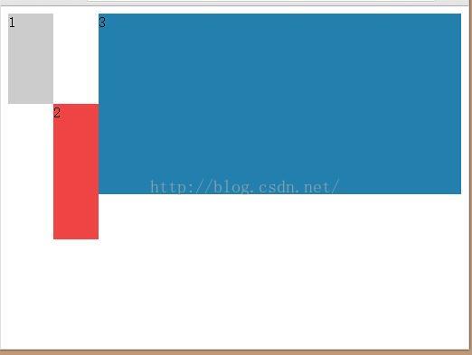
3.浮动方式顶端对齐
为了使块状元素能够在同一行,经常会用float:left来实现,左浮动和有浮动都能使元素顶端对齐,同时,其中一个元素设置margin不会影响其他的元素。
当都设为float:left时,设置最右边的为overflow:auto,可以使最右边的占满一行剩余的所有空间
<style>
	.div1{height:100px;background:#ccc;float:left;width:10%}
	.div2{height:150px;background:#e44;float:left;width:10%;margin-top:100px;}
	.div3{height:200px;background:#237FAD;overflow:auto;}
</style>
<body>
	<div class="div1">1</div>
	<div class="div2">2</div>
	<div class="div3">3</div>
</body>
4.flex布局
flex布局真的是超级好用,想知道更多的可以去了解一下
<style>
<span style="white-space:pre">	</span>.box{display:flex;display:-webkit-flex;justify-content:flex-start;}
	.div1{height:100px;background:#ccc;width:10%}
	.div2{height:150px;background:#e44;width:10%;}
	.div3{height:200px;background:#237FAD;width:10%;}
</style>
<body>
<span style="white-space:pre">	</span><div class="box">
	<span style="white-space:pre">	</span><div class="div1">1</div>
	<span style="white-space:pre">	</span><div class="div2">2</div>
	<span style="white-space:pre">	</span><div class="div3">3</div>
<span style="white-space:pre">	</span></div>
</body>


 扫一扫
扫一扫


 306
306

 被折叠的 条评论
为什么被折叠?
被折叠的 条评论
为什么被折叠?
 到【灌水乐园】发言


