


 文章介绍了使用CSS3和伪元素实现的气泡角效果,以及关于微信视频号创作者分成计划的一些注意事项,涉及HTML代码示例。
示例代码
<template>
<div>
<div class="wrapper">
<div class="desc">
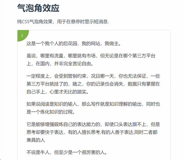
<h1>气泡角效应</h1>
<p>纯CSS气泡角效果,用于在悬停时显示短消息.</p>
</div>
<div class="box">
<div class="bubble-aprox"></div>
<div class="bubble">
<span class="bubble__icon">i</span>
<div class="bubble__content">
一个靠前排的 90 后,具有情怀的技匠,路上正追逐斜杠青年的践行者
</div>
</div>
<div class="box__content">
<p>这是一个我个人的后花园,我的网站,我做主。
虽说,哪里有流量,哪里就有市场,但无论是在哪个第三方平台上,在国内,并非完全言论自由。
一定程度上,会受到管制约束,况且哪一天,你也无法保证,一些第三方平台就挂了的,随之,你的记录也会消失,数据只有掌握在自己手上,心里才无比的踏实。
如果说阅读是知识的输入,那么写作就是知识理解的输出,同时也是一个炼化知识的过程。
它是能够增强锻炼自己的表达能力的,即使口头表达跟不上,但是思考却要快于表达,有的人擅长思考,有的人善于表达,同时二者都兼具的人
不说是牛人,但至少是一个很厉害的人。
</p>
</div>
</div>
</div>
</div>
</template>
<style>
.wrapper {
width: 40em;
margin: 4em auto;
background: #fff;
padding: 4em;
border-radius: 8px;
border: 1px solid #f5f5f5;
}
.wrapper >:first-child {
margin-top: 0;
}
.wrapper >:last-child {
margin-bottom: 0;
}
.desc {
font-size: 1.2em;
}
.todo {
background: #f9f9f9;
padding: 1em;
border-radius: 4px;
color: #ccc;
font-style: italic;
font-weight: lighter;
font-size: 0.9em;
}
.todo ul {
margin: 0.4em 0;
padding: 0 1em;
}
.todo ul li {
list-style-position: inside;
}
h1 {
margin: 0;
}
a {
text-decoration: none;
color: #2196f3;
}
a:hover {
text-decoration: underline;
}
.emoticon-face {
background: #ffeb3b;
border-radius: 100%;
width: 1.7em;
height: 1.7em;
transform: rotate(90deg);
display: inline-block;
vertical-align: middle;
line-heigh: 1;
margin: -0.4em 0.2em 0;
text-align: center;
border: 1px solid #fdd835;
padding-left: 0.1em;
-webkit-font-smoothing: antialiased;
}
.emoticon-face--no-rotation {
transform: rotate(0deg);
}
code {
padding: 0.2em 0.3em;
background: #f5f5f5;
margin: 0 0.2em;
border-radius: 4px;
font-size: 0.95em;
font-family: 'Source Code Pro';
}
.tac {
text-align: center;
}
.box {
margin: 1em auto;
border: 1px solid #ccc;
border-radius: 3px;
padding: 2em;
overflow: hidden;
position: relative;
color: #333;
line-height: 1.6;
font-size: 1.2em;
z-index: 2;
}
.box *:first-child {
margin-top: 0;
}
.box *:last-child {
margin-bottom: 0;
}
.bubble-aprox {
width: 3em;
height: 3em;
top: 0;
left: 0;
position: absolute;
border-radius: 0 0% 100% 0;
}
.bubble-aprox:hover + .bubble,
.bubble-aprox:hover + .bubble:before {
padding: 0.2em;
border-radius: 0 0 90% 0;
}
.bubble {
position: absolute;
color: #fff;
height: 2.5em;
width: 2.5em;
transform-style: preserve-3d;
border-radius: 0 0% 100% 0;
top: 0;
left: 0;
z-index: 2;
transition: 0.4s ease;
}
.bubble:before {
content: '';
height: 2.5em;
width: 2.5em;
transition: 0.8s ease;
border-radius: 0 0% 100% 0;
background: #7cb342;
top: 0;
left: 0;
position: absolute;
z-index: 1;
}
.bubble:hover {
width: 100%;
height: 100%;
}
.bubble:hover:before {
border-radius: 0;
width: 150%;
height: 150%;
transition: 0.8s ease;
}
.bubble:hover .bubble__icon {
top: -50%;
left: -50%;
transition: 0.8s ease;
}
.bubble:hover .bubble__content {
transition: 0.8s ease;
top: 50%;
left: 0;
z-index: 4;
}
.bubble__icon {
position: absolute;
top: 0;
left: 0;
z-index: 3;
transition: 0.8s ease;
padding: 0.6em 0.9em;
line-height: 1;
font-size: 1em;
}
.bubble__content {
position: absolute;
top: -200%;
transform: translateY(-50%);
transition: 0.4s ease;
text-align: center;
width: 100%;
color: #fff;
left: -200%;
padding: 1.2em;
}
</style>实现这个效果,主要是利用伪元素,以及结合css3当中的transform,鼠标移动到指定的元素,从左上角,到右下角,气泡遮盖层是一个绝对定位元素
鼠标hover元素上时,改变top,left,width,height元素即可实现


(能绘画,能问答)


 扫一扫
扫一扫


 被折叠的 条评论
为什么被折叠?
被折叠的 条评论
为什么被折叠?
 到【灌水乐园】发言


