 Vue组件封装:多条件搜索表单的高效实现


 本文介绍了如何在Vue项目中针对多条件搜索功能进行组件封装,以提高开发效率和界面一致性。通过传递配置数组,实现了不同类型的表单元素(如input、select、datePicker等)的动态生成,并提供了提交、重置和关闭功能。组件使用了ElementUI框架,配置文件定义了各种类型的表单元素,简化了代码并增强了代码的可控性。
vue saas项目,有很多Table,大部分Table都有多条件搜索功能,而多条件搜索功能每次写起来都很繁琐、代码也夸张的多,而且多人开发情况下可控性太低;
所以考虑对多条件搜索做一个封装,统一配置引用,达到一次注册、全局使用,提升开发维护效率和界面统一的效果。
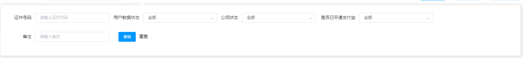
最终界面如下
现状分析
项目使用的是elementui框架,多条件搜索表单提交,需要使用el-form组件来封装,复杂点就是表单项有很多种,配置项包括input、select、datePicker、daterange、cascader等,每一项的名称label、后端接收字段名code、选项属性type等,绑定的属性方法都不尽相同。所以不能通过普通的绑定个别属性的方式来处理,而slot插槽的方式也无法简化,最终决定通过传递一个配置项数组的形式来解析生成相应的结构。
实现代码思路
子组件
<template>
  <!-- 过滤搜索弹窗   -->
  <transition :name="transition">
    <div class="absolute z_index_11 wpercent100 popover-search" :style="{ top: topHeight + 'px' }">
      <div class="custom-modal_fixed bg-black opacity_0 wh-percent-100" @click="close"></div>
      <div class="custom-dialog-wrap bg-white">
        <div class="popper__arrow" :style="{ left: popperArrowLeft + 'px' }"></div>
        <div class="form">
          <el-form ref="validateForm" :inline="true" :model="formModelData" label-position="right">
            <el-row>
              <el-col
                v-for="(item, index) in configData"
                :key="index"
                class="first-child_pl-30"
                :span="item.colSpan">
                <el-form-item :label="item.label" :prop="item.code" :label-width="item.labelWidth">
                  <el-select
                    v-if="item.type === 'select'"
                    v-model="formModelData[item.code]"
                    :placeholder="`请选择${item.label}`"
                    :size="size"
                    >
                    <el-option
                      v-for="option in item.options"
                      :key="option.value"
                      :label="option.label"
                      :value="option.value">
                    </el-option>
                  </el-select>
                  <el-date-picker
                    v-else-if="item.type === 'datePicker'"
                    v-model="formModelData[item.code]"
                    format="yyyy 年 MM 月 dd 日"
                    value-format="timestamp"
                    type="date"
                    :size="size"
                    :placeholder="`请选择${item.label}`"
                    >
                  </el-date-picker>
                  <el-date-picker
                    v-else-if="item.type === 'daterange'"
                    v-model="formModelData[item.code]"
                    format="yyyy 年 MM 月 dd 日"
                    value-format="timestamp"
                    type="daterange"
                    :size="size"
                    start-placeholder="开始日期"
                    end-placeholder="结束日期"
                    >
                  </el-date-picker>
                  <el-cascader
                    v-else-if="item.type === 'cascader'"
                    v-model="formModelData[item.code]"
                    :show-all-levels="false"
                    :props="item.props ? item.props : {}"
                    >
                  </el-cascader>
                  <el-input
                    v-else
                    v-model.trim="formModelData[item.code]"
                    :placeholder="`请输入${item.label}`"
                    :size="size"
                    >
                  </el-input>
                </el-form-item>
              </el-col>
              <el-col class="pl-20 w140_important">
                <el-form-item>
                  <el-button size="small" type="primary" @click="onSubmit">查询</el-button>
                  <el-button type="text" @click="onReset">重置</el-button>
                </el-form-item>
              </el-col>
            </el-row>
          </el-form>
        </div>
      </div>
    </div>
  </transition>
</template>

<script lang="ts">
  import { Component, Vue, Prop } from 'vue-property-decorator'
  import { HeaderConfigItem } from './dataTs/popoverSearchData'
  @Component({
    name: 'popoverSearch'
  })
  export default class  extends Vue {
    @Prop({ default: 'fade' }) private transition?: string
    @Prop({ default: 48 }) private topHeight?: number                   // 距离顶部距离
    @Prop({ default: {} }) private formModelData!: any                  // model  对象
    @Prop({ default: [] }) private configData!: HeaderConfigItem[]      // 主要数据
    @Prop({ default: 425 }) popperArrowLeft?: number                    // 箭头 left
    @Prop({ default: () => { return 'small' } }) private size?: string      // 'small' | 'mini' | 'medium'
    private objectKeys: Array<string> = []     // formModelData 的 key
    private mounted() {
      this.objectKeys = Object.keys(this.formModelData)
    }
    private onSubmit() {
      this.$emit('submit', this.formModelData)
    }
    private onReset() {
      this.objectKeys.forEach((item: string) => {
        this.$set(this.formModelData, item, '')
      })
      this.onSubmit()
    }
    private close() {
      this.$emit('close')
      this.objectKeys.forEach((item: string) => {
        this.$set(this.formModelData, item, '')
      })
    }
  }
</script>
<style lang="less">
  .custom_dialog_modal(@position, @top, @left, @z_index) {
    position: @position;
    top: @top;
    left: @left;
    z-index: @z_index;
  }
  @darkGray: #333;
  @white: #fff;
  .popover-search {
    .custom-modal_fixed {
      .custom_dialog_modal(fixed, 0, 0, 1)
    }
    .custom-dialog-wrap {
      position: relative;
      z-index: 111;
      padding: 20px 12px;
      left: 0;
      transform-origin: center top;
      border-radius: 5px;
      text-align: justify;
      box-shadow: 2px 2px 11px 5px rgba(0, 0, 0, 0.1);
      word-break: break-all;
      .el-button--text {
        color: @darkGray;
      }
      .popper__arrow {
        position: relative;
        top: -3px;
        margin-right: 3px;
        border-top-width: 0;
        border-bottom-color: #ebeef5;
        border-width: 6px;
        -webkit-filter: drop-shadow(0 2px 12px rgba(0, 0, 0, .03));
        filter: drop-shadow(0 2px 12px rgba(0, 0, 0, .03));
        &:after {
          content: " ";
          position: absolute;
          display: block;
          width: 0;
          height: 0;
          border-color: transparent;
          border-style: solid;
          border-width: 10px;
          top: -27px;
          margin-left: -6px;
          border-top-width: 0;
          border-bottom-color: @white;
        }
      }
      /deep/ .el-input {
        width: 240px;
      }
      /deep/ .el-button--text {
        color: @darkGray;
      }
      .first-child_pl-30:first-child {
        padding-left: 30px;
      }
      .first-child_pl-60:first-child {
        padding-left: 60px;
      }
    }
  }
</style>
配置文件 popoverSearchData.d.ts
  /*
  * popoverSearchData.ts
  *
  * 数据类型 - popover-search 组件
  */


  export interface SelectOptionItem {
    value: String | Number;
    label: String | Number;
  }

  export class HeaderConfigItem {
    public colSpan: number;
    public labelWidth: string;
    public label: string;
    public code: string;
    public props?: any;
    public type?: 'select' | 'input' | 'datePicker' | 'daterange' | 'cascader';
    public options?: SelectOptionItem[];
  }
父组件
<popover-search
  :popperArrowLeft="445"
  v-show="searchVisible"
  :formModelData="formModel"
  :configData="moreSearchConfig"
  @close="closeDropSearch"
  @submit="screenSearchSubmit">
</popover-search>

<script lang="ts">
  import { mixins } from 'vue-class-component'
  import TableMixin from '@/mixins/table'
  import { HeaderConfigItem } from '@/dataTs/popoverSearchData'
  const HEADERCONFIG: Array<any> = [
    {
      label: 'label',        // label文字
      code: 'code',          // 后端接收参数
      type: 'select',
      colSpan: 4.5,
      labelWidth: '70px',
      options: [
        {
          value: 'value',
          label: 'label'
        }
      ]
    },
    {
      label: 'label',
      code: 'code',
      type: 'input',
      labelWidth: '45px',
      colSpan: 4.5,
    }, {
      label: 'label',
      code: 'code',
      type: 'datePicker',
      labelWidth: '100px',
      colSpan: 6.5,
    }, {
      label: 'label',
      code: 'code',
      type: 'daterange',
      labelWidth: '100px',
      colSpan: 6.5,
    }, {
      label: 'label',
      code: 'code',
      type: 'cascader',
      colSpan: 4.5,
      labelWidth: '100px',
      props: {},
      options: [
        {
          type: "text",
        }
      ]
    }
  ]
  export default class extends mixins(TableMixin) {
    private formModel: any = {
      code1: '',
      code2: '',
      code3: '',
      code4: '',
      code5: '',
    }
    private moreSearchConfig: HeaderConfigItem[]  = HEADERCONFIG
  }
</script>
TableMixin
public screenSearchSubmit(obj: object) {
    // 搜索相关业务需求 可在此补充
    this.getTableData()
    this.searchVisible = false
}
public closeDropSearch() {
   this.searchVisible = false
}
不定期会分享项目的组件封装,如果有哪里不合理,请各路大神多多指教。


 扫一扫
扫一扫


 2505
2505

 被折叠的 条评论
为什么被折叠?
被折叠的 条评论
为什么被折叠?
 到【灌水乐园】发言


