


9.类、布局、响应式设计
9.1类
- 使用style标签设置样式颜色 div块儿级元素
<!--类 -->
<html>
<head>
<style>
.cities {
   background-color:black;
  color:white;
  margin:20px;
  padding:20px;

}

</style>
</head>

<body>
<div class="cities">
<h4>中国</h4>
<p>中华人民共和国(the People's Republic of China),简称“中国”,成立于1949年10月1日,位于亚洲东部,太平洋西岸,是工人阶级领导的、以工农联盟为基础的人民民主专政的社会主义国家</p>
</div>

<div class="cities">
<h4>俄罗斯</h4>
<p>中华人民共和国(the People's Republic of China),简称“中国”,成立于1949年10月1日,位于亚洲东部,太平洋西岸,是工人阶级领导的、以工农联盟为基础的人民民主专政的社会主义国家</p>
</div>
</body>
</html>
运行效果:

9.2分类行内元素 (字体不同色)
<!--分类行内元素 不同字体不同色-->
<html>
<head>
<style>
span.red {color:red;}
</style>
</head>
<body>
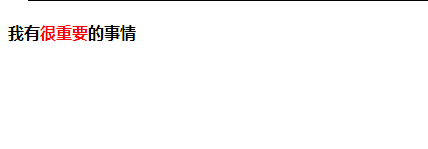
<h4>我有<span class="red">很重要</span>的事情</h4>
</body>
</html>
运行效果:
9.3 布局(涉及CSS )–由于初学阶段还不了解CSS 所以先学写个例子放在这里,具体学习放在接下来CSS的学习中
<!--布局 CSS写法-->
<html>
<head>
<!-- 只设置padding不设置float:left;间距不管用
(2)使用clear:both;清除了前面两个div设置的float: left;(浮动)才能使得bottom位于整个布局下部-->
<style>
#header {
 background-color:#D8B3D8;
 color:white;
 text-align:center;
 padding:5px;
}
#left {
  background-color:#B3B3D8;
  color:black;
  height:500px;
  width:100px;
  padding:10px;
  line-height:30px;
  float:left;
  text-align:center;
}
#right {
 padding:30px;
float:left;
}
#bottom{
 background-color:black;
 text-align:center;
 color:white;
 padding:30px;
 clear:both;

}
</style>
</head>
<body>

<div id="header">
<h1>详情页</h1>
</div>
<div id="left">
种类<br >
价格<br >
配送<br >
</div>

<div id="right">
<h2>London</h2>
<p>
London is the capital city of England. It is the most populous city in the United Kingdom,
with a metropolitan area of over 13 million inhabitants.
</p>
<p>
Standing on the River Thames, London has been a major settlement for two millennia,
its history going back to its founding by the Romans, who named it Londinium.
</p>
</div>

<div id="bottom">
下一页
</div>

</body>
</html>
运行效果:

9.4 响应式设计 (一) (使用到CSS)
- 响应式设计:就是能根据你打开网页窗口大小随意变化适合你窗口大小的设计,比如说以前有的网页在pc端上打开刚好但是在手机端上载体变小了,相应字就变的比较小了,而且还只能显示左边一半的页面内容,但是用了响应式设计后,他就能根据你自身载体的大小来变化了
- 简单的讲,就是说,里面的内容可以根据窗口的大小,自动布局
- border: 1px solid black;CSS盒模型–边框设置
- float:left;CSS float 属性
<!--响应式设计一 -->
<!--(1)  float:left;  (2)border:1px solid-->
<html lang="en-US">
<head>
<style>
.cars{
  float:left;
  margin:10px;
  padding:20px;
  width:300px;
  height:300px;

  border: 1px solid black;
}

</style>
</head>
<body>
<h1>响应式布局Demo</h1>
<p>调整此响应页面的大小</p>


<br >
<div class="cars">
<h4>London</h4>
<p>伦敦是英国的首都</p>
<p>It is the most populous city in the United Kingdom,
with a metropolitan area of over 13 million inhabitants.</p>
</div>
<div class="cars">
<h4>London</h4>
<p>伦敦是英国的首都</p>
<p>It is the most populous city in the United Kingdom,
with a metropolitan area of over 13 million inhabitants.</p>
</div>

</body>
</html>
运行效果:
(1)全屏的浏览器

(2)缩小后的窗口布局

9.4 响应式设计 (二) 使用 Bootstrap (使用到CSS)
内附部分代码:
<!DOCTYPE html>
<html lang="en">
<head>
    <meta charset="UTF-8">
    <meta http-equiv="X-UA-Compatible" content="IE=edge">
    <meta name="viewport" content="width=device-width, initial-scale=1.0">
    <title>样式</title>

    <style type="text/css">
        /* h1 {color: #909399}
        p {color: #000000}
        a {text-decoration: none;}
         */
         /* 数字后面要加单位才起效 */
        .cities{
            background-color: black;
            color: white;
            margin-left: 12px;
            margin-top: 10px;
            padding: 20px;
        }
        span.red {color: red;}
        #header {
            background-color: #EDEDED;
            color: #333333;
            text-align: center;
            padding: 100px;
        }

    </style>
</head>
<body>
    <h1>等级1的标题</h1>
<p>这是个一行的段落</p>
<a href="https://www.baidu.com/?tn=21002492_45_hao_pg">百度(不加下划线)</a>
<div class="cities">
    <h4>中国</h4>
    <p>中华人民共和国</p>
</div>
<br/>
<h4>分类行内元素(字体不同颜色)</h4>
<div>
    <h4>我有<span class="red">很重要</span>的事情</h4>
</div>
<br/>
<h4>根据引用id来调用style</h4>
<div id="header">
    <h4>春晓</h4>
    <p>春眠不觉晓</p>
    <p>处处闻啼鸟</p>
    <p>夜来风雨声</p>
    <p>花落知多少</p>
</div>
</body>
</html>


 扫一扫
扫一扫


 1万+
1万+

 被折叠的 条评论
为什么被折叠?
被折叠的 条评论
为什么被折叠?
 到【灌水乐园】发言


