


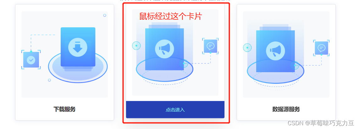
样式效果:
代码说明:
设置一整个为ul标签,每一个卡片作为一个li标签,最重要的是进行样式设置。
serviceCodeList 是每个卡片中的信息数据,由后端返回,格式先不贴了,点击事件也不必关注
代码:
<ul class="home-box">
        <li @click="goToService(service)" class="item home-item" v-for="service in serviceCodeList" :key="service.serviceCode">
          <div class="img-box">
            <img :src="service.imgSrc" alt="" />
          </div>
          <div class="name">{{ service.serviceName }}</div>
          <div class="item-hover">点击进入</div>
        </li>
      </ul>
<style lang="scss">
ul{
      display: flex;
      margin: 0 auto;
      max-width: 1200px;
      justify-content: center;
      align-items: flex-start;
      flex-wrap: wrap;
    }
.item{
      width: 200px;
      height: 219px;
      padding: 20px;
      margin: 0 15px 15px;
      background: $light-color;
      box-shadow: 0 2px 10px 0 rgba(23, 70, 161, .11);
      overflow: hidden;
      border:1px solid rgba(0, 0, 0, 0.12);
      border-radius: 4px;
      transition: box-shadow .25s ease,transform .25s ease,-webkit-transform .25s ease;
      &:hover{
        transform: translate3d(0,-5px,0);
        box-shadow: 0 1.5rem 2.5rem rgba(22,28,45,.1),0 .3rem 0.5rem -.50rem rgba(22,28,45,.05) !important;
      }
    }
.item-hover{
    position: absolute;
    height: 0;
    bottom: 0;
    left: 0;
    right: 0px;
    overflow: hidden;
    background: $banner-bg;
    // color: $light-color;
    color: #7ff3f2;
    z-index: 1;
    transition: all .25s;
    display: flex;
    align-items: center;
    justify-content: center;
  }

&:hover .item-hover{
      height: 44px;
    }
</style>
不理解transition,可看transition transform


 扫一扫
扫一扫


 被折叠的 条评论
为什么被折叠?
被折叠的 条评论
为什么被折叠?
 到【灌水乐园】发言


