


- 学习地址: https://github.com/hakimel/css/tree/master/cloudy-spiral
- perspector属性的 动画演示:http://www.fangyexu.com/tool-CSS3-Perspector.html
- 深入理解CSS变形transform(3d): https://www.cnblogs.com/xiaohuochai/p/5351477.html
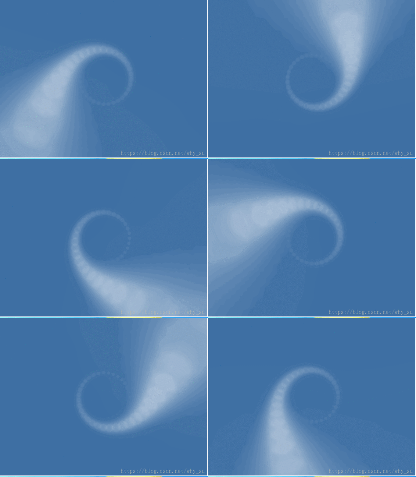
代码:
index.html
<!DOCTYPE html>
<html lang="en">
    <head>
        <meta charset="UTF-8">
        <title>Cloudy Spiral</title>
        <meta name="author" content="suwei">
        <meta name="description" content="">
        <link rel="stylesheet" type="text/css" href="style.css"/>
    </head>
    <body>
        <script type="text/javascript">
            var wrapper = document.createElement("div");
            wrapper.className = "wrapper";
            document.body.appendChild(wrapper);
            for(var i = 0; i < 62; i++){
                var el = document.createElement("i");
               wrapper.appendChild(el);
            }
        </script>
    </body>
</html>
style.css
html, body {
    /*隐藏溢出,清除浮动*/
    overflow: hidden;
  background: #3e6fa3;
  font-family: Helvetica, sans-serif;
}

.wrapper {
  position: absolute;
  top: 50%;
  left: 50%;
  /*指眼睛离 屏幕的距离(z轴),值越大,表示距离越远,3d效果越不明显。值越小,表示距离越近,3d效果越明显*/
  /*perspective 不能为0或者负数,因为眼睛距离屏幕的距离不能为0和负数*/
  /*为负数的话,跑到屏幕背面是看不到屏幕的内容的*/
  /*perspective 为 none的话,就没有3d效果了,而只是平面*/
  /*一般地,该属性只能设置在变形元素的父级或祖先级。*/
  /*因为浏览器会为其子级的变形产生透视效果,但并不会为其自身产生透视效果*/
  perspective: 500px;
}


i {
  position: absolute;
  width: 8px;
  height: 8px;
  border-radius: 8px;
  /*opacity透明程度,从0到1,0表示完全透明,1表示完全不透明*/
  opacity: 0;
  background: rgba(255, 255, 255, 0.5);
  box-shadow: 0px 0px 10px white;
  animation-name: spin;
  animation-duration: 3s;
  /*动画播放次数: infinite无数次*/
  animation-iteration-count: infinite;
  /*以低速开始和结束*/
  animation-timing-function: ease-in-out;
}

@keyframes spin {
  from {
    opacity: 0.0;
  }
  /*这里不要添加逗号 , */
  to {
    opacity: 0.6;
    transform: translate3d(-4px, -4px, 570px);
  }
}
/*:nth-child选取第几个标签。*/
/*你可以使用 transform-origin:20% 40%; 定义动画的旋转中心。*/
/*rotate(90deg) 表示按顺时针旋转90度 ,负数表示逆时针旋转*/
i:nth-child(1) {
  transform: rotate(11.6129032258deg) translate3d(80px, 0, 0);
  animation-delay: 0.0483870968s; }

i:nth-child(2) {
  transform: rotate(23.2258064516deg) translate3d(80px, 0, 0);
  animation-delay: 0.0967741935s; }

i:nth-child(3) {
  transform: rotate(34.8387096774deg) translate3d(80px, 0, 0);
  animation-delay: 0.1451612903s; }

i:nth-child(4) {
  transform: rotate(46.4516129032deg) translate3d(80px, 0, 0);
  animation-delay: 0.1935483871s; }

i:nth-child(5) {
  transform: rotate(58.064516129deg) translate3d(80px, 0, 0);
  animation-delay: 0.2419354839s; }

i:nth-child(6) {
  transform: rotate(69.6774193548deg) translate3d(80px, 0, 0);
  animation-delay: 0.2903225806s; }

i:nth-child(7) {
  transform: rotate(81.2903225806deg) translate3d(80px, 0, 0);
  animation-delay: 0.3387096774s; }

i:nth-child(8) {
  transform: rotate(92.9032258065deg) translate3d(80px, 0, 0);
  animation-delay: 0.3870967742s; }

i:nth-child(9) {
  transform: rotate(104.516129032deg) translate3d(80px, 0, 0);
  animation-delay: 0.435483871s; }

i:nth-child(10) {
  transform: rotate(116.129032258deg) translate3d(80px, 0, 0);
  animation-delay: 0.4838709677s; }

i:nth-child(11) {
  transform: rotate(127.741935484deg) translate3d(80px, 0, 0);
  animation-delay: 0.5322580645s; }

i:nth-child(12) {
  transform: rotate(139.35483871deg) translate3d(80px, 0, 0);
  animation-delay: 0.5806451613s; }

i:nth-child(13) {
  transform: rotate(150.967741935deg) translate3d(80px, 0, 0);
  animation-delay: 0.6290322581s; }

i:nth-child(14) {
  transform: rotate(162.580645161deg) translate3d(80px, 0, 0);
  animation-delay: 0.6774193548s; }

i:nth-child(15) {
  transform: rotate(174.193548387deg) translate3d(80px, 0, 0);
  animation-delay: 0.7258064516s; }

i:nth-child(16) {
  transform: rotate(185.806451613deg) translate3d(80px, 0, 0);
  animation-delay: 0.7741935484s; }

i:nth-child(17) {
  transform: rotate(197.419354839deg) translate3d(80px, 0, 0);
  animation-delay: 0.8225806452s; }

i:nth-child(18) {
  transform: rotate(209.032258065deg) translate3d(80px, 0, 0);
  animation-delay: 0.8709677419s; }

i:nth-child(19) {
  transform: rotate(220.64516129deg) translate3d(80px, 0, 0);
  animation-delay: 0.9193548387s; }

i:nth-child(20) {
  transform: rotate(232.258064516deg) translate3d(80px, 0, 0);
  animation-delay: 0.9677419355s; }

i:nth-child(21) {
  transform: rotate(243.870967742deg) translate3d(80px, 0, 0);
  animation-delay: 1.0161290323s; }

i:nth-child(22) {
  transform: rotate(255.483870968deg) translate3d(80px, 0, 0);
  animation-delay: 1.064516129s; }

i:nth-child(23) {
  transform: rotate(267.096774194deg) translate3d(80px, 0, 0);
  animation-delay: 1.1129032258s; }

i:nth-child(24) {
  transform: rotate(278.709677419deg) translate3d(80px, 0, 0);
  animation-delay: 1.1612903226s; }

i:nth-child(25) {
  transform: rotate(290.322580645deg) translate3d(80px, 0, 0);
  animation-delay: 1.2096774194s; }

i:nth-child(26) {
  transform: rotate(301.935483871deg) translate3d(80px, 0, 0);
  animation-delay: 1.2580645161s; }

i:nth-child(27) {
  transform: rotate(313.548387097deg) translate3d(80px, 0, 0);
  animation-delay: 1.3064516129s; }

i:nth-child(28) {
  transform: rotate(325.161290323deg) translate3d(80px, 0, 0);
  animation-delay: 1.3548387097s; }

i:nth-child(29) {
  transform: rotate(336.774193548deg) translate3d(80px, 0, 0);
  animation-delay: 1.4032258065s; }

i:nth-child(30) {
  transform: rotate(348.387096774deg) translate3d(80px, 0, 0);
  animation-delay: 1.4516129032s; }

i:nth-child(31) {
  transform: rotate(360deg) translate3d(80px, 0, 0);
  animation-delay: 1.5s; }

i:nth-child(32) {
  transform: rotate(371.612903226deg) translate3d(80px, 0, 0);
  animation-delay: 1.5483870968s; }

i:nth-child(33) {
  transform: rotate(383.225806452deg) translate3d(80px, 0, 0);
  animation-delay: 1.5967741935s; }

i:nth-child(34) {
  transform: rotate(394.838709677deg) translate3d(80px, 0, 0);
  animation-delay: 1.6451612903s; }

i:nth-child(35) {
  transform: rotate(406.451612903deg) translate3d(80px, 0, 0);
  animation-delay: 1.6935483871s; }

i:nth-child(36) {
  transform: rotate(418.064516129deg) translate3d(80px, 0, 0);
  animation-delay: 1.7419354839s; }

i:nth-child(37) {
  transform: rotate(429.677419355deg) translate3d(80px, 0, 0);
  animation-delay: 1.7903225806s; }

i:nth-child(38) {
  transform: rotate(441.290322581deg) translate3d(80px, 0, 0);
  animation-delay: 1.8387096774s; }

i:nth-child(39) {
  transform: rotate(452.903225806deg) translate3d(80px, 0, 0);
  animation-delay: 1.8870967742s; }

i:nth-child(40) {
  transform: rotate(464.516129032deg) translate3d(80px, 0, 0);
  animation-delay: 1.935483871s; }

i:nth-child(41) {
  transform: rotate(476.129032258deg) translate3d(80px, 0, 0);
  animation-delay: 1.9838709677s; }

i:nth-child(42) {
  transform: rotate(487.741935484deg) translate3d(80px, 0, 0);
  animation-delay: 2.0322580645s; }

i:nth-child(43) {
  transform: rotate(499.35483871deg) translate3d(80px, 0, 0);
  animation-delay: 2.0806451613s; }

i:nth-child(44) {
  transform: rotate(510.967741935deg) translate3d(80px, 0, 0);
  animation-delay: 2.1290322581s; }

i:nth-child(45) {
  transform: rotate(522.580645161deg) translate3d(80px, 0, 0);
  animation-delay: 2.1774193548s; }

i:nth-child(46) {
  transform: rotate(534.193548387deg) translate3d(80px, 0, 0);
  animation-delay: 2.2258064516s; }

i:nth-child(47) {
  transform: rotate(545.806451613deg) translate3d(80px, 0, 0);
  animation-delay: 2.2741935484s; }

i:nth-child(48) {
  transform: rotate(557.419354839deg) translate3d(80px, 0, 0);
  animation-delay: 2.3225806452s; }

i:nth-child(49) {
  transform: rotate(569.032258065deg) translate3d(80px, 0, 0);
  animation-delay: 2.3709677419s; }

i:nth-child(50) {
  transform: rotate(580.64516129deg) translate3d(80px, 0, 0);
  animation-delay: 2.4193548387s; }

i:nth-child(51) {
  transform: rotate(592.258064516deg) translate3d(80px, 0, 0);
  animation-delay: 2.4677419355s; }

i:nth-child(52) {
  transform: rotate(603.870967742deg) translate3d(80px, 0, 0);
  animation-delay: 2.5161290323s; }

i:nth-child(53) {
  transform: rotate(615.483870968deg) translate3d(80px, 0, 0);
  animation-delay: 2.564516129s; }

i:nth-child(54) {
  transform: rotate(627.096774194deg) translate3d(80px, 0, 0);
  animation-delay: 2.6129032258s; }

i:nth-child(55) {
  transform: rotate(638.709677419deg) translate3d(80px, 0, 0);
  animation-delay: 2.6612903226s; }

i:nth-child(56) {
  transform: rotate(650.322580645deg) translate3d(80px, 0, 0);
  animation-delay: 2.7096774194s; }

i:nth-child(57) {
  transform: rotate(661.935483871deg) translate3d(80px, 0, 0);
  animation-delay: 2.7580645161s; }

i:nth-child(58) {
  transform: rotate(673.548387097deg) translate3d(80px, 0, 0);
  animation-delay: 2.8064516129s; }

i:nth-child(59) {
  transform: rotate(685.161290323deg) translate3d(80px, 0, 0);
  animation-delay: 2.8548387097s; }

i:nth-child(60) {
  transform: rotate(696.774193548deg) translate3d(80px, 0, 0);
  animation-delay: 2.9032258065s; }

i:nth-child(61) {
  transform: rotate(708.387096774deg) translate3d(80px, 0, 0);
  animation-delay: 2.9516129032s; }

i:nth-child(62) {
  transform: rotate(720deg) translate3d(80px, 0, 0);
  animation-delay: 3s;
  }
 8952


 扫一扫


 被折叠的 条评论
为什么被折叠?
 到【灌水乐园】发言


