


Progress step
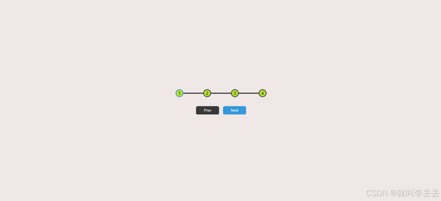
先上效果图
先说下思路,html是
- 一个container 里面一个大进度盒子 两个botton
- 进度盒子里一个progress用来加载进度进度条的 四个circle
css思路是
- 正常画,多用flex简化布局
- 进度条的原始轨道用progress的before伪元素实现
- progress再js阶段将元素进度条覆盖,实现加载的视觉效果
- circle的active属性给其边框加颜色即可
- 按钮点击可将其大小scale稍小些,就有了点击的动画效果,注意初始禁用的问题
js的思路是
-
记录正在加载的索引的大小,事件监听进行更新,一旦超边界就停在边界
-
通过foreach比较圆圈的idx和activeindex的关系 控制每个圆圈是否应该有active属性,同时计算progress的长度
-
还有通过activeindex下标控制禁用问题
html代码
<!DOCTYPE html>
<html lang="en">
<head>
    <meta charset="UTF-8">
    <meta name="viewport" content="width=device-width, initial-scale=1.0">
    <title>Progress Steps</title>
    <link rel="stylesheet" href="Progress.css">
</head>
<body>
    <div class="container">
        <div class="progress-container">
            <div class="progress" id="progress"></div>
            <div class="circle active">1</div>
            <div class="circle">2</div>
            <div class="circle">3</div>
            <div class="circle">4</div>
        </div>
        <button class="btn" id="prev" disabled>Prev</button>
        <button class="btn" id="next">Next</button>
    </div>
    <script src="Progress.js"></script>
</body>
</html>
CSS代码
:root {
    --line-border-fill: #3498db;
    --line-border-empty: #383838;
}

* {
    box-sizing: border-box;
}

body {
    background-color: #f0e7e7;
    display: flex;
    align-items: center;
    justify-content: center;
    height: 100vh;
    overflow: hidden;
    margin: 0 auto;
}

.container {
    text-align: center;
}

.progress-container {
    display: flex;
    justify-content: space-between;
    /*贴紧两侧,中间等距分布*/
    position: relative;
    margin-bottom: 30px;
    max-width: 100%;
    width: 350px;
}

.progress-container::before {
    content: '';
    background-color: var(--line-border-empty);
    position: absolute;
    top: 50%;
    left: 0;
    transform: translateY(-50%);
    height: 4px;
    width: 100%;
    z-index: -1;
    transition: 0.4s ease;
}

.progress {
    background-color: var(--line-border-fill);
    position: absolute;
    top: 50%;
    left: 0;
    transform: translateY(-50%);
    height: 4px;
    width: 0%;
    z-index: -1;
    transition: 0.4s ease;
}

.circle {
    background-color: #b5e032;
    border-radius: 50%;
    height: 30px;
    width: 30px;
    display: flex;
    align-items: center;
    justify-content: center;
    border: 3px solid var(--line-border-empty);
    transition: 0.4s ease;
}

.circle.active {
    border-color: var(--line-border-fill);
}

.btn {
    background-color: var(--line-border-fill);
    color: #fff;
    border: 0;
    border-radius: 6px;
    cursor: pointer;
    padding: 8px 30px;
    margin: 5px;
    font-size: 14px;
}

.btn:active {
    transform: scale(0.98);
}

.btn:disabled {
    background-color: var(--line-border-empty);
    cursor: not-allowed;
}
js代码
const progress = document.getElementById('progress');
const prev = document.getElementById('prev');
const next = document.getElementById('next');
const circles = document.querySelectorAll('.circle');
let currentActive = 1;

next.addEventListener('click', () => {
    currentActive++;
    if (currentActive > circles.length) {
        currentActive = circles.length;
    }
    update();
})

prev.addEventListener('click', () => {
    currentActive--;
    if (currentActive < 1) {
        currentActive = 1;
    }
    update();
})

function update() {
    circles.forEach((circle, idx) => {
        if (idx < currentActive) circle.classList.add('active');
        else circle.classList.remove('active');
    })

    const actives = document.querySelectorAll('.active');
    progress.style.width = (actives.length - 1) / (circles.length - 1) * 100 + '%';
    if (currentActive === 1) {
        prev.disabled = true;
    }
    else if (currentActive === circles.length) {
        next.disabled = true;
    }

    else {
        prev.disabled = false;
        next.disabled = false;
    }
}


bled = true;
    }
    else if (currentActive === circles.length) {
        next.disabled = true;
    }

   else {
        prev.disabled = false;
        next.disabled = false;
    }
}


 扫一扫
扫一扫


 被折叠的 条评论
为什么被折叠?
被折叠的 条评论
为什么被折叠?
 到【灌水乐园】发言


