


 本文介绍如何使用Python进行动态数据抓包,通过requests库发送请求并解析结构化与非结构化数据,收集世界大学排名,并展示数据可视化的过程。重点涉及的知识点包括requests的使用和数据保存。
前言
大家早好、午好、晚好吖 ❤ ~

本次内容:
Python 采集世界大学排行榜 并做数据可视化
知识点:
-
动态数据抓包
-
requests发送请求
-
结构化+非结构化数据解析
开发环境:
-
python 3.8 运行代码
-
pycharm 2021.2 辅助敲代码
-
requests 第三方模块 pip install 模块名
本次文章案例教程、源码料找小钰老师微信: python5180
+ python安装包 安装教程视频
+ pycharm 社区版 专业版 及 免费
代码展示
数据采集
代码里网址被我删了好过审核, ( 源码、教程、文档、软件点击此处跳转跳转文末名片+找管理员领取呀~ )
import requests         # 发送请求 第三方模块
import re
import csv
def replace(str):
    str = re.sub('<.*?>', '', str)
    return str
乱码和代码没关系, 软件有关系
每一个软件打开文件的编码方式不一样
f = open('排名.csv',  mode='a', encoding='utf-8', newline='')
csv_writer = csv.writer(f)
请求链接
url = 'https://www.***.cn/sites/default/files/qs-rankings-data/cn/2057712.txt?_=1669724480772'
发送请求
response = requests.get(url)
获取数据
.text: 获取文本数据的
.json(): 获取 {}/[] 所包裹的数据 字符串类型 ==> 字典/列表 Python基础里面的数据容器
.content: 获取 音频/视频/图片 数据的
json_data = response.json()
解析数据 提取数据
data_list = json_data['data']
for data in data_list:
    country = data['country']
    title = replace(data['title'])
    ind_0 = replace(data['ind_0'])
    ind_1 = replace(data['ind_1'])
    ind_2 = replace(data['ind_2'])
    rank_0 = data['rank_0']
    rank_d_0 = replace(data['rank_d_0'])
    rank_d_1 = replace(data['rank_d_1'])
    score = data['score']
    region = data['region']
    print(country, title, ind_0, ind_1, ind_2, rank_0, rank_d_0, rank_d_1, score, region)
保存数据
csv_writer.writerow([country, title, ind_0, ind_1, ind_2, rank_0, rank_d_0, rank_d_1, score, region])
详情 / 相对应的安装包/安装教程/激活码/使用教程/学习资料/工具插件 可以点击免费领取
数据可视化
from pyecharts.charts import *
from pyecharts import options as opts
from pyecharts.commons.utils import JsCode
from pyecharts.components import Table
import re
import pandas as pd
df = pd.read_csv('rank.csv')
香港,澳门与中国大陆地区等在榜单中是分开的记录的,这边都归为china
df['loc'] = df['country']
df['country'].replace(['China (Mainland)', 'Hong Kong SAR', 'Taiwan', 'Macau SAR'],'China',inplace=True)
tool_js = """
<div style="border-bottom: 1px solid rgba(255,255,255,.3); font-size: 18px;padding-bottom: 7px;margin-bottom: 7px">
                 {

   }
                 </div>
                 排名:{

   } <br>
                 国家地区:{

   } <br>
                 加权总分:{

   } <br>
                 国际学生:{

   } <br>
                 国际教师:{

   } <br>
                 师生比例:{

   } <br>
                 学术声誉:{

   } <br>
                 雇主声誉:{

   } <br>
                 教员引用率:{

   } <br>
"""

t_data = df[(df.year==2021) & (df['rank']<=100)]
t_data = t_data.sort_values(by="total_score" , ascending=True)

university, score = [], []
for idx, row in t_data.iterrows():
    tjs = tool_js.format(row['university'], row['rank'], row['country'],row['total_score'],
                         row['score_6'],row['score_5'], row['score_3'],row['score_1'],row['score_2'], row['score_4'])
    if row['country'] == 'China':
        university.append('🇨🇳 {

   }'.format(re.sub('(.*?)', '',row['university'])))
    else:
        university.append(re.sub('(.*?)', '',row['university']))
    score.append(opts.BarItem(name='', value=row['total_score'], tooltip_opts=opts.TooltipOpts(formatter=tjs)))

bar = (Bar()
.add_xaxis(university)
.add_yaxis('', score, category_gap='30%')
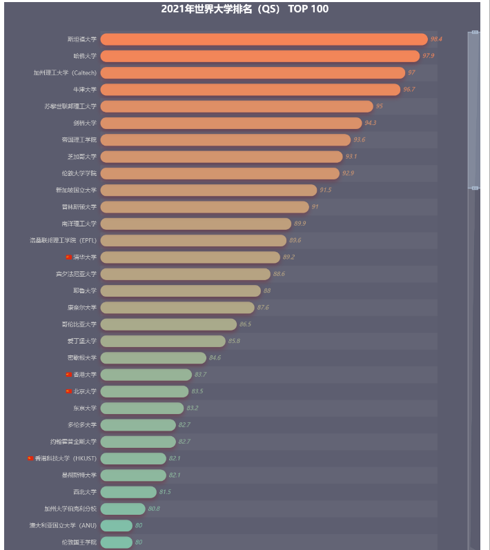
.set_global_opts(title_opts=opts.TitleOpts(title="2021年世界大学排名(QS) TOP 100",
pos_left="center",
title_textstyle_opts=opts.TextStyleOpts(font_size=20)),
datazoom_opts=opts.DataZoomOpts(range_start=70, range_end=100, orient='vertical'),
visualmap_opts=opts.VisualMapOpts(is_show=False, max_=100, min_=60, dimension=0,
range_color=['#00FFFF', '#FF7F50']),
legend_opts=opts.LegendOpts(is_show=False),
xaxis_opts=opts.AxisOpts(is_show=False, is_scale=True),
yaxis_opts=opts.AxisOpts(axistick_opts=opts.AxisTickOpts(is_show=False),
axisline_opts=opts.AxisLineOpts(is_show=False),
axislabel_opts=opts.LabelOpts(font_size=12)))
.set_series_opts(label_opts=opts.LabelOpts(is_show=True,
position='right',
font_style='italic'),
itemstyle_opts={
"normal": {
"barBorderRadius": [30, 30, 30, 30],
'shadowBlur': 10,
'shadowColor': 'rgba(120, 36, 50, 0.5)',
'shadowOffsetY': 5,
}
}
).reversal_axis())
grid = (
Grid(init_opts=opts.InitOpts(theme='purple-passion', width='1000px', height='1200px'))
.add(bar, grid_opts=opts.GridOpts(pos_right='10%', pos_left='20%'))
)
grid.render_notebook()
tool_js = """
<div style="border-bottom: 1px solid rgba(255,255,255,.3); font-size: 18px;padding-bottom: 7px;margin-bottom: 7px">
                 {

   }
                 </div>
                 世界排名:{

   } <br>
                 国家地区:{

   } <br>
                 加权总分:{

   } <br>
                 国际学生:{

   } <br>
                 国际教师:{

   } <br>
                 师生比例:{

   } <br>
                 学术声誉:{

   } <br>
                 雇主声誉:{

   } <br>
                 教员引用率:{

   } <br>
"""

t_data = df[(df.country=='China') & (df['rank']<=500)]
t_data = t_data.sort_values(by="total_score" , ascending=True)

university, score = [], []
for idx, row in t_data.iterrows():
    tjs = tool_js.format(row['university'], row['rank'], row['country'],row['total_score'],
                         row['score_6'],row['score_5'], row['score_3'],row['score_1'],row['score_2'], row['score_4'])
    if row['country'] == 'China':
        university.append('🇨🇳 {}'.format(re.sub('(.*?)', '',row['university'])))
    else:
        university.append(re.sub('(.*?)', '',row['university']))
    score.append(opts.BarItem(name='', value=row['total_score'], tooltip_opts=opts.TooltipOpts(formatter=tjs)))

bar = (Bar()
       .add_xaxis(university)
       .add_yaxis('', score, category_gap='30%')
       .set_global_opts(title_opts=opts.TitleOpts(title="TOP 500中的中国大学",
                                                  pos_left="center",
                                                  title_textstyle_opts=opts.TextStyleOpts(font_size=20)),
                        datazoom_opts=opts.DataZoomOpts(range_start=50, range_end=100, orient='vertical'),
 最低0.47元/天 解锁文章


 2710
2710

 被折叠的 条评论
为什么被折叠?
被折叠的 条评论
为什么被折叠?
 到【灌水乐园】发言


