


CSS学习
语法:
语法: 选择器{
                声明1;
                声明2;
                声明3;
                声明4;
        }
代码例子:
HTML:
<!DOCTYPE html>
<html lang="en">
<head>
    <meta charset="UTF-8">
    <title>Title</title>

<!--    规范<style 可以编写css代码,每一个声明,最好使用分号结尾>
语法: 选择器{
                声明1;
                声明2;
                声明3;
                声明4;
        }

-->
    <link rel="stylesheet" href="CSS/Style.css">

</head>
<body>
<h1>我是标题</h1>

</body>
</html>
css:
h1{
    color: aquamarine;
}
CSS的优势:
1、内容和表现分离
2、网页结构统一,可以实现复用
3、样式十分丰富
4、建议使用独立于HTML的CSS文件
5、利用SEO,容易被搜索引擎搜到
CSS的三种导入方式
<!DOCTYPE html>
<html lang="en">
<head>
    <meta charset="UTF-8">
    <title>Title</title>
<!--    内部样式-->
    <style>
        h1{
            color: greenyellow;
        }
    </style>
    <link rel="stylesheet" href="css/style.css">


</head>
<body>
<!--
优先级:
行内样式>内部样式>外部样式
-->

<!--行内样式:在标签元素内,编写一个style属性,编写样式即可-->
<h1 style="color: red">我是标题</h1>

</body>
</html>
/*外部样式*/

h1{
    color: yellow;
}
外部样式的两种写法:
- 链接式:html
<link rel="stylesheet" href="css/style.css">
- 导入式:CSS2.1特有的
<style>
        /*导入式*/
        @import url("css/style.css");
    </style>
2、选择器
作用:选择页面上某一个或者某一个元素
2.1、基本选择器
1、标签选择器:选择一类标签 标签{}
<!DOCTYPE html>
<html lang="en">
<head>
    <meta charset="UTF-8">
    <title>Title</title>
    <style>
        h1{
            color: #31acaa;
        }
    </style>
</head>
<body>
<h1>只因你太美</h1>
<h1>oh,baby</h1>
<p>xxx</p>

</body>
</html>
2、类选择器: 选择 所有class属性一样的的标签,跨标签, .类名{}
<!DOCTYPE html>
<html lang="en">
<head>
    <meta charset="UTF-8">
    <title>Title</title>
    <style>
        /*类选择器的格式   .class的名称{}
        好处:可以多个标签归类,是同一个class,可以复用

        */

        .kunkun {
            color: #31acaa;
        }
        .zz{
            color: greenyellow;
        }
    </style>
</head>
<body>
<h1 class="kunkun">你好</h1>
<h1 class="zz">你们好</h1>
<h1 class="zz">我是你们的</h1>
<h1 class="kunkun">好盆友</h1>

</body>
</html>
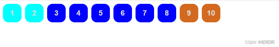
3、id选择器:全局唯一 #id名{}
<!DOCTYPE html>
<html lang="en">
<head>
    <meta charset="UTF-8">
    <title>Title</title>


    <style>
        /*id选择器  :id必须全局唯一
            #id名{}
            不遵循就近原则 优先级是固定的
            id选择器>class选择器>标签选择器


        */
        .ss{
            color: green;
        }
        #aa {
            color: aqua;
        }
        #bb{
            color: sienna;
        }
        h1{
            color: blueviolet;
        }
    </style>
</head>
<body>
<h1 id="aa">标签1</h1>
<h1 id="bb" >标签2</h1>
<h1 class="ss">标签3</h1>
<h1>标签4</h1>
<h1>标签5</h1>
<h1>标签6</h1>
<h1>标签7</h1>

</body>
</html>
优先级: id>class>标签
2.2、层次选择器
1、后代选择器:在某个元素的后面
/*后代选择器*/
        body p{
            /*body后面的p标签会被选择
            */
            background-color: sienna;
        }
2、子选择器 后面一代会被选择
/*子选择器*/
            body>p{
                /*body标签下面的这一层p标签被选择*/
                background-color: blueviolet;
            }
3、 相邻兄弟选择器 同辈
/*相邻兄弟选择器*/
            .zhaozhao + p{
                /*对下不对上,找到对应的class属性的下一个 p 标签*/
                background-color: aquamarine;
            }
4、通用选择器
/*通用选择器*/
        .zhaozhao~{
            /*找到对应class属性的下方的所有同级标签*/
            background-color: green;
        }
2.3、结构伪类选择器
/*选择ul的第一个子元素*/

        ul li:first-child{
            background-color: #31acaa;
        }

/*选择ul的最后一个元素*/


        ul li:last-child{
            background-color: aquamarine;
        }


        /*选中p1*/
        /*定位到父元素,选择当前的第一个元素,而且必须是当前元素才会生效*/
        p:nth-child(1){
            background-color: blueviolet;
        }
        p:nth-of-type(2){
            /*定位到父元素 ,选择父元素下面子元素第二个类型为p的元素*/
            background-color: chocolate;
        }
2.4、属性选择器(常用)
<!DOCTYPE html>
<html lang="en">
<head>
    <meta charset="UTF-8">
    <title>Title</title>
    <style>
        .demo a {
            float: left;
            display: block;
            height: 50px;
            width: 50px;
            border-radius: 15px;
            background-color: #31acaa;
            text-align: center;
            color: gainsboro;
            text-decoration: none;
            margin-right: 10px;
            font: bold 20px/50px Arial;
        }

            /*存在id的属性元素   a[]{}*/
            a[id]{
                background-color: sienna;
            }
        /*id等于last的元素*/
            a[id=last]{
                background-color: aqua;
            }
        /*class中有links属性的元素*/
            a[class*="links"]{
                background-color: blue;
            }
        /*href中以http开头的*/
            a[href^=http]{
                background-color: aqua;
            }
        /*href中以doc结尾的*/
            a[href$=doc]{
                background-color: chocolate;
            }
    </style>
</head>
<body class="demo">
<a href="http://www.baidu,com"class="links item first" id="first">1</a>
<a href="http://www.zz.com"class="links item ">2</a>
<a href="image/123.jpg"class="links item ">3</a>
<a href="image/ad.png"class="links item ">4</a>
<a href="image/cc.html"class="links item ">5</a>
<a href="abc"class="links item ">6</a>
<a href="/a/c"class="links item ">7</a>
<a href="abc.pdf"class="links item ">8</a>
<a href="sss.doc"class="links item ">9</a>
<a href="sasd.doc"class="links item last"id="last">10</a>


</body>
</html>
总结: *=含有元素
^=以…开头
$=以…结尾
3、美化网页元素
3.1、字体样式
<!DOCTYPE html>
<html lang="en">
<head>
    <meta charset="UTF-8">
    <title>Title</title>
    <style>
        body{
            font-family: 华文楷体;
            color: #c4832d;
        }
        h1{
            font-size: 50px;
        }
        .p1{
            font-weight: bolder;
        }
    </style>
3.2、文本样式
- 颜色 color
- 文本对齐方式 text-align = center
- 首行缩进 text-indent :2em;
- 行高 line-height: 单行文字上下居中(与想要居中的对象行高设置相同就可以做到)
- 装饰(下划线) text-decoration : none(去掉超链接的下划线)
- 文本图片水平对齐:vertical-align:middle
<!DOCTYPE html>
<html lang="en">
<head>
    <meta charset="UTF-8">
    <title>Title</title>
</head>
<style>
    h1{
        /*设置文本水平居中*/
        text-align: center;
        color: brown;
    }
    p{
        /*设置文本首行缩进*/
        text-indent: 2em;
        color: sienna;
    }
    img,a{
        /*设置图片与文字对齐*/
        vertical-align: middle;
    }

</style>
4、盒子模型
4.1边框
1、边框的粗细
2、边框的样式
3、边框的颜色
<!DOCTYPE html>
<html lang="en">
<head>
<meta charset="UTF-8">
<title>Title</title>
<style>
/*去掉body默认的外边距*/
a,ul,li,p,body{
margin: 0;
padding: 0;
}
/*border
粗细 样式 颜色
*/
#box{
width: 300px;
border: 1px solid red;
}
h2{
font-size: 16px;
background-color: chocolate;
line-height: 30px;
color: brown;
}
form{
background-color: chocolate;
}
div:nth-of-type(1) input{
border: 3px solid blanchedalmond;
}
div:nth-of-type(2) input{
border: 3px solid blanchedalmond;
}
div:nth-of-type(3) input{
border: 3px solid blanchedalmond;
}
</style>
</head>
<body>
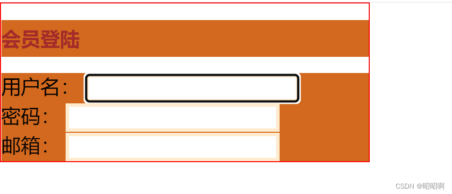
<div id="box">
<h2>会员登陆</h2>
<form action="#">
<div>
<span>用户名:</span>
<input type="text">
</div>
<div>
<span>密码:</span>
<input type="text">
</div>
<div>
<span>邮箱:</span>
<input type="text">
</div>
</form>
</div>
</body>
</html>
4.2、内外边距
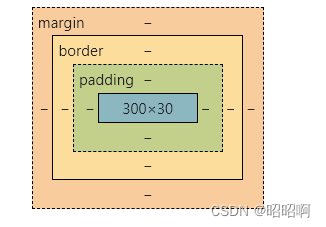
盒子大小的算法 :margin + border + padidng + 内容宽度
<!DOCTYPE html>
<html lang="en">
<head>
    <meta charset="UTF-8">
    <title>Title</title>
    <style>
        /*去掉body默认的外边距*/
        a,ul,li,p,body{
            margin: 0;
            padding: 0;
        }


        /*border
              粗细  样式   颜色
        */
        #box{
            width: 300px;
            border: 1px solid red;
            margin: 0 auto;
        }
        h2{
            font-size: 16px;
            background-color: chocolate;
            line-height: 30px;
            color: brown;
            margin: 0;
        }
        form{
            background-color: chocolate;

        }
        div:nth-of-type(1) input{
            border: 3px solid blanchedalmond;
        }
        div:nth-of-type(2) input{
            border: 3px solid blanchedalmond;
        }
        div:nth-of-type(3) input{
            border: 3px solid blanchedalmond;
        }

    </style>
</head>
<body>
<div id="box">
    <h2>会员登陆</h2>
    <form action="#">
        <div>
            <span>用户名:</span>
            <input type="text">
        </div>
        <div>
            <span>密码:</span>
            <input type="text">
        </div>
        <div>
            <span>邮箱:</span>
            <input type="text">
        </div>

    </form>
</div>

</body>
</html>
4.3、圆角边框
<!DOCTYPE html>
<html lang="en">
<head>
    <meta charset="UTF-8">
    <title>Title</title>
    <style>

        /*圆角边框
        如何变成圆形:将正方形的边长减半作为圆的半径
        border-radius:四个参数   可以设置两个  对应左上、右下   右上、左上
        四个参数是:
        */
        div {
            width: 100px;
            height: 100px;
            border: 3px solid red;
            border-radius: 50px;
        }
    </style>
</head>
<body>

<div>

</div>

</body>
</html>
4.3、阴影
<!DOCTYPE html>
<html lang="en">
<head>
    <meta charset="UTF-8">
    <title>Title</title>
    <style>
        div{
            width: 1000px;
            margin: 0 auto;
        }
        img{
            box-shadow: 10px 10px 100px yellow;

        }
    </style>
</head>
<body>
<div style="width: 500px;display: block;text-align: center">
    <div>
        <img src="image/a1.jpg" alt="">
    </div>
</div>


</body>
</html>
5、浮动
5.1、标准文档流
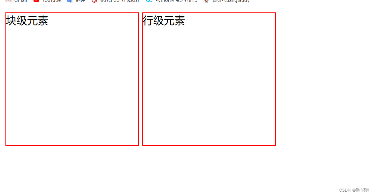
块级元素:独占一行
eg:h1~h6,p div 列表……
行级元素:不独占一行
eg:span a img strong……
块级元素可以包含行级元素,反之,则不可
5.2、dispaly
block 块元素
inline 行内元素
inline-block 是块级元素,但是可以内联,在一行展示
none
<!DOCTYPE html>
<html lang="en">
<head>
    <meta charset="UTF-8">
    <title>Title</title>
    <style>
        div{
            height: 200px;
            width: 200px;
            display: inline-block;
            border: 1px solid red;
        }
        span{
            height: 200px;
            width: 200px;
            border: 1px solid red;
            display: inline-block;
        }
    </style>
</head>
<body>
<div>块级元素

</div>
<span>行级元素</span>

</body>
</html>
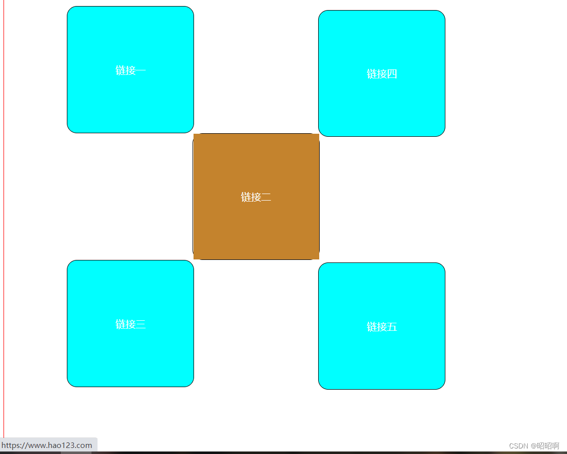
5.3、float
<!DOCTYPE html>
<html lang="en">
<head>
    <meta charset="UTF-8">
    <title>Title</title>
    <link rel="stylesheet" href="css/style.css">
</head>
<body>

<div id="box">
    <div class="zz1">
        <img src="images/a.jpg" alt="">
    </div>

    <div class="zz2">
        <img src="images/b.jpg" alt="">
    </div>
    <div class="zz3">
        <img src="images/c.jpg" alt="">
    </div>
</div>


</body>
</html>
.zz1{
    float: left;
}
#box{
    border: 1px solid red;
    width: 800px;
    height: 300px;
}
.zz2{
    float: left;
}
.zz3{
    float: left;
}

5.4、父级元素边框塌陷问题
1、clear
/*clear
right:清除右侧浮动
left:清除左侧浮动
both:清除两侧浮动
*/
解决方法:
1、增大父级元素的大小
#box{
    border: 1px solid red;
    width: 1000px;
    height: 300px;


}
2、设置一个空的div,将空的div清除浮动,将内外边距设为0,也可以达到效果
<div class="clear1"></div>
.clear1{
    margin: 0;
    padding: 0;
    clear: both;
}
3、overflow
在父级元素增加一个 overflow:hidden;
#box{
    border: 1px solid red;
    overflow: hidden;


}
4、在父类添加一个伪类 :after
#box:after{
    content: '';
    display: block;
    clear: both;
}
原理就是跟方法二一样,只是避免了在html中添加空的div
小结:
- 浮动元素后面加一个空的div 简单,但是代码中避免空div
- 设置父元素的高度,简单,但有限制
- overflow 简单,但是会有下拉框,在有些场景并不合适(不美观)
- 父类后加伪类:after 写法稍微复杂,但是没什么副作用,推荐使用
5.5、对比
- dispaly
不能控制左右,但没有边框塌陷问题
- float
可控制左右,但是会造成父级边框塌陷问题 需要清除浮动
6、定位
6.1、相对定位
相对定位:position:relation;
相对于原来的位置,来进行指定偏移
top: -20px;
left: 10px;
bottom: 20px;
right: 30px;
练习:
<!DOCTYPE html>
<html lang="en">
<head>
    <meta charset="UTF-8">
    <title>Title</title>
    <style>
        #father{
            border: 1px red solid;
            width: 700px;
            height: 700px;
            padding: 100px;
        }
        .a {
            width: 200px;
            height: 200px;
            border: 1px solid black;
            border-radius: 16px;

        }
        a {
            margin: 0 auto;
            width: 200px;
            height: 200px;
            line-height: 200px;
            text-align: center;
            color: white;
            text-decoration: none;
            display: block;

        }
        a:hover{
            background-color: #c4832d;
        }
        #a1{
            background-color: aqua;
            position: relative;
6.2、绝对定位
定位:基于xxx定位,上下左右
1、没有父级元素的前提下,相当于浏览器定位
2、假设父级元素存在定位,我们通常会以父级单位为参照进行偏移
3、在父级元素内移动,不能超过
相对于父级或者浏览器的位置,进行指定的偏移,绝对定位的话,不在标准文档流中,原来的位置不会被保留
6.3、固定定位
postion :fixed
  <meta charset="UTF-8">
    <title>Title</title>
    <style>
        body{
            height: 1000px;

        }
        div:nth-of-type(1){
            /*绝对定位      相当于浏览器
            */
            width: 100px;
            height: 100px;
            background-color: #c4832d;
            position: absolute;
            right: 0;
            bottom: 0;
        }
        div:nth-of-type(2){
            /*固定定位:    fixed
            */
            width: 50px;
            height: 50px;
            background-color: chartreuse;
            position: fixed;
            right: 0;
            bottom: 0;
        }
    </style>
</head>
<body>
<div>

</div>
<div></div>

</body>
</html>
6.4、z-index
mg-r11kGfGU-1666578637659)]
6.2、绝对定位
定位:基于xxx定位,上下左右
1、没有父级元素的前提下,相当于浏览器定位
2、假设父级元素存在定位,我们通常会以父级单位为参照进行偏移
3、在父级元素内移动,不能超过
相对于父级或者浏览器的位置,进行指定的偏移,绝对定位的话,不在标准文档流中,原来的位置不会被保留
6.3、固定定位
postion :fixed
  <meta charset="UTF-8">
    <title>Title</title>
    <style>
        body{
            height: 1000px;

        }
        div:nth-of-type(1){
            /*绝对定位      相当于浏览器
            */
            width: 100px;
            height: 100px;
            background-color: #c4832d;
            position: absolute;
            right: 0;
            bottom: 0;
        }
        div:nth-of-type(2){
            /*固定定位:    fixed
            */
            width: 50px;
            height: 50px;
            background-color: chartreuse;
            position: fixed;
            right: 0;
            bottom: 0;
        }
    </style>
</head>
<body>
<div>

</div>
<div></div>

</body>
</html>


 扫一扫
扫一扫


 2018
2018

 被折叠的 条评论
为什么被折叠?
被折叠的 条评论
为什么被折叠?
 到【灌水乐园】发言


