


 本文详细讲解了浮动元素导致的高度塌陷问题,包括如何通过设置父元素高度、使用`overflow:hidden`和添加clear属性来修复。同时介绍了相对定位、绝对定位和固定定位的概念及其应用实例。
第29节:浮动和定位

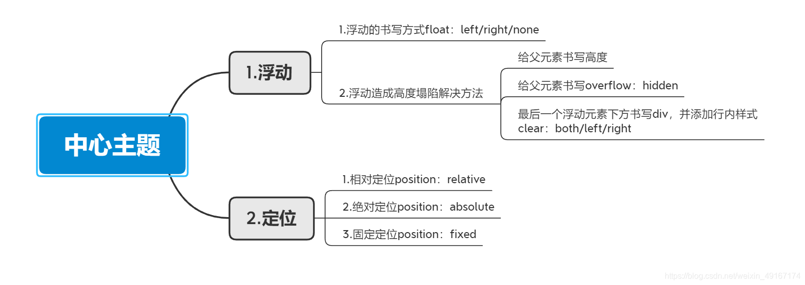
1.浮动:
- 浮动的概念:浮动让元素脱离标准文档流,添加了浮动的元素会向左 or 向右移动,改变元素显示位置
(1)浮动书写方式:
<!DOCTYPE html>
<html>
	<head>
		<meta charset="utf-8" />
		<title>第29节:浮动与定位</title>
		<link rel="stylesheet" type="text/css" href="css/style.css"/>
	</head>
	<body>
		<!-- 浮动:float:left/right/none -->
		<!-- 浮动:设置了浮动的元素会向左或者向右移动 -->

		<!-- 结论1:正常情况下父元素如果不设置高度,其高度是由子集撑开的 -->
		<div class="father">
			<div id="" class="son">1</div>
			<div id="" class="son">2</div>
			<div id="" class="son">3</div>
		</div>
	</body>
</html>
.father{
	width: 800px;
	border: 1px solid red;
}

.son{
	width: 100px;
	height: 100px;
	background-color: pink;
	border: 1px solid blue;
}

<!DOCTYPE html>
<html>
	<head>
		<meta charset="utf-8" />
		<title>第29节:浮动与定位</title>
		<link rel="stylesheet" type="text/css" href="css/style.css"/>
	</head>
	<body style="background-color:#fffae8;">
		<!-- 浮动:float:left/right/none -->
		<!-- 浮动:设置了浮动的元素会向左或者向右移动 -->

		<!-- 结论1:正常情况下父元素如果不设置高度,其高度是由子集撑开的 -->
		<!-- 结论2:子元素书写了浮动后,父元素高度为0,造成高度塌陷 -->
		<div class="father">
			<div id="" class="son">1</div>
			<div id="" class="son">2</div>
			<div id="" class="son">3</div>
		</div>
	</body>
</html>
.father{
	width: 800px;
	border: 1px solid red;
}

.son{
	width: 100px;
	height: 100px;
	background-color: pink;
	border: 1px solid blue;
	/* 左浮动效果 */
	float: left;
}

(2)浮动造成高度塌陷解决方法:
- 给父元素直接书写高度(需要计算高度)
.father{
	width: 800px;
	border: 1px solid red;
    /* 给父元素书写高度 */
	height:102px;
}

.son{
	width: 100px;
	height: 100px;
	background-color: pink;
	border: 1px solid blue;
	/* 左浮动效果 */
	float: left;
}

- 给父元素书写overflow: hidden;
.father{
	width: 800px;
	border: 1px solid red;
	/* 给父元素书overflow:hidden */
	overflow: hidden;
}

.son{
	width: 100px;
	height: 100px;
	background-color: pink;
	border: 1px solid blue;
	/* 左浮动效果 */
	float: left;
}

- 在最后一个设置浮动的元素下方书写空的div,然后添加行内样式
clear:both/left/right;
<!DOCTYPE html>
<html>
	<head>
		<meta charset="utf-8" />
		<title>第29节:浮动与定位</title>
		<link rel="stylesheet" type="text/css" href="css/style.css"/>
	</head>
	<body style="background-color:#fffae8;">
		<!-- 浮动:float:left/right/none -->
		<!-- 浮动:设置了浮动的元素会向左或者向右移动 -->

		<!-- 结论1:正常情况下父元素如果不设置高度,其高度是由子集撑开的 -->
		<!-- 结论2:子元素书写了浮动后,父元素高度为0,造成高度塌陷 -->
		<div class="father">
			<div id="" class="son">1</div>
			<div id="" class="son">2</div>
			<div id="" class="son">3</div>
			<!-- 最后一个元素下方书写div,然后添加一个行内样式clear:both; -->
			<div id="" style="clear: both;">

			</div>
		</div>
	</body>
</html>

2.定位
- 定位的概念:元素根据参照物的不同来进行位置的设置

(1)相对定位:参照自身的位置
<!DOCTYPE html>
<html>
	<head>
		<meta charset="utf-8">
		<title>定位</title>
		<link rel="stylesheet" type="text/css" href="css/position.css"/>
	</head>
	<body>
		<!-- 1.相对定位:position:relative; -->
		<p>我是相对定位案例</p>
	</body>
</html>
*{
	margin: 0;
}
p{
	width: 400px;
	height: 400px;
	border: 1px solid red;
	/* 相对定位 */
	position:relative;
	/* top:上 bottom:下 left:左 right:右 */
	top: 20px;
	left: 20px;
}

(2)绝对定位:参照对有定位设置的第一级父元素
- case1:初始页面
<!DOCTYPE html>
<html>
	<head>
		<meta charset="utf-8">
		<title>定位</title>
		<link rel="stylesheet" type="text/css" href="css/position.css"/>
	</head>
	<body style="background-color:#fffae8;">
		<!-- 2.绝对定位:position:absolute; -->
		<div id="" class="father">
			<div id="" class="son">
				我是绝对定位案例
			</div>
		</div>

	</body>
</html>
*{
	margin: 0;
}
.father{
	width: 400px;
	height: 400px;
	border: 1px solid black;
}
.son{
	width: 100px;
	height: 100px;
	background-color: pink;
}

- case2:给子元素设置绝对定位
*{
	margin: 0;
}
.father{
	width: 400px;
	height: 400px;
	border: 1px solid black;
}
.son{
	width: 100px;
	height: 100px;
	background-color: pink;
    /* 给子元素设置绝对定位 */
	position: absolute;
	left: 0;
	bottom: 0;
}

由于只给子元素设置了绝对定位,所以子元素以body为参考系处于浏览器窗口左下方
- case3:给父元素设置相对定位
*{
	margin: 0;
}

.father{
	width: 400px;
	height: 400px;
	border: 1px solid black;
	/* 给父元素设置相对定位 */
	position: relative;
}
/* 给子类设置绝对定位 */
.son{
	width: 100px;
	height: 100px;
	background-color: pink;
	position: absolute;
	left: 0;
	bottom: 0;
}

给父元素书写了一个相对定位,所以子元素以父元素为参考系处于父元素左下方
(3)固定定位:参考浏览器窗口进行定位
<!DOCTYPE html>
<html>
	<head>
		<meta charset="utf-8">
		<title>定位</title>
		<link rel="stylesheet" type="text/css" href="css/position.css"/>
	</head>
	<body style="background-color:#fffae8;">
		<!-- 3.固定定位:position:fixed; -->
		<div id="" class="box">
			我是固定定位的案例
		</div>

	</body>
</html>
*{
	margin: 0;
}
body{
	height: 5000px;
}
.box{
	width: 100px;
	height: 200px;
	background-color: green;
	/* 固定定位 */
	position: fixed;
	top:300px;
	left:200px;
}

固定定位常见于浏览器的悬浮窗广告
3.悬浮与定位代码演示
<!DOCTYPE html>
<html>
	<head>
		<meta charset="utf-8">
		<title>悬浮与定位代码演示</title>
		<link rel="stylesheet" type="text/css" href="css/29节代码演示.css"/>
	</head>
	<body>
		<div id="" class="pro_box">
			<div class="item">
				<img src="img/img01.jpg" >
				<div class="zhezhao">
				</div>
			</div>

			<div class="item">
				<img src="img/img02.jpg" >
			</div>

			<div class="item">
				<img src="img/img03.jpg" >
			</div>

			<div class="item">
				<img src="img/img04.jpg" >
			</div>

			<div class="item">
				<img src="img/img05.jpg" >
			</div>

			<div class="item">
				<img src="img/img06.jpg" >
			</div>
		</div>

	</body>
</html>
.pro_box{
	width: 1200px;
	border: 1px solid red;
	overflow: hidden;/* 高度塌陷处理 */
}
.item{
	float: left;/* 浮动 */
	width: 380px;
	height: 230px;
	position: relative;/* 相对定位 */
}
.zhezhao{
	width: 380px;
	height: 230px;
	background-color: black;
	opacity: 0.5;/* opacity图层透明度 */
	position: absolute;/* 绝对定位 */
	left: 0;
	top: 0;
}
/* 鼠标滑过透明度变化交互效果 */
.item .zhezhao:hover{
	opacity: 0.2;
}


 扫一扫
扫一扫


 3274
3274

 被折叠的 条评论
为什么被折叠?
被折叠的 条评论
为什么被折叠?
 到【灌水乐园】发言


