


 本文详细介绍了前端开发中常见的两种布局模式——两栏布局和三栏布局,并提供了五种实现两栏布局的方法,包括浮动、flex布局、BFC、绝对定位等。对于三栏布局,文章列举了四种方法,如浮动、flex布局以及经典的圣杯布局和双飞翼布局。这些布局技巧对于前端开发者理解和创建响应式网页至关重要。
两栏布局,三栏布局
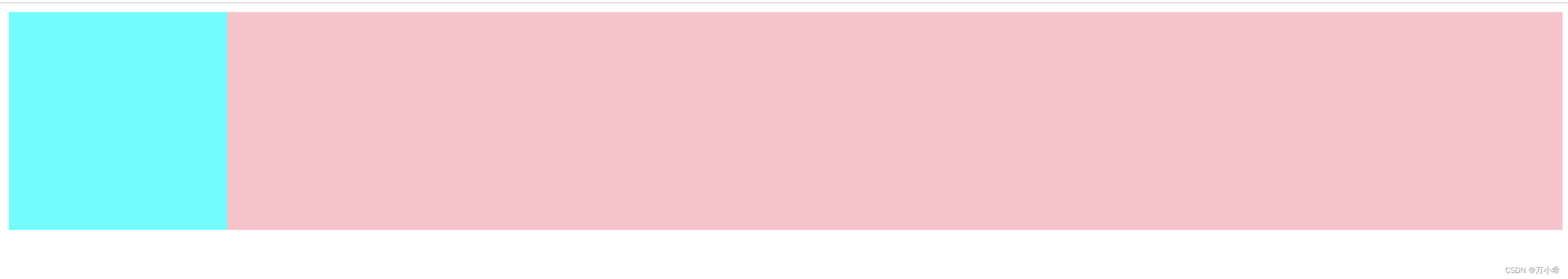
两栏布局:左边宽度固定,右边宽度自适应
效果图
html代码
<body>
    <div class="box">
    <div class="left"></div>
    <div class="right"></div>
    </div>
</body>
方法1:浮动,left向左浮动,right设置margin-left:左元素宽度值
.left
{
    float: left;
    width: 200px;
    height: 200px;
    background-color: aqua;

}
.right{
    margin-left: 200px;
    height: 200px;
    background-color: pink;


}
方法2:flex布局,right设置flex=1
.box{
    display:flex
}
.left
{
    width: 200px;
    height: 200px;
    background-color: aqua;

}
.right{
    height: 200px;
    flex: 1;
    background-color: pink;

}
方法3:BFC,left设置浮动,right设置BFC(overflow: hidden),使右元素不会与浮动元素重叠
.left
{
    float: left;
    width: 200px;
    height: 200px;
    background-color: aqua;

}
.right{
    overflow: hidden;
    height: 200px;
    background-color: pink;

}
方法4:绝对定位,父元素采用相对定位,左子元素采用绝对定位,右元素设置margin-left
.box{
    position: relative;//布局还在原来的文档流位置
}
.left
{
    position: absolute;//相对父元素,做定位
    width: 200px;
    height: 200px;
    background-color: aqua;

}
.right{
    height: 200px;
    margin-left: 200px;
    background-color: pink;
}
方法5:绝对定位,父元素采用相对定位,右子元素采用绝对定位,left=左元素宽度。其他方位为0
.box{
    position: relative;//布局还在原来的文档流位置
}
.left
{
    width: 200px;
    height: 200px;
    background-color: aqua;

}
.right{
    position: absolute;
    height: 200px;
   top:0;
   right:0;
   left:200px;
   bottom: 0;
    background-color: pink;
}
扩展:left和margin-left的区别
left是相对它最近的设置了position的父元素进行定位的,position和left搭配使用。margin-left:父元素进行定位的,据父元素左边的相对距离,不考虑是否是指position
三栏布局:左右两栏宽度固定,中间自适应的布局
效果图
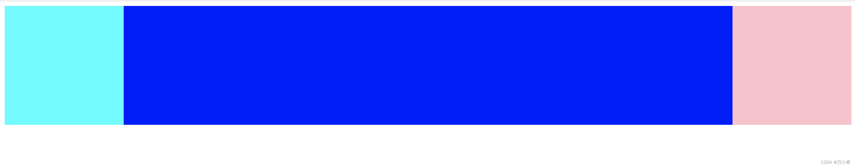
方法一:浮动,left左浮动,right右浮动。中间栏,设置左右边距,元素放最后
<!DOCTYPE html>
<html lang="en">
<head>
    <meta charset="UTF-8">
    <meta http-equiv="X-UA-Compatible" content="IE=edge">
    <meta name="viewport" content="width=device-width, initial-scale=1.0">
    <title>Document</title>
</head>
<style>
.left
{
    float: left;
    width: 200px;
    height: 200px;
    background-color: aqua;

}
.center{
    background-color:blue;
    height: 200px;
    margin:0 200px; //左右边距为200px
}
.right{
    float: right;
    width: 200px;
    height: 200px;
    background-color: pink;
}
</style>

<body>
    <div class="box">
    <div class="left"></div>
    <div class="right"></div>
    <div class="center"></div>//中间栏放最后
    </div>
</body>
</html>
方法二:flex布局,中间设置flex=1。
<!DOCTYPE html>
<html lang="en">
<head>
    <meta charset="UTF-8">
    <meta http-equiv="X-UA-Compatible" content="IE=edge">
    <meta name="viewport" content="width=device-width, initial-scale=1.0">
    <title>Document</title>
</head>
<style>
.box{
  display: flex;
}
.left
{
    width: 200px;
    height: 200px;
    background-color: aqua;

}
.center{

    background-color:blue;
    height: 200px;
    flex:1
}
.right{
    width: 200px;
    height: 200px;
    background-color: pink;
}
</style>

<body>
    <div class="box">
    <div class="left"></div>
    <div class="center"></div>
    <div class="right"></div>
    </div>
</body>
</html>
方法三:圣杯布局。父级元素设置左右的 padding,三列均设置向左浮动,中间一列放在最前面,宽度设置为父级元素的宽度,因此后面两列都被挤到了下一行,通过设置 margin 负值将其移动到上一行,再利用相对定位,定位到两边。
<!DOCTYPE html>
<html lang="en">
<head>
    <meta charset="UTF-8">
    <meta http-equiv="X-UA-Compatible" content="IE=edge">
    <meta name="viewport" content="width=device-width, initial-scale=1.0">
    <title>Document</title>
</head>
<style>
.box{
 padding-left: 200px;
  padding-right: 200px;
}
.left
{
    float: left;
    position: relative;
    left: -200px;
    width: 200px;
    height: 200px;
    background-color: aqua;
    margin-left: -100%;
}
.center{
    float: left;
    width: 100%;
    background-color:blue;
    height: 200px;

}
.right{
    float: left;
    position: relative;
    right: -200px;
    width: 200px;
    height: 200px;
    margin-left: -200px;
    background-color: pink;
}
</style>

<body>
    <div class="box">
    <div class="center"></div>
    <div class="left"></div>
    <div class="right"></div>
    </div>
</body>
</html>
方法4:双飞翼布局。与圣杯布局类型,不同点在于,左右位置保留使用的不是父元素的padding,而是通过中间栏(外面需要包裹一层div)设置margin实现.
<!DOCTYPE html>
<html lang="en">
<head>
    <meta charset="UTF-8">
    <meta http-equiv="X-UA-Compatible" content="IE=edge">
    <meta name="viewport" content="width=device-width, initial-scale=1.0">
    <title>Document</title>
</head>
<style>
.left
{
    float: left;
    width: 200px;
    height: 200px;
    background-color: aqua;
    margin-left: -100%;
}
.wrapper{
    float: left;
    width: 100%;
    background-color:blue;
    height: 200px;
}
.center{
    margin: 0 200px;
    height: 200px;
}
.right{
    float: left;
    width: 200px;
    height: 200px;
    margin-left: -200px;
    background-color: pink;
}
</style>

<body>
    <div class="box">
    <div class="wrapper">
    <div class="center">center</div>
    </div>
    <div class="left">left</div>
    <div class="right">right</div>
    </div>
</body>
</html>
代码就是要多敲,才会有收获。如果对你有帮助,帮忙点个小👍哈


 扫一扫
扫一扫


 695
695

 被折叠的 条评论
为什么被折叠?
被折叠的 条评论
为什么被折叠?
 到【灌水乐园】发言


