


 本文深入解析Flex布局的工作原理,包括如何使子元素在父元素中分列显示,与float布局的对比,以及在响应式设计中的应用。详细介绍了Flex布局的属性设置,如display、flex-direction、flex-wrap、flex-basis、flex-grow、flex-shrink等,帮助读者掌握Flex布局的使用技巧。
<!DOCTYPE html>
<html lang="en">
<head>
	<meta charset="UTF-8">
	<title>flex</title>
	<style>
		body {
			margin: 0;
		}
		.outer {
			background-color: #ededed;
			width:1000px;
			height: 500px;
			margin: 0 auto;

			display: flex;
			flex-direction: row;
			flex-wrap: wrap;


		}
		.other > div {

		}
		.outer >div:nth-child(1){
			background-color: teal;
			flex-basis: 400px;
			flex-grow: 1;

		}
		.outer >div:nth-child(2){
			background-color: pink;
			flex-basis: 400px;
			flex-grow: 1;
		}
		.outer >div:nth-child(3){
			background-color: lightblue;
			flex-basis: 400px;
			flex-grow: 1;

		}
</style>
</head>
<body>
	<div class="outer">
		<div></div>
		<div></div>
		<div></div>
	</div>
</body>
</html>

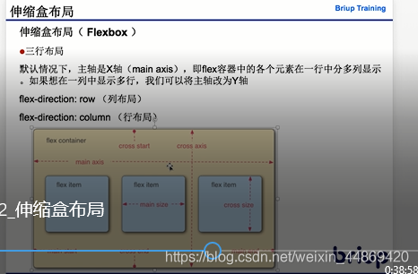
7.3 伸缩盒布局
1) 作用:使得子元素在父元素中分列显示,与float的作用类似。一般用于响应式布局(手机app中)
2) 用法
1. 父元素在主轴上一定要有一个固定的宽/高
2. 子元素在交叉轴上默认宽/高占满父元素
如果主轴为x轴,那么资源的默认高度占满父元素
如果主轴为y轴,那么资源的默认宽度占满父元素
3.
			<ul>
				<li></li>
				<li></li>
				<li></li>
			</ul>

			ul {
				display:flex;
			}


			ul 伸缩盒
				1)设置父元素为伸缩盒 (display)
					flex
				2) 主轴 (flex-direction)
					主轴 	默认情况下为x轴
						row 【左中右】/column【上中下】
					交叉轴 默认情况下为y轴
					元素沿着伸缩盒的主轴排列的
				3) 伸缩盒自动换行(flex-wrap)
					子元素宽度和大于父元素的时候是否换行
						nowrap 	默认值,不换行
						wrap 		换行
li 伸缩盒的元素
1) 基础值
flex-basis 主轴上元素的基础值(宽/高)
2) 对盈余空间的分配
flex-grow
3) 对亏损空间的贡献
flex-shrink:
4) 速写
flex: grow shrink basis;


 扫一扫
扫一扫


 2156
2156

 被折叠的 条评论
为什么被折叠?
被折叠的 条评论
为什么被折叠?
 到【灌水乐园】发言


