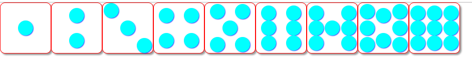
flex布局---九种色子案例分析

九种色子案例代码:
效果图:
在这里插入图片描述

<!DOCTYPE html>
<html lang="en">

<head>
    <meta charset="UTF-8">
    <title>Document</title>
    <style>
        * {
            margin: 0;
            padding: 0;
        }

        .wrap {
            display: flex;
        }

        .container {
            border: 1px solid red;
            width: 100px;
            height: 100px;
            border-radius: 10px;
            background: #fff;
            box-shadow: 3px 3px 3px 0px #999;
            display: flex;
        }

        .item {
            width: 30px;
            height: 30px;
            background: aqua;
            border-radius: 50%;
            /*可以绘制成一个圆形*/
            box-shadow: 1px 1px 2px 0px blue;
        }

        /* 一点 */
        .one {
            justify-content: center;
            align-items: center;
        }

        /* 两点 */
        .two {
            flex-direction: column;
            justify-content: space-around;
            align-items: center;
        }

        /* 三点 */
        .three {
            justify-content: space-around;
            align-items: center;

        }

        .three div:first-child {
            align-self: flex-start;
        }

        .three div:last-child {
            align-self: flex-end;
        }

        /* 四点 */
        .four div {
            display: flex;
            flex-wrap: wrap;
            align-items: center;
            justify-content: space-around;
        }

        /* 五点 */
        .five {
            justify-content: space-around;
            flex-direction: column;
            /* align-items: center; */
        }

        .five div {
            display: flex;
            justify-content: space-around;
        }

        /* 六点 */
        .six {
            justify-content: space-around;
            align-items: center;
        }

        /* 七点 */
        .seven div {
            display: flex;
            flex-wrap: wrap;
            align-self: center;
            justify-content: space-around;
        }

        /* 八点 */
        .eight div {
            display: flex;
            flex-wrap: wrap;
            justify-content: space-around;
            align-items: center;

        }

        /* 九点 */
        .nine {
            justify-content: space-around;
            align-items: center;
        }
    </style>
</head>

<body>
    <div class="wrap">
        <!-- 容器 -->
        <!-- 一点 -->
        <div class="container one">
            <!-- 项目 -->
            <div class="item"></div>
        </div>
        <!-- 二点 -->
        <div class="container two">
            <div class="item"></div>
            <div class="item"></div>
        </div>
        <!-- 三点 -->
        <div class="container three">
            <div class="item"></div>
            <div class="item"></div>
            <div class="item"></div>
        </div>
        <!-- 四点 -->
        <div class="container four">
            <div>
                <div class="item four_first"></div>
                <div class="item four_second"></div>

            </div>
            <div>
                <div class="item four_three"></div>
                <div class="item four_four"></div>

            </div>

        </div>
        <!-- 五点 -->
        <div class="container five">
            <div>
                <div class="item"></div>
                <div class="item"></div>
            </div>
            <div class="item_seven">
                <div class="item"></div>
            </div>
            <div>
                <div class="item"></div>
                <div class="item"></div>
            </div>
        </div>
        <!-- 六点 -->
        <div class="container six">
            <div>
                <div class="item"></div>
                <div class="item"></div>
                <div class="item"></div>
            </div>
            <div>
                <div class="item"></div>
                <div class="item"></div>
                <div class="item"></div>
            </div>
        </div>
        <!-- 七点 -->
        <div class="container seven">
            <div>
                <div class="item"></div>
                <div class="item"></div>
                <div class="item"></div>

            </div>
            <div>
                <div class="item"></div>

            </div>
            <div>
                <div class="item"></div>
                <div class="item"></div>
                <div class="item"></div>
            </div>
        </div>
        <!-- 八点 -->
        <div class="container eight">
            <div>
                <div class="item"></div>
                <div class="item"></div>
                <div class="item"></div>

            </div>
            <div>
                <div class="item"></div>
                <div class="item"></div>
            </div>
            <div>
                <div class="item"></div>
                <div class="item"></div>
                <div class="item"></div>
            </div>
        </div>
        <!-- 九点 -->
        <div class="container nine">
            <div>
                <div class="item"></div>
                <div class="item"></div>
                <div class="item"></div>
            </div>
            <div>
                <div class="item"></div>
                <div class="item"></div>
                <div class="item"></div>

            </div>
            <div>
                <div class="item"></div>
                <div class="item"></div>
                <div class="item"></div>
            </div>
        </div>
    </div>
</body>

</html>
### 使用 Flex 布局实现骰子效果 通过 CSS 的 Flex 布局可以轻松创建具有灵活性和响应性的设计。以下是基于提供的引用内容以及专业知识,展示如何使用 Flex 布局绘制一个五点的骰子。 #### HTML 结构 HTML 提供了一个简单的容器结构用于定义骰子及其内部的点位。 ```html <div class="dice-container"> <div class="box"></div> <div class="box"></div> <div class="box"></div> <div class="box"></div> <div class="box"></div> </div> ``` #### CSS 样式 利用 Flex 布局特性设置骰子的整体样式,并调整各个点的位置使其呈现为五点分布模式。 ```css .dice-container { display: flex; justify-content: center; /* 主轴居中 */ align-items: center; /* 交叉轴居中 */ width: 100px; height: 100px; border: 2px solid black; background-color: white; position: relative; } .box { width: 10px; height: 10px; background-color: black; border-radius: 50%; /* 圆形点 */ position: absolute; } /* 定义五个黑点的具体位置 */ .box:nth-child(1) { top: 20%; left: 20%; } /* 左上角点 [^1]*/ .box:nth-child(2) { top: 80%; left: 20%; } /* 左下角点 */ .box:nth-child(3) { top: 50%; left: 50%; } /* 中心点 [^1]*/ .box:nth-child(4) { top: 20%; right: 20%; } /* 右上角点 [^1]*/ .box:nth-child(5) { bottom: 20%; right: 20%; } /* 右下角点 [^1]*/ ``` 上述代码实现了五点排列方式的骰子外观。其中 `.dice-container` 是整个骰子区域,而 `nth-child()` 被用来分别定位每一个黑色圆点到合适的地方。 对于六面体的情况,在实际应用时可以通过嵌套多个这样的单一面板并组合起来形成完整的立体视觉效果[^2]。 #### 总结 此方案展示了如何借助 CSS 的 Flex 布局技术构建出既美观又易于维护的二维平面图形——骰子图案。它不仅限于静态显示用途,还可以进一步扩展应用于动态交互场景之中。
评论
添加红包

请填写红包祝福语或标题

红包个数最小为10个

红包金额最低5元

当前余额3.43前往充值 >
需支付:10.00
成就一亿技术人!
领取后你会自动成为博主和红包主的粉丝 规则
hope_wisdom
发出的红包
实付
使用余额支付
点击重新获取
扫码支付
钱包余额 0

抵扣说明:

1.余额是钱包充值的虚拟货币,按照1:1的比例进行支付金额的抵扣。
2.余额无法直接购买下载,可以购买VIP、付费专栏及课程。

余额充值