


 本文通过实例展示了如何使用图表展示供水量、用水量数据以及产销差情况,利用ECharts库创建了柱状图和折线图,详细解释了数据结构和配置选项。
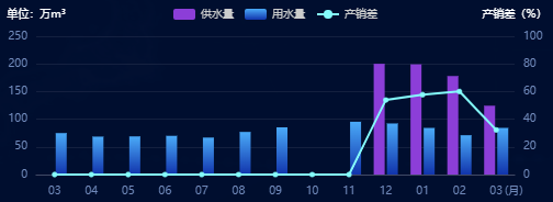
效果图
数据结构
const nrwData = [
      { label: "10", proviceWater: "100.45", userWater: "55", nrwRate: 80.65 },
      { label: "11", proviceWater: "80", userWater: "80", nrwRate: 70 },
      { label: "12", proviceWater: "81.45", userWater: "67", nrwRate: 89 },
      { label: "01", proviceWater: "145.45", userWater: "140.45", nrwRate: 55 },
      { label: "02", proviceWater: "60.45", userWater: "45", nrwRate: 43.65 },
      { label: "03", proviceWater: "55", userWater: "50", nrwRate: 85.65 },
      { label: "10", proviceWater: "100.45", userWater: "55", nrwRate: 80.65 },
      { label: "11", proviceWater: "80", userWater: "80", nrwRate: 70 },
      { label: "12", proviceWater: "81.45", userWater: "67", nrwRate: 89 },
      { label: "01", proviceWater: "145.45", userWater: "140.45", nrwRate: 55 },
      { label: "02", proviceWater: "60.45", userWater: "45", nrwRate: 43.65 },
      { label: "03", proviceWater: "55", userWater: "50", nrwRate: 85.65 }
    ];
具体代码
var xData3 = nrwData?.map((item) => item.label);
const proviceWater = nrwData?.map((item) => item.proviceWater <= 0 ? 0 : item.proviceWater);
const userWater = nrwData?.map((item) => item.userWater <= 0 ? 0 : item.userWater);
const lineData = nrwData?.map((item) => item.nrwRate >= 100 ? 0 : item.nrwRate);
var option = {
      tooltip: {
        trigger: "axis",
        show: true,
        backgroundColor: "rgba(16, 34, 79, 0.9)",
        borderColor: "#274370",
        textStyle: {
          color: "#fff",
          fontSize: 8,
        }
      },
      legend: {
        show: true,
        itemWidth: 20,
        itemHeight: 10,
        itemGap: 10,
        textStyle: {
          fontSize: 10,
          color: "#ccc",
        },
      },
      grid: {
        left: 30,
        bottom: 20,
        top: 30,
        right: 30,
      },
      xAxis: {
        data: xData3,
        name: "\n\n\n(月)",
        nameTextStyle: {
          color: "#7089ba",
          fontSize: "10px"
        },
        // 坐标轴刻度相关设置
        axisTick: {
          show: false,
        },
        nameGap: -9,
        // 坐标轴线的相关设置
        axisLine: {
          show: true,
          lineStyle: {
            color: "#414965",
          },
        },
        // 坐标轴刻度标签的相关设置
        axisLabel: {
          // 可以设置成 0 强制显示所有标签
          interval: 0,
          textStyle: {
            color: "#7089ba",
            fontSize: "10px"
          },
          margin: 10, //刻度标签与轴线之间的距离。
        },
      },
      yAxis: [{
        type: "value",
        name: "单位:万m³",
        nameTextStyle: {
          color: "#fff",
          fontSize: "10px"
        },
        // 坐标轴在grid区域中的分隔线
        splitLine: {
          show: false,
          lineStyle: {
            color: "#414965",
            opacity: 0.3,
          },
        },
        axisTick: {
          show: false,
        },
        axisLine: {
          show: false,
        },
        axisLabel: {
          textStyle: {
            color: "#7089ba",
            fontSize: "10px",
          },
        },
      },
      {
        type: "value",
        name: "产销差(%)",
        min: 0,
        max: 100,
        nameTextStyle: {
          color: "#fff",
          fontFamily: "PingFangSC-Light",
          fontSize: "10px",
        },
        axisLabel: {
          textStyle: {
            color: "#7089ba",
            fontSize: "10px"
          }
        },
        axisTick: {
          show: false,
        },
        axisLine: {
          show: false,
        },
        splitLine: {
          show: true,
          lineStyle: {
            color: "#414965",
            opacity: 0.3,
          },
        },
      },
      ],
      series: [
        {
          name: "供水量",
          type: "bar",
          barWidth: 10,
          itemStyle: {
            opacity: 0.1,
            normal: {
              show: true,
              color: "#8c3ed8",
              barBorderRadius: 0,
              borderWidth: 0,
            },
          },
          label: {
            show: false,//数据不进行显示
            position: "top",
            distance: 10,
            color: "#fff",
          },
          tooltip: {
            valueFormatter: function (value) {
              return value + "万m³";
            }
          },
          data: proviceWater,
        },
        {
          name: "用水量",
          type: "bar",
          barWidth: 10,
          itemStyle: {
            opacity: 0.1,
            normal: {
              show: true,
              color: new echarts.graphic.LinearGradient(0, 1, 0, 0, [
                {
                  offset: 0,
                  color: "#1134ac",
                },
                {
                  offset: 1,
                  color: "#4aaaf8",
                },
              ]),
              barBorderRadius: 0,
              borderWidth: 0,
            },
          },
          label: {
            show: false,//数据不进行显示
            position: "top",
            distance: 10,
            color: "#fff",
          },
          tooltip: {
            valueFormatter: function (value) {
              return value + "万m³";
            }
          },
          data: userWater,
        },
        /*折线图*/
        {
          name: "产销差",
          type: "line",
          yAxisIndex: 1,
          z: 15,
          tooltip: {
            valueFormatter: function (value) {
              return value + "%";
            }
          },
          symbol: "circle",
          // symbolSize: 10,
          itemStyle: {
            normal: {
              color: "#84fbfb",
              borderColor: "#84fbfb",  //拐点边框颜色
              lineStyle: {
                color: "#84fbfb"//折线的颜色
              },
            },
          },
          data: lineData,
        }
      ],
    };


 529
529

 被折叠的 条评论
为什么被折叠?
被折叠的 条评论
为什么被折叠?
 到【灌水乐园】发言


