


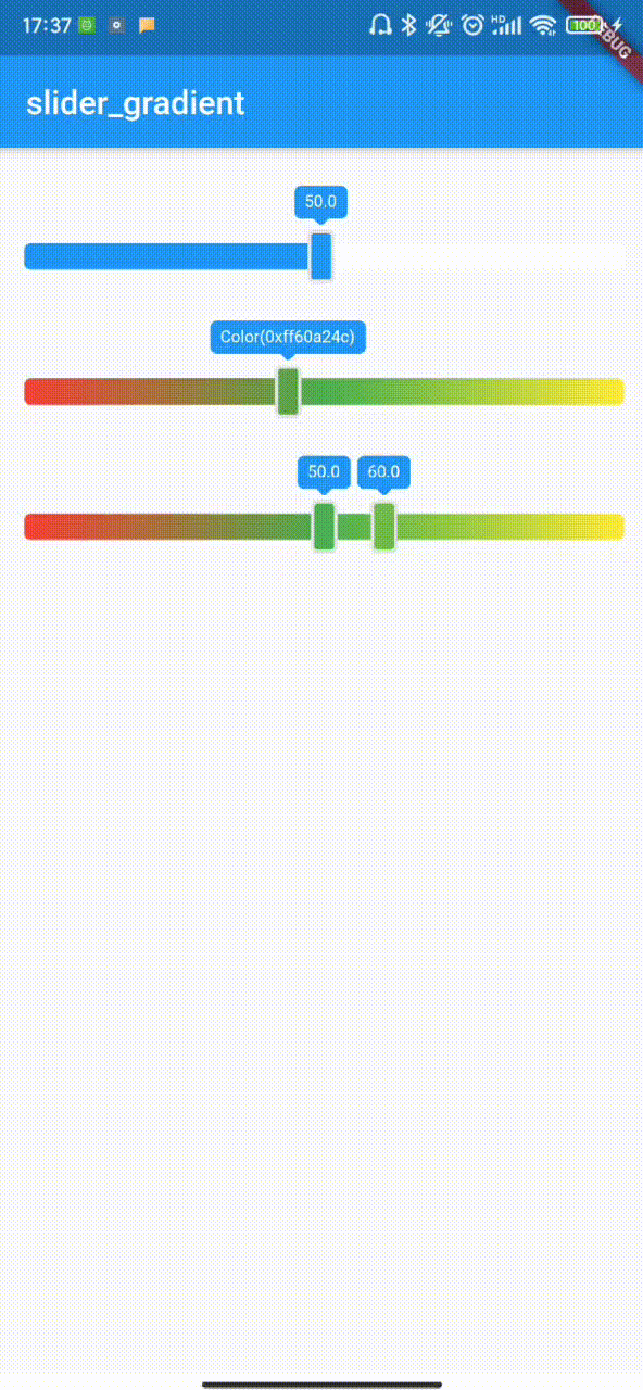
 为解决项目中渐变色背景滑块需求,开发了一款Flutter插件。该插件支持自定义背景渐变色、范围选择等功能,并提供多种回调以适应不同交互需求。
插件地址:slider_gradient
应用场景
参数说明
| Name | Type | Description | Default |
|---|---|---|---|
| value | int | Default value | Slider default minimum |
| values | List | isRange = true, values must be passed as a valid value and cannot be empty | - |
| isRange | bool | whether to use the range | false |
| min | int | Slider minimum | 0 |
| max | int | Slider maximum | 100 |
| isShowLabel | bool | Show the label on the slider | false |
| label | String | Label displays data. It is valid only when “isShowlabel” is true. | null |
| isGradientBg | bool | Whether the background color of the background slider is a gradient. | true |
| onChange | SliderChangeCallback | A custom callback function that triggers as long as the slider moves | null |
| onChangeEnd | SliderChangeCallback | A Custom callback function triggered by slider stop movement | null |
| onChangeBegin | SliderChangeCallback | A Custom callback function triggered by slider start movement | null |
| colors | List< Color > | Slider background gradient from left to right,When isgradientbg = true, it is the gradient color array. When isgradientbg = false, when it is not set, the main color of the slider is the current theme color of the system, and the auxiliary color is white. When colors is set, the main color is the first in the array and the auxiliary color is the last | There are two colors by default, the first app is the main color, and the second is white |
| labelStyle | LabelStyle | Custom label style | this |
| sliderStyle | SliderStyle | slider label style | this |
| thumbStyle | ThumbStyle | thumb label style | this |
总结
开发项目时需要一个渐变色背景的滑块,大概找了下没找到合适的,刚好有时间所以就自己写了一个,内容比较冷门想着以后有可能还会用到就练手写了个插件。最后非常感谢 Magic旭 他的 Flutter-如何计算文字宽高 文章对我帮助很大。


 扫一扫
扫一扫


 3053
3053

 被折叠的 条评论
为什么被折叠?
被折叠的 条评论
为什么被折叠?
 到【灌水乐园】发言


