


 本文探讨Python中的图形绘制,通过比较seaborn和matplotlib,阐述seaborn的易用性和matplotlib的灵活性。内容涵盖箱线图、散点图、折线图等各类图形的创建,特别强调了在复杂图形和定制需求下matplotlib的重要性。
本文主要讲python常见的图形应用,并会结合seaborn 和 matplotlib 两种对比,整体来说seaborn比matplotlib 要更简单,但 matplotlib可延展性更强,在实际应用中简单的图形可以直接调用seaborn,但是一些定制的组合图形还是需要借助matplotlib才能实现。希望本文会对初学者有一定的借鉴作用;
- 1.箱线图
- 2.散点图
- 3.折线图
- 4.双坐标轴折线图
- 5.柱状图
- 6.带数字标签的柱状图
- 7.排序的柱状图
- 8.带标签的饼图
- 9.组合柱状图
import pandas as pd
import matplotlib.pyplot as plt
import seaborn as sns
import numpy as np
tips = sns.load_dataset("tips")
tips.head()
| total_bill | tip | sex | smoker | day | time | size | |
|---|---|---|---|---|---|---|---|
| 0 | 16.99 | 1.01 | Female | No | Sun | Dinner | 2 |
| 1 | 10.34 | 1.66 | Male | No | Sun | Dinner | 3 |
| 2 | 21.01 | 3.50 | Male | No | Sun | Dinner | 3 |
| 3 | 23.68 | 3.31 | Male | No | Sun | Dinner | 2 |
| 4 | 24.59 | 3.61 | Female | No | Sun | Dinner | 4 |
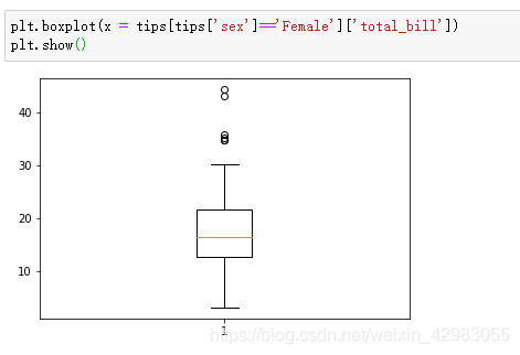
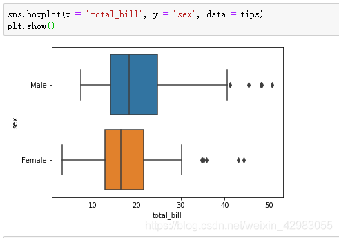
1.箱线图
plt.boxplot(x = tips[tips['sex']=='Female']['total_bill'])
plt.show()
sns.boxplot(x = 'total_bill', y = 'sex', data = tips)
plt.show()
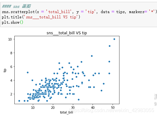
2.散点图
##### plt  画图
plt.scatter(tips['total_bill'], tips['tip'], color='green', marker='o')
# plt.xlim(np.floor(min(tips['total_bill'])), np.ceil(max(tips['total_bill'])))
# plt.xlim(np.floor(min(tips['tip'])), np.ceil(max(tips['tip'])))
# plt.plot(np.mean(tips['tip']),color = 'red')
plt.title('total_bill VS tip')
plt.xlabel('total_bill')
plt.ylabel('tip')
plt.show()
#### sns 画图
sns.scatterplot(x = 'total_bill', y = 'tip', data = tips, markers= '*')
plt.title('sns___total_bill VS tip')
plt.show()
![[外链图片转存失败(img-AP7f9B0P-1565448130956)(output_5_0.png)]](https://i-blog.csdnimg.cn/blog_migrate/c52e77dce8b6ec3daf7c1881d519e7da.png)
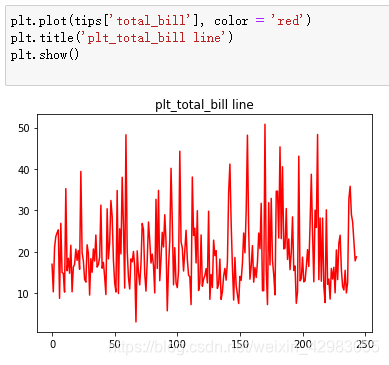
3. 折线图
plt.plot(tips['total_bill'], color = 'red')
plt.title('plt_total_bill line')
plt.show()
plt.plot(tips['tip'], color = 'green')
plt.show()
![[外链图片转存失败(img-erdi4uvf-1565448130959)(output_7_1.png)]](https://i-blog.csdnimg.cn/blog_migrate/6de026b856cd36c547a3c935779e5a1e.png)
4. 双坐标轴折线图
ax1=plt.subplot(111)
# tips['tip'].plot(ax=ax1,color='b')
ax1.plot('tip', data = tips, color = 'b')
ax1.set_ylabel('tip')
# 重点来了,twinx 或者 twiny 函数
ax2 = ax1.twinx()
# tips['total_bill'].plot(ax=ax2,color='r')
ax2.plot('total_bill', data = tips, color = 'r')
ax2.set_ylabel('total_bill')
ax1.set_label('double label for total_bill and tip')
![[外链图片转存失败(img-wit6sjO2-1565448130963)(output_9_0.png)]](https://i-blog.csdnimg.cn/blog_migrate/5af196d13dafa63cc9d79ce1569ae3a4.png)
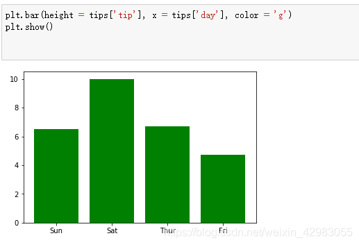
5.柱状图
plt.bar(height = tips['tip'], x = tips['day'], color = 'g')
plt.show()
## sns.barplot()
sns.barplot(y = 'tip', x = 'day', data = tips,estimator= np.sum, palette='Blues_d')
plt.title('the total tip of each day')
# for a,b in zip(tips['day'], tips['tip']):
# plt.text(a, b+0.1,'%.0f'%b,ha = 'center',va = 'bottom',fontsize=7)
plt.show()
ax = sns.barplot(x = 'time', y = 'tip', data = tips,order = ['Dinner', 'Lunch'],estimator= np.sum)
plt.title('the total tip of each time order by ---Dinner, Luach')
plt.show()
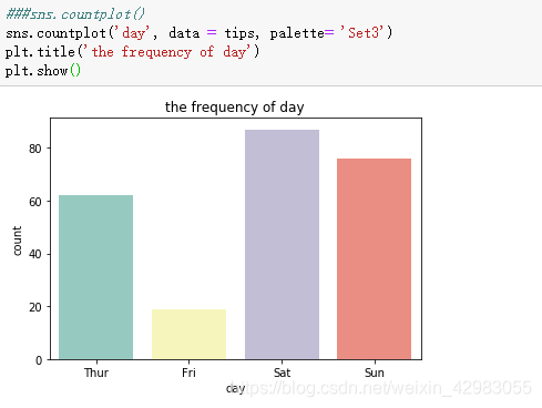
###sns.countplot()
sns.countplot('day', data = tips, palette= 'Set3')
plt.title('the frequency of day')
plt.show()
![[外链图片转存失败(img-WUSPPpyF-1565448130967)(output_11_3.png)]](https://i-blog.csdnimg.cn/blog_migrate/d112abe8f46b4f2071a47a09b5ba8c08.png)
![[外链图片转存失败(img-TVZL0LoD-1565448130968)(output_11_4.png)]](https://i-blog.csdnimg.cn/blog_migrate/0e72d94d2f33f86b09e31fe6612b14c5.png)
6. 创建带数字标签的直方图
numbers = list(range(1,11))
#np.array()将列表转换为存储单一数据类型的多维数组
x = np.array(numbers)
y = np.array([a**2 for a in numbers])
plt.bar(x,y,width=0.5,align='center',color='c')
plt.title('Square Numbers',fontsize=24)
plt.xlabel('Value',fontsize=14)
plt.ylabel('Square of Value',fontsize=14)
plt.tick_params(axis='both',labelsize=14)
plt.axis([0,11,0,110])
for a,b in zip(x,y):
    plt.text(a,b+0.1,'%.0f'%b,ha = 'center',va = 'bottom',fontsize=7)
plt.show()
![[外链图片转存失败(img-ZOdSFUXP-1565448130972)(output_13_0.png)]](https://i-blog.csdnimg.cn/blog_migrate/9b2bc42b3a048060b079a2b813ce5d27.png)
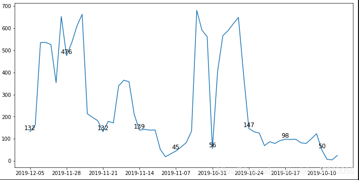
plt画折线图:功能,时间轴不连续+plt.text()
x = df2['All'][1:].values
y = df2.index[1:]
import matplotlib.pyplot as plt
ax = plt.subplots(figsize = (12,6))
plt.plot(y, x)
#plt.xticks(range(0,len(x),7))
plt.xticks(y[::7])
for a,b in zip(y[::7],x[::7]):
    plt.text(a,b,b,ha = 'center', va = 'bottom', fontsize = 12)
#plt.text(x.index[7],x.iloc[7],x.iloc[7])
#模块pyplot包含很多生成图表的函数
input_values = [1,2,3,4,5,6]
squares = [1,4,9,16,25,36]
#plot()绘制折线图
plt.plot(input_values,squares,linewidth=5)
#np.array()将列表转换为存储单一数据类型的多维数组
x = np.array(input_values)
y = np.array(squares)
#annotate()给折线点设置坐标值
for a,b in zip(x,y):
    plt.annotate('(%s,%s)'%(a,b),xy=(a,b),xytext=(-20,10),
                 textcoords='offset points')
#设置标题
plt.title('Square Numbers',fontsize=24)
plt.xlabel('Value',fontsize=14)
plt.ylabel('Square of Value',fontsize=14)
#设置刻度的大小,both代表xy同时设置
plt.tick_params(axis='both',labelsize=14)
#show()打开matplotlib查看器,并显示绘制的图形
plt.show()
![[外链图片转存失败(img-PfcYgHhR-1565448130973)(output_14_0.png)]](https://i-blog.csdnimg.cn/blog_migrate/85aa1c6fbda6ed72d7590edba156eab5.png)
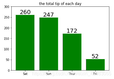
day = tips.groupby('day', as_index = False)['tip'].sum()
day.sort_values(by = 'tip',ascending=False, inplace=True)
day

res = plt.bar(height = day['tip'], x = day['day'], color = 'g')
plt.title('the total tip of each day')
for r in res:
    b = r.get_height()
#     plt.text(r.get_x()+ r.get_width()/2, r.get_height(), '%.0f'r.get_height(), ha='center', fontsize=7 )
    plt.text(r.get_x()+ r.get_width()/2, r.get_height(),'%.0f'%b,ha = 'center',va = 'bottom',fontsize=20)
plt.ylim(0,300)
plt.show()
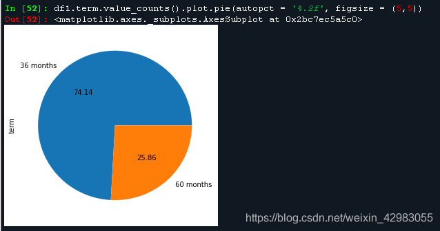
7. 饼图,带标签占比。
df1.term.value_counts().plot.pie(autopct = '%.2f', figsize = (5,5))
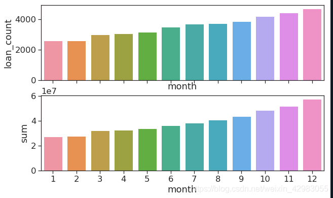
结合matplotlib 一起使用
perform_data = analysis_data.groupby('month')['loan_amnt'].agg(['count', 'sum'])
f, (ax1, ax2) = plt.subplots(2,1,sharex= True)
x = perform_data.index
y1 = perform_data['count']
sns.barplot(x, y1, ax = ax1)
ax1.set_ylabel('loan_count')
y2 = perform_data['sum']
sns.barplot(x, y2, ax = ax2)
ax2.set_ylable('loan_amount')
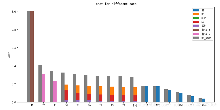
8.组合图形
import pandas as pd
import seaborn as sns
import matplotlib.pyplot as plt
import numpy as np
import seaborn as sns
import matplotlib as mpl
import matplotlib.pyplot as plt
mpl.rcParams['font.sans-serif'] = ['SimHei'] # 指定默认字体
mpl.rcParams['axes.unicode_minus'] = False # 解决保存图像是负号'-'显示为方块的问题
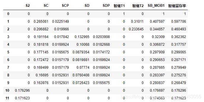
###########处理数据
df = pd.read_excel(r'D:\python_Practice\Jupyter\df.xlsx', sheet_name = 'Sheet1')
df1 = pd.DataFrame()
j = 0
for i in df.iloc[:,0]:
df1[i] = df.iloc[j,:].values[1:]
j += 1
df1
数据格式如下:
plt.rcParams['figure.figsize'] = (12.0, 6.0) # 设置figure_size尺寸
N = 16
width = 0.3
ind = range(N)
ind1 = ind - np.tile(0.3, 16)
m = np.zeros(N)
['S2', 'SC', 'SCP', 'SD', 'SDP', '智催T1', '智催T2', 'SB_MOB1']
plt.bar(ind,df1['S2'].values, width, bottom = m)
plt.bar(ind,df1['SC'].values, width, bottom = m)
plt.bar(ind,df1['SCP'].values, width, bottom = m)
plt.bar(ind,df1['SD'].values, width, bottom = m)
plt.bar(ind,df1['SDP'].values, width, bottom = m)
plt.bar(ind,df1['智催T1'].values, width, bottom = m)
plt.bar(ind,df1['智催T2'].values, width, bottom = m)

plt.bar(ind1,df1['SB_MOB1'].values, width)

plt.ylabel('cost')
plt.title('cost for different cato')
#设置X轴标签
plt.xticks(ind, ('T1', 'T2', 'T3', 'T4', 'T5','T6', 'T7', 'T8', 'T9', 'T10', 'T11', 'T12', 'T13', 'T14', 'T15', 'T16'))
#plt.yticks(np.arange(0, 81, 20))  #设置y的范围
plt.legend(('S2', 'SC', 'SCP', 'SD', 'SDP', '智催T1', '智催T2', 'SB_MOB1')) #设置图例

plt.show()

#for i in df1.columns[:-1]:
 #   plt.bar(ind,df1[i].values, width, bottom = m)
  #  m += df1[i].values


 1061
1061

 被折叠的 条评论
为什么被折叠?
被折叠的 条评论
为什么被折叠?
 到【灌水乐园】发言


