


 本文详细介绍了Android中各种可绘制资源的使用方法,包括位图、九宫格、图层列表、状态列表、等级列表、过渡、插入、剪辑、缩放和形状可绘制资源。每种资源都有详细的解释、示例和XML语法说明。
图像资源
可绘制资源是可以绘制到屏幕上的图形的一般概念,您可以使用API(例如getDrawable(int))检索该图形,或者应用于具有诸如android:drawable和android:icon等属性的另一个XML资源。有几种不同类型的drawable:
Bitmap File
位图图形文件(.png,.jpg或.gif)。创建一个BitmapDrawable。
Nine-Patch File
具有可伸展区域的PNG文件,允许基于内容(.9.png)调整图像大小。创建NinePatchDrawable。
Layer List
一个Drawable,管理其他Drawables数组。它们以数组顺序绘制,因此具有最大索引的元素将绘制在顶部。创建一个LayerDrawable。
State List
一个XML文件,它引用不同状态的不同位图图形(例如,按下按钮时使用不同的图像)。创建StateListDrawable。
Level List
一个XML文件,它定义一个drawable,用于管理多个备用Drawable,每个Drawable分配一个最大数值。创建一个LevelListDrawable。
Transition Drawable
一个XML文件,用于定义可在两个可绘制资源之间交叉淡入淡出的drawable。创建TransitionDrawable。
Inset Drawable
一个XML文件,用于定义一个drawable,它将另一个drawable以指定的距离进行插入。当View需要的背景绘图小于View的实际边界时,这非常有用。
Clip Drawable
一个XML文件,它定义一个drawable,根据此Drawable的当前级别值剪辑另一个Drawable。创建一个ClipDrawable。
Scale Drawable
一个XML文件,它定义一个drawable,它根据当前的级别值更改另一个Drawable的大小。创建ScaleDrawable
Shape Drawable
定义几何形状的XML文件,包括颜色和渐变。创建一个ShapeDrawable。
另请参阅动画资源文档以了解如何创建AnimationDrawable。
注意:颜色资源也可以用作XML中的drawable。例如,在创建状态列表drawable时,您可以引用android:drawable属性的颜色资源(android:drawable =“@ color / green”)。
Bitmap
位图图像。 Android支持三种格式的位图文件:.png(首选),.jpg(可接受),gif(不鼓励)。
您可以使用文件名作为资源ID直接引用位图文件,或者在XML中创建别名资源ID。
注意:在构建过程中,aapt工具可以使用无损图像压缩自动优化位图文件。例如,不需要超过256种颜色的真彩色PNG可以转换为带有调色板的8位PNG。这将产生质量相同但需要较少内存的图像。因此请注意,放置在此目录中的图像二进制文件可能会在构建期间发生更改。如果您打算将图像作为位流读取以将其转换为位图,请将图像放在res / raw /文件夹中,而不是优化它们。
位图文件
位图文件是.png,.jpg或.gif文件。当您将它们保存在res / drawable /目录中时,Android会为这些文件中的任何文件创建Drawable资源。
文件位置:
res/drawable/filename.png (.png, .jpg, or .gif)
文件名用作资源ID。
编译资源数据类型:
指向BitmapDrawable的资源指针。
资源引用:
在Java中:R.drawable.filename
在XML中:@ [package:] drawable / filename
例子:
将图像保存在res / drawable / myimage.png中,此布局XML将图像应用于视图:
<ImageView
    android:layout_height="wrap_content"
    android:layout_width="wrap_content"
    android:src="@drawable/myimage" />
以下应用程序代码将图像检索为Drawable:
Resources res = getResources();
Drawable drawable = res.getDrawable(R.drawable.myimage);
参阅:
- 2D Graphics
BitmapDrawable
XML Bitmap
XML位图是XML中定义的指向位图文件的资源。效果是原始位图文件的别名。 XML可以为位图指定其他属性,例如抖动和平铺。
注意:您可以将<bitmap>元素用作<item>元素的子元素。例如,在创建状态列表或图层列表时,可以从<item>元素中排除android:drawable属性,并在其中嵌套一个定义可绘制项目的<bitmap>。
文件位置:
res/drawable/filename.xml
文件名用作资源ID。
编译资源数据类型:
指向BitmapDrawable的资源指针。
资源引用:
在Java中:R.drawable.filename
在XML中:@ [package:] drawable / filename
语法:
    <?xml version="1.0" encoding="utf-8"?>
    <bitmap
        xmlns:android="http://schemas.android.com/apk/res/android"
        android:src="@[package:]drawable/drawable_resource"
        android:antialias=["true" | "false"]
        android:dither=["true" | "false"]
        android:filter=["true" | "false"]
        android:gravity=["top" | "bottom" | "left" | "right" | "center_vertical" |
                          "fill_vertical" | "center_horizontal" | "fill_horizontal" |
                          "center" | "fill" | "clip_vertical" | "clip_horizontal"]
        android:mipMap=["true" | "false"]
        android:tileMode=["disabled" | "clamp" | "repeat" | "mirror"] />
元素:
<bitmap>
定义位图源及其属性。
属性:
xmlns:android
字符串。定义XML命名空间,该命名空间必须为“http://schemas.android.com/apk/res/android”。仅当<bitmap>是根元素时才需要这样做 - 当<bitmap>嵌套在<item>中时不需要它。
android:src
可绘制的资源。必要。引用可绘制资源。
android:antialias
布尔。启用或禁用抗锯齿功能。
android:dither
布尔。如果位图与屏幕的像素配置不同,则启用或禁用位图的抖动(例如:带有RGB 565屏幕的ARGB 8888位图)。
android:filter
布尔。启用或禁用位图过滤。当位图缩小或拉伸以平滑其外观时使用过滤。
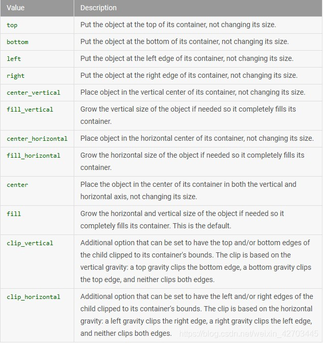
android:gravity
关键词。定义位图的重力。如果位图小于容器,则重力指示将drawable放置在其容器中的位置。
必须是以下常量值中的一个或多个(由“|”分隔):
android:mipMap
布尔。启用或禁用mipmap提示。有关更多信息,请参见setHasMipMap()。默认值为false。
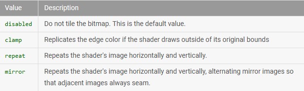
android:tileMode
关键词。定义切片模式。启用切片模式后,将重复位图。启用切片模式时,将忽略重力。
必须是以下常量值之一:
例子:
   <?xml version="1.0" encoding="utf-8"?>
    <bitmap xmlns:android="http://schemas.android.com/apk/res/android"
        android:src="@drawable/icon"
        android:tileMode="repeat" />
参阅:
BitmapDrawable- Creating alias resources
Nine-Patch
NinePatch是一个PNG图像,您可以在其中定义当视图中的内容超出正常图像边界时Android缩放的可伸展区域。您通常将此类图像指定为至少将一个维度设置为“wrap_content”的View的背景,并且当View增长以容纳内容时,Nine-Patch图像也会缩放以匹配View的大小。 Nine-Patch图像的一个示例用法是Android的标准Button小部件使用的背景,它必须拉伸以适应按钮内的文本(或图像)。
与普通位图相同,您可以直接引用Nine-Patch文件,也可以从XML定义的资源引用。
有关如何创建具有可伸展区域的Nine-Patch文件的完整讨论,请参阅2D Graphics文档。
Nine-Patch文件
文件位置:
res/drawable/filename.9.png
文件名用作资源ID。
编译资源数据类型:
指向NinePatchDrawable的资源指针。
资源参考:
在Java中:R.drawable.filename
在XML中:@ [package:] drawable / filename
例子:
将图像保存在res / drawable / myninepatch.9.png中,此布局XML将Nine-Patch应用于视图:
<Button
    android:layout_height="wrap_content"
    android:layout_width="wrap_content"
    android:background="@drawable/myninepatch" />
参阅:
- 2D Graphics
NinePatchDrawable
XML Nine-Patch
XML Nine-Patch是一种用XML定义的资源,指向Nine-Patch文件。 XML可以为图像指定抖动。
文件定位:
res/drawable/filename.xml
文件名用作资源ID。
编译资源数据类型:
指向NinePatchDrawable的资源指针。
资源参考:
在Java中:R.drawable.filename
在XML中:@ [package:] drawable / filename
语法:
   <?xml version="1.0" encoding="utf-8"?>
    <nine-patch
        xmlns:android="http://schemas.android.com/apk/res/android"
        android:src="@[package:]drawable/drawable_resource"
        android:dither=["true" | "false"] />
元素:
<nine-patch>
定义Nine-Patch源及其属性。
属性:
xmlns:android
字符串。必要。定义XML命名空间,该命名空间必须为“http://schemas.android.com/apk/res/android”。
android:src
可绘制的资源。需要。参考Nine-Patch文件。
android:dither
布尔。如果位图与屏幕的像素配置不同,则启用或禁用位图的抖动(例如:带有RGB 565屏幕的ARGB 8888位图)。
例子:
   <?xml version="1.0" encoding="utf-8"?>
    <nine-patch xmlns:android="http://schemas.android.com/apk/res/android"
        android:src="@drawable/myninepatch"
        android:dither="false" />
Layer List
LayerDrawable是一个可绘制的对象,用于管理其他drawable的数组。列表中的每个drawable都按列表的顺序绘制 - 列表中的最后一个drawable绘制在顶部。
每个drawable由单个<layer-list>元素内的<item>元素表示。
文件位置:
res/drawable/filename.xml
文件名用作资源ID。
编译资源数据类型:
指向LayerDrawable的资源指针。
资源参考:
在Java中:R.drawable.filename
在XML中:@ [package:] drawable / filename
语法:
    <?xml version="1.0" encoding="utf-8"?>
    <layer-list
        xmlns:android="http://schemas.android.com/apk/res/android" >
        <item
            android:drawable="@[package:]drawable/drawable_resource"
            android:id="@[+][package:]id/resource_name"
            android:top="dimension"
            android:right="dimension"
            android:bottom="dimension"
            android:left="dimension" />
    </layer-list>
元素:
<layer-list>
需要。这必须是根元素。包含一个或多个<item>元素。
属性:
xmlns:android
字符串。必要。定义XML命名空间,该命名空间必须为“http://schemas.android.com/apk/res/android”。
<item>
将drawable定义为可绘制的图层,位于由其属性定义的位置。必须是<selector>元素的子元素。接受子<bitmap>元素。
属性:
android:drawable
可绘制的资源。必要。引用可绘制资源。
android:id
资源ID。此drawable的唯一资源ID。要为此项目创建新的资源ID,请使用以下格式:“@ + id / name”。加号表示应将其创建为新ID。您可以使用此标识符来检索和修改使用View.findViewById()或Activity.findViewById()的drawable。
android:top
整数。顶部偏移量,以像素为单位
android:right
整数。右侧的像素偏移量。
android:bottom
整数。底部偏移量以像素为单位。
android:left
整数。左偏移量,以像素为单位。
默认情况下,所有可绘制项目都会缩放以适合包含视图的大小。因此,将图像放置在不同位置的图层列表中可能会增加视图的大小,并且某些图像会根据需要进行缩放。要避免缩放列表中的项目,请使用<item>元素内的<bitmap>元素指定drawable并将重力定义为不可缩放的内容,例如“center”。例如,以下<item>定义了一个可以缩放以适合其容器视图的项目:
<item android:drawable="@drawable/image" />
为避免缩放,以下示例使用具有居中重力的<bitmap>元素:
<item>
  <bitmap android:src="@drawable/image"
          android:gravity="center" />
</item>
例子:
保存在res / drawable / layers.xml的XML文件:
<?xml version="1.0" encoding="utf-8"?>
<layer-list xmlns:android="http://schemas.android.com/apk/res/android">
    <item>
      <bitmap android:src="@drawable/android_red"
        android:gravity="center" />
    </item>
    <item android:top="10dp" android:left="10dp">
      <bitmap android:src="@drawable/android_green"
        android:gravity="center" />
    </item>
    <item android:top="20dp" android:left="20dp">
      <bitmap android:src="@drawable/android_blue"
        android:gravity="center" />
    </item>
</layer-list>
请注意,此示例使用嵌套的<bitmap>元素为具有“中心”重力的每个项目定义可绘制资源。这确保了由于偏移图像引起的尺寸调整,没有任何图像被缩放以适合容器的尺寸。
此布局XML将drawable应用于View:
<ImageView
    android:layout_height="wrap_content"
    android:layout_width="wrap_content"
    android:src="@drawable/layers" />
参阅:
LayerDrawable
State List
StateListDrawable是一个XML格式的可绘制对象,它使用几个不同的图像来表示相同的图形,具体取决于对象的状态。例如,Button小部件可以存在于几种不同状态之一(按下,聚焦或两者都不存在),并且使用状态列表drawable,您可以为每个状态提供不同的背景图像。
您可以在XML文件中描述状态列表。每个图形由单个<selector>元素内的<item>元素表示。每个<item>使用各种属性来描述它应该用作drawable图形的状态。
在每次状态更改期间,状态列表从上到下遍历,并且使用与当前状态匹配的第一个项目 - 选择不基于“最佳匹配”,而只是满足州的最低标准的第一个项目。
文件位置:
res/drawable/filename.xml
文件名用作资源ID。
编译资源数据类型:
指向StateListDrawable的资源指针。
资源参考:
在Java中:R.drawable.filename
在XML中:@ [package:] drawable / filename
语法:
 <?xml version="1.0" encoding="utf-8"?>
    <selector xmlns:android="http://schemas.android.com/apk/res/android"
        android:constantSize=["true" | "false"]
        android:dither=["true" | "false"]
        android:variablePadding=["true" | "false"] >
        <item
            android:drawable="@[package:]drawable/drawable_resource"
            android:state_pressed=["true" | "false"]
            android:state_focused=["true" | "false"]
            android:state_hovered=["true" | "false"]
            android:state_selected=["true" | "false"]
            android:state_checkable=["true" | "false"]
            android:state_checked=["true" | "false"]
            android:state_enabled=["true" | "false"]
            android:state_activated=["true" | "false"]
            android:state_window_focused=["true" | "false"] />
    </selector>
元素:
<selector>
需要。这必须是根元素。包含一个或多个<item>元素。
属性:
xmlns:android
字符串。必要。定义XML命名空间,该命名空间必须为“http://schemas.android.com/apk/res/android”。
android:constantSize
布尔。如果绘制的报告内部大小随着状态的变化而保持不变(大小是所有状态的最大值),则为“true”;如果尺寸根据当前状态而变化,则为“假”。默认值为false。
android:dither
尔。如果位图与屏幕没有相同的像素配置(例如,带有RGB 565屏幕的ARGB 8888位图),则启用位图抖动的“true”; “false”禁用抖动。默认为true。
android:variablePadding
布尔。如果drawable的填充应根据所选的当前状态而改变,则为“true”;如果填充应保持不变(“基于所有状态的最大填充”),则为“false”。启用此功能需要您在状态更改时处理执行布局,这通常不受支持。默认值为false。
<item>
定义在某些状态下使用的drawable,如其属性所述。必须是<selector>元素的子元素。
属性:
android:drawable
可绘制的资源。需要。引用可绘制资源。
android:state_pressed
布尔。如果在按下对象时使用此项目(例如触摸/点击按钮时),则为“true”;如果此项应在默认的非按下状态下使用,则为“false”。
android:state_focused
布尔。如果在对象具有输入焦点时(例如当用户选择文本输入时)应该使用此项,则为“true”;如果此项应在默认的非聚焦状态下使用,则为“false”。
android:state_hovered
布尔。如果对象被光标悬停时应使用此项,则为“true”;如果此项应在默认的非悬停状态下使用,则为“false”。通常,这种可绘制的可以是用于“聚焦”状态的相同的可绘制的。
在API级别14中引入。
android:state_selected
布尔。 “true”如果在使用方向控件导航时对象是当前用户选择时应该使用此项(例如,当使用d-pad导航列表时);如果未选择对象时应使用此项,则为“false”。
当焦点(android:state_focused)不足时(例如当列表视图具有焦点并且使用d-pad选择其中的项目时),将使用所选状态。
android:state_checkable
布尔。如果在检查对象时应使用此项,则为“true”;如果对象不可检查则应使用此项目时为“false”。 (仅当对象可以在可检查和不可检查的小部件之间转换时才有用。)
android:state_checked
布尔。如果在检查对象时应使用此项,则为“true”;如果在取消选中对象时应该使用“false”。
android:state_enabled
布尔。 “true”如果在启用对象时应该使用此项(能够接收触摸/点击事件);如果在禁用对象时应该使用“false”。
android:state_activated
布尔。如果在将对象激活为持久选择时(例如,在持久导航视图中“突出显示”先前选择的列表项),则应使用此项;“true”;如果在未激活对象时应该使用“false”。
在API级别11中引入。
android:state_window_focused
布尔。如果应用程序窗口具有焦点(应用程序位于前景)时应使用此项目,则为“true”;如果应用程序窗口没有焦点时应使用此项目,则为“false”(例如,如果通知阴影为拉下或出现对话框)。
注意:请记住,Android应用状态列表中与对象的当前状态匹配的第一项。因此,如果列表中的第一项不包含上述任何状态属性,则每次都应用它,这就是您的默认值应始终为最后的原因(如下例所示)。
例子:
XML file saved at res/drawable/button.xml:
<?xml version="1.0" encoding="utf-8"?>
<selector xmlns:android="http://schemas.android.com/apk/res/android">
    <item android:state_pressed="true"
          android:drawable="@drawable/button_pressed" /> <!-- pressed -->
    <item android:state_focused="true"
          android:drawable="@drawable/button_focused" /> <!-- focused -->
    <item android:state_hovered="true"
          android:drawable="@drawable/button_focused" /> <!-- hovered -->
    <item android:drawable="@drawable/button_normal" /> <!-- default -->
</selector>
此布局XML将可绘制的状态列表应用于Button:
<Button
    android:layout_height="wrap_content"
    android:layout_width="wrap_content"
    android:background="@drawable/button" />
参阅:
StateListDrawable
Level List
一个Drawable,管理许多备用Drawable,每个Drawable分配一个最大数值。使用setLevel()设置drawable的级别值会在级别列表中加载drawable资源,该级别列表的android:maxLevel值大于或等于传递给方法的值。
文件位置:
res/drawable/filename.xml
文件名用作资源ID。
编译资源数据类型:
指向LevelListDrawable的资源指针。
资源参考:
在Java中:R.drawable.filename
在XML中:@ [package:] drawable / filename
语法:
 <?xml version="1.0" encoding="utf-8"?>
    <level-list
        xmlns:android="http://schemas.android.com/apk/res/android" >
        <item
            android:drawable="@drawable/drawable_resource"
            android:maxLevel="integer"
            android:minLevel="integer" />
    </level-list>
元素:
<level-list>
这必须是根元素。包含一个或多个<item>元素。
属性:
xmlns:android
字符串。必要。定义XML命名空间,该命名空间必须为“http://schemas.android.com/apk/res/android”。
<item>
定义在某个级别使用的drawable。
属性:
android:drawable
可绘制的资源。需要。引用要插入的可绘制资源。
android:maxLevel
整数。此项目允许的最高级别。
android:minLevel
整数。此项目允许的最低级别。
例子:
<?xml version="1.0" encoding="utf-8"?>
<level-list xmlns:android="http://schemas.android.com/apk/res/android" >
    <item
        android:drawable="@drawable/status_off"
        android:maxLevel="0" />
    <item
        android:drawable="@drawable/status_on"
        android:maxLevel="1" />
</level-list>
将此应用于View后,可以使用setLevel()或setImageLevel()更改级别。
参阅:
LevelListDrawable
Transition Drawable
TransitionDrawable是一个可绘制的对象,可以在两个可绘制资源之间交叉淡入淡出。
每个drawable由单个<transition>元素内的<item>元素表示。不超过两个项目。要向前转换,请调用startTransition()。要向后转换,请调用reverseTransition()。
文件位置:
res/drawable/filename.xml
文件名用作资源ID。
编译资源数据类型:
指向TransitionDrawable的资源指针。
资源参考:
在Java中:R.drawable.filename
在XML中:@ [package:] drawable / filename
语法:
    <?xml version="1.0" encoding="utf-8"?>
    <transition
    xmlns:android="http://schemas.android.com/apk/res/android" >
        <item
            android:drawable="@[package:]drawable/drawable_resource"
            android:id="@[+][package:]id/resource_name"
            android:top="dimension"
            android:right="dimension"
            android:bottom="dimension"
            android:left="dimension" />
    </transition>
元素:
<transition>
必要。这必须是根元素。包含一个或多个<item>元素。
属性:
xmlns:android
字符串。必要。定义XML命名空间,该命名空间必须为“http://schemas.android.com/apk/res/android”。
<item>
定义一个drawable,用作drawable过渡的一部分。必须是<transition>元素的子元素。接受子<bitmap>元素。
属性:
android:drawable
可绘制的资源。必要。引用可绘制资源。
android:id
资源ID。此drawable的唯一资源ID。要为此项目创建新的资源ID,请使用以下格式:“@ + id / name”。加号表示应将其创建为新ID。您可以使用此标识符来检索和修改使用View.findViewById()或Activity.findViewById()的drawable。
android:top
整数。顶部偏移量,以像素为单位
android:right
整数。右侧的像素偏移量。
android:bottom
整数。底部偏移量以像素为单位。
android:left
整数。左偏移量,以像素为单位。
例子:
保存在res / drawable / transition.xml的XML文件:
<?xml version="1.0" encoding="utf-8"?>
<transition xmlns:android="http://schemas.android.com/apk/res/android">
    <item android:drawable="@drawable/on" />
    <item android:drawable="@drawable/off" />
</transition>
此布局XML将drawable应用于View:
<ImageButton
    android:id="@+id/button"
    android:layout_height="wrap_content"
    android:layout_width="wrap_content"
    android:src="@drawable/transition" />
以下代码执行从第一个项到第二个项的500毫秒过渡:
ImageButton button = (ImageButton) findViewById(R.id.button);
TransitionDrawable drawable = (TransitionDrawable) button.getDrawable();
drawable.startTransition(500);
参阅:
TransitionDrawable
Inset Drawable
以XML格式定义的drawable,它将另一个drawable以指定的距离进行插入。当View需要的背景小于View的实际边界时,这非常有用。
文件位置:
res/drawable/filename.xml
文件名用作资源ID。
编译资源数据类型:
指向InsetDrawable的资源指针。
资源参考:
在Java中:R.drawable.filename
在XML中:@ [package:] drawable / filename
语法:
    <?xml version="1.0" encoding="utf-8"?>
    <inset
        xmlns:android="http://schemas.android.com/apk/res/android"
        android:drawable="@drawable/drawable_resource"
        android:insetTop="dimension"
        android:insetRight="dimension"
        android:insetBottom="dimension"
        android:insetLeft="dimension" />
元素:
<inset>
定义插入drawable。这必须是根元素。
属性:
xmlns:android
字符串。必要。定义XML命名空间,该命名空间必须为“http://schemas.android.com/apk/res/android”。
android:drawable
可绘制的资源。需要。引用要插入的可绘制资源。
android:insetTop
尺寸。顶部插入,作为维度值或维度资源
android:insetRight
尺寸。右侧插入,作为维值或维度资源
android:insetBottom
尺寸。底部插入,作为维度值或维度资源
android:insetLeft
尺寸。左侧插图,作为维值或维度资源
例子:
    <?xml version="1.0" encoding="utf-8"?>
    <inset xmlns:android="http://schemas.android.com/apk/res/android"
        android:drawable="@drawable/background"
        android:insetTop="10dp"
        android:insetLeft="10dp" />
参阅:
InsetDrawable
Clip Drawable
以XML格式定义的drawable,根据此Drawable的当前级别剪切另一个drawable。您可以根据级别控制子绘图在宽度和高度上被剪裁的程度,以及控制它在整个容器中放置位置的重力。最常用于实现进度条等内容。
文件位置:
res/drawable/filename.xml
文件名用作资源ID。
编译资源数据类型:
指向ClipDrawable的资源指针。
资源参考:
在Java中:R.drawable.filename
在XML中:@ [package:] drawable / filename
语法:
    <?xml version="1.0" encoding="utf-8"?>
    <clip
        xmlns:android="http://schemas.android.com/apk/res/android"
        android:drawable="@drawable/drawable_resource"
        android:clipOrientation=["horizontal" | "vertical"]
        android:gravity=["top" | "bottom" | "left" | "right" | "center_vertical" |
                         "fill_vertical" | "center_horizontal" | "fill_horizontal" |
                         "center" | "fill" | "clip_vertical" | "clip_horizontal"] />
元素:
<clip>
定义可绘制的剪辑。这必须是根元素。
属性:
xmlns:android
字符串。必要。定义XML命名空间,该命名空间必须为“http://schemas.android.com/apk/res/android”。
android:drawable
可绘制的资源。必要。引用要剪裁的可绘制资源。
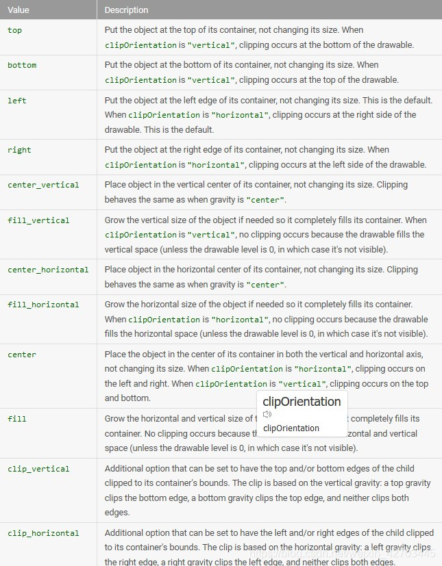
android:clipOrientation
关键词。剪辑的方向。
必须是以下常量值之一:
| Value | Description |
horizontal | 水平裁剪图片。 |
vertical | 垂直裁剪图片。 |
android:gravity
关键词。指定在drawable中剪切的位置。
必须是以下常量值中的一个或多个(由“|”分隔):
例子:
保存在res / drawable / clip.xml的XML文件:
<?xml version="1.0" encoding="utf-8"?>
<clip xmlns:android="http://schemas.android.com/apk/res/android"
    android:drawable="@drawable/android"
    android:clipOrientation="horizontal"
    android:gravity="left" />
以下布局XML将可绘制剪辑应用于视图:
<ImageView
    android:id="@+id/image"
    android:background="@drawable/clip"
    android:layout_height="wrap_content"
    android:layout_width="wrap_content" />
以下代码获取drawable并增加剪裁量以逐步显示图像:
ImageView imageview = (ImageView) findViewById(R.id.image);
ClipDrawable drawable = (ClipDrawable) imageview.getDrawable();
drawable.setLevel(drawable.getLevel() + 1000);
增加水平会减少剪裁量并慢慢显示图像。这是7000的水平:
注意:默认级别为0,完全剪切,因此图像不可见。当级别为10,000时,图像不会被剪裁并且完全可见。
参阅:
ClipDrawable
Scale Drawable
以XML定义的drawable,它根据当前级别更改另一个drawable的大小。
文件位置:
res/drawable/filename.xml
文件名用作资源ID。
编译资源数据类型:
指向ScaleDrawable的资源指针。
资源参考:
在Java中:R.drawable.filename
在XML中:@ [package:] drawable / filename
语法:
    <?xml version="1.0" encoding="utf-8"?>
    <scale
        xmlns:android="http://schemas.android.com/apk/res/android"
        android:drawable="@drawable/drawable_resource"
        android:scaleGravity=["top" | "bottom" | "left" | "right" | "center_vertical" |
                              "fill_vertical" | "center_horizontal" | "fill_horizontal" |
                              "center" | "fill" | "clip_vertical" | "clip_horizontal"]
        android:scaleHeight="percentage"
        android:scaleWidth="percentage" />
元素:
<scale>
定义可绘制的比例。这必须是根元素。
属性:
xmlns:android
字符串。必要。定义XML命名空间,该命名空间必须为“http://schemas.android.com/apk/res/android”。
android:drawable
可绘制的资源。必要。引用可绘制资源。
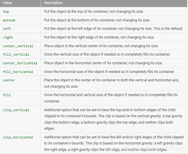
android:scaleGravity
关键词。指定缩放后的重力位置。
必须是以下常量值中的一个或多个(由“|”分隔):
android:scaleHeight
百分比。刻度高度,表示为可绘制边界的百分比。值的格式为XX%。例如:100%,12.5%等
android:scaleWidth
百分比。比例宽度,表示为可绘制边界的百分比。值的格式为XX%。例如:100%,12.5%等
例子:
    <?xml version="1.0" encoding="utf-8"?>
    <scale xmlns:android="http://schemas.android.com/apk/res/android"
        android:drawable="@drawable/logo"
        android:scaleGravity="center_vertical|center_horizontal"
        android:scaleHeight="80%"
        android:scaleWidth="80%" />
参阅:
ScaleDrawable
Shape Drawable
这是XML中定义的形状。
res/drawable/filename.xml
文件名用作资源ID。
编译资源数据类型:
指向GradientDrawable的资源指针。
资源参考:
在Java中:R.drawable.filename
在XML中:@ [package:] drawable / filename
语法:
    <?xml version="1.0" encoding="utf-8"?>
    <shape
        xmlns:android="http://schemas.android.com/apk/res/android"
        android:shape=["rectangle" | "oval" | "line" | "ring"] >
        <corners
            android:radius="integer"
            android:topLeftRadius="integer"
            android:topRightRadius="integer"
            android:bottomLeftRadius="integer"
            android:bottomRightRadius="integer" />
        <gradient
            android:angle="integer"
            android:centerX="float"
            android:centerY="float"
            android:centerColor="integer"
            android:endColor="color"
            android:gradientRadius="integer"
            android:startColor="color"
            android:type=["linear" | "radial" | "sweep"]
            android:useLevel=["true" | "false"] />
        <padding
            android:left="integer"
            android:top="integer"
            android:right="integer"
            android:bottom="integer" />
        <size
            android:width="integer"
            android:height="integer" />
        <solid
            android:color="color" />
        <stroke
            android:width="integer"
            android:color="color"
            android:dashWidth="integer"
            android:dashGap="integer" />
    </shape>
元素:
<shape>
形状可绘制。这必须是根元素。
属性:
xmlns:android
字符串。必要。定义XML命名空间,该命名空间必须为“http://schemas.android.com/apk/res/android”。
android:shape
关键词。定义形状的类型。有效值为:
| Value | Desciption |
"rectangle" | 填充包含视图的矩形。这是默认形状。 |
"oval" | 椭圆形,适合包含视图的尺寸。 |
"line" | 横跨包含视图宽度的水平线。此形状需要<stroke>元素来定义线条的宽度。 |
"ring" | 环形。 |
仅当android:shape =“ring”时才使用以下属性:
android:innerRadius
尺寸。环的内部半径(中间的孔)的半径,作为尺寸值或尺寸资源。
android:innerRadiusRatio
flaot。环内部的半径,表示为环的宽度比。例如,如果android:innerRadiusRatio =“5”,那么内半径等于环的宽度除以5.这个值被android:innerRadius覆盖。默认值为9。
android:thickness
尺寸。环的厚度,作为尺寸值或尺寸资源。
android:thicknessRatio
float。环的厚度,表示为环的宽度比。例如,如果android:thicknessRatio =“2”,则厚度等于环的宽度除以2.此值被android:innerRadius覆盖。默认值为3。
android:useLevel
布尔。如果将其用作LevelListDrawable,则为“true”。这应该是“假的”或你的形状可能不会出现。
<corners>
为形状创建圆角。仅在形状为矩形时应用。
属性:
android:radius
尺寸。所有角的半径,作为维值或维度资源。通过以下属性覆盖每个角落。
android:topLeftRadius
尺寸。左上角的半径,作为维值或维度资源。
android:topRightRadius
尺寸。右上角的半径,作为维值或维度资源。
android:bottomLeftRadius
尺寸。左下角的半径,作为维值或维度资源。
android:bottomRightRadius
尺寸。右下角的半径,作为维值或维度资源。
注意:每个角必须(最初)提供大于1的角半径,否则没有角是圆角。如果你想要特定的角不被舍入,一个解决方法是使用android:radius来设置一个大于1的默认角半径,但是然后使用你真正想要的值覆盖每个角,提供零(“0dp”) )你不想要圆角。
<gradient>
指定形状的渐变颜色。
属性:
android:angle
整数。渐变的角度,以度为单位。 0从左到右,90从下到上。它必须是45的倍数。默认值为0。
android:centerX
float。梯度中心的相对X位置(0 - 1.0)。
android:centerY
float。梯度中心的相对Y位置(0 - 1.0)。
android:centerColor
颜色。作为十六进制值或颜色资源的起始颜色和结束颜色之间的可选颜色。
android:endColor
颜色。结束颜色,作为十六进制值或颜色资源。
android:gradientRadius
float。渐变的半径。仅在android:type =“radial”时应用。
android:startColor
颜色。起始颜色,作为十六进制值或颜色资源。
android:type
关键词。要应用的渐变图案的类型。有效值为:
| Value | Description |
"linear" | 线性渐变。这是默认值。 |
"radial" | 径向渐变。起始颜色是中心颜色。 |
"sweep" | 扫描线渐变。 |
android:useLevel
布尔。如果将其用作LevelListDrawable,则为“true”。
<padding>
用于应用于包含View元素的填充(这将填充View内容的位置,而不是形状)。
属性:
android:left
尺寸。左边填充,作为维值或维度资源。
android:top
尺寸。顶部填充,作为维度值或维度资源。
android:right
尺寸。右边填充,作为维值或维度资源。
android:bottom
尺寸。底部填充,作为维值或维度资源。
<size>
形状的大小。
属性:
android:height
尺寸。形状的高度,作为尺寸值或尺寸资源。
android:width
尺寸。形状的宽度,作为尺寸值或尺寸资源。
注意:默认情况下,形状会缩放到容器视图的大小,该视图与此处定义的尺寸成比例。在ImageView中使用形状时,可以通过将android:scaleType设置为“center”来限制缩放。
<solid>
填充形状的纯色。
属性:
android:color
颜色。要应用于形状的颜色,作为十六进制值或颜色资源。
<stroke>
形状的笔划线。
属性:
android:width
尺寸。线的粗细,作为尺寸值或尺寸资源。
android:color
颜色。线条的颜色,作为十六进制值或颜色资源。
android:dashGap
尺寸。线破折号之间的距离,作为尺寸值或尺寸资源。仅在设置了android:dashWidth时有效。
android:dashWidth
尺寸。每个虚线的大小,作为维值或维度资源。仅在设置了android:dashGap时才有效。
例子:
保存在res / drawable / gradient_box.xml的XML文件:
<?xml version="1.0" encoding="utf-8"?>
<shape xmlns:android="http://schemas.android.com/apk/res/android"
    android:shape="rectangle">
    <gradient
        android:startColor="#FFFF0000"
        android:endColor="#80FF00FF"
        android:angle="45"/>
    <padding android:left="7dp"
        android:top="7dp"
        android:right="7dp"
        android:bottom="7dp" />
    <corners android:radius="8dp" />
</shape>
此布局XML将可绘制的形状应用于视图:
<TextView
    android:background="@drawable/gradient_box"
    android:layout_height="wrap_content"
    android:layout_width="wrap_content" />
此应用程序代码获取可绘制的形状并将其应用于视图:
Resources res = getResources();
Drawable shape = res. getDrawable(R.drawable.gradient_box);

TextView tv = (TextView)findViewByID(R.id.textview);
tv.setBackground(shape);
参阅:
ShapeDrawable


 扫一扫
扫一扫


 16
16

 被折叠的 条评论
为什么被折叠?
被折叠的 条评论
为什么被折叠?
 到【灌水乐园】发言


