


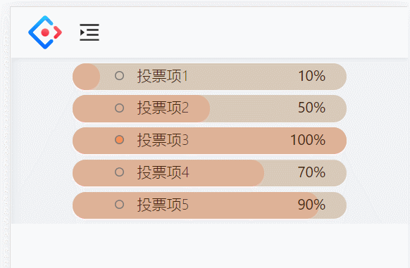
效果
React代码
// 投票组件
import React ,{FC,useState,useEffect}from 'react'
import styles from './index.less'

const Vote:FC= ()=>{

const voteData2 = ["10%","50%","100%","70%","90%"] //模拟的投票结果数据

const[voteData,setVoteDate] = useState(["0%","0%","0%","0%","0%"]) //投票结果

const [checkId,setCheckId] = useState(0) //选择的投票项

const vote = (id:number)=>{
  setCheckId(id)
  setVoteDate(voteData2)
}

useEffect(()=>{
  /*

  rem单位
	rem是css中的一个尺寸单位,和px、%,em(相对于父元素的字体大小)单位一样都是设置大小

	rem:html字体大小的多少倍

	用法:
	设置rem大小:
		方式一
			document.documentElement.style.fontSize=(document.documentElement.clientWidth/750)*100+'px';
		方式二:
			document.documentElement.style.fontSize='10vw';
				即1rem等于屏幕宽度的10分之一,若宽为375px,则1rem=37.5px;

		750px是当前流行美工稿大小;

		所以根据用法可得:
			 保证在750px大小的设备当中,1 rem=100px;
				在350px大小的设备中,1 rem=50px;
  */
  	document.documentElement.style.fontSize=(document.documentElement.clientWidth/750)*100+'px';
},[])

const arr = [
  {id:1,text:"投票项1"},
  {id:2,text:"投票项2"},
  {id:3,text:"投票项3"},
  {id:4,text:"投票项4"},
  {id:5,text:"投票项5"},
]

  return(
    <div className={styles.vote}>
      {
        arr.map((voteitem,index)=>{
          return(
            <div className={styles.voteContain} onClick={checkId===0?()=>vote(voteitem.id):undefined}  key={voteitem.id}>
              {/* 根据投票百分比占位的div */}
                <div className={styles.rs} style={{width:`${voteData[index]}`, transition:"width 2s"}}/>
                <ul>
                  <li  className={checkId===voteitem.id?styles.liCheck:styles.li}>
                    <span>{voteitem.text}</span>

                     <span className={styles.data} style={{opacity:checkId===0?"0":"1"}}>{voteData[index]}</span>
                  </li>
                </ul>

            </div>
          )
        })
      }
    </div>
  )
}

export default Vote
css代码
.vote{
  .voteTip{
    width: 4.68rem;
    margin: 0.4rem 0 0.1rem 0;
  }

  .voteContain{
    background-color: #D8C9B8;
    width: 5.19rem;
    height: 0.51rem;
    border-radius: 0.25rem;
    margin: 0.1rem auto;
    color: #432209;
    font-size: 0.28rem;
    font-weight: 300;
    position: relative;

    ul{
      position: relative;
      z-index: 1;
       text-align: left;
      .li{
        list-style-type: none;
        background: url('../../img/vote/circle.png') ;
        background-repeat:  no-repeat;
        background-size: 0.17rem 0.17rem;
        background-position: 0 0.15rem;
        text-indent: 1.5em;
      }
      .liCheck{
        list-style-type: none;
        background: url('../../img/vote/circle2.png') ;
        background-repeat:  no-repeat;
        background-size: 0.17rem 0.17rem;
        background-position: 0 0.15rem;
        text-indent: 1.5em;
      }
    }

    .rs{
      height: 0.51rem;
      border-radius: 0.25rem;
      background-color: #DFB297;
      position: absolute;
      left: 0;
      bottom: 0;
    }
    .data{
      font-weight: 400;
       position: absolute;
       right: 0.4rem;
       transition: opacity 1s;
    }
  }
}
总结
1、动画效果通过过渡属性来做
<div className={styles.rs} style={{width:`${voteData[index]}`, transition:"width 2s"}}/>
2、改变li样式,区分选择和未选择效果
.li{
        list-style-type: none;
        background: url('../../img/vote/circle.png') ;
        background-repeat:  no-repeat;
        background-size: 0.17rem 0.17rem;
        background-position: 0 0.15rem;
        text-indent: 1.5em;
      }
.liCheck{
   list-style-type: none;
   background: url('../../img/vote/circle2.png') ;
   background-repeat:  no-repeat;
   background-size: 0.17rem 0.17rem;
   background-position: 0 0.15rem;
   text-indent: 1.5em;
 }
这个投票功能的实现还是比较简单的,有一点css基础就基本能做出来了


 扫一扫
扫一扫


 3万+
3万+

 被折叠的 条评论
为什么被折叠?
被折叠的 条评论
为什么被折叠?
 到【灌水乐园】发言


