


 本文介绍了使用CSS3给背景图片添加颜色遮罩的三种方法:通过定位叠加、伪类元素叠加以及颜色叠加混合模式(background-blend-mode)。这些方法可以帮助开发者在网页设计中创建具有颜色遮罩的背景图片效果。
css3如何给背景图片加颜色遮罩?下面本篇文章给大家介绍一下css3给背景图片加颜色遮罩的方法。有一定的参考价值,有需要的朋友可以参考一下,希望对大家有所帮助。

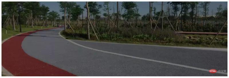
在开发中,有时遇到需要给背景层加颜色遮罩的项目,现在特定总结一下给背景图层加颜色遮罩的方法。
方法一:通过定位叠加(注意层级)
.wrap1 {
position: relative;
width: 1200px;
height: 400px;
background: rgba(0, 0, 0, .5);
}
.wrap1 .inner {
position: absolute;
left: 0;
right: 0;
top: 0;
bottom: 0;
background: url(ban8.jpg) no-repeat center center;
background-size: cover;
z-index: -1;
}
方法二:通过伪类元素叠加
.wrap2 {
position: relative;
width: 1200px;
height: 400px;
background: url(ban8.jpg) no-repeat center center;
background-size: cover;
}
.wrap2::before {
content: "";
position: absolute;
left: 0;
right: 0;
bottom: 0;
top: 0;
background-color: rgba(0, 0, 0, .5);
z-index: 2;
}
方法三:CSS3颜色叠加background-blend-mode:multiply;(正片叠底)
.wrap3 {
position: relative;
width: 1200px;
height: 400px;
background: url(ban8.jpg) rgba(0, 0, 0, .5) no-repeat center center;
background-blend-mode: multiply;
}
拓展:背景模糊加颜色叠加
 .wrap4 {
position: relative;
width: 1200px;
height: 400px;
background: url(ban8.jpg) rgba(0, 0, 0, .5) no-repeat center center;
background-blend-mode: multiply;
filter: blur(2px);
overflow: hidden;
}
更多web前端知识,请查阅 HTML中文网 !!


 扫一扫
扫一扫


 被折叠的 条评论
为什么被折叠?
被折叠的 条评论
为什么被折叠?
 到【灌水乐园】发言


