


一、 ScrollBar
描述: 滚动条组件
功能: 用于配合可滚动组件使用,如List、Grid、Scroll
子组件:可以包含单个子组件
ScrollBar(value: { scroller: Scroller, direction?: ScrollBarDirection, state?: BarState })
参数:
参数名
参数类型
必填
默认值
参数描述
scroller
Scroller
是
-
可滚动组件的控制器。用于与可滚动组件进行绑定
direction
ScrollBarDirection
否
ScrollBarDirection.Vertical
滚动条的方向,控制可滚动组件对应方向的滚动
state
BarState
否
BarState.Auto
滚动条状态
ScrollBarDirection详解:
-
Vertical:纵向滚动条
-
Horizontal:横向滚动条
使用案例:
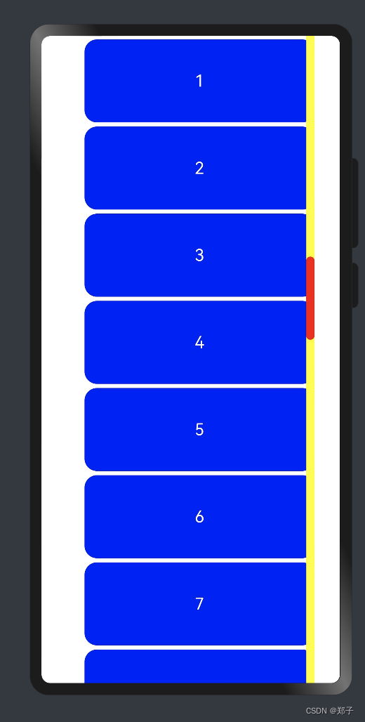
创建一个Scroller使得ScrollBar与滑动组件连接起来,且方向一致时,两者产生联动
@Entry
@Component
struct ScrollBarPage {
  private scroller: Scroller = new Scroller()
  private arr: number[] = [0, 1, 2, 3, 4, 5, 6, 7, 8, 9]

  build() {
    Column() {
      Stack({ alignContent: Alignment.End }) {
        Scroll(this.scroller) {
          Flex({ direction: FlexDirection.Column }) {
            ForEach(this.arr, (item) => {
              Row() {
                Text(item.toString())
                  .width('90%')
                  .height(100)
                  .backgroundColor(Color.Blue)
                  .borderRadius(15)
                  .fontSize(20)
                  .fontColor(Color.White)
                  .textAlign(TextAlign.Center)
                  .margin({ top: 5 })
              }
            }, item => item)
          }.margin({ left: 52 })
        }
        .scrollBar(BarState.Off)
        .scrollable(ScrollDirection.Vertical)
        ScrollBar({ scroller: this.scroller, direction: ScrollBarDirection.Vertical,state: BarState.Auto }) {
          Text()
            .width(10)
            .height(100)
            .borderRadius(10)
            .backgroundColor(Color.Red)
        }.width(10).backgroundColor(Color.Yellow)
      }
    }
  }
}
二、Search
描述: 搜索框组件
功能: 用于搜索内容输入框等应用场景
子组件:无
Search(options?: { value?: string; placeholder?: string; icon?: string; controller?: SearchController })
参数:
参数名
参数类型
必填
参数描述
value
string
否
搜索文本值
placeholder
string
否
无输入时的提示文本
icon
string
否
搜索图标路径,默认使用系统搜索图标,支持的图标格式: svg, jpg和png
controller
SearchController
否
控制器
属性:
名称
参数类型
描述
searchButton
string
搜索框末尾搜索按钮文本值,默认无搜索按钮
placeholderColor
ResourceColor 设置placeholder颜色
placeholderFont
Font
设置placeholder文本样式
textFont
Font
设置搜索框内文本样式
事件:
名称
功能描述
onSubmit(callback: (value: string) => void)
点击搜索图标、搜索按钮或者按下软键盘搜索按钮时触发
-value: 当前输入文本框的内容
onChange(callback: (value: string) => void)
输入内容发生变化时,触发回调
-value: 当前输入文本框的内容
onCopy(callback: (value: string) => void)
组件触发系统剪切板复制操作
-value: 复制的文本内容
onCut(callback: (value: string) => void)
组件触发系统剪切板剪切操作
-value: 剪切的文本内容
onPaste(callback: (value: string) => void)
组件触发系统剪切板粘贴操作
-value: 粘贴的文本内容
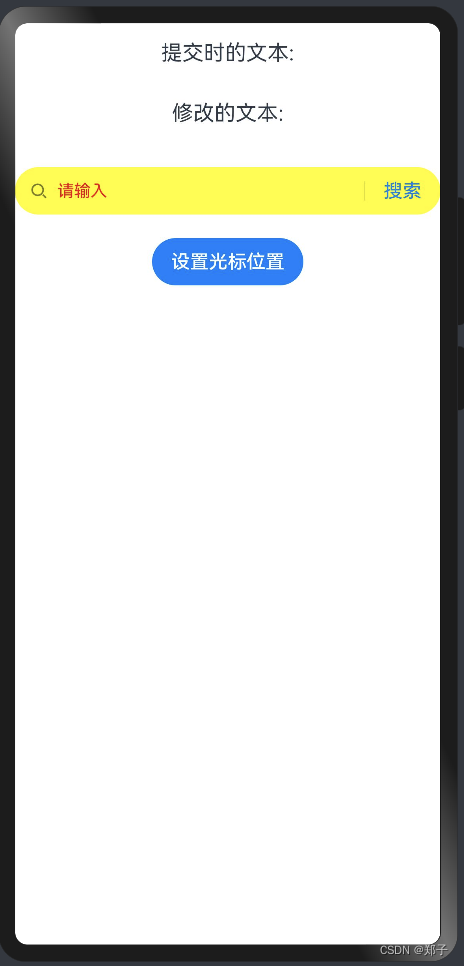
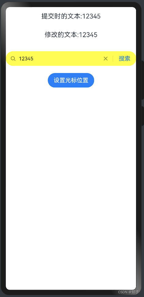
使用案例:
@Entry
@Component
struct SearchPage {
  @State changeValue: string = '';
  @State submitValue: string = '';
  controller: SearchController = new SearchController();

  build() {
    Column() {
      Text('提交时的文本:' + this.submitValue).fontSize(18).margin(15)
      Text('修改的文本:' + this.changeValue).fontSize(18).margin(15)
      Search({ value: this.changeValue, placeholder: '请输入', controller: this.controller })
        .searchButton('搜索')
        .width('100%')
        .height(40)
        .backgroundColor(Color.Yellow)
        .placeholderColor(Color.Red)
        .placeholderFont({ size: 14, weight: 10 })
        .textFont({ size: 14, weight: 400 })
        .onSubmit((value: string) => {
          //搜索框点击搜索之后的回调
          this.submitValue = value;
        })
        .onChange((value: string) => {
          //搜索框修改后的回调
          this.changeValue = value;
        })
        .margin(20)
      Button('设置光标位置')
        .onClick(() => {
          // 通过controller.caretPosition设置光标位置
          this.controller.caretPosition(0);
        })
    }.width('100%')
  }
}
三、Select
描述:下拉选择菜单组件
子组件:无
Select(options: Array<SelectOption>)
属性:
名称
参数类型
描述
selected
number
设置初始选项的索引,第一项的索引为0
value
string
设置默认文本
font
Font
设置默认文本样式
fontColor
ResourceColor
设置默认文本颜色
selectedOptionBgColor
ResourceColor
设置选中项的背景色
selectedOptionFont
Font
设置选中项的文本样式
selectedOptionFontColor
ResourceColor
设置选中项的文本颜色
optionBgColor
ResourceColor
设置背景色
optionFont
 最低0.47元/天 解锁文章


 扫一扫
扫一扫


 3544
3544

 被折叠的 条评论
为什么被折叠?
被折叠的 条评论
为什么被折叠?
 到【灌水乐园】发言


