


 本文详细解析了TabLayout的默认样式、基本用法,包括静态和动态添加Tab,以及与ViewPager的联动。同时介绍了如何自定义TabLayout的样式,如修改Indicator长度,并展示了如何创建自定义TabItem并监听其点击事件。
TabLayout的默认样式:
app:theme="@style/Widget.Design.TabLayout"
从系统定义的该样式继续深入:
fill
fixed
264dp
?attr/colorAccent
2dp
12dp
12dp
?attr/selectableItemBackground
@style/TextAppearance.Design.Tab
?android:textColorPrimary
接着,看看系统定义Tab文本的样式(注意textAllcaps这个属性):
14dp
?android:textColorSecondary
true
从系统定义TabLayout的默认样式可以看出,我们可以改变TabLayout对应的系统样式的属性值来适配我们自己的需求.
TabLayout的基本用法
TabLayout独立使用使用时,可以xml布局中静态添加tab个数及其样式,也可以动态添加Tab的个数及其样式,如:
android:id="@+id/tablayout"
android:background="@color/colorPrimary"
android:layout_width="match_parent"
android:layout_height="wrap_content">
android:layout_width="match_parent"
android:layout_height="wrap_content"
android:text="Android"/>
android:layout_width="match_parent"
android:layout_height="wrap_content"
android:icon="@mipmap/ic_launcher"/>

或者:
android:id="@+id/tablayout"
android:background="@color/colorPrimary"
android:layout_width="match_parent"
android:layout_height="wrap_content"/>
private int[] images = new int[]{
R.drawable.ic_account_balance_wallet_black,
R.drawable.ic_android_black,
R.drawable.ic_account_box_black};
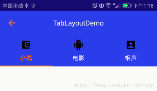
private String[] tabs = new String[]{"小说", "电影", "相声"};
TabLayout tabLayout = (TabLayout) findViewById(R.id.tablayout);
tabLayout.addTab(tabLayout.newTab().setIcon(images[0]).setText(tabs[0]),true);
tabLayout.addTab(tabLayout.newTab().setIcon(images[1]).setText(tabs[1]),false);
tabLayout.addTab(tabLayout.newTab().setIcon(images[2]).setText(tabs[2]),false);
TabLayout在实际开发中最多的是与ViewPager联合使用,实现TabLayout与ViewPager的联动:
android:id="@+id/tablayout"
android:layout_width="match_parent"
android:layout_height="wrap_content"
android:background="@color/colorPrimary"
app:tabGravity="fill"
app:tabIndicatorColor="@android:color/holo_orange_dark"
app:tabIndicatorHeight="2dp"
app:tabMode="fixed"
app:tabSelectedTextColor="@android:color/holo_orange_dark"
app:tabTextAppearance="@style/CustomTabTextAppearanceStyle"
app:tabTextColor="@android:color/white"
app:theme="@style/Widget.Design.TabLayout"/>
android:id="@+id/view_pager"
android:layout_width="match_parent"
android:layout_height="match_parent"/>
TabLayout tabLayout = (TabLayout) findViewById(R.id.tablayout);
ViewPager viewPager = (ViewPager) findViewById(R.id.view_pager);
viewPager.setAdapter(new TabPagerAdapter(getSupportFragmentManager()));
tabLayout.setupWithViewPager(viewPager);
值得注意的是:
在TabPagerAdapter中需要实现getPagerTitle()否则,TabLayout的Tab将不显示,先看TabLayout#setupWithPager()源码,发现Tab的添加是在populateFromPagerAdapter()中实现,实现源码如下,可以看出该方法调用了PagerAdpater#getPagerTitle()为Tab设置文本信息,如果我们自定义的Adapter没有实现getPagerTitle()将会导致Tab不显示文本信息.
void populateFromPagerAdapter() {
removeAllTabs();
if (mPagerAdapter != null) {
final int adapterCount = mPagerAdapter.getCount();
for (int i = 0; i < adapterCount; i++) {
addTab(newTab().setText(mPagerAdapter.getPageTitle(i)), false);
}
// Make sure we reflect the currently set ViewPager item
if (mViewPager != null && adapterCount > 0) {
final int curItem = mViewPager.getCurrentItem();
if (curItem != getSelectedTabPosition() && curItem < getTabCount()) {
selectTab(getTabAt(curItem));
}
}
}
}
另外, 我们发现getPagerTitle()方法的返回值CharSequence而不是String,那么Tab的文本信息的设置将变得更加灵活,比如设置一个SpanableString,将图片和文本设置Tab的文本.
@Override
public CharSequence getPageTitle(int position) {
Drawable image = TablayoutActivity.this.getResources().getDrawable(images[position]);
image.setBounds(0, 0, image.getIntrinsicWidth()/2, image.getIntrinsicHeight()/2);
ImageSpan imageSpan = new ImageSpan(image, ImageSpan.ALIGN_BOTTOM);
SpannableString ss = new SpannableString(" "+tabs[position]);
ss.setSpan(imageSpan, 0, 1, Spannable.SPAN_EXCLUSIVE_EXCLUSIVE);
return ss;
}
但是Tab缺没有显示任何信息,一片空白,从上面提到的TabLayout的系统默认样式中我们发现: true,这会阻止ImageSpan渲染出来,我们只需要将textAllCaps改为false即可,如下定义,再次运行,成功显示
false
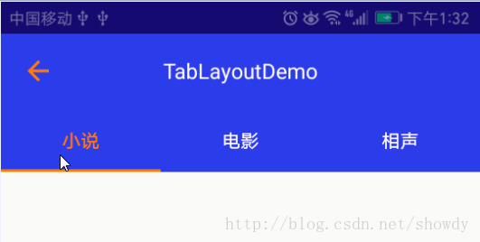
修改Indicator的长度:
从TabLayout的源码可以看出Indicator的绘制,是在其内部类SlidingTabStrip中绘制,而SlingTabStrip类继承LinearLayout,源码如下:
@Override
public void draw(Canvas canvas) {
super.draw(canvas);
// Thick colored underline below the current selection
if (mIndicatorLeft >= 0 && mIndicatorRight > mIndicatorLeft) {
canvas.drawRect(mIndicatorLeft, getHeight() - mSelectedIndicatorHeight,
mIndicatorRight, getHeight(), mSelectedIndicatorPaint);
}
}
在onDraw()中主要是就绘制一个Rect,并且宽度是根据mIndicatorLeft和mIndicatorRight设置的,而mIndicatorLeft等的宽度来自SlidingTabStrip的child,而Child就相当于一个Tab,这样我们就通过修改Child的margin来设置mIndicatorLeft的值.
public void setIndicator(TabLayout tabs, int leftDip, int rightDip) {
Class> tabLayout = tabs.getClass();
Field tabStrip = null;
try {
tabStrip = tabLayout.getDeclaredField("mTabStrip");
} catch (NoSuchFieldException e) {
e.printStackTrace();
}
tabStrip.setAccessible(true);
LinearLayout llTab = null;
try {
llTab = (LinearLayout) tabStrip.get(tabs);
} catch (IllegalAccessException e) {
e.printStackTrace();
}
int left = (int) TypedValue.applyDimension(TypedValue.COMPLEX_UNIT_DIP, leftDip, Resources.getSystem().getDisplayMetrics());
int right = (int) TypedValue.applyDimension(TypedValue.COMPLEX_UNIT_DIP, rightDip, Resources.getSystem().getDisplayMetrics());
for (int i = 0; i < llTab.getChildCount(); i++) {
View child = llTab.getChildAt(i);
child.setPadding(0, 0, 0, 0);
LinearLayout.LayoutParams params = new LinearLayout.LayoutParams(0, LinearLayout.LayoutParams.MATCH_PARENT, 1);
params.leftMargin = left;
params.rightMargin = right;
child.setLayoutParams(params);
child.invalidate();
}
}
然后在代码中调用即可,但是要注意,必须要在Tablayout渲染出来后调用,我们可以选择view.post()方法来实现:
tabLayout.post(new Runnable() {
@Override
public void run() {
setIndicator(tabLayout, 20, 20);
}
});
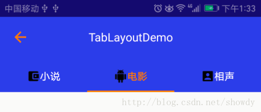
最后得到效果图如下:
自定义TabLayout的TabItem及TabItem的点击事件
在TabLayout的Api是没有提供TabItem点击事件的方法,如果我们想实现如下效果图,怎么办?
先自定义一个TabItem:
android:layout_width="match_parent"
android:layout_height="match_parent"
android:gravity="center"
android:orientation="horizontal">
android:id="@+id/txt_title"
android:layout_width="wrap_content"
android:layout_height="wrap_content"
android:gravity="center"
android:textSize="14sp" />
android:id="@+id/img_title"
android:src="@drawable/indicator"
android:layout_width="wrap_content"
android:layout_height="wrap_content"
android:layout_marginLeft="5dp" />
在自定义的Adapter中可以定义一个getTabView的方法:
public View getTabView(int position){
View view = LayoutInflater.from(context).inflate(R.layout.tab_item, null);
TextView tv= (TextView) view.findViewById(R.id.textView);
tv.setText(tabTitles[position]);
ImageView img = (ImageView) view.findViewById(R.id.imageView);
img.setImageResource(imageResId[position]);
return view;
}
重新设置点击事件:
viewPager.setAdapter(pagerAdapter);
tabLayout.setupWithViewPager(viewPager);
for (int i = 0; i < tabLayout.getTabCount(); i++) {
TabLayout.Tab tab = tabLayout.getTabAt(i);
if (tab != null) {
tab.setCustomView(pagerAdapter.getTabView(i));
if (tab.getCustomView() != null) {
View tabView = (View) tab.getCustomView().getParent();
tabView.setTag(i);
tabView.setOnClickListener(mTabOnClickListener);
}
}
}
viewPager.setCurrentItem(1);
以上所述是小编给大家介绍的TabLayout用法详解及自定义样式,希望对大家有所帮助,如果大家有任何疑问请给我留言,小编会及时回复大家的。在此也非常感谢大家对脚本之家网站的支持!


 扫一扫
扫一扫


 5063
5063

 被折叠的 条评论
为什么被折叠?
被折叠的 条评论
为什么被折叠?
 到【灌水乐园】发言


