


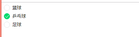
 本文介绍如何使用CSS3来定制HTML中的checkbox样式,包括创建圆形边框、过渡效果以及勾选状态的变化,使网页表单更加美观和交互友好。
原文章:通过css3实现checkbox选择样式 https://www.imooc.com/article/15815
<!DOCTYPE html>
<html>
<head>
    <meta charset="utf-8">
    <meta http-equiv="X-UA-Compatible" content="IE=edge,chrome=1">
    <title>Examples</title>
    <meta content="width=device-width, initial-scale=1.0, minimum-scale=1.0, maximum-scale=1.0,user-scalable=no" name="viewport"/>
    <meta name="description" content="">
    <meta name="keywords" content="">
    <link href="" rel="stylesheet">
</head>
<style>

    .checkbox {
        position: relative;
        height: 30px;
    }
    .checkbox input[type='checkbox'] {
        position: absolute;
        left: 0;
        top: 0;
        width: 20px;
        height: 20px;
        opacity: 0;
    }
    .checkbox label {
        position: absolute;
        left: 30px;
        top: 0;
        height: 20px;
        line-height: 20px;
    }
    .checkbox label:before {
        content: '';
        position: absolute;
        left: -30px;
        top: 0;
        width: 20px;
        height: 20px;
        border: 1px solid #ddd;
        border-radius: 50%;
        transition: all 0.3s ease;
        -webkit-transition: all 0.3s ease;
        -moz-transition: all 0.3s ease;
    }

    .checkbox label:after {
        content: '';
        position: absolute;
        left: -22px;
        top: 3px;
        width: 6px;
        height: 12px;
        border: 0;
        border-right: 1px solid #fff;
        border-bottom: 1px solid #fff;
        background: #fff;
        transform: rotate(45deg);
        -webkit-transform: rotate(45deg);
        -moz-transform: rotate(45deg);
        -ms-transform: rotate(45deg);
        transition: all 0.3s ease;
        -webkit-transition: all 0.3s ease;
        -moz-transition: all 0.3s ease;
    }

    .checkbox input[type='checkbox']:checked + label:before {
        background: #4cd764;
        border-color: #4cd764;
    }

    .checkbox input[type='checkbox']:checked + label:after {
        background: #4cd764;
    }
</style>
<body>
<div class='checkbox'>
    <input type='checkbox' id='checkbox1' name='checkboox[]'>
    <label for='checkbox1'>篮球</label>
</div>
<div class='checkbox'>
    <input type='checkbox' id='checkbox2' name='checkboox[]'>
    <label for='checkbox2'>乒乓球</label>
</div>
<div class='checkbox'>
    <input type='checkbox' id='checkbox3' name='checkboox[]' checked>
    <label for='checkbox3'>足球</label>
</div>

</body>
</html>


 扫一扫
扫一扫


 736
736

 被折叠的 条评论
为什么被折叠?
被折叠的 条评论
为什么被折叠?
 到【灌水乐园】发言


