


 本文详细探讨了在Chrome浏览器中clientHeight, offsetHeight, scrollHeight的含义及差异,并通过测试得出结论。clientHeight表示可见高度,不包括border和margin;offsetHeight包含padding和border;scrollHeight则表示元素的全部高度,包括隐藏部分。同时,文章介绍了如何获取当前网页窗口和文档的高度,以及屏幕分辨率和可用工作区高度的区别。"
132849738,19669826,粒子群算法优化综合能源系统设计,"['算法', '能源', '优化', 'MATLAB']
本文详细探讨了在Chrome浏览器中clientHeight, offsetHeight, scrollHeight的含义及差异,并通过测试得出结论。clientHeight表示可见高度,不包括border和margin;offsetHeight包含padding和border;scrollHeight则表示元素的全部高度,包括隐藏部分。同时,文章介绍了如何获取当前网页窗口和文档的高度,以及屏幕分辨率和可用工作区高度的区别。"
132849738,19669826,粒子群算法优化综合能源系统设计,"['算法', '能源', '优化', 'MATLAB']
【基本概念】clientHeight / offsetHeight / scrollHeight / window.screen.height / window.screen.availHeight
参考博客:
https://blog.youkuaiyun.com/qq_35430000/article/details/80277587
https://www.cnblogs.com/chuaWeb/p/html_css_1.html
以下测试和结论均基于Chrome浏览器 86.0.4240.198 (正式版本) (x86_64)
首先从字面意思上来看,
- clientHeight 的意思是 可见高度(包括padding,但不包括border、水平滚动条、margin的元素的高度),inline元素的clientHeight 为 0。
- offseHeight 的意思是 可见高度 (包括padding、border、水平滚动条,但不包括margin的元素的高度)
- scrollHeight 的意思是 滚动部分的全部高度(包括可见高度和被隐藏高度)
测试
下面用一个简单的例子测试一下(基于Chrome浏览器),读者可以自己运行试一下。
<!DOCTYPE html>
<html lang="en">
<head>
<meta charset="UTF-8">
<meta name="viewport" content="width=device-width, initial-scale=1.0">
<title>Document</title>
<style type="text/css">
html,body, div, dl, dt, dd, ul, ol, li, h1, h2, h3, h4, h5, h6, pre, code, form, fieldset, legend, input, button, textarea, p, blockquote, th, td{
margin: 0;
padding:0;
}
body{
margin: 20px auto;
}
#absolute{
position: absolute;
margin-left: 300px;
height: 500px;
width: 500px;
background: #ff0;
}
#normal{
height: 300px;
width: 300px;
background: #f00;
}
</style>
</head>
<body>
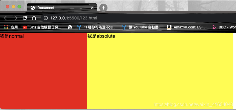
<div id='absolute' >我是absolute</div>
<div id="normal">我是normal</div>
<span id="inline">我是行内元素</span>
<script type="text/javascript">
function show(){
console.log(document.documentElement.tagName); // HTML
console.log('--------关于网页窗口大小-------');
console.log("window height " + document.documentElement.clientHeight)
console.log("document height " + document.documentElement.scrollHeight)
console.log("html height " + document.documentElement.offsetHeight)
console.log("body height " + document.querySelector('body').clientHeight)
console.log("body height " + document.querySelector('body').offsetHeight)
console.log("屏幕分辨率的高" + window.screen.height)
console.log("屏幕分辨率的宽" + window.screen.width)
console.log("屏幕可用工作区高度" + window.screen.availHeight)
console.log("屏幕可用工作区宽度" + window.screen.availWidth)
console.log('--------普通块元素-------');
console.log(document.querySelector('#normal').clientHeight)
console.log(document.querySelector('#normal').offsetHeight)
console.log(document.querySelector('#normal').scrollHeight)
console.log('--------绝对定位元素-------');
console.log(document.querySelector('#absolute').clientHeight)
console.log(document.querySelector('#absolute').offsetHeight)
console.log(document.querySelector('#normal').scrollHeight)
console.log('--------行内元素-------');
console.log(document.querySelector('#inline').clientHeight)
console.log(document.querySelector('#inline').offsetHeight)
console.log(document.querySelector('#inline').scrollHeight)
}
</script>
</body>
</html>
结果讨论
document.documentElement === document.querySelector('body')。
document.documentElement 表示 DOM 树中的根元素,而这个元素就是html。
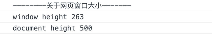
详见https://blog.youkuaiyun.com/weixin_41604040/article/details/110476653- 当前网页窗口的高度 可以用
document.documentElement.clientHeight来获取,即html元素的可见高度,它会随着浏览器的缩放而缩放;而文档的高度 可以用document.documentElement.scrollHeight来获取,它与浏览器缩放无关。
这个时候的窗口高度就是263px,而文档高度则被最高的元素(即使它脱离了文档流)撑开,一直是500px。
- 正常文档流的真实高度:即不包含脱离文档流的元素的文档高度,与缩放无关,这个可以用下面三个来表示:
      console.log("html height " + document.documentElement.offsetHeight)
      console.log("body height " + document.querySelector('body').clientHeight)
      console.log("body height " + document.querySelector('body').offsetHeight)
但需要注意的是,如果body元素有margin(就像这个例子里写的20px的margin),则 document.documentElement.offsetHeight = document.querySelector(‘body’).offsetHeight + margin
- 屏幕分辨率和可用工作区高度
      console.log("屏幕分辨率的高" + window.screen.height)
      console.log("屏幕分辨率的宽" + window.screen.width)
      console.log("屏幕可用工作区高度" + window.screen.availHeight)
      console.log("屏幕可用工作区宽度" + window.screen.availWidth)
在macbookPro 13英寸的屏幕上,开启缩放模式:
得到的结果:

但实际上,这块屏幕的分辨率是2880*1800的,得到的结果缩小了一倍数。这是因为这块屏幕的ppi比较高,在移动设备上也会出现类似的情景。可用工作区的高度比分辨率高度少的那一部分就是这个栏:

如果把浏览器全屏,那么这两个高度就是一样的了。
在dell p2217h的扩展屏幕上,开启缩放模式,结果如下:

看起来比mac分辨率还要高?其实只是因为这个扩展屏的物理尺寸比13寸的mac大而已。
- 不同类型的元素的高度
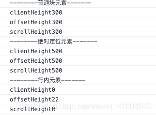
可以看到,比较特殊的是inline元素的clientHeight和scrollHeight都是0,而offsetHeight 却是真实的高度。


 扫一扫
扫一扫


 17万+
17万+

 被折叠的 条评论
为什么被折叠?
被折叠的 条评论
为什么被折叠?
 到【灌水乐园】发言


