


 本文深入探讨移动端布局基础,包括视口设置、二倍图应用、背景缩放技巧及CSS3盒子模型,并逐步讲解流式布局、Flex弹性盒子与REM适配方案,辅以实战案例,如携程首页与苏宁易购项目。
目录
3.justify-content:设置主轴上子元素排列方式
5.align-items设置侧轴上的子元素的排列方式(单行)
6.align-content:设置侧轴子元素排列方式(多行)
9.flex-self:控制子项自己在侧轴排列方式(属性与flex-items相同),order:设置单个子元素的排列位置,这两个属性都是可以控制单个子元素的
9.rem适配方案2(flexbie.js+rem(cssrem))
一、移动端基础
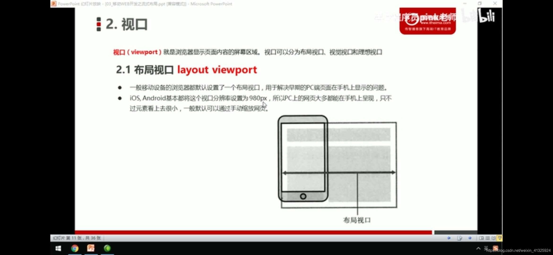
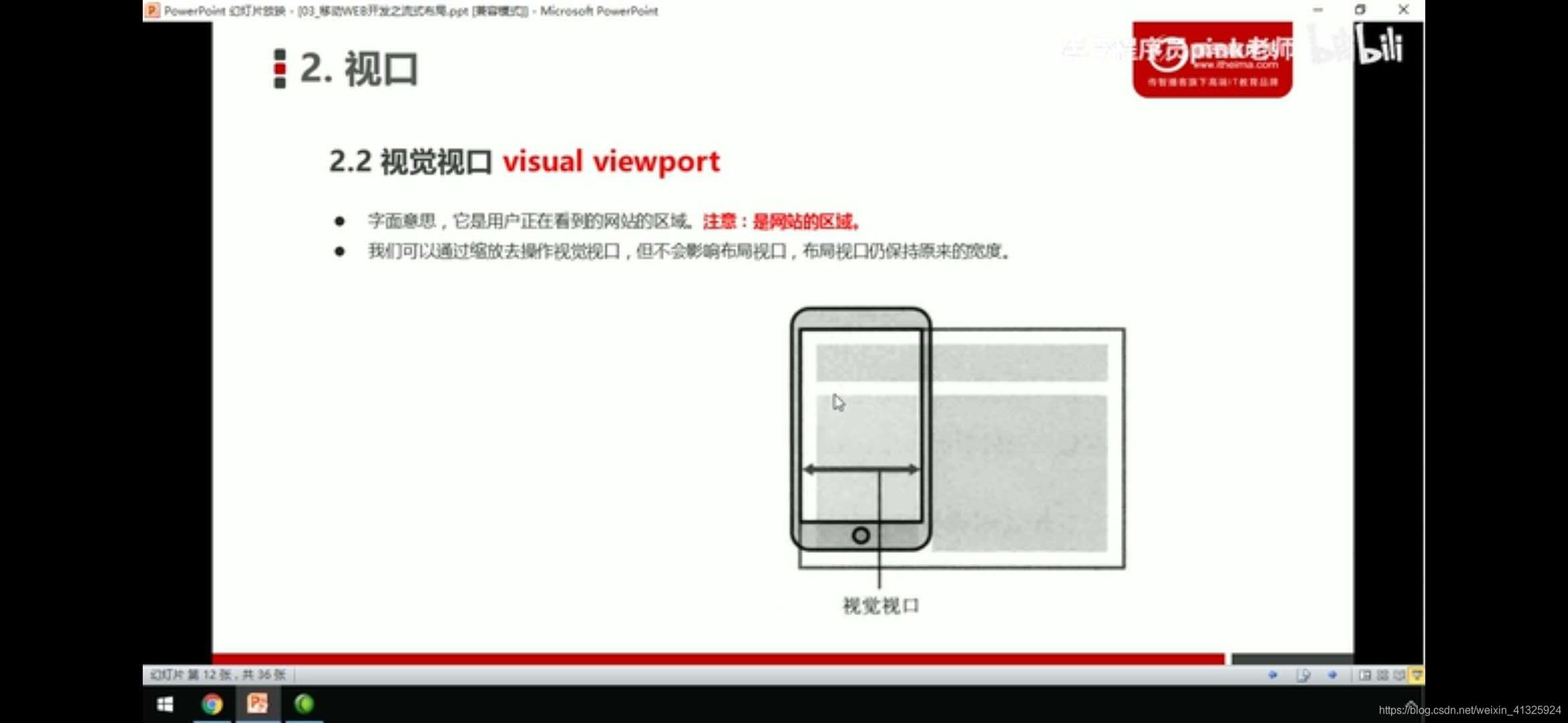
1.视口
2.meta视口标签
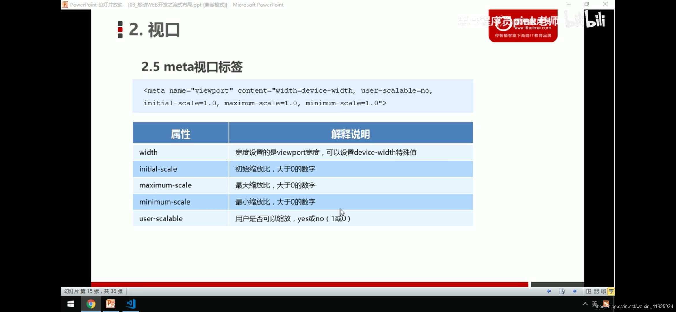
<meta name="viewport" content="with=device-width,user-scalabel=no,initial-scale=1.0,maximum-scale=1.0,minimun-scale=1.0">3.二倍图做法
<style>
img:first-child{width: 50px;height: 50px;}
	/*我们需要一个50*50像素(css像素)的图片 直接放到我们的iphone8里面放大2倍 100*100就会模糊*/
	/*我们采取的是放一个100*100的图片 然后手动的把这个图片 缩小为50*50(css像素)*/
	/*我们准备的图片 比我们实际需要的大小大2倍,这种方式就是2倍图*/
	img:nth-child(2){width: 50px;height: 50px;}
</style>
</head>
<body>
	<!--模糊的-->
	<img src="images/apple50(1).jpg" alt="">
	<!--2倍图-->
	<img src="images/apple100.jpg" alt="">
</body>
4.背景缩放background-size
background-size:背景高度 背景宽度
单位: 长度|百分比|cover|contain
cover: 把背景图像扩展至足够大,使背景图像完全覆盖背景区域
contain: 把图像扩展至最大尺寸,使其宽度和高度完全适应内容区域
<style>
div{
	width: 500px;height: 200px;
	border: 2px solid #c00;
	background: url(images/dog.jpg) no-repeat;
	/*background-size: 图片的宽度 图片的高度*/
	/*background-size:500px 200px;*/
	/*1.只写一个参数 肯定是宽度 高度省略了 会等比例缩放*/
	/*background-size:500px;*/
	/*2.里面的单位可以跟% 相对于父盒子来说的*/
	/*background-size: 50%;*/
	/*3.cover要完全覆盖div盒子 可能有部分背景图片显示不全*/
	/*background-size: cover;*/
	/*4.contain高度和宽度等比例拉伸 当宽度或者高度铺满div盒子就不再进行拉伸了 可能有部分空白区域*/
	background-size: contain;
	}
</style>
5.背景图片2倍图
/*1.我们有一个50*50的盒子需要一个背景图片,但是根据分析这个还是要准备2倍 100*100*/
/*2.我们需要把这个图片缩放一把,也就是50*50 background-size*/
div{
	width: 50px;
	height: 50px;
	border:1px solid pink;
	background: url(images/apple100.jpg) no-repeat;
	background-size: 50px 50px;
}
<div></div>
6.css3盒子模型
div:nth-child(1){
	/*传统盒子模型= width +border + padding*/
	width: 200px;
	height: 200px;
	background: skyblue;
	padding:10px;
	border: 1px solid #c00;
}
div:last-child{
	/*有了这句话就让盒子变成css3盒子模型*/
	/*padding和border不会再撑大盒子了*/
	box-sizing:border-box;
	width: 200px;
	height: 200px;
	background: purple;
	padding: 10px;
	border: 1px solid #c00;
}
</style>
</head>
<body>
	<div></div>
	<div></div>
</body>
7.移动端特殊样式
css3盒子模型:box-sizing:border-box
-webkit-box-sizing:border-box
-ms-box-sizing:border-box
-moz-box-sizing:border-box
-o-box-sizing:border-box
点击高亮我们需要清除 设置为transparent 完成透明
-webkit-tap-highlight-color:transparent
在移动端浏览器默认的外观在ios上加上这个属性才能给按钮和输入框自定义样式
-webkit-appearance:none;
禁用长按页面时的弹出菜单
img,a{-webkit-touch-callout:none;}
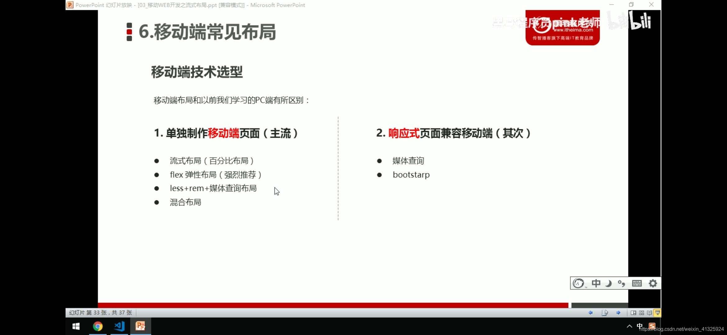
二、移动端的常见布局
三、流式布局(百分比布局)
max-width:最大宽度(max-hieght:最大高度)
min-width:最小宽度(min-height:最小高度)
1.流式布局示例
*{margin: 0;padding: 0;}
section{width: 100%;max-width: 980px;min-height: 320px;margin: 0 auto;}
section div{width: 50%;float:left;height: 400px;}
section div:nth-child(1){background: pink;}
section div:last-child{background: blue;}
</style>
</head>
<body>
<section>
	<div></div>
	<div></div>
</section>
2.京东首页流式布局案例
body{
	width: 100%;
	max-width: 640px;
	min-width: 320px;
	margin:0 auto;
	font-size: 14px;
	font-family:-apple-system,Helvetica,sans-serif;
	color: #666;
	line-height: 1.5;
}
/*点击高亮我们需要清除清除  设置为transparent 完成透明*/

* {
    -webkit-tap-highlight-color: transparent;
}


/*在移动端浏览器默认的外观在iOS上加上这个属性才能给按钮和输入框自定义样式*/

input {
    -webkit-appearance: none;
}


/*禁用长按页面时的弹出菜单*/

img,
a {
    -webkit-touch-callout: none;
}

img{vertical-align:middle;}
ul{
	margin: 0;
	padding: 0;
	height: 45px;
	background: #333;
}
li{
	list-style: none;
}
.app{
	height: 45px;
}
.app ul li{
	float: left;
	height: 45px;
	line-height: 45px;
	color: #fff;
	text-align: center;
}
.app ul li:hover{cursor: position;}
.app ul li:nth-child(1)
{
	width: 8%;
}
.app ul li:nth-child(1) img{
	width: 10px;
}
.app ul li:nth-child(2)
{
	width: 10%;
}
.app ul li:nth-child(2) img
{
	width: 30px;
	vertical-align: middle;
}
.app ul li:nth-child(3)
{
	width: 57%;
}
.app ul li:nth-child(4)
{
	width: 25%;
	background: #f63515;
}
.search_swap{position: fixed;z-index: 1;height: 44px;overflow: hidden;max-width: 640px;min-width: 320px;width: 100%;}
.search_swap .search_left{position: absolute;left: 0;top: 0; width: 40px;height: 44px;}
.search_swap .search_left::after{content:'';background: url(../images/s-btn.png);width: 20px;height: 15px;display: inline-block;background-size: 20px 15px;margin: 15px 0 0 10px;}
.search_swap .search{height: 30px;background: #fff;margin: 7px 50px 0;border-radius: 15px;position: relative;}
.search .search_btn{content:'';background: url(../images/jd.png);width: 20px;height: 15px;background-size: 20px 15px;display: inline-block;position: absolute;top: 8px;left: 15px;}
.search .search_btn::after{content:'';width: 1px;height: 15px;background: #ccc;display: inline-block;left: 30px;position: absolute;}
.search .sou{background: url(../images/jd-sprites.png) -81px 0;width: 18px;height: 15px;position: absolute;left: 55px;top: 8px;background-size: 200px auto;}
.search_swap .search_login{position: absolute;right: 0;top: 0; width: 40px;height: 44px;color: #fff;line-height: 44px;text-align: center;margin-right: 5px;}
.search input{float: left;width: 80%;border: 0;height: 25px;margin: 2px 15px 0 85px;}
.main_content{}
.main_content .sider{position: relative;}
.main_content .sider img{width: 100%;position: relative;}
.nav_icon{position: absolute;height: auto;bottom: 20px;text-align: center;left: 43%;background: transparent;}
.nav_icon li{width: 10px;height: 10px;border: 1px solid #fff;float: left;margin: 0 5px;border-radius: 5px;}
.nav_icon .active,.nav_icon li:hover{background: #c00;cursor: pointer;}
.sbanner{overflow: hidden;}
.sbanner div{width: 33.33%;float: left;}
.sbanner div img{width: 100%;}
nav{clear: both;padding-top: 5px;overflow: hidden;}
nav a{width: 20%;float: left;display: block;text-align: center;}
nav a span{display: block;}
nav a img{width: 40px;margin: 10px 0;}
.news{margin: 20px 0 10px;overflow: hidden;}
.news a{width: 50%;float: left;box-sizing: border-box;}
.news a img{width: 100%;}
.news a:nth-child(n+2){width: 25%;border-left: 1px solid #ccc;}
<!DOCTYPE html>
<html lang="en">
<head>
<meta charset="UTF-8">
<meta name="viewport" content="width=device-width, initial-scale=1.0, user-scalable=no,maximum-scale=1.0,minimum-scale=1.0">
<meta http-equiv="X-UA-Compatible" content="ie=edge">
<!-- 引入我们的css初始化文件 -->
<link rel="stylesheet" href="css/normalize.css">
<!-- 引入我们首页的css -->
<link rel="stylesheet" href="css/index.css">
<title>www.m.jd.com</title>
</head>
<body>
<header class="app">
<ul>
<li>
<img src="images/close.png"/>
</li>
<li>
<img src="images/logo.png"/>
</li>
<li>打开京东App,购物更轻松</li>
<li>立即打开</li>
</ul>
</header>
<div class="search_swap" id="search_swap">
<div class="search_left"></div>
<div class="search">
<div class="search_btn"></div>
<div class="sou"></div>
<input type="text" />
</div>
<div class="search_login">登录</div>
</div>
<div class="main_content">
<div class="sider">
<img src="upload/banner.dpg"/>
<ul class="nav_icon">
<li class="active"></li>
<li></li>
<li></li>
<li></li>
<li></li>
</ul>
</div>
<div class="sbanner">
<div>
<a>
<img src="upload/pic11.dpg"/>
</a>
</div>
<div>
<a>
<img src="upload/pic22.dpg"/>
</a>
</div>
<div>
<a>
<img src="upload/pic33.dpg"/>
</a>
</div>
</div>
</div>
<nav>
<a>
<img src="upload/nav2.webp"/>
<span>jd超市</span>
</a>
<a>
<img src="upload/nav1.webp"/>
<span>jd超市</span>
</a>
<a>
<img src="upload/nav2.webp"/>
<span>jd超市</span>
</a>
<a>
<img src="upload/nav2.webp"/>
<span>jd超市</span>
</a>
<a>
<img src="upload/nav2.webp"/>
<span>jd超市</span>
</a>
<a>
<img src="upload/nav2.webp"/>
<span>jd超市</span>
</a>
<a>
<img src="upload/nav2.webp"/>
<span>jd超市</span>
</a>
<a>
<img src="upload/nav2.webp"/>
<span>jd超市</span>
</a>
<a>
<img src="upload/nav3.webp"/>
<span>jd超市</span>
</a>
<a>
<img src="upload/nav2.webp"/>
<span>jd超市</span>
</a>
</nav>
<div class="news">
<a><img src="upload/new1.dpg"/></a>
<a><img src="upload/new2.dpg"/></a>
<a><img src="upload/new3.dpg"/></a>
</div>
<script type="text/javascript">
window.onload=function(){
window.onscroll = function() {
var scrollTop = document.documentElement.scrollTop || document.body.scrollTop;
if(scrollTop>40)
{
document.getElementById('search_swap').style.setProperty('top', 0);
document.getElementById('search_swap').style.setProperty('background','#c82519');
}
else{
document.getElementById('search_swap').style.setProperty('top','45px');
}
}
}
</script>
</body>
</html>四、flex弹性盒子布局
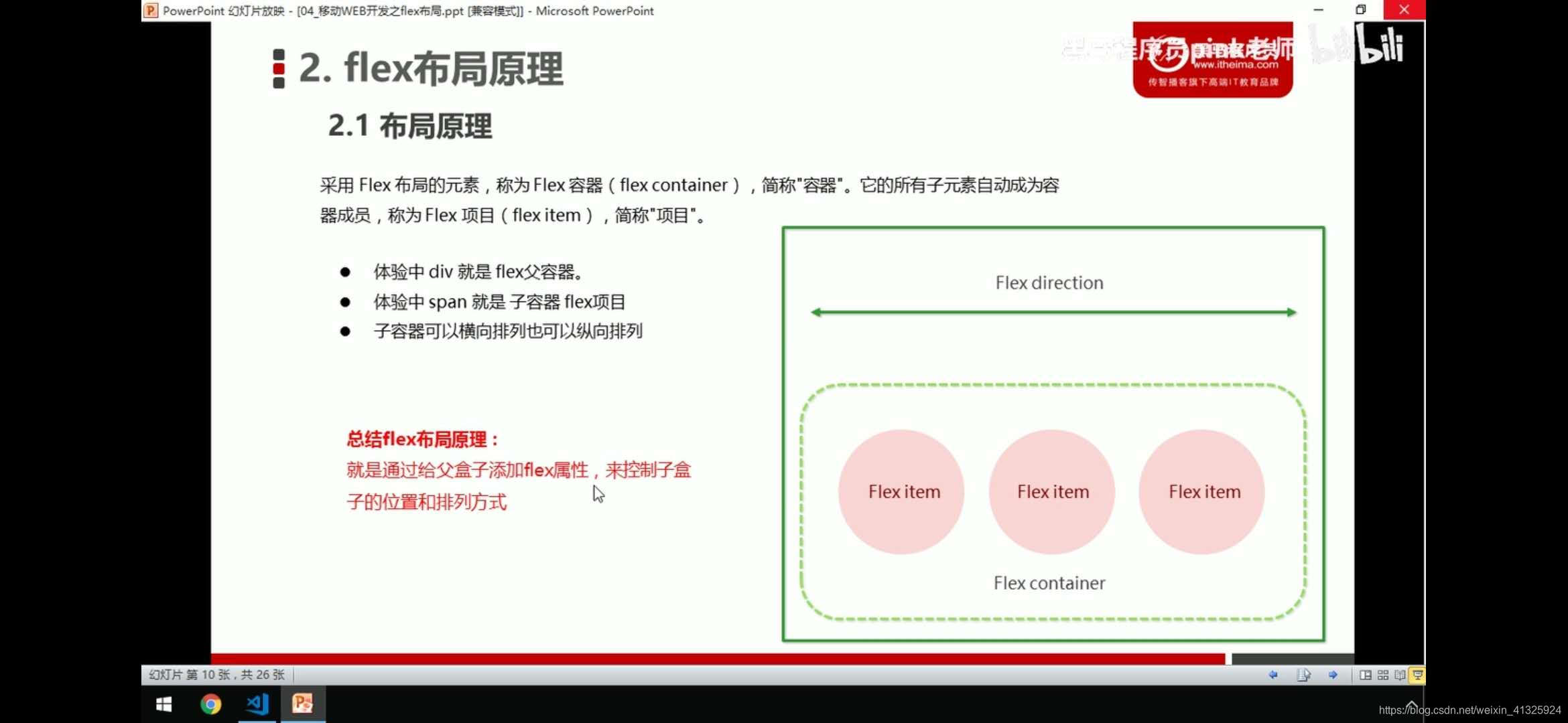
1.flex布局体验
div{display: flex;width: 60%;height:300px;background: pink;/*! justify-content:center; */}
span{height: 100px;background: skyblue;margin:0 50px;flex:1;width: 47px;}
<body>
	<div>
		<span></span>
		<span></span>
		<span></span>
	</div>
</body>
这种布局方式小小的震撼到了我,get到了一种新技能
父盒子设为flex布局以后,子元素的float,clear,vertical-align属性将失效
通过给父盒子添加flex属性,来控制子盒子的位置和排列方式
2.flex-direction设置主轴的方向
flex-direction:row
row:默认值从左到右
row-reverse:从右到左
column:从上到下
column-reverse:从下到上
<style>
/*div{display: flex;width: 60%;height:300px;background: pink;}
span{height: 100px;background: skyblue;margin:0 50px;flex:1;width: 47px;}*/
div{display: flex;
	width: 800px;
	height: 300px;
	background: #c00;
	/*默认的主轴是x轴 行row 那么y轴就是侧轴*/
	/*我们的元素是跟着主轴来排列的*/
	/*flex-direction:row;*/
	/*简单了解下翻转*/
	/*flex-direction:row-reverse;*/
	/*我们可以把我们的主轴设置为y轴,那么y轴距成了侧轴*/
	flex-direction:column;
	/*flex-direction:column-reverse;*/
}
div span{
	width: 150px;
	height: 100px;
	background: skyblue;
}
div span:nth-child(2){order:-1;}
div span:nth-child(3){order:-2;}
</style>
</head>
<body>
	<div>
		<span>1</span>
		<span>2</span>
		<span>3</span>
		<span>4</span>
	</div>
</body>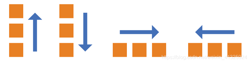
3.justify-content:设置主轴上子元素排列方式
flex-start:(默认)左→右 1→4
flex-end:左←右 4←1
center:居中对齐
space-around:平分剩余空间
space-between:先两边贴边,再平分剩余
x轴
div{
	display: flex;
	width: 800px;
	height: 300px;
	background: pink;
	/*默认的主轴是x轴 row*/
	flex-direction:row;
	/*justify-content:是设置主轴上子元素的排列方式*/
	/*justify-content:flex-start;*/
	/*justify-content:flex-end;*/
	/*子元素居中对齐*/
	/*justify-content:center;*/
	/*平分剩余空间*/
	/*justify-content:space-around;*/
	/*先两边贴边,再平分剩余空间*/
	justify-content:space-between;
}
div span{
	width: 150px;
	height: 100px;
	background: skyblue;
}
<body>
	<div>
		<span>1</span>
		<span>2</span>
		<span>3</span>
		<span>4</span>
	</div>
</body>
</html>
y轴
div{
	display: flex;
	width: 800px;
	height: 500px;
	background: #c00;
	flex-direction:column;
	/*justify-content:flex-start;*/
	/*justify-content:flex-end;*/
	/*justify-content:center;*/
	/*justify-content:space-around;*/
	justify-content:space-between;
}
div span{
	width: 150px;
	height: 100px;
	background: skyblue;
}
<body>
	<div>
		<span>1</span>
		<span>2</span>
		<span>3</span>
		<span>4</span>
	</div>
</body>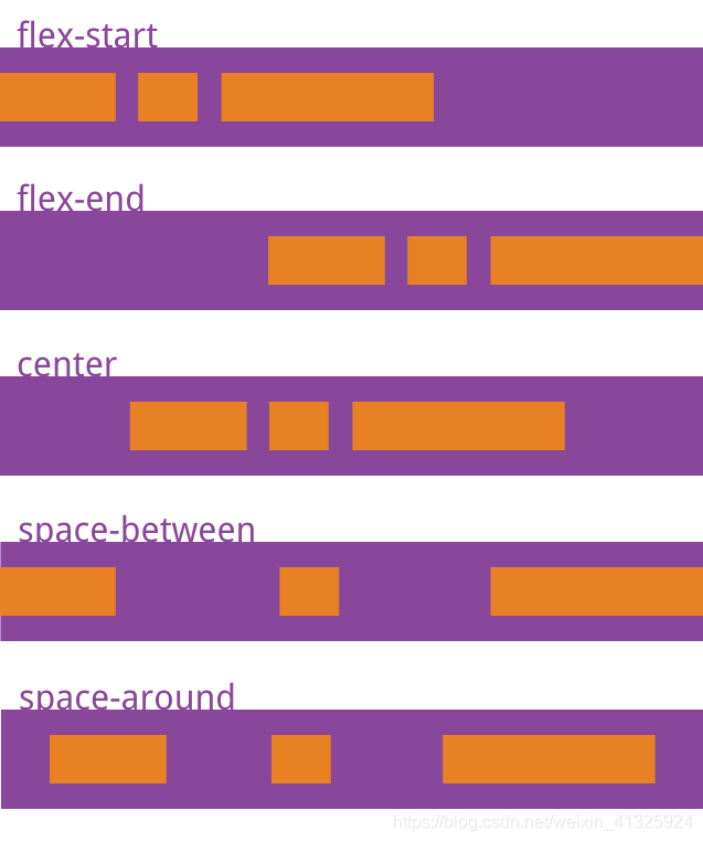
4.flex-wrap:设置子元素是否换行
nowrap:(默认)不换行
wrap:换行
div{
	display: flex;
	width: 800px;
	height: 500px;
	background: #c00;
	/*flex-direction:column;*/
	/*justify-content:flex-start;*/
	/*justify-content:flex-end;*/
	/*justify-content:center;*/
	/*justify-content:space-around;*/
	justify-content:space-between;
	flex-wrap: wrap;
}
div span{
	width: 150px;
	height: 100px;
	background: skyblue;
}
<body>
	<div>
		<span>1</span>
		<span>2</span>
		<span>3</span>
		<span>4</span>
		<span>5</span>
		<span>6</span>
		<span>7</span>
	</div>
</body>
5.align-items设置侧轴上的子元素的排列方式(单行)
flex-start:从上到下
flex-end:从下到上
center:挤在一起居中,垂直居中
stretch:拉伸(默认值) 子元素不能设高度
baseline: 项目的第一行文字的基线对齐。
div{
	display: flex;
	width: 600px;
	height: 400px;
	background: #c00;
	/*默认的主轴是x轴 row*/
	/*justify-content:center;*/
	/*我们需要一个侧轴居中*/
	/*拉伸,但是子盒子不要给高度*/
	/*align-items:stretch;*/
	/*align-items:center;*/
	/*align-items:flex-start;*/
	align-items:flex-end;
        align-items:baseline;
}
div span{
	width: 150px;
	height: 100px;
	background: skyblue;
	color: #fff;
	margin:  0 10px;
}
<body>
	<div>
		<span>1</span>
		<span>2</span>
		<span>3</span>
		<span>4</span>
	</div>
</body>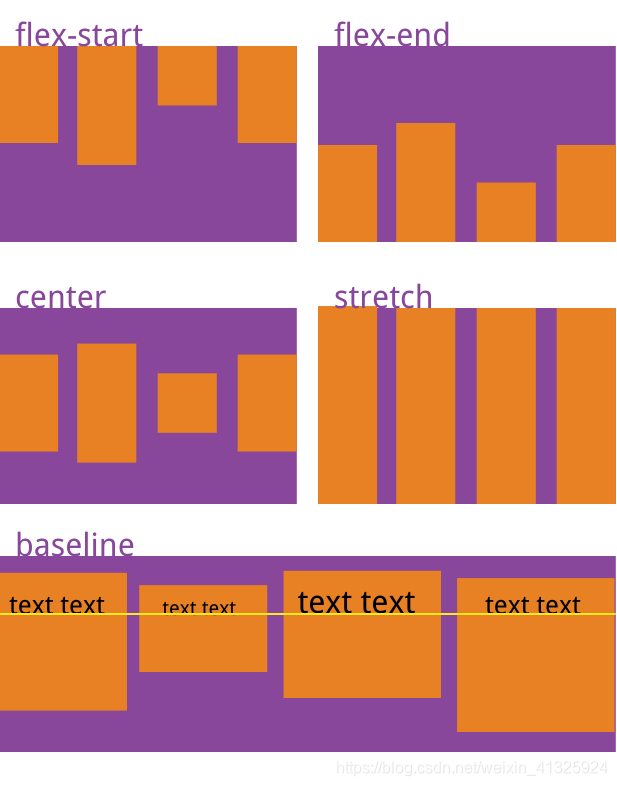
6.align-content:设置侧轴子元素排列方式(多行)
只能用于子项出现换行的情况(多行),在单行下是没有效果的
flex-start:(默认值)在侧轴的头部开始排列
flex-end:在侧轴的尾部开始排列
center:在侧轴中间显示
space-around:子项在侧轴平分剩余空间
space-between:子项在侧轴先分布在两头,再平分剩余空间
stretch:设置子项元素高度平分父元素高度
div{
	display: flex;
	background: pink;
	width: 800px;
	height:400px;
	/*换行*/
	flex-wrap:wrap;
	/*因为有了换行,此时我们侧轴上控制子元素的对齐方式我们用align-content*/
	/*align-content:flex-start;*/
	/*align-content:flex-end;*/
	/*align-content:center;*/
	/*align-content:space-around;*//*平分剩余空间*/
	/*align-content:space-between;*//*先两边贴边,再平分剩余空间*/
	align-content:stretch;
}
div span{
	width: 150px;
	/*height: 100px;*/
	background: skyblue;
	color: #fff;
	margin:  0 10px;
}
<body>
	<div>
		<span>1</span>
		<span>2</span>
		<span>3</span>
		<span>4</span>
		<span>5</span>
		<span>6</span>
		<span>7</span>
	</div>
</body>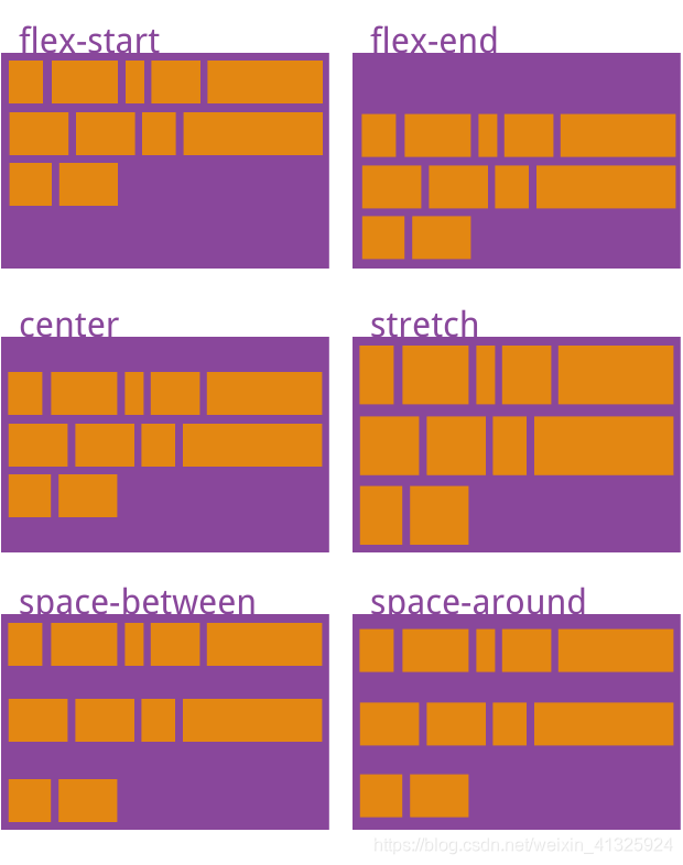
7.flex-flow:设置主轴方向和是否换行简写
flex-flow:colum wrap;
div{
	display: flex;
	background: pink;
	width: 800px;
	height:400px;
	/*flex-direction:column;
	flex-wrap:wrap;*/
	/*把设置主轴方向和是否换行(换列)简写*/
	flex-flow:column wrap;
}
div span{
	width: 150px;
	height: 100px;
	background: skyblue;
	color: #fff;
	margin:  0 10px;
}
<body>
	<div>
		<span>1</span>
		<span>2</span>
		<span>3</span>
		<span>4</span>
		<span>5</span>
		<span>6</span>
		<span>7</span>
	</div>
</body>
8.子项flex属性使用
flex:1(默认0)
(1)京东移动端的菜单搜索和登录
section{
	display: flex;
	justify-content:center;
	width: 60%;
	height: 150px;
	background: pink;
	margin:0 auto;
	align-items: center;
}
section > div:nth-child(1){
	width: 100px;
	height: 120px;
	background: yellow;
	/*! align-items:center; */
}
section > div:nth-child(2){
	flex:1;
	background: green;
	height: 120px;
}
section > div:nth-child(3){
	width: 100px;
	height: 120px;
	background: skyblue;
}

</style>
</head>
<body>

	<section>
		<div></div>
		<div></div>
		<div></div>
	</section>
</body>
(2)3等分,设置指定子元素宽度
p{
	display: flex;
	width: 60%;
	height: 200px;
	background: skyblue;
	margin: 100px auto;
}
p span{
	flex:1;
	background: #333;
}
p span:nth-child(2)
{
	flex:50%;
	background: #ddd;
}
<body>
	<p>
		<span>1</span>
		<span>2</span>
		<span>3</span>
	</p>
</body>
9.flex-self:控制子项自己在侧轴排列方式(属性与flex-items相同),order:设置单个子元素的排列位置,这两个属性都是可以控制单个子元素的
flex-self可覆盖flex-items属性
p span{
	width: 150px;
	height: 100px;
	background: #333;
	margin-right: 5px;
	color: #fff;
}
p span:nth-child(1){
	order:-1;
}
p span:nth-child(3)
{
	order:-2;
	align-self:flex-end;
}
<body>
	<section>
		<div></div>
		<div></div>
		<div></div>
	</section>
	<p>
		<span>1</span>
		<span>2</span>
		<span>3</span>
	</p>
</body>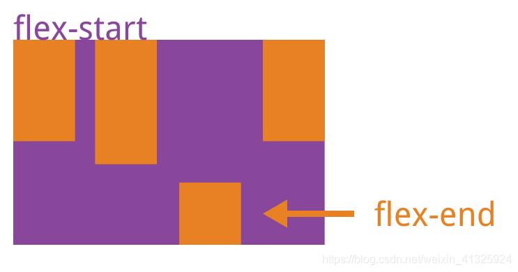
10.flex携程首页案例
css:
body {
    max-width: 540px;
    min-width: 320px;
    margin: 0 auto;
    font: normal 14px/1.5 Tahoma, "Lucida Grande", Verdana, "Microsoft Yahei", STXihei, hei;
    color: #000;
    background: #f2f2f2;
    overflow-x: hidden;
    -webkit-tap-highlight-color: transparent;
    box-sizing: border-box;
}

ul {
    list-style: none;
    margin: 0;
    padding: 0;
}

a {
    text-decoration: none;
    color: #222;
}

.search_index{
    position: fixed;
    display: flex;
    min-width: 320px;
    max-width: 540px;
    height: 44px;
    background: #f6f6f6;
    width: 100%;
    top: 0;
    left: 50%;
    transform: translateX(-50%);
    border-top:1px solid #ccc;
    border-bottom: 1px solid #ccc;
}
.search_index .search{
    position:relative;
    flex:1;
    height: 26px;
    line-height: 24px;
    font-size: 12px;
    color: #666;
    border: 1px solid #ccc;
    margin: 8px 10px;
    padding-left: 30px;
    border-radius: 5px;
    box-shadow:0 2px 4px rgba(0,0,0,.2);/*水平,垂直,模糊,透明度*/
}
.search_index .search::before{
    content:'';
    position: absolute;
    top:5px;
    left: 8px;
    width: 15px;
    height: 15px;
    background: url("../images/sprite.png") no-repeat -59px -279px;
    background-size: 104px auto;
}
.search_index .user{
    width: 44px;
    height: 44px;
    font-size: 12px;
    text-align: center;
    color: #2eaae0;
}
.search_index .user::before{
    content:'';
    display: block;
    width: 23px;
    height: 23px;
    background: url("../images/sprite.png") no-repeat -59px -194px;
    background-size: 104px auto;
    margin: 4px auto -2px;
}
.focus {
    padding-top:44px;
}
.focus img{
    width: 100%;
}
.local_nav{
    display: flex;
    height: 64px;
    background: #fff;
    margin: 3px 4px;
    border-radius: 8px;
    text-align: center;
}
.local_nav li{
    flex:1;
}
.local_nav a{
    display: flex;
    flex-direction:column;
    align-items:center;
    font-size: 12px;
}
.local_nav li [class^="local-nav-icon"]{
    width: 32px;
    height: 32px;
    background: blue;
    background: url("../images/localnav_bg.png") no-repeat 0 0;
    background-size: 32px auto;
    margin: 8px auto 3px;
}
.local_nav li .local-nav-icon-c2{
    background-position:0 -32px;
}
.local_nav li .local-nav-icon-c3{
    background-position:0 -64px;
}
.local_nav li .local-nav-icon-c4{
    background-position:0 -96px;
}
.local_nav li .local-nav-icon-c5{
    background-position:0 -128px;
}
.nav{
    overflow: hidden;
    border-radius: 8px;
    margin: 0 4px 3px;
}
.nav .nav_common{
    display: flex;
    /*background: orange;*/
    background: -webkit-linear-gradient(left,#6ccbc9,#56cd78,#6ad45a);
    height: 88px;
    text-align:center;
}
.nav .nav_common:first-child{
    /*背景渐变必须加上浏览器的私有前缀-webkit-*/
    background: -webkit-linear-gradient(left,#fa6d53,#fb8450,#ffcb4f);
}
.nav .nav_common:nth-child(2){
    /*背景渐变必须加上浏览器的私有前缀-webkit-*/
    background: -webkit-linear-gradient(left,#4d99ed,#72c0eb,#73c6eb);
}
.nav .nav_common .nav_items{
    display:flex;
    flex-direction:column;
    flex:1;
}
.nav .nav_common .nav_items:first-child a{
    border: 0;
    background: url("../images/hotel.png") no-repeat bottom center;
    background-size: 121px auto;
}
.nav_items a{
    flex:1;
    line-height: 44px;
    color: #fff;
    font-size: :14px;
    /*文字阴影(水平,垂直,透明度)*/
    text-shadow:1px 1px rgba(0,0,0,.8);
}
.nav_items a:first-child{
    border-bottom:1px solid #fff;
}
/*-n+2:选择前两个元素*/
.nav .nav_items:nth-child(-n+2)
{
    border-right: 1px solid #fff;
}
/*第二个元素加左右边框*/
/*.nav .nav_items:nth-child(2)
{
    border-left: 1px solid #fff;
    border-right: 1px solid #fff;
}*/
.nav .nav_common:nth-child(2)
{
    margin: 3px 0;
}
.subnav-entry{
    display: flex;
    flex-wrap:wrap;
    border-radius: 8px;
    background: #fff;
    margin: 0 4px;
    text-align: center;
    padding:5px 0;
}
.subnav-entry li{
    /*里面的盒子可以写%,相对于父级来说的*/
    flex:20%;
}
.subnav-entry a{
    display: flex;
    flex-direction:column;
    align-items:center;
}
.sybnav-entry-icon{
    width: 28px;
    height: 28px;
    margin-top:4px;
    background: url(../images/subnav-bg.png) no-repeat;
    background-size: 28px auto;
}
.subnav-entry li:nth-child(2) .sybnav-entry-icon{
    background-position:0 -28px;
}
.subnav-entry li:nth-child(3) .sybnav-entry-icon{
    background-position:0 -60px;
}
.sales_box{
    border-top:1px solid #bbb;
    background: #fff;
    margin: 4px;
}
.sales_hd{
    height: 44px;
    border-bottom: 1px solid #ccc;
    position: relative;
}
.sales_hd h2{
    position:relative;
    text-indent:-999px;
    overflow: :hidden;
}
.sales_hd h2::after{
    position: absolute;
    top:8px;
    left:8px;
    content: '';
    width: 79px;
    height: 15px;
    background: url("../images/hot.png") no-repeat 0 -20px;
    background-size: 79px auto;
}
.more{
    position: absolute;
    right: 10px;
    top: 0px;
    background: -webkit-linear-gradient(left,#FF506C,#FF6BC6);
    border-radius: 15px;
    padding:3px 20px 3px 10px;
    color: #fff;
}
.more::after{
    content:'';
    width: 7px;
    height: 7px;
    position: absolute;
    border-left: 2px solid #fff;
    border-top: 2px solid #fff;
    transform: rotate(135deg);
    top: 9px;
    right: 10px;
}
.row{display: flex;}
.row a{flex: 1;border-bottom: 1px solid #eee;display: inherit;}
.row a:first-child{
    border-right: 1px solid #eee;
}
.row a img{
   max-width: 100%;
}
.foot_nav{display: flex;border-top: 1px solid #ccc;border-bottom: 1px solid #ccc;background: #fff;padding-bottom: 7px;margin-top: 5px;}
.foot_nav li{flex: 1;}
.foot_nav a{display: flex;flex-direction: column;align-items: center;}
.foot_nav span{}
.foot_nav .icon{width: 32px;height: 32px;background: url("../images/localnav_bg.png") no-repeat 0 0;background-size: auto;background-size: 32px auto;margin: 8px auto 2px;}
Html:
<!DOCTYPE html>
<html lang="Zh-CN">
<head>
 <meta charset="UTF-8">
    <meta name="viewport" content="width=device-width, initial-scale=1.0">
    <meta http-equiv="X-UA-Compatible" content="ie=edge">
    <link rel="shortcut icon" href="images/ico.png"/>
    <link rel="stylesheet" href="css/normalize.css">
    <link rel="stylesheet" href="css/index.css">
    <title>携程在手,天下我有</title>
</head>
<body>
   <div class="search_index">
       <div class="search">搜索:目的地/酒店/景点/航班号</div>
       <a href="#" class="user">我 的</a>
   </div>
   <div class="focus">
       <img src="upload/focus.jpg" alt="焦点图"/>
   </div>
   <ul class="local_nav">
       <li>
           <a href="#" title="景点娱乐">
                <span class="local-nav-icon-c1"></span>
                <span>景点娱乐</span>
           </a>
       </li>
         <li>
           <a href="#" title="景点娱乐">
                <span class="local-nav-icon-c2"></span>
                <span>景点娱乐</span>
           </a>
       </li>
         <li>
           <a href="#" title="景点娱乐">
                <span class="local-nav-icon-c3"></span>
                <span>景点娱乐</span>
           </a>
       </li>
         <li>
           <a href="#" title="景点娱乐">
                <span class="local-nav-icon-c4"></span>
                <span>景点娱乐</span>
           </a>
       </li>
         <li>
           <a href="#" title="景点娱乐">
                <span class="local-nav-icon-c5"></span>
                <span>景点娱乐</span>
           </a>
       </li>
   </ul>
   <div class="nav">
       <div class="nav_common">
           <div class="nav_items">
               <a href="#">海外酒店</a>

           </div>
           <div class="nav_items">
               <a href="#">海外酒店</a>
               <a href="#">特价酒店</a>
           </div>
           <div class="nav_items">
               <a href="#">团购</a>
               <a href="#">民宿.客栈</a>
           </div>
       </div>
        <div class="nav_common">
           <div class="nav_items">
               <a href="#">海外酒店</a>

           </div>
           <div class="nav_items">
               <a href="#">海外酒店</a>
               <a href="#">特价酒店</a>
           </div>
           <div class="nav_items">
               <a href="#">团购</a>
               <a href="#">民宿.客栈</a>
           </div>
       </div>
   </div>
   <ul class="subnav-entry">
       <li>
            <a href="#">
                <span class="sybnav-entry-icon"></span>
                <span>电话费</span>
            </a>
        </li>
        <li>
            <a href="#">
                <span class="sybnav-entry-icon"></span>
                <span>电话费</span>
            </a>
        </li>
         <li>
            <a href="#">
                <span class="sybnav-entry-icon"></span>
                <span>电话费</span>
            </a>
        </li>
        <li>
            <a href="#">
                <span class="sybnav-entry-icon"></span>
                <span>电话费</span>
            </a>
        </li>
   </ul>
   <div class="sales_box">
       <div class="sales_hd">
           <h2>热门活动</h2>
           <a href="#" class="more">获取更多福利</a>
       </div>
   </div>
<div class="sales-bd">
   <div class="row">
       <a href="#">
           <img src="upload/pic1.jpg" alt=""/>
       </a>
       <a href="#">
           <img src="upload/pic2.jpg" alt=""/>
       </a>
   </div>
   <div class="row">
       <a href="#">
           <img src="upload/pic3.jpg" alt=""/>
       </a>
       <a href="#">
           <img src="upload/pic4.jpg" alt=""/>
       </a>
   </div>
    <div class="row">
       <a href="#">
           <img src="upload/pic5.jpg" alt=""/>
       </a>
       <a href="#">
           <img src="upload/pic6.jpg" alt=""/>
       </a>
   </div>
</div>
<ul class="foot_nav">
    <li>
        <a href="#">
            <span class="icon"></span>
            <span>电话预定</span>
        </a>
    </li>
    <li>
        <a href="#">
            <span class="icon"></span>
            <span>下载客户端</span>
        </a>
    </li>
    <li>
      <a href="#">
        <span class="icon"></span>
        <span>我的</span>
        </a>
    </li>
</div>
</body>
</html>
五、rem+less+媒体查询布局
1.rem单位
.(1)em是相对于父元素的字体大小来说的
div{font-size: 12px;}
p{
	/*em相对于父元素的字体大小来说的*/
	width: 10em;
	height: 10em;
	background: #c00;
}
<div>
	<p>21</p>
</div>
(2)rem相对于html元素字体大小来说的(rem的优点就是可以通过修改html里面的文字大小来对页面中元素的大小整体控制)
html{font-size: 14px;}
p{
	background: #c00;
	width: 10rem;
	height: 10rem;
}
<div>
	<p>21</p>
</div>
2.媒体查询@media
@media 查询类型 关键字 媒体特性
查询类型:all - 用于所有设备 print - 用于打印机和打印预览 screen - 用于电脑屏幕,平板电脑,智能手机等
关键字: and - 可以将多个媒体特性连接到一起,相当于且的意思 not - 排除某个媒体类型,相当于非,可以省略 only - 指定某个特定的媒体类型,可以省略
媒体特性:width - 页面可见区域的宽度 min-width - 页面最小可见区域宽度 max-width - 页面最大可见区域宽度
<style type="text/css">
	body{background: #c00;}
	@media screen and (max-width: 800px)
	{
		body{background: purple;}
	}
	@media screen and (max-width: 400px)
	{
		body{background: pink;}
	}
</style>
3.媒体查询案例修改背景颜色
<style type="text/css">
	@media screen and (max-width:539px){
		body{background: blue;}
	}
	@media screen and (min-width:540px) and (max-width: 996px)
	{
	    body{background: red}
	}
	@media screen and (min-width: 970px)
	{
		body{background: orange}
	}
</style>
简写(css层叠性,重复的代码会被后面覆盖)
<style type="text/css">
	@media screen and (max-width:539px){
		body{background: blue;}
	}
	@media screen and (min-width:540px)
	{
	    body{background: red}
	}
	@media screen and (min-width: 970px)
	{
		body{background: orange}
	}
</style>
4.媒体查询+rem实现元素动态变化
<style type="text/css">
*{margin:0;padding:0;}
@media screen and (min-width: 320px)
{
	html{font-size: 50px;}
}
@media screen and (min-width: 640px)
{
	html{font-size: 100px;}
}
.top{
	height: 1rem;
	line-height: 1rem;
	background: #c00;
	color: #fff;
	text-align: center;
}
</style>
</head>
<body>
<div class="top"></div>
</body>
5.引入资源
当我们屏幕大于等于640以上时,我们让div一行显示2个
当我们屏幕小于640时,我们让div一行显示1个
使用媒体查询最好的方法是从小到大
<!DOCTYPE html>
<html lang="Zh-CN">
<head>
<meta charset="UTF-8">
<meta name="viewport" content="width=device-width, initial-scale=1.0">
<meta http-equiv="X-UA-Compatible" content="ie=edge">
<title></title>
<link rel="stylesheet" href="css/style320.css" media="screen and (min-width:320px)"></style>
<link rel="stylesheet" href="css/style640.css" media="screen and (min-width:640px)"></style>
</head>
<body>
<div>1</div>
<div>2</div>
</body>
</html>
style640.css
div{float: left; width: 50%;height: 100px;}
div:nth-child(1){background: #c00;}
div:nth-child(2){background: pink;}
style320.css
div{width: 100%;height: 100px;}
div:nth-child(1){background: #c00;}
div:nth-child(2){background: pink;}
6.Less+css
1.less变量
必须有@为前缀
不能包含特殊字符
不能以数字开头
大小写敏感
//定义一个粉色的变量
@color:deeppink;
//错误的变量名 @1color @color~@#
//变量名区分大小写@color和@Color是两个不同的变量
//定义了一个字体为14像素的变量
@font14:14px;
body,div{background: @color;font-size: @font14;}
2.less嵌套
less嵌套 子元素的样式直接写到父元素里面就好了
如果有伪类,交集选择器,微元素选择器,我们内层选择器的前面需要加&
.header{
    width: 500px;height:500px;background: @color;
    //less嵌套 子元素的样式直接写到父元素里面就好了
    a{
        color:@bgBlue;
        //伪类元素 + &
        //如果有伪类,交集选择器,微元素选择器,我们内层选择器的前面需要加&
        &:hover{
            color: green;
        }
    }
    &::before{
        content:"sb";
    }
}
  <header class="header"><a>2142</a></header>
3.less运算
(1).我们运算符左右两侧必须敲一个空格隔开
(2).两个数参与运算,如果只有一个数有单位,则最后的结果就以这个单位为准
(3)两个数参与运算,如果两个数都有单位,而且是不一样的单位,最后的结果以第一个单位为准
@border:5px + 5;
@baseFont:50px;
//1.我们运算符左右两侧必须敲一个空格隔开
//2.两个数参与运算,如果只有一个数有单位,则最后的结果就以这个单位为准
//3.两个数参与运算,如果两个数都有单位,而且是不一样的单位,最后的结果以第一个单位为准
html{font-size: @baseFont;}
div{width:400px - 50;height: (40px+50px) * 2;border:@border solid pink;background: #c00 - #444;}
img{
    // width: 87/50rem;
    // height: 85/80rem;
    width:82rem / @baseFont;
    height: 82rem / @baseFont;
}
7.rem适配方案
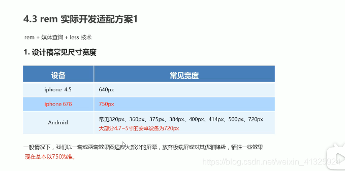
目前项目是把整个屏幕切为7.5等份
750/7.5 = 100px
320/7.5 = 42.6667px
html,body {width:100%;height:100%;overflow-x:hidden;word-break:break-all;-webkit-font-smoothing:antialiased;}
@media (min-width: 320px){html{font-size: 42.6667px;} }
@media (min-width: 360px){html{font-size: 48px;} }
@media (min-width: 375px){html{font-size: 50px;} }
@media (min-width: 384px){html{font-size: 51.2px;} }
@media (min-width: 414px){html{font-size: 55.2px;} }
@media (min-width: 448px){html{font-size: 59.7333px;} }
@media (min-width: 480px){html{font-size: 48px;} }
@media (min-width: 512px){html{font-size: 68.2667px;} }
@media (min-width: 544px){html{font-size: 72.5333px;} }
@media (min-width: 576px){html{font-size: 76.8px;} }
@media (min-width: 608px){html{font-size: 81.0667px;} }
@media (min-width: 640px){html{font-size: 85.3333px;} }
@media (min-width: 750px){html{font-size: 100px;} }
html {
font-size: 100px;
}
@media screen and (max-width: 320px) {
html {
font-size: 42.6667px;
}
}
div {
width: 1rem;
height: 1rem;
background: deeppink;
}
<div></div>得到不同屏幕尺寸下1:1的rem设置
8.苏宁易购项目实战(less+rem+媒体查询)
在一个css文件中引入另外一个css文件
@import "common";
//引入首页common.css文件
@import "common";
//@import 导入的意思,可以把一个css样式引入到另一个css样式文件里
Css:
common.less
html{font-size: 50px;}
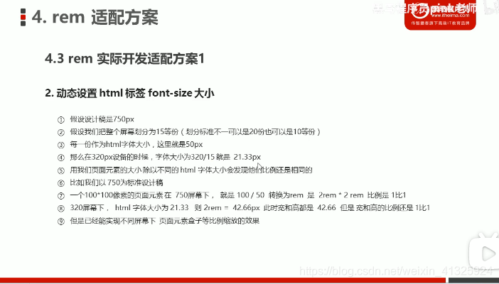
//设置常见的屏幕尺寸 修改里面的Html文字大小
//我们此次定义的划分的分数为15
@no:15;
@media screen and (min-width:320px){html{font-size: 320px / @no;}}
@media screen and (min-width:360px){html{font-size: 360px / @no;}}
//375 iphone 678
@media screen and (min-width:375px){html{font-size: 375px / @no;}}
@media screen and (min-width:384px){html{font-size: 384px / @no;}}
@media screen and (min-width:400px){html{font-size: 400px / @no;}}
@media screen and (min-width:414px){html{font-size: 414px / @no;}}
@media screen and (min-width:424px){html{font-size: 424px / @no;}}
@media screen and (min-width:480px){html{font-size: 480px / @no;}}
@media screen and (min-width:500px){html{font-size: 500px / @no;}}
@media screen and (min-width:540px){html{font-size: 540px / @no;}}
@media screen and (min-width:720px){html{font-size: 720px / @no;}}
@media screen and (min-width:750px){html{font-size: 750px / @no;}}
index.less
//引入首页common.css文件
@import "common";
//@import 导入的意思,可以把一个css样式引入到另一个css样式文件里
body{
    min-width: 320px;
    width: 15rem;
    margin:0 auto;
    line-height: 1.5;
    font-family: Arial, Helvetica;
    background: #f2f2f2;
}
@baseFont:50;
@Hfont25:25rem/@baseFont;
.Hfont25{font-size: @Hfont25;}
a{text-decoration: none;}
//页面元素rem公式:页面元素的px / html字体大小
.search-content{
    display:flex;
    position:fixed;
    top:0;
    left: 50%;
    transform: translateX(-50%);//自己宽度的50%
    width: 15rem;
    height: 88rem / @baseFont;
    background: #ffc001;
    // align-items: center;
    .classify{
        width: 44rem/@baseFont;
        height: 70rem/@baseFont;
        background: #c00;
        background: url(../images/classify.png) no-repeat;
        margin: 11rem/@baseFont 25rem/@baseFont 7rem/@baseFont 24rem/@baseFont;
        background-size:44rem/@baseFont 70rem/@baseFont;
    }
    .search{
        flex:1;
        input{
            outline:none;
            border: 0;
            height: 66rem/@baseFont;
            border-radius: 33rem/@baseFont;
            width: 100%;
            background: #fff2cc;
            margin-top: 12rem/@baseFont;
            font-size: 25rem/@baseFont;
            padding-left: 55rem/@baseFont;
            color: #757575;
        }
    }
    .login{
        width: 75rem/@baseFont;
        height: 70rem/@baseFont;
        margin:10rem/@baseFont;
        text-align:center;
        color: #fff;
        line-height: 70rem/@baseFont;
    }
}
//banner
.banner{
    width: 750rem/@baseFont;
    height: 368rem/@baseFont;
    img{
        width: 100%;
        height: 100%;
    }
}
.ad{
    display: flex;
    a{
        flex:1;
        img{width:100%;}
    }
}
nav{
    width: 750rem/@baseFont;
    a{
        float: left;
        width: 150rem/@baseFont;
        height: 140rem/@baseFont;
        text-align:center;
    }
    img{
        display:block;
        width: 82rem/@baseFont;
        height: 82rem/@baseFont;
        margin: 10rem/@baseFont auto 0;
    }
    span{
        font-size: 25rem/@baseFont;
        color: #333;
    }
}
Html:
<!DOCTYPE html>
<html lang="en">
<head>
    <meta charset="UTF-8">
    <meta name="viewport" content="width=device-width, initial-scale=1.0, maximum-scale=1.0, user-scalable=0" />
    <meta http-equiv="X-UA-Compatible" content="ie=edge">
    <link rel="stylesheet" href="css/normalize.css">
    <link rel="stylesheet" href="css/index.css">
    <link href="upload/sn.ico" rel="shortcut icon" mce_href="upload/sn.ico" type="image/x-icon" />
    <title>看爱情公寓5,上苏宁易购</title>
</head>
<body>
    <div class="search-content">
        <a href="#" class="classify"></a>
        <div class="search">
            <form action="">
                <input type="search" placeholder="张伟大律师事务所"/>
            </form>
        </div>
        <a href="#" class="login Hfont25">登录</a>
    </div>
    <div class="banner">
        <img src="upload/banner.gif" alt="爱情公寓">
    </div>
    <div class="ad">
        <a href="#"><img src="upload/ad1.gif" alt=""></a>
        <a href="#"><img src="upload/ad2.gif" alt=""></a>
        <a href="#"><img src="upload/ad3.gif" alt=""></a>
    </div>
    <nav>
        <a href="#">
            <img src="upload/nav1.png" alt="">
            <span>诸葛大力</span>
        </a>
        <a href="#">
            <img src="upload/nav1.png" alt="">
            <span>张伟</span>
        </a>
        <a href="#">
            <img src="upload/nav1.png" alt="">
            <span>诸葛大力</span>
        </a>
        <a href="#">
            <img src="upload/nav1.png" alt="">
            <span>张伟</span>
        </a>
        <a href="#">
            <img src="upload/nav1.png" alt="">
            <span>诸葛大力</span>
        </a>
        <a href="#">
            <img src="upload/nav1.png" alt="">
            <span>张伟</span>
        </a>
        <a href="#">
            <img src="upload/nav1.png" alt="">
            <span>诸葛大力</span>
        </a>
        <a href="#">
            <img src="upload/nav1.png" alt="">
            <span>张伟</span>
        </a>
        <a href="#">
            <img src="upload/nav1.png" alt="">
            <span>诸葛大力</span>
        </a>
        <a href="#">
            <img src="upload/nav1.png" alt="">
            <span>张伟</span>
        </a>
    </nav>
</body>
</html>
9.rem适配方案2(flexbie.js+rem(cssrem))
1.flexbie.js:直接设置页面为n等份,不用自己再写媒体查询进行设置
需要重新设置cssrem的默认字体(默认字体大小是16,如果是划分成10等份的话字体就为75,15等份是50,7.5等份是100,以屏幕宽度是750px来算)
2.cssrem:px直接转成rem,不用再通过less计算
px转rem插件(cssrem,vsCode)可以直接安装
总结:flexbie.js+cssrem是一种便捷的工具,省去了设置页面分割的份数和转换px为rem,但是其原理还是建立在媒体查询和less之上的,只是一种利于开发的工具
css:
body {
    min-width: 320px;
    max-width: 750px;
    /* flexible 给我们划分了 10 等份 */
    width: 10rem;
    margin: 0 auto;
    line-height: 1.5;
    font-family: Arial, Helvetica;
    background: #f2f2f2;
}
a{
    text-decoration:none;
    font-size: .333333rem;
}
img{
    width: 1.093333rem;
    height: 1rem;
}
@media screen and (min-width:750px)
{
    html{font-size: 75px !important;}
}
.search_content{
    display: flex;
    position:fixed;
    top: 0;
    left: 50%;
    transform: translateX(-50%);
    width: 10rem;
    height: 1.173333rem;
    background: #ffc001;
}
.classify{
    width: .586667rem;
    height: .933333rem;
    margin: .146667rem .333333rem .133333rem;
    background: url(../images/classify.png) no-repeat;
    background-size: .586667rem .933333rem ;
}
.search{
    flex: 1;
}
.search input{
    border: 0;
    outline: none;
    width: 100%;
    height: .88rem;
    font-size: .333333rem;
    background: #fff2cc;
    margin-top:.133333rem;
    border-radius: .44rem;
    color: #757575;
    padding:0 .733333rem;
}
.login{
    width: 1rem;
    height: .933333rem;
    margin: .133333rem;
    line-height: .933333rem;
    text-align:center;
    font-size: .333333rem;
    color: #fff;
}
html:
<!DOCTYPE html>
<html lang="en">
<head>
    <meta name="viewport" content="width=device-width, initial-scale=1.0, maximum-scale=1.0, user-scalable=0" />
    <meta http-equiv="X-UA-Compatible" content="ie=edge">
    <link rel="stylesheet" href="css/normalize.css">
    <link rel="stylesheet" href="css/index.css">
    <link href="upload/sn.ico" rel="shortcut icon" mce_href="upload/sn.ico" type="image/x-icon" />
    <script src="js/flexible.js"></script>
    <title>看爱情公寓5,上苏宁易购</title>
</head>
<body>
    <div class="search_content">
        <a href="#" class="classify"></a>
        <div class="search">
            <input type="search" placeholder="猪大力和猪益达"/>
        </div>
        <a href="#" class="login">登录</a>
    </div>
</body>
</html>
六、黑马公开课-黑马面面项目
Swiper演示 - Swiper中文网 (电脑端,移动端脚本)
html:
<!DOCTYPE html>
<html lang="en">
<head>
    <meta charset="UTF-8">
    <meta name="viewport" content="width=device-width, initial-scale=1.0">
    <title>白马face to face</title>
    <link rel="stylesheet" href="./css/normalize.css"/>
    <link rel="stylesheet" href="./css/swiper.min.css">
    <link rel="stylesheet" href="./css/index.css"/>
    <script src="./js/flexible.js"></script>
</head>
<body>
    <section class="wrap">
    <header class="text_align">白马面面</header>
    <nav class="nav"><!--nav.nav-->
        <a href="#" class="item"><!--{$}*6--><!--shift+alt-->
            <img src="./icons/icon1.png" alt=""/>
            <span>HR面试</span>
        </a>
        <a href="#" class="item">
            <img src="./icons/icon2.png" alt=""/>
            <span>笔试</span>
        </a>
        <a href="#" class="item">
            <img src="./icons/icon3.png" alt=""/>
            <span>技术面试</span>
        </a>
        <a href="#" class="item">
            <img src="./icons/icon4.png" alt=""/>
            <span>模拟面试</span>
        </a>
        <a href="#" class="item">
            <img src="./icons/icon5.png" alt=""/>
            <span>面试技巧</span>
        </a>
        <a href="#" class="item">
            <img src="./icons/icon6.png" alt=""/>
            <span>薪资查询</span>
        </a>
    </nav>
    <section class="go">
        <img src="./images/go.png"/>
    </section>
</section>
<section class="content">
    <div class="con-hd">
        <h4>
            <span class="icon"><img src="./icons/i1.png"></span>
            就业指导</h4>
        <a href="#" class="more">更多>></a>
    </div>
    <div class="get_job_focus">
        <!-- Swiper -->
        <div class="swiper-container get_job_fo swiper-container-initialized swiper-container-horizontal">
          <div class="swiper-wrapper" style="transition-duration: 0ms; transform: translate3d(-427.5px, 0px, 0px);"><div class="swiper-slide swiper-slide-duplicate swiper-slide-duplicate-next" data-swiper-slide-index="1" style="width: 255px; margin-right: 30px;">
              <a href="#"><img src="./images/ldh.jpg" alt=""></a>
              <p>老师教你应对面试技巧</p>
            </div><div class="swiper-slide swiper-slide-duplicate swiper-slide-prev" data-swiper-slide-index="2" style="width: 255px; margin-right: 30px;">
              <a href="#"><img src="./images/3.jpg" alt=""></a>
              <p>老师教你应对面试技巧</p>
            </div>
            <div class="swiper-slide swiper-slide-active" data-swiper-slide-index="0" style="width: 255px; margin-right: 30px;">
              <a href="#"><img src="./images/pic.png" alt=""></a>
              <p>老师教你应对面试技巧</p>
            </div>
            <div class="swiper-slide swiper-slide-next" data-swiper-slide-index="1" style="width: 255px; margin-right: 30px;">
              <a href="#"><img src="./images/ldh.jpg" alt=""></a>
              <p>老师教你应对面试技巧</p>
            </div>
            <div class="swiper-slide swiper-slide-duplicate-prev" data-swiper-slide-index="2" style="width: 255px; margin-right: 30px;">
              <a href="#"><img src="./images/3.jpg" alt=""></a>
              <p>老师教你应对面试技巧</p>
            </div>
          <div class="swiper-slide swiper-slide-duplicate swiper-slide-duplicate-active" data-swiper-slide-index="0" style="width: 255px; margin-right: 30px;">
              <a href="#"><img src="./images/pic.png" alt=""></a>
              <p>老师教你应对面试技巧</p>
            </div><div class="swiper-slide swiper-slide-duplicate swiper-slide-duplicate-next" data-swiper-slide-index="1" style="width: 255px; margin-right: 30px;">
              <a href="#"><img src="./images/ldh.jpg" alt=""></a>
              <p>老师教你应对面试技巧</p>
            </div></div>
        <span class="swiper-notification" aria-live="assertive" aria-atomic="true"></span></div>
        <!-- Add Arrows 根据需求这个代码放到 container外面 添加左右箭头-->
        <div class="swiper-button-next" tabindex="0" role="button" aria-label="Next slide"></div>
        <div class="swiper-button-prev" tabindex="0" role="button" aria-label="Previous slide"></div>
      </div>
</section>
<section class="content">
  <div class="con-hd">
      <h4>
          <span class="icon"><img src="./icons/i1.png"></span>
          充电学习</h4>
      <a href="#" class="more">更多>></a>
  </div>
  <div class="study">
    <div class="swiper-container swiper_study">
      <div class="swiper-wrapper">
        <div class="swiper-slide">
          <img src="./images/pic1.png" alt="" />
          <h5>说低调英语,告别中式英语</h5>
          <p>156人学习</p>
        </div>
        <div class="swiper-slide">
          <img src="./images/pic2.png" alt="" />
          <h5>说低调英语,告别中式英语</h5>
          <p>156人学习</p>
        </div>
        <div class="swiper-slide">
          <img src="./images/pic1.png" alt="" />
          <h5>说低调英语,告别中式英语</h5>
          <p>156人学习</p>
        </div>
        <div class="swiper-slide">
          <img src="./images/pic1.png" alt="" />
          <h5>说低调英语,告别中式英语</h5>
          <p>156人学习</p>
        </div>
      </div>
      <!-- Add Pagination -->
      <div class="swiper-pagination"></div>
    </div>
  </div>
</section>
<footer class="footer">
  <a href="#" class="item">
    <img src="./icons/home.png" alt="">
    <p>首页</p>
  </a>
  <a href="#" class="item">
    <img src="./icons/ms.png" alt="">
    <p>模拟面试</p>
  </a>
  <a href="#" class="item">
    <img src="./icons/net.png" alt="">
    <p>技术面试</p>
  </a>
  <a href="#" class="item">
    <img src="./icons/user.png" alt="">
    <p>我的首页</p>
  </a>
</footer>
<script src="./js/swiper.min.js"></script>
<script src="./js/flexible.js"></script>
<script>
  // 第一个函数里面是 就业指导轮播图
  (function () {
    var swiper = new Swiper(".get_job_fo", {
      // 能够显示的 slider的个数
      slidesPerView: 2,
      // 每一个slide之间的距离
      spaceBetween: 30,
      centeredSlides: true,
      loop: true,
      // 添加左右箭头
      navigation: {
        nextEl: ".swiper-button-next",
        prevEl: ".swiper-button-prev",
      },
    });
  })();
  (function(){
    var swiper = new Swiper('.swiper_study', {
      slidesPerView: 2.2,
      spaceBetween: 20
    });
  })()
</script>
</body>
</html>
less:
body{
    min-width: 320px;
    max-width: 750px;
    margin: 0 auto;
    // height: 1200px;
    background-color: #f2f4f7;
}
.text_align{
    text-align: center;
}
a{
    text-decoration:none;
    color: #070707;
}
h4{
    margin:0;
}
//约束当屏幕大于750px的时候,html字体大小就不变化了
@media screen and (min-width:750px)
{
    html{
        font-size: 37.5px !important;
    }
}
.wrap{
    background: #fff;
    padding-bottom: 1.146667rem;
}
header{
    height: 2.133333rem;
    line-height: 2.133333rem;
    border-bottom: 1px  solid #eee;
    font-size: .933333rem;
}
.nav{
    display: flex;flex-wrap:wrap;
    padding: 1.2rem 0 1.6rem 0;
    .item{
        display: flex;
        flex-direction: column;
        align-items:center;/*水平居中*/
        width: 33.33%;
        img{
            width: 3.706667rem;
            height: 3.706667rem;
        }
        span{
           font-size: .666667rem;
           color: #070707;
        }
        //选择前面3个
        &:nth-child(-n+3)//&表示:
        {
            margin-bottom: 1.653333rem;
        }
    }
}
.go{margin: 0 .266667rem 0 .48rem;}
.content{
    padding:1.066667rem .533333rem;
    background-color: #fff;
    margin-top: .266667rem;
    .con-hd{
        display: flex;
        justify-content: space-between;
        height: .746667rem;
        line-height: .746667rem;
        margin-bottom: 0.906667rem;
    }
    h4{
        font-size: .746667rem;
        color: #333;
        .icon{
            display: inline-block;
            width: 1.013333rem;
            height: 1.013333rem;
            vertical-align: middle;
        }
    }
    .more{
        font-size: .586667rem;
        color: #999;
    }
}
.get_job_focus {
    position: relative;
    .swiper-container {
      // width: 100%;
      height: 100%;
      // 根据需求把宽度定位 540px
      width: 14.4rem;
    }
    .swiper-slide {
      text-align: center;
      font-size: 18px;
      background: #fff;

      /* Center slide text vertically */
      display: -webkit-box;
      display: -ms-flexbox;
      display: -webkit-flex;
      display: flex;
      // 竖向显示
      flex-direction: column;
      /* Center slide text vertically */
      display: -webkit-box;
      display: -ms-flexbox;
      display: -webkit-flex;
      display: flex;
      -webkit-box-pack: center;
      -ms-flex-pack: center;
      -webkit-justify-content: center;
      justify-content: center;
      -webkit-box-align: center;
      -ms-flex-align: center;
      -webkit-align-items: center;
      align-items: center;
      transition: 300ms;
      // 其余的兄弟是 0.8
      transform: scale(0.8);
      opacity: 0.4;
      a {
        width: 9.013333rem;
        height: 10.026667rem;
        img {
          width: 100%;
          height: 100%;
        }
      }
      p {
        width: 9.013333rem;
        font-size: 0.666667rem;
        margin-top: 0.64rem;
        color: #333;
      }
    }
    // 当前选中的 slide   中间那个
    .swiper-slide-active,
    .swiper-slide-duplicate-active {
      transform: scale(1);
      z-index: 999;
      opacity: 1;
    }
    .swiper-button-next,
    .swiper-button-prev {
      outline: none;
      &:after {
        font-size: 1.066667rem;
        color: #333;
      }
    }
  }
.study{
    .swiper_study{
      padding: .266667rem;
      margin-bottom: 2.666667rem!important;
    }
    .swiper-slide {
        font-size: 18px;
        background: #fff;
        width: 7.733333rem;
        height: 9.066667rem;
        background-color: #fff;
        border-radius: 0.266667rem;
        box-shadow: 0 0px 10px rgba(0, 0, 0, 0.1);
        h5{
          font-size: 0.693333rem;
          margin: 0.533333rem 0;
          font-weight: 400;
          padding: 0 0.266667rem;
        }
        p {
          font-size: 0.693333rem;
          color: #ff4400;
          padding: 0 0.266667rem;
        }
      }
}
.footer{
  position:fixed;
  z-index: 1;
  left: 0;
  bottom: 0;
  width: 100%;
  height: 2.933333rem;
  background: #fff;
  display: flex;
  border-top: 1px solid #ccc;
  .item{
    display: flex;
    flex-direction: column;
    flex: 1;
    align-items: center;
    justify-content: center;
    img{
      width: 1.04rem;
      height: 1.093333rem;
    }
    p{
      font-size: 0.586667rem;
      color: #666666;
      margin-top: 0.266667rem;
    }
  }
}
七、响应式开发
1.响应式基本布局
<!DOCTYPE html>
<html lang="Zh-CN">
<head>
<meta name="viewport" content="with=device-width,user-scalabel=no,initial-scale=1.0,maximum-scale=1.0,minimun-scale=1.0">
<meta charset="UTF-8">
<title></title>
<style type="">
    .container{
        height: 150px;
        background: pink;
        margin: 0 auto;
    }
    /*1.屏幕小于768*/
    @media screen and (max-width:767px)
    {
        .container{width: 100%;}
    }
    /*2.大于等于768 -- 屏幕为750px*/
    @media screen and (min-width:768px)
    {
        .container{width: 750px;}
    }
    /*3.中等屏幕992px 布局容器修改为970px*/
    @media screen and (min-width:992px)
    {
        .container{width: 970px;}
    }
    /*4.大屏幕 大于等于1200 布局容器 1170*/
    @media screen and (min-width:1200px)
    {
        .container{width: 1170px;}
    }
</style>
</head>
<body>
    <div class="container"></div>
</body>
</html>
2.响应式导航栏
<!DOCTYPE html>
<html lang="Zh-CN">
<head>
<meta name="viewport" content="with=device-width,user-scalabel=no,initial-scale=1.0,maximum-scale=1.0,minimun-scale=1.0">
<meta charset="UTF-8">
<title></title>
<style type="">
    *{margin: 0;padding: 0;}
    ul{list-style: none;}
    .container{width: 750px;margin: 0 auto;}
    .container ul li{float: left;text-align: center; width: 93.75px;border-radius:10px; height: 40px;line-height: 40px; background: purple;color: #fff;}
    @media screen and (max-width:767px)
    {
        .container{width: 100%;}
        .container ul li{width: 33.333%;}
    }
</style>
</head>
<body>
    <div class="container">
        <ul>
            <li>导航栏</li>
            <li>导航栏</li>
            <li>导航栏</li>
            <li>导航栏</li>
            <li>导航栏</li>
            <li>导航栏</li>
            <li>导航栏</li>
            <li>导航栏</li>
        </ul>
    </div>
</body>
</html>
3.Bootstrap简介
网址:https://bootstrap.css88.com
 <meta http-equiv="X-UA-Compatible" content="IE=edge">
/*要求当前网页使用IE浏览器最高版本的内核来渲染*/
<!--[if lt IE 9]>
/*解决IE9以下浏览器对HTML5新增标签的不识别,导致css不起作用的问题*/
<script src="https://oss.maxcdn.com/html5shiv/3.7.2/html5shiv.min.js"></script>
/*解决IE9以下浏览器对CSS3MediaQuery的不识别*/
<script src="https://oss.maxcdn.com/respond/1.4.2/respond.min.js"></script>
<![endif]-->.container类:响应式布局的容器
.container-fluid类:流式布局,100%宽度,适用于移动端
lg(col-lg):大 md(col-md):中等 sm(col-sm):小 xs(col-xs):超小
col-lg-3:最后接切割的份数 页面为12份
每一列都有默认的padding 15像素
   <style>
        [class^="col"]{border: 1px solid #ccc;}/*前缀为col*/
        .container .row:nth-child(1){background: #c00;}
    </style>
  <div class="container">
        <div class="row">
            <!---每个盒子占3份-->
            <div class="col-lg-3 col-md-4 col-sm-6 col-xm-12">1</div>
            <div class="col-lg-3 col-md-4 col-sm-6 col-xm-12">2</div>
            <div class="col-lg-3 col-md-4 col-sm-6 col-xm-12">3</div>
            <div class="col-lg-3 col-md-4 col-sm-6 col-xm-12">4</div>
        </div>
        <!--如果孩子的份数相加等于12 则孩子能占满整个的container的宽度-->
        <div class="row">
            <div class="col-lg-6">1</div>
            <div class="col-lg-2">2</div>
            <div class="col-lg-2">3</div>
            <div class="col-lg-2">4</div>
        </div>
         <!--如果孩子的份数相加小于12 则占不满整个的container的宽度,会有空白-->
        <div class="row">
            <div class="col-lg-6">1</div>
            <div class="col-lg-1">2</div>
            <div class="col-lg-2">3</div>
            <div class="col-lg-2">4</div>
        </div>
        <!--如果孩子的份数相加大于12 则多余的列会另起一行显示-->
        <div class="row">
              <div class="col-lg-6">1</div>
              <div class="col-lg-4">2</div>
              <div class="col-lg-2">3</div>
              <div class="col-lg-2">4</div>
          </div>
    </div>
(1)bootstarp栅格系统
0.列嵌套
列中再分成若干小份。我们可以通过添加一个新的.row元素和一系列.col-sm-*元素刂已经存在的.col-sm-*元素内
.colpur{background: purple !important;}
<div class="container">
        <div class="row">
            <div class="col-md-4">
                <!--我们列嵌套最好加1个行row 这样可以取消父元素的padding值 而且高度自动和父级一样高-->
                <div class="col-md-4 colpur">l</div>
                <div class="col-md-8 colpur">h</div>
            </div>
            <div class="col-md-4">2</div>
            <div class="col-md-4">3</div>
        </div>
    </div>
1.列偏移
.col-md-offset-*类可将列向右侧偏移。通过*选择器为当前元素增加了左侧的边距
 <style>
 .row div {height:40px;line-height:40px;background:pink;color: #fff;text-align:center;}
</style>
    <div class="container">
        <div class="row">
            <div class="col-md-4">左侧</div>
            <!--偏移的份数就是12 - 两个盒子的份数 = 4-->
            <div class="col-md-4 col-md-offset-4">右侧</div>
        </div>
        <div class="row">
            <!--如果只有一个盒子 那么就偏移 = (12-8 / 2 )-->
            <div class="col-md-8 col-md-offset-2">中间</div>
        </div>
    </div>
2.列排序
通过.col-md-push-* 和 .col-md-pull-*类就可以很容易的改变列(column)的顺序
 <div class="contanier">
        <div class="row">
            <div class="col-md-4 col-md-push-8">左侧</div>
            <div class="col-md-8 col-md-pull-4">右侧</div>
        </div>
    </div>
3.响应式工具
根据不同设备大小隐藏/显示不同内容
超小屏:.hidden-xs .visible-xs
小屏:.hidden-sm .visible-sm
中屏:.hidden-md .visible-md
大屏:.hidden-lg .visible-lg
.row div:nth-child(3){background: purple;}
<div class="container">
        <div class="row">
            <div class="col-md-3">
                <span class="visible-sm visible-sm-md">我会显示哦</span>
            </div>
            <div class="col-md-3">2</div>
            <div class="col-md-3 hidden-md hidden-xs">我最特别</div>
            <div class="col-md-3">4</div>
        </div>
    </div>
4.阿里秀秀案例(响应式设计bootstarp)
html:
<!DOCTYPE html>
<html lang="en">
<head>
    <meta charset="UTF-8">
    <meta name="viewport" content="width=device-width, initial-scale=1.0">
    <meta http-equiv="X-UA-Compatible" content="ie=edge">
      <!--[if lt IE 9]>
      <script src="https://oss.maxcdn.com/html5shiv/3.7.2/html5shiv.min.js"></script>
      <script src="https://oss.maxcdn.com/respond/1.4.2/respond.min.js"></script>
    <![endif]-->
    <link rel="stylesheet" href="bootstarp/css/bootstrap.min.css"/>
    <link rel="stylesheet" href="css/index.css"/>
    <title>阿里秀秀</title>
    <style>
    </style>
</head>
<body>
    <div class="container">
        <div class="row">
            <header class="col-md-2">
                <div class="logo">
                    <a href="#">
                        <img src="images/logo.png" alt="logo" class="hidden-xs"/>
                        <span class="visible-xs">阿里秀秀</span>
                    </a>
                </div>
                <div class="nav">
                    <ul>
                        <li><a href="#" class="glyphicon glyphicon-list-alt">生活馆</a></li>
                        <li><a href="#" class="glyphicon glyphicon-home">自然汇</a></li>
                        <li><a href="#" class="glyphicon glyphicon-eye-open">刘亦菲</a></li>
                        <li><a href="#" class="glyphicon glyphicon-magnet">胡歌</a></li>
                        <li><a href="#" class="glyphicon glyphicon-education">古月文刂</a></li>
                    </ul>
                </div>
            </header>
            <article class="col-md-7">
                <!--新闻-->
                <div class="news clearfix">
                    <ul>
                        <li>
                            <a href="#">
                                <img src="upload/lg.png" alt=""/>
                                <p>阿里秀秀</p>
                            </a>
                        </li>
                        <li>
                            <a href="#">
                                <img src="upload/1.jpg" alt="4"/>
                                <p>奇了 成都一小区护卫长得像马云 市民纷纷求合影</p>
                            </a>
                        </li>
                        <li>
                            <a href="#">
                                <img src="upload/2.jpg" alt="3"/>
                                <p>奇了 成都一小区护卫长得像马云 市民纷纷求合影</p>
                            </a>
                        </li>
                        <li>
                            <a href="#">
                                <img src="upload/3.jpg" alt="1"/>
                                <p>奇了 成都一小区护卫长得像马云 市民纷纷求合影</p>
                            </a>
                        </li>
                        <li>
                            <a href="#">
                                <img src="upload/4.jpg" alt="2"/>
                                <p>奇了 成都一小区护卫长得像马云 市民纷纷求合影</p>
                            </a>
                        </li>
                    </ul>
                </div>
                 <!--发表-->
                 <div class="publish">
                     <div class="row">
                         <div class="col-sm-9">
                             <h3>生活馆 关于指甲的10个健康知识 你知道几个?</h3>
                             <p class="text-muted  hidden-xs">alibaixiu 发布于 2015-11-23</p>
                             <p class=" hidden-xs">指甲是经常容易被人们忽略的身体部位, 事实上从指甲的健康状况可以看出一个人的身体健康状况, 快来看看10个暗藏在指甲里知识吧!</p>
                             <p class="text-muted">阅读(2417)评论(1)赞 (18) <span class="hidden-xs">标签:健康 / 感染 / 指甲 / 疾病 / 皮肤 / 营养 / 趣味生活</span></p>
                         </div>
                         <div class="col-sm-3 pic hidden-xs">
                            <img src="upload/4.jpg" alt="新闻图片"/>
                        </div>
                     </div>
                    <div class="row">
                         <div class="col-sm-9">
                             <h3>生活馆 关于指甲的10个健康知识 你知道几个?</h3>
                             <p class="text-muted  hidden-xs">alibaixiu 发布于 2015-11-23</p>
                             <p class=" hidden-xs">指甲是经常容易被人们忽略的身体部位, 事实上从指甲的健康状况可以看出一个人的身体健康状况, 快来看看10个暗藏在指甲里知识吧!</p>
                             <p class="text-muted">阅读(2417)评论(1)赞 (18) <span class="hidden-xs">标签:健康 / 感染 / 指甲 / 疾病 / 皮肤 / 营养 / 趣味生活</span></p>
                         </div>
                         <div class="col-sm-3 pic hidden-xs">
                            <img src="upload/4.jpg" alt="新闻图片"/>
                        </div>
                     </div>
                      <div class="row">
                         <div class="col-sm-9">
                             <h3>生活馆 关于指甲的10个健康知识 你知道几个?</h3>
                             <p class="text-muted  hidden-xs">alibaixiu 发布于 2015-11-23</p>
                             <p class=" hidden-xs">指甲是经常容易被人们忽略的身体部位, 事实上从指甲的健康状况可以看出一个人的身体健康状况, 快来看看10个暗藏在指甲里知识吧!</p>
                             <p class="text-muted">阅读(2417)评论(1)赞 (18) <span class="hidden-xs">标签:健康 / 感染 / 指甲 / 疾病 / 皮肤 / 营养 / 趣味生活</span></p>
                         </div>
                         <div class="col-sm-3 pic hidden-xs">
                            <img src="upload/4.jpg" alt="新闻图片"/>
                        </div>
                     </div>
                 </div>
            </article>
            <aside class="col-md-3">
                <a href="#" class="banner">
                    <img src="upload/zgboke.jpg"/>
                </a>
                <a href="#" class="hot">
                    <span class="btn btn-primary">热搜</span>
                    <h4 class="text-primary">欢迎加入中国博客联盟</h4>
                    <p class="text-muted">这里收录国内各个领域的优秀博客,是一个全人工编辑的开放式博客联盟交流和展示平台......</p>
                </a>
            </aside>
        </div>
    </div>
</body>
</html>
css:
ul{
    list-style-type: none;
    margin: 0;
    padding: 0;
}
body {background-color: #f5f5f5;}
a{color:#666;text-decoration: none;}
a:hover{text-decoration: none;}
.container{background-color: #fff;}
/*修改container的最大宽度为1280*/
@media screen and (min-width:1280px){
    .container{width: 1280px;}
}
/*小屏幕,超小屏幕*/
@media screen and(max-width:991px)
{
    .nav li{float:left;width: 20%;}
    article{margin-top: 10px;}
    .news li:last-child{padding-right: 0;}
    aside{padding-top: 10px;}
}
/*超小屏幕 nav文字会变成14px*/
@media screen and(max-width:767px)
{
    header{padding-right: 0 !important;}
    .nav li a{
        font-size: 14px;
        padding:0 10px;
        text-align: center;
    }
    .news li:nth-child(1){width: 100% !important;padding-right: 0!important;}
    .news li:nth-child(3){padding-right: 0;}
    .news li{width:50%!important;}
    .publish h3{font-size: 14px;}
}
/*header*/
header{padding-left:0!important;}
.logo{background:#429ad9;}
.logo img{max-width: 100%;display: block;margin: 0 auto;}
.logo span{display: block;height: 50px;line-height: 50px;color: #fff;font-size: 18px;text-align: center;}
.nav{background-color:#eee;border-bottom: 1px solid #ccc;}
.nav a{display: block;height: 50px;line-height:50px;padding-left:30px;font-size: 16px;}
.nav a:hover{background-color: #fff;color: #333;}
.nav a::before{vertical-align:middle;padding-right: 5px;}
.news li{ float: left;width:25%;height: 128px;padding-right: 10px;margin-bottom: 10px;}
.news li a{position: relative;display: block;width: 100%;height: 100%;}
.news li:nth-child(1){width: 50%;height: 266px;}
.news li a img{width: 100%;height: 100%;}
.news li a p {position:absolute;bottom: 0;left: 0;width: 100%;height: 41px;padding: 0 10px;font-size: 12px; margin-bottom: 0; background: rgba(0,0,0,.5);color:#fff;}
.news li:nth-child(1) p {line-height: 41px;font-size: 20px;padding: 0 10px;}
.publish{border-top:1px solid #ccc;}
.publish .row{border-bottom:1px solid #ccc;padding: 10px 0;}
.pic{margin-top:10px;}
.pic img{width: 100%;}
.banner img{width: 100%;}
.hot{display: block;margin-top:20px;padding: 0 20px 20px; border: 1px solid #ccc;}
.hot span{border-radius: 0;margin-bottom: 20px;}
.hot p{font-size: 12px;}
八、总结
从2020.06.15开始今天2021.04.03历时10个月,终于把pink老师的前端基础528个视频全部学完,每个视频看完都认真跟着敲代码并做详细的笔记,在其中学到了许多html5和css3的新特性,把以前初略学过的知识详细/系统的学习了一遍,本来可以不超过3个月学完的东西,我却花了10个月,中间穿插了一些公司的项目又或者是自己懒不想学,以后要努力自律变成更好的自己,这一年的不自律其实也没有得到什么,反而觉得更加的焦虑.html5+css3的学习已经告一段落,接下来进阶Js.加油,干巴爹!!!ヾ(◍°∇°◍)ノ゙
这个是HTML,CSS,HTML5思维导图我学习html这段时间来整理的思维导图,方便以后查阅


 扫一扫
扫一扫


 1231
1231

 被折叠的 条评论
为什么被折叠?
被折叠的 条评论
为什么被折叠?
 到【灌水乐园】发言


