


 这篇博客展示了如何使用HTML、CSS和JavaScript创建一个带有动态点亮效果的步骤条。通过CSS实现每个步骤的样式,包括三角形箭头和背景颜色,而JavaScript则用于根据指定步骤点亮对应的条目。代码示例详细,适用于前端开发者实现类似功能。
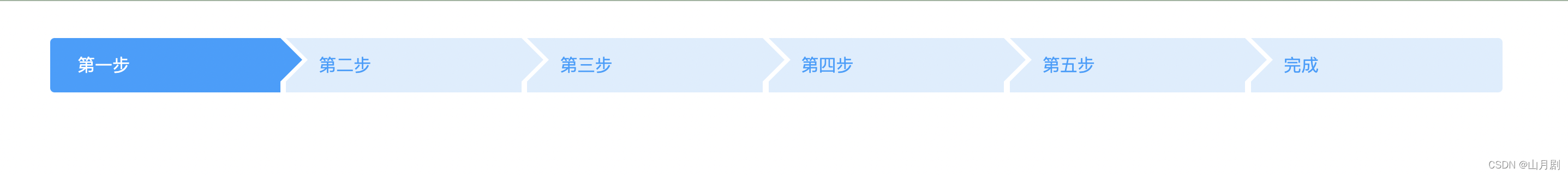
效果图:
具体实现效果代码如下
HTML
<div class="container">
    <div class="navs">
        <ul>
            <li class="active">第一步</li>
            <li>第二步</li>
            <li>第三步</li>
            <li>第四步</li>
            <li>第五步</li>
            <li>完成</li>
        </ul>
    </div>
</div>
CSS
    <style>
        .navs {
            height: 50px;
            line-height: 50px;
            padding-top: 10px;
            padding-bottom: 10px;
            width: 100%;
        }

        .navs li {
            padding: 0 10px 0 30px;
            line-height: 50px;
            background: #DCEEFE;
            display: inline-block;
            color: #1E9FFF /*#50abe4*/;
            position: relative;
            width: 12.7%;
        }

        .navs li:after {
            content: '';
            display: block;
            border-top: 20px solid #DCEEFE;
            border-bottom: 20px solid #DCEEFE;
            border-left: 20px solid #fff;
            position: absolute;
            right: -20px;
            top: 0;
        }

        .navs li:after {
            content: '';
            display: block;
            border-top: 20px solid transparent;
            border-bottom: 20px solid transparent;
            border-left: 20px solid #DCEEFE;
            position: absolute;
            right: -20px;
            top: 0;
            z-index: 10;
        }

        .navs li:before {
            content: '';
            display: block;
            border-top: 20px solid #DCEEFE;
            border-bottom: 20px solid #DCEEFE;
            border-left: 20px solid #fff;
            position: absolute;
            left: 0px;
            top: 0;
        }

        .navs li:first-child {
            border-radius: 4px 0 0 4px;
            padding-left: 25px;
        }

        .navs li:last-child,
        .cssNavEnd {
            border-radius: 0px 4px 4px 0px;
            padding-right: 25px;
        }

        .navs li:first-child:before {
            display: none;
        }

        .navs li:last-child:after,
        .cssNavEnd:after {
            display: none;
        }

        .navs li.active {
            background: #1E9FFF;
            color: #fff;
        }

        .navs li.active:after {
            border-left-color: #1E9FFF;
        }

        .navs li.active:before {
            border-top: 20px solid #1E9FFF;
            border-bottom: 20px solid #1E9FFF;
        }
    </style>
JS实现点亮步骤条效果
<script>
    $(function () {
        gotoStep(1);
    });

    function gotoStep(step) {
        $(".navs li").slice(0, step).addClass("active");
    }
</script>


 扫一扫
扫一扫


 2473
2473

 被折叠的 条评论
为什么被折叠?
被折叠的 条评论
为什么被折叠?
 到【灌水乐园】发言


