


 本文介绍了一种使用HTML, CSS和JavaScript实现的轮播图效果,支持自动播放和手动按钮切换。通过克隆列表项并应用CSS transform实现平滑过渡,确保了良好的用户体验。
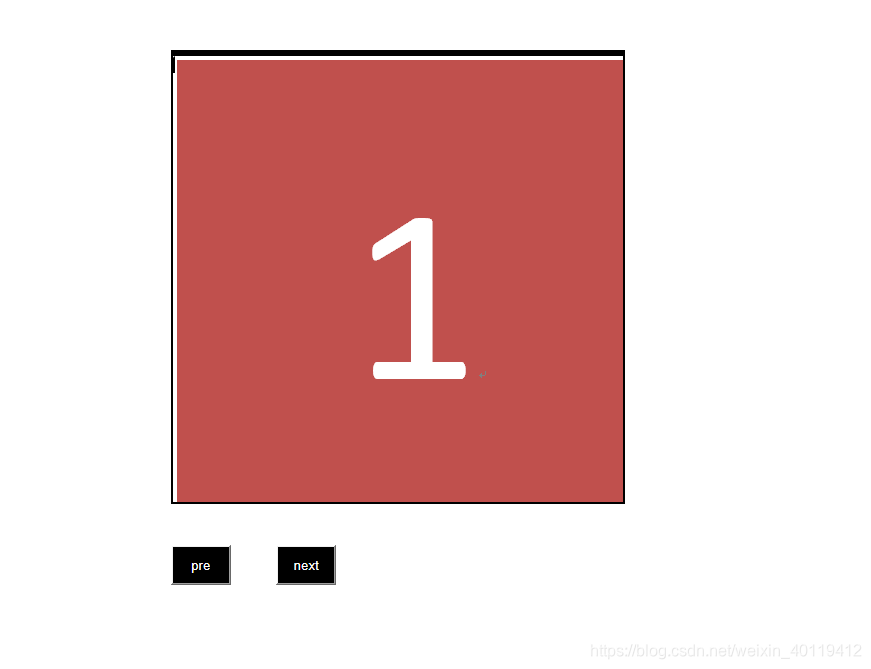
实现效果
html
<!DOCTYPE html>
<html>
	<head>
		<meta charset="UTF-8">
		<title></title>
		<link rel="stylesheet" href="../css/marquee.css" />
	</head>
	<body>
		<br />
		<br />
		<br />
		<div class="marquee">
			<div class="box">
				<div class="list"><img src="../img/11.PNG" alt="" /></div>
				<div class="list"><img src="../img/22.PNG" alt="" /></div>
				<div class="list"><img src="../img/33.PNG" alt="" /></div>
			</div>

		</div>
		<button id="preBtn">pre</button>
		<button id="nextBtn">next</button>
		<br />

	</body>
	<script type="text/javascript" src="../js/jquery-1.9.1.min.js" ></script>
	<script>
		$(()=>{
			var outerWidth=450;
			var outerHeight=450;
			var speed=3;

			var transitionTime=0.3;
			var initIndex=0;
			var setTimeId=null;

			var $marquee=$('.marquee');
			var $box=$marquee.find('.box');
			var $list=$box.find('.list');


			var listLength=$list.length;
			var contentWidth=outerWidth*listLength;

			var style=document.styleSheets;
			//Document.styleSheets 只读属性,返回一个由 StyleSheet 对象组成的 StyleSheetList,每个 StyleSheet 对象都是一个文档中链接或嵌入的样式表。

			$marquee.css({
				"width":`${outerWidth}px`,
				"height":`${outerHeight}px`
			});
			$list.css({
				"width":`${outerWidth}px`,
				"height":`${outerHeight}px`
			});
			$box.css({
				"width":`${contentWidth}px`,
				"height":`${outerHeight}px`
			});
			var clone=$list.eq(0).clone();
			$box.append(clone);//追加

			function autoplay(){

					setTimeId=setInterval(()=>{
						initIndex++;
						$box.css({
							"transition":`transform ${transitionTime}s ease `,
							"transform":`translateX(-${outerWidth*initIndex}px)`
						})
						initIndex===listLength?initIndex=0:'';
					},speed*1000)
			}
			//autoplay();

			$box[0].addEventListener('transitionend',()=>{
				$box.css({
					"transition":`none`,
					"transform":`translateX(-${outerWidth*initIndex}px)`
				})
			})
			$('#preBtn').mouseenter(()=>{
				if(initIndex===0){
					initIndex=listLength;
					$box.css({
						"transition":`none`,
						"transform":`translateX(-${outerWidth*initIndex}px)`
					})
				}
			})
			$('#preBtn').click(()=>{

				initIndex--;
				$box.css({
					"transition":`transform ${transitionTime}s ease `,
					"transform":`translateX(-${outerWidth*initIndex}px)`
					})
				initIndex===0?initIndex=listLength:'';

			})

			$('#nextBtn').click(()=>{
				initIndex++;
				$box.css({
					"transition":`transform ${transitionTime}s ease `,
					"transform":`translateX(-${outerWidth*initIndex}px)`
					})
					initIndex===listLength?initIndex=0:'';
			})
			//
		})
	</script>
</html>
css
@charset "utf-8";

*{margin: 0;padding: ;}
body{
	width: 100%;
	height: 100%;
}
.marquee{
	overflow: hidden;
	position: absolute;
	left: 20%;
	border: 2px solid black;
}
.box{

	display: flex;
}
.list{
	overflow: hidden;
	flex-shrink:0 ;
	img{
		height: 100%;
		width: 100%;
	}
	}

#nextBtn{
	position: absolute;
	left: 30%;
	bottom:30%;
	width: 60px;
	background: #000000;
	color: white;
	height: 40px;
	line-height: 30px;
	text-align: center;
}
#preBtn{
	position: absolute;
	left: 20%;
	bottom:30%;
	background: #000000;
	color: white;
	width: 60px;
	height: 40px;
	line-height: 30px;
	text-align: center;
}
源码下载地址: https://github.com/YanHSana/lunbotu


 扫一扫
扫一扫


 3116
3116

 被折叠的 条评论
为什么被折叠?
被折叠的 条评论
为什么被折叠?
 到【灌水乐园】发言


