


 本文介绍了Python使用matplotlib进行数据可视化的基础知识,包括散点图、折线图、柱状图和热图。通过示例展示了如何绘制股票价格走势,计算涨跌幅度,并在同一图表上比较GAFATA公司的股价变化。此外,还提到了在Jupyter Notebook中制作报告的技巧,如Markdown语法和幻灯片制作。
可视化元素:
画板和画布:figure and subplot

图像的元素:其中的英文需要被记住

根据需求选择图形:
- 数值类型:散点图 - scatter
- 时间序列:折线图 - line
- 分类数据:柱状图 - bar
- 颜色/地图分布:热图 - heat map
如何用python的matplotlib进行可视化:
折线图 - plot
- 定义x,y轴上的点
- 使用plot绘制线条
- 显示图形
#导入matplotlib的pyplot模块
import matplotlib.pyplot as plt

#定义x
x = [1,2,3,4]
#定义y
y = [2,4,6,8]
#绘制
plt.plot(x,y)
#显示
plt.show()
设置线条属性:
matplotlib.lines.Line2D - Matplotlib 3.3.0 documentationmatplotlib.org
添加属性:
- color:颜色
- marker:点的形状
- linestyle:线条形状
设置坐标轴axis:
axis:坐标轴范围
语法为axis[xmin, xmax, ymin, ymax], 也就是axis[x轴最小值, x轴最大值, y轴最小值, y轴最大值]
#颜色紫色,点是方形,虚线
plt.plot(x, y, color='purple',marker='s',linestyle='dashed')
#plt.plot(x, y, 'plot1')

plt.axis([0, 6, 0, 10])
plt.show()
同一个图里放多个线条:
用arrange快速生成数组 arrange([start], [stop], [step] ]
import numpy as np
t = np.arange(0, 10, 0.5)
t
array([ 0. , 0.5, 1. , 1.5, 2. , 2.5, 3. , 3.5, 4. , 4.5, 5. , 5.5, 6. , 6.5, 7. , 7.5, 8. , 8.5, 9. , 9.5])
#线条1
x1=y1=t

#线条2 - t的二次方
x2=x1
y2=t**2

#线条3 t的三次方
x3=x1
y3=t**3

#使用plot绘制线条
linesList=plt.plot(x1, y1,
         x2, y2,
         x3, y3 )

#用setp方法可以同时设置多个线条的属性
plt.setp(linesList, color='green',linestyle = 'dashed')

plt.show()

print('返回的数据类型',type(linesList))
print('数据大小:',len(linesList))
查看数据类型和长度:
print('datatype:',type(linesList))
print('datalength:',len(linesList))
datatype: <class 'list'>
datalength: 3
所有参入的值内部都会转换为numpy的数组。
添加文本:
注释的使用:
- 参数名xy:箭头注释中箭头所在位置
- 参数名xytext:注释文本所在位置
- arrowprops在xy和xytext之间绘制箭头
- facecolor是颜色
- shrink表示注释点与注释文本之间的图标距离
#找到 matplotlib 加载的配置文件路径
import matplotlib
matplotlib.matplotlib_fname()

#定义x
x = [1,2,3,4]
#定义y
y = [2,4,6,8]
#绘制
plt.plot(x,y)

#添加文本:
#x轴文本
plt.xlabel('x_axis')
#y轴文本
plt.ylabel('y_axis')
#标题
plt.title('Header')

#添加注释
plt.annotate('Attention pls!', xy=(2,5), xytext=(2, 7),
            arrowprops=dict(facecolor='red', shrink=0.01),
            )
#显示
plt.show()
多图绘图:
创建画板figure
创建画纸subplot
- subplot()方法里面传入的三个数字
- 前两个数字代表要生成几行几列的子图矩阵,第三个数字代表选中的子图位置
- subplot(2,1,1)生成一个2行1列的子图矩阵,当前是第一个子图
#创建画板1
fig = plt.figure()
#创建画纸,并选择画纸1
ax1 = plt.subplot(2,1,1)
#在画纸上绘图
plt.plot([1,2,3,4],[1,4,9,16],color='red',marker='o')
#选择画纸2
ax2 = plt.subplot(2,1,2)
#在画纸2上绘图
plt.plot([1,2,3,4],[1,7,9,6],color='blue',marker='s')

plt.show()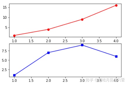
股票数据可视化:
导入数据分析包pandas和互联数据获取包pandas_datareader
import pandas as pd
from pandas_datareader import data
建立股票和公司的对应字典:
#字典:6家公司的股票
stockDict={'谷歌':'GOOG','亚马逊':'AMZN','Facebook':'FB',
            '苹果':'AAPL','阿里巴巴':'BABA','腾讯':'0700.hk'}
定义计算股票涨跌幅度的函数:
- 股票涨幅 = (现在股价-买入价格)/买入价格
- 输入参数:收盘价closing price - closing
- 返回数据:涨跌幅
def change(closing):
    buyPrice = closing[0]
    currentPrice = closing[closing.size-1]
    priceChange = (currentPrice-buyPrice)/buyPrice
    if(priceChange>0):
        print('cumulative inclined:',priceChange*100,'%')
    elif(priceChange==0):
        print('no change',priceChange*100,'%')
    else:
        print('cumulative declined:',priceChange*100,'%')
    return priceChange
Alibaba:
# 获取时间范围的股票数据
start_date = '2018-01-01'
end_date = '2018-06-29'
#从雅虎财经数据源(get_data_yahoo)获取阿里巴巴股票数据
babaDf=data.get_data_yahoo(stockDict['阿里巴巴'],start_date, end_date)
初步了解数据:
#查看前5行数据
babaDf.head()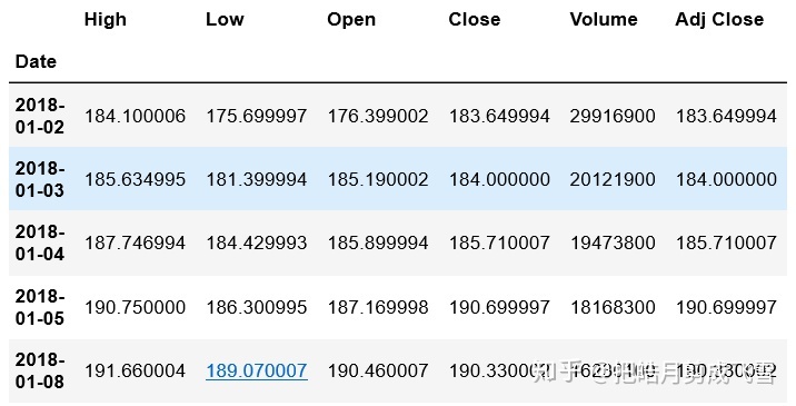
因为是DF数据,所以会有索引,查看索引
babaDf.index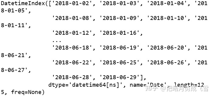
显示以时间作为索引,记录每日的股票信息
查看数据集的信息:
babaDf.info()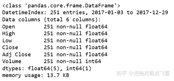
查看统计描述信息:
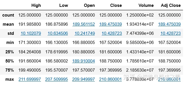
应用函数:
#得到收盘价
closingAli = babaDf['Close']
#应用函数
babaChange = change(closingAli)
cumulative inclined: 1.0236890527054294 %
谷歌:
#获取谷歌股票数据
googDf=data.get_data_yahoo(stockDict['谷歌'],start_date, end_date)
googDf.head()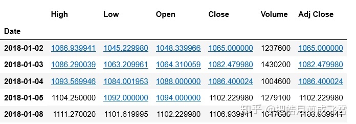
closeGoo = googDf['Close']
googChange=change(closeGoo)
cumulative inclined: 4.755870837001173 %
亚马逊:
#获取亚马逊股票数据
amazDf=data.get_data_yahoo(stockDict['亚马逊'],start_date, end_date)
amazDf.head()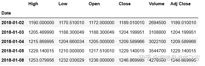
closeAmaz = amazDf['Close']
amazChange=change(closeAmaz)
cumulative inclined: 42.95927156771252 %
Facebook:
#获取Facebook股票数据
fbDf=data.get_data_yahoo(stockDict['Facebook'],start_date, end_date)
fbDf.head()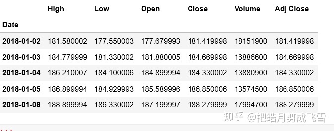
closeFb=fbDf['Close']
fbChange=change(closeFb)
cumulative inclined: 7.110577271233599 %
苹果:
#获取苹果股票数据
applDf=data.get_data_yahoo(stockDict['苹果'],start_date, end_date)
applDf.head()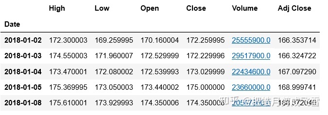
closeApp=applDf['Close']
applChange=change(closeApp)
cumulative inclined: 7.4596577924572545 %
腾讯:
#获取亚马逊股票数据
txDf=data.get_data_yahoo(stockDict['腾讯'],start_date, end_date)
txDf.head()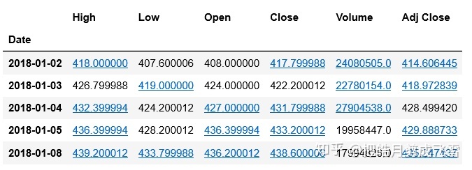
腾讯是港股,所以收盘价是港币,按照当天的汇率转化成美元
汇率是0.1290
exchange=0.1290
txDf['Close_dollar']= txDf['Close']* exchange
txDf.head()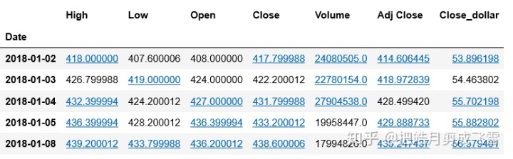
closeTx=txDf['Close']
txChange=change(closeTx)
cumulative declined: -5.744375467021951 %
数据可视化
%matplotlib inline
#导入可视化包
import matplotlib.pyplot as plt
阿里巴巴:
用折线图绘制股票的走势:
#不需要x轴的数据,只要用y轴就可以了,索引会被自动设置为x轴
babaDf.plot(y='Close')
#x坐标轴文本
plt.xlabel('时间Time')
#y坐标轴文本
plt.ylabel('stockPrice(USD)')
#图片标题
plt.title('Alibaba Stock Price')
#显示网格
plt.grid(True)
#显示图形
plt.show()
散点图:
babaDf.plot(x='Volume',y='Close',kind='scatter')
#x坐标轴文本
plt.xlabel('Volumn')
#y坐标轴文本
plt.ylabel('Stock Price')
#图片标题
plt.title('Volumn and Price')
#显示网格
plt.grid(True)
#显示图形
plt.show()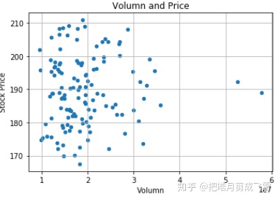
计算相关系数矩阵
babaDf.corr()
可以用同样的方法为其他几家公司作图
GAFATA股价走势比较 - 一张图上多线条
#绘制谷歌的画纸 - subplot
ax1=googDf.plot(y='Close')
#通过指定画纸ax,在同一张画纸上绘图
#亚马逊
amazDf.plot(ax=ax1,y='Close')
#Facebook
fbDf.plot(ax=ax1,y='Close')
#苹果
applDf.plot(ax=ax1,y='Close')
#阿里巴巴
babaDf.plot(ax=ax1,y='Close')
#腾讯
txDf.plot(ax=ax1,y='Close_dollar')
#x坐标轴文本
plt.xlabel('Time')
#y坐标轴文本
plt.ylabel('StockPrice(USD)')
#图片标题
plt.title('2018 - GAFATA Stock price change comparison')
#显示网格
plt.grid(True)
plt.show()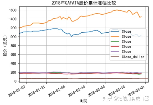
这里的图例是不同的颜色加y轴的名称,需要修改y轴的‘label’
使用label自定义图例
'''
#绘制谷歌的画纸1
ax1=googDf.plot(y='Close',label='谷歌')
#通过指定画纸ax,在同一张画纸上绘图
#亚马逊
amazDf.plot(ax=ax1,y='Close',label='亚马逊')
#Facebook
fbDf.plot(ax=ax1,y='Close',label='Facebook')
#苹果
applDf.plot(ax=ax1,y='Close',label='苹果')
#阿里巴巴
babaDf.plot(ax=ax1,y='Close',label='阿里巴巴')
#腾讯
txDf.plot(ax=ax1,y='Close_dollar',label='腾讯')
#x坐标轴文本
plt.xlabel('Time')
#y坐标轴文本
plt.ylabel('StockPrice(USD)')
#图片标题
plt.title('2018 - GAFATA Stock price change comparison')
#显示网格
plt.grid(True)
plt.show()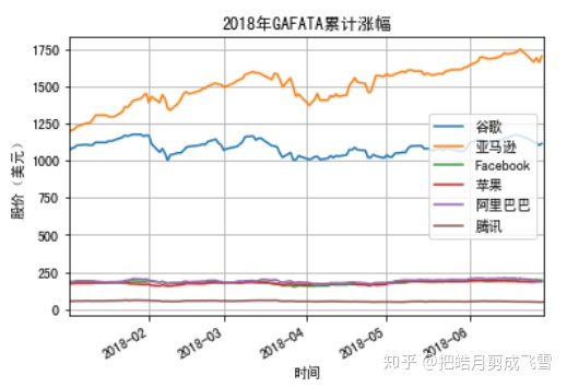
亚马逊和谷歌的股价远高于其他几家,因此我们将其分为两组比较
第一组:亚马逊和谷歌的对比
#绘制谷歌的画纸2
ax2=googDf.plot(y='Close',label='Google')
#通过指定画纸ax,在同一张画纸上绘图
#亚马逊
amazDf.plot(ax=ax2,x=amazDf.index,y='Close',label='Amazon')
#x坐标轴文本
plt.xlabel('Time')
#y坐标轴文本
plt.ylabel('StockPrice(USD)')
#图片标题
plt.title('stock price change for Google and Amazon in 2018')
#显示网格
plt.grid(True)
plt.show()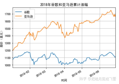
#绘制Facebook的画纸3
#通过指定画纸ax,在同一张画纸上绘图
#Facebook
ax3=fbDf.plot(y='Close',label='Facebook')
#苹果
applDf.plot(ax=ax3,y='Close',label='APPLE')
#阿里巴巴
babaDf.plot(ax=ax3,y='Close',label='Alibaba')
#腾讯
txDf.plot(ax=ax3,y='Close_dollar',label='Tencent')
#x坐标轴文本
plt.xlabel('Time')
#y坐标轴文本
plt.ylabel('StockPrice(USD)')
#图片标题
plt.title('2018 stock price change')
#显示网格
plt.grid(True)
plt.show()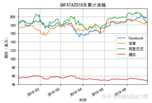
柱状图:六家公司的股票平均值
计算收盘的平均价.mean()并创建一维数组series
stockMeanList=[googDf['Close'].mean(),
               amazDf['Close'].mean(),
               fbDf['Close'].mean(),
               applDf['Close'].mean(),
               babaDf['Close'].mean(),
               txDf['Close_dollar'].mean()
              ]
stockMeanList

stockMeanSer = pd.Series(stockMeanList,
                         index=['Google',
                             'Amazon',
                            'Facebook',
                              'Apple',
                             'Ali',
                             'TX'])
stockMeanSer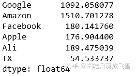
stockMeanSer.plot(kind='bar',color = 'orange',label='stock')
#图片标题
plt.title('2017 average stock price')
#x坐标轴文本
plt.xlabel('company')
#y坐标轴文本
plt.ylabel('avg_price(usd)')
plt.grid(True)
plt.show()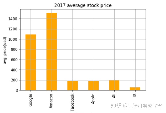
绘制四分位图:创建收盘价的二维数组
closeDf = pd.DataFrame()
closeDf=pd.concat([closeDf,googDf['Close'],#谷歌
                      amazDf['Close'],#亚马逊
                      fbDf['Close'],#Facebook
                      applDf['Close'],#苹果
                      babaDf['Close'],#阿里巴巴
                      txDf['Close_dollar']#腾讯
                 ],axis=1)
closeDf.columns=['Google','Amazon','Facebook','Apple','Ali','TX']
closeDf.head()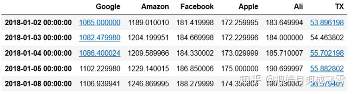
closeDf.plot(kind='box',color='purple')
plt.grid(True)
plt.show()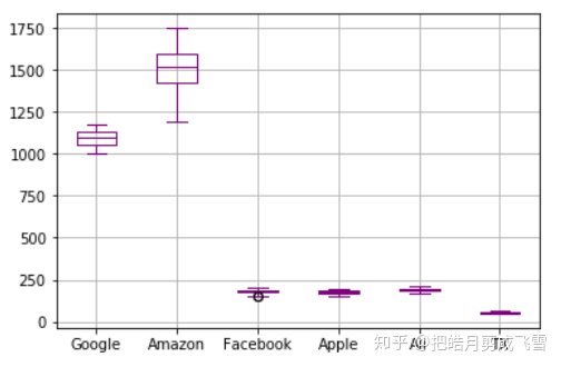
用Jupyter notebook制作报告
markdown:
可以用于文档排版
标题:
# 一级标题
##二级标题
###三级标题 - ######六级标题
示例如图:

无序列表和有序列表:
*用于无序列表
- 2. 3. 等用于有序列表

加粗和斜体:
**加粗内容**
*斜体内容*

超链接和图片:
[网站名字](网址)
![图片名字] (图片地址)
网址:


图片


引用:
>这部分是引用,不包含空格


分隔线:三个*,换行


幻灯片制作:
设置 - view - Cell toolbar - Slides Show
退出 - view - Cell toolbar - None
生成:

最后会生成一个(.html)文件


 3万+
3万+

 被折叠的 条评论
为什么被折叠?
被折叠的 条评论
为什么被折叠?
 到【灌水乐园】发言


