


 本文介绍了CSS中的一些不常见的但非常实用的技巧,包括自定义文本选择、去除video控件中的下载按钮、滚动条样式修改等。此外还展示了如何使用CSS3特性的transform进行GPU加速、如何隐藏input number的上下按钮等技巧。
1、自定义文本选择
::selection {
background: red;
color: black;
}
2、去掉video的controls中的下载按钮
video::-internal-media-controls-download-button {
display:none;
}
video::-webkit-media-controls-enclosure {
overflow:hidden;
}
video::-webkit-media-controls-panel {
width: calc(100% + 30px);
}
3、css3特性中的transform:translateZ(0)有什么作用
GPU加速,优化前端性能
4、滚动条样式修改
/* * 可以换其他选择器 */
*::-webkit-scrollbar {
width: 2px;
height: 2px;
}
*::-webkit-scrollbar-thumb {
border-radius: 5px;
box-shadow: inset 0 0 5px rgba(0, 0, 0, 0.2);
-webkit-box-shadow: inset 0 0 5px rgba(0, 0, 0, 0.2);
background: #00063a;
}
*::-webkit-scrollbar-track {
box-shadow: inset 0 0 5px rgba(0, 0, 0, 0.2);
-webkit-box-shadow: inset 0 0 5px rgba(0, 0, 0, 0.2);
border-radius: 0;
background: #00063a;
}
5、input type number 隐藏上下按钮
input::-webkit-outer-spin-button,
input::-webkit-inner-spin-button {
-webkit-appearance: none;
}
input[type="number"]{
-moz-appearance: textfield;
}
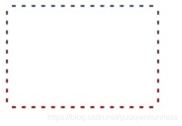
6、css渐变虚框
.box {
width: 150px;
border: 2px dashed #fff;
background: linear-gradient(to bottom, #34538b, #cd0000);
background-origin: border-box;
}
.content {
height: 100px;
background-color: #fff;
}
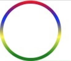
7、border渐变色圆角
.content {
width: 100px;
height: 100px;
box-sizing: border-box;
padding: 5px;
border-radius: 50%;
background-image: -webkit-linear-gradient(top, red 0%, blue 30%, yellow 60%, green 90%);
background-image: -moz-linear-gradient(top, red 0%, blue 30%, yellow 60%, green 90%);
background-image: linear-gradient(top, red 0%, blue 30%, yellow 60%, green 90%);
}
.box {
width:100%;
height:100%;
border-radius:50%;
background:#fff;
}
8、输入框光标变色,文字不变色
input{
caret-color: red;
}

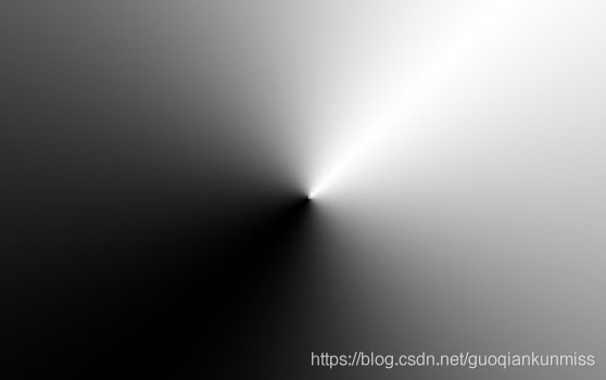
9、锥形渐变
.box {
width: 300px; height: 300px;
background: conic-gradient(from 45deg, white, black, white);
}
10、 text-decoration实现波浪线
wavy {
display: block;
height: .5em;
white-space: nowrap;
letter-spacing: 100vw;
padding-top: .5em;
overflow: hidden;
}
wavy::before {
content: "\2000\2000";
/* IE浏览器实线代替 */
text-decoration: overline;
/* 现代浏览器 */
text-decoration: overline wavy;
}

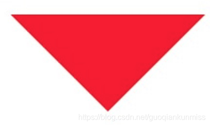
11、css三角形
.div1{
width: 0;
height: 0;
border: 100px solid;
border-color: red transparent transparent transparent;
}
12、css背景渐变与背景图片并存
background: url(https://img.alicdn.com/imgextra/i4/1881744325/O1CN01JBktT81hotb8c6Py0_!!1881744325.png) center no-repeat,linear-gradient(to bottom,red,#3c3f40);

13、自定义浏览器滚动条
/*定义滚动条宽高及背景,宽高分别对应横竖滚动条的尺寸*/
::-webkit-scrollbar {
width: 5px;
height: 5px;
background-color: rgba(245, 245, 245, 0.47);
}
/*定义滚动条的轨道,内阴影及圆角*/
::-webkit-scrollbar-track {
-webkit-box-shadow: inset 0 0 6px rgba(0, 0, 0, .3);
border-radius: 10px;
background-color: #f5f5f5;
}
/*定义滑块,内阴影及圆角*/
::-webkit-scrollbar-thumb {
/*width: 10px;*/
height: 20px;
border-radius: 10px;
-webkit-box-shadow: inset 0 0 6px rgba(0, 0, 0, .3);
background-color: rgba(85, 85, 85, 0.25);
}
14、改变placeholder的字体颜色大小
input::-webkit-input-placeholder {
/* WebKit browsers */
font-size:14px;
color: #333;
}
input::-moz-placeholder {
/* Mozilla Firefox 19+ */
font-size:14px;
color: #333;
}
input:-ms-input-placeholder {
/* Internet Explorer 10+ */
font-size:14px;
color: #333;
}
到此这篇关于css一些不常见但很有用的属性操作大全的文章就介绍到这了,更多相关css 属性操作内容请搜索脚本之家以前的文章或继续浏览下面的相关文章,希望大家以后多多支持脚本之家!


 扫一扫
扫一扫


 161
161

 被折叠的 条评论
为什么被折叠?
被折叠的 条评论
为什么被折叠?
 到【灌水乐园】发言


