


 本文详细介绍如何在Android应用中自定义一个底部菜单栏,通过MenuItemM控件实现不同效果,包括消息提示、新/更多选项及未读数量显示。跟着步骤学习如何配置属性、布局和事件处理,适合Android开发者进阶学习。
利用Android怎么实现一个底部菜单栏
发布时间:2020-11-20 16:02:29
来源:亿速云
阅读:71
作者:Leah
利用Android怎么实现一个底部菜单栏?很多新手对此不是很清楚,为了帮助大家解决这个难题,下面小编将为大家详细讲解,有这方面需求的人可以来学习下,希望你能有所收获。
今天我们封装一个底部的菜单栏,这个大多数的应用都会用到,因此我们来自定义,方便以后项目的使用。
该控件的实现将分上下篇来介绍,先来看一个菜单栏的子控件–MenuItemM,这个控件有什么用呢?我们来看下一些主流app上的一些控件,如:
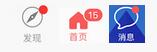
以上三张图片分别来自微信,今日头条和去哪儿,接下来我们将看到如何通过一个控件来实现不同的效果。
首先看下我写的一个deme
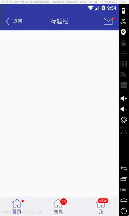
可以看到标题栏的消息控件,以及底部三个菜单项都是通过MenuItemM来实现的
这里面只是演示菜单栏的子控件,我们将在下一篇博客中完成底部菜单栏的封装,这个控件里使用了上一篇博客介绍的一个控件ButtonExtendM,可以先看一下https://www.jb51.net/article/103920.htm
接下来看下实现过程
1 定义属性
这里面重点看一下visibleMore和visibleNew里面的两个枚举值,这里面与View源码中的visible和gone保持一致。关于如何定义属性以及使用,可以参考我之前的博客。
2 布局文件view_menu_item_m.xml
xmlns:landptf="http://schemas.android.com/apk/res-auto"
android:layout_width="wrap_content"
android:layout_height="wrap_content"
android:layout_gravity="center">
android:id="@+id/bem_menu"
android:layout_width="match_parent"
android:layout_height="match_parent"
android:layout_marginRight="8dp"
landptf: />
android:id="@+id/iv_more"
android:layout_width="wrap_content"
android:layout_height="wrap_content"
android:layout_gravity="top|right"
android:background="@drawable/icon_more"
android:visibility="gone" />
android:id="@+id/iv_new"
android:layout_width="wrap_content"
android:layout_height="wrap_content"
android:layout_gravity="top|right"
android:background="@drawable/icon_new"
android:visibility="gone" />
android:id="@+id/btm_unread_count"
android:layout_width="20dp"
android:layout_height="20dp"
android:layout_gravity="top|right"
android:textSize="12sp"
android:visibility="gone"
landptf:backColor="#ff0000"
landptf:fillet="true"
landptf:shape="oval"
landptf:textColor="@android:color/white" />
这里面使用了FrameLayout,主要使用了ButtonExtendM上下结构的控件加上右上角的三种提示信息,数量提示,more提示,new提示
3 MenuItemM.java
package com.landptf.view;
import android.content.Context;
import android.content.res.ColorStateList;
import android.content.res.TypedArray;
import android.graphics.drawable.Drawable;
import android.util.AttributeSet;
import android.util.Log;
import android.view.Gravity;
import android.view.LayoutInflater;
import android.view.MotionEvent;
import android.view.View;
import android.widget.FrameLayout;
import android.widget.ImageView;
import com.landptf.R;
/**
* Created by landptf on 2016/11/07.
* 菜单按钮,例如底部菜单的item或者消息控件
*/
public class MenuItemM extends FrameLayout {
private static final String TAG = MenuItemM.class.getSimpleName();
/**
* 定义控件
*/
private ButtonExtendM bemMenu;
private ImageView ivMore;
private ImageView ivNew;
private ButtonM btmUnReadCount;
private OnClickListener onClickListener = null;
public interface OnClickListener {
void onClick(View v);
}
/**
* 设置View的Click事件
*
* @param l
*/
public void setOnClickListener(OnClickListener l) {
this.onClickListener = l;
//拦截ButtonExtendM控件的点击事件,使其指向this.onclick
bemMenu.setOnClickListener(new ButtonExtendM.OnClickListener() {
@Override
public void onClick(View v) {
onClickListener.onClick(v);
}
});
}
public MenuItemM(Context context) {
super(context);
}
public MenuItemM(Context context, AttributeSet attrs) {
this(context, attrs, 0);
}
public MenuItemM(Context context, AttributeSet attrs, int defStyleAttr) {
super(context, attrs, defStyleAttr);
init(context, attrs, defStyleAttr);
}
private void init(Context context, AttributeSet attrs, int defStyle) {
//加载布局
LayoutInflater.from(context).inflate(R.layout.view_menu_item_m, this, true);
//初始化控件
bemMenu = (ButtonExtendM) findViewById(R.id.bem_menu);
ivMore = (ImageView) findViewById(R.id.iv_more);
ivNew = (ImageView) findViewById(R.id.iv_new);
btmUnReadCount = (ButtonM) findViewById(R.id.btm_unread_count);
btmUnReadCount.setGravity(Gravity.CENTER);
TypedArray a = getContext().obtainStyledAttributes(
attrs, R.styleable.MenuItemM, defStyle, 0);
if (a != null) {
//设置背景色
ColorStateList colorList = a.getColorStateList(R.styleable.MenuItemM_backColor);
if (colorList != null) {
int backColor = colorList.getColorForState(getDrawableState(), 0);
if (backColor != 0) {
setBackColor(backColor);
}
}
//设置icon
Drawable iconDrawable = a.getDrawable(R.styleable.MenuItemM_iconDrawable);
if (iconDrawable != null) {
setIconDrawable(iconDrawable);
}
//记录View被按下时的icon的图片
Drawable iconDrawablePress = a.getDrawable(R.styleable.MenuItemM_iconDrawablePress);
if (iconDrawablePress != null) {
setIconDrawablePress(iconDrawablePress);
}
//设置文字的颜色
ColorStateList textColorList = a.getColorStateList(R.styleable.MenuItemM_textColor);
if (textColorList != null) {
int textColor = textColorList.getColorForState(getDrawableState(), 0);
if (textColor != 0) {
setTextColor(textColor);
}
}
//记录View被按下时文字的颜色
ColorStateList textColorPressList = a.getColorStateList(R.styleable.MenuItemM_textColorPress);
if (textColorPressList != null) {
int textColorPress = textColorPressList.getColorForState(getDrawableState(), 0);
if (textColorPress != 0) {
setTextColorPress(textColorPress);
}
}
//设置显示的文本内容
String text = a.getString(R.styleable.MenuItemM_text);
if (text != null) {
setText(text);
}
//设置文本字体大小
float textSize = a.getFloat(R.styleable.MenuItemM_textSize, 0);
if (textSize != 0) {
setTextSize(textSize);
}
//设置更多提示是否显示
int visibleMore = a.getInt(R.styleable.MenuItemM_visibleMore, -1);
if (visibleMore != -1){
setVisibilityMore(visibleMore);
}
//设置new提示是否显示
int visibleNew = a.getInt(R.styleable.MenuItemM_visibleNew, -1);
if (visibleNew != -1){
setVisibilityNew(visibleNew);
}
//设置消息未读数量
int unReadCount = a.getInt(R.styleable.MenuItemM_unReadCount, -1);
if (unReadCount != -1){
setUnReadCount(unReadCount);
}
a.recycle();
}
setOnClickListener(new View.OnClickListener() {
@Override
public void onClick(View v) {
if (onClickListener != null) {
onClickListener.onClick(v);
}
}
});
}
/**
* 设置为被选中状态
* @param state in MotionEvent.ACTION_DOWN or MotionEvent.ACTION_UP
*/
public void setPressState(int state){
if (state != MotionEvent.ACTION_DOWN && state != MotionEvent.ACTION_UP){
Log.w(TAG, "无效参数");
return;
}
bemMenu.setPressState(state);
}
/**
* 设置View的背景色
*
* @param backColor
*/
public void setBackColor(int backColor) {
bemMenu.setBackColor(backColor);
}
/**
* 设置icon的图片
*
* @param iconDrawable
*/
public void setIconDrawable(Drawable iconDrawable) {
bemMenu.setIconDrawable(iconDrawable);
}
/**
* 设置View被按下时的icon的图片
*
* @param iconDrawablePress
*/
public void setIconDrawablePress(Drawable iconDrawablePress) {
bemMenu.setIconDrawablePress(iconDrawablePress);
}
/**
* 设置文字的颜色
*
* @param textColor
*/
public void setTextColor(int textColor) {
if (textColor == 0) return;
bemMenu.setTextColor(textColor);
}
/**
* 设置View被按下时文字的颜色
*
* @param textColorPress
*/
public void setTextColorPress(int textColorPress) {
if (textColorPress == 0) return;
bemMenu.setTextColorPress(textColorPress);
}
/**
* 设置显示的文本内容
*
* @param text
*/
public void setText(CharSequence text) {
bemMenu.setText(text);
}
/**
* 获取显示的文本
*
* @return
*/
public String getText() {
return bemMenu.getText();
}
/**
* 设置文本字体大小
*
* @param size
*/
public void setTextSize(float size) {
bemMenu.setTextSize(size);
}
/**
* 设置更多提示是否显示
* 如果显示则先重置new和未读数量图标
* @param visibleMore
*/
public void setVisibilityMore(int visibleMore) {
if (visibleMore == VISIBLE) {
resetTip();
}
ivMore.setVisibility(visibleMore);
}
/**
* 设置New提示是否显示
* 如果显示则先重置更多和未读数量图标
* @param visibleNew
*/
public void setVisibilityNew(int visibleNew) {
if (visibleNew == VISIBLE) {
resetTip();
}
ivNew.setVisibility(visibleNew);
}
/**
* 设置未读数量
* 如果小于等于0,表示隐藏
* 如果大于99,则将其隐藏,同时显示更多的提示
* 如果在0-99区间,则隐藏更多和new图标
* @param unReadCount
*/
public void setUnReadCount(int unReadCount){
if (unReadCount <= 0){
btmUnReadCount.setVisibility(GONE);
//如果先设置100(此时会显示ivMore),再设置0,因此此处应将ivMore同时置为GONE
if (ivMore.getVisibility() == VISIBLE){
ivMore.setVisibility(GONE);
}
return;
}
if (unReadCount > 99){
setVisibilityMore(VISIBLE);
return;
}
resetTip();
btmUnReadCount.setVisibility(VISIBLE);
btmUnReadCount.setText(unReadCount + "");
}
/**
* 重置提示信息
*/
private void resetTip(){
setVisibilityMore(GONE);
setVisibilityNew(GONE);
setUnReadCount(0);
}
}
代码有点长,逻辑比较简单,本身自定义控件的过程都是类似的,比较多的是对外提供的接口。
特别要注意的是使用时大小要设置为自定义,如果指定了大小或者match_parent,则子控件将居于左上角,无法居中。
4 最后简单看下如何使用
android:id="@+id/mim_home_page"
android:layout_width="wrap_content"
android:layout_height="wrap_content"
android:layout_centerVertical="true"
android:layout_marginLeft="32dp"
landptf:iconDrawable="@drawable/icon_home_page"
landptf:iconDrawablePress="@drawable/icon_home_page_press"
landptf:textColor="#696969"
landptf:textColorPress="#303f9f"
landptf:text="首页"
/>
这里面主要使用了以下四个属性,分别表示默认图标和按下后显示的图标,以及文字颜色和按下后的文字颜色
landptf:iconDrawable="@drawable/icon_home_page"
landptf:iconDrawablePress="@drawable/icon_home_page_press"
landptf:textColor="#696969"
landptf:textColorPress="#303f9f"
final MenuItemM mimHomePage = (MenuItemM) findViewById(R.id.mim_home_page);
if (mimHomePage != null){
//默认为选中状态
mimHomePage.setPressState(MotionEvent.ACTION_DOWN);
mimHomePage.setVisibilityMore(View.VISIBLE);
mimHomePage.setOnClickListener(new MenuItemM.OnClickListener() {
@Override
public void onClick(View v) {
//按下后隐藏提示信息
mimHomePage.setVisibilityMore(View.GONE);
}
});
}
看完上述内容是否对您有帮助呢?如果还想对相关知识有进一步的了解或阅读更多相关文章,请关注亿速云行业资讯频道,感谢您对亿速云的支持。


 扫一扫
扫一扫


 被折叠的 条评论
为什么被折叠?
被折叠的 条评论
为什么被折叠?
 到【灌水乐园】发言


