


 博客内容仅提及了Code,未包含更多关键信息。
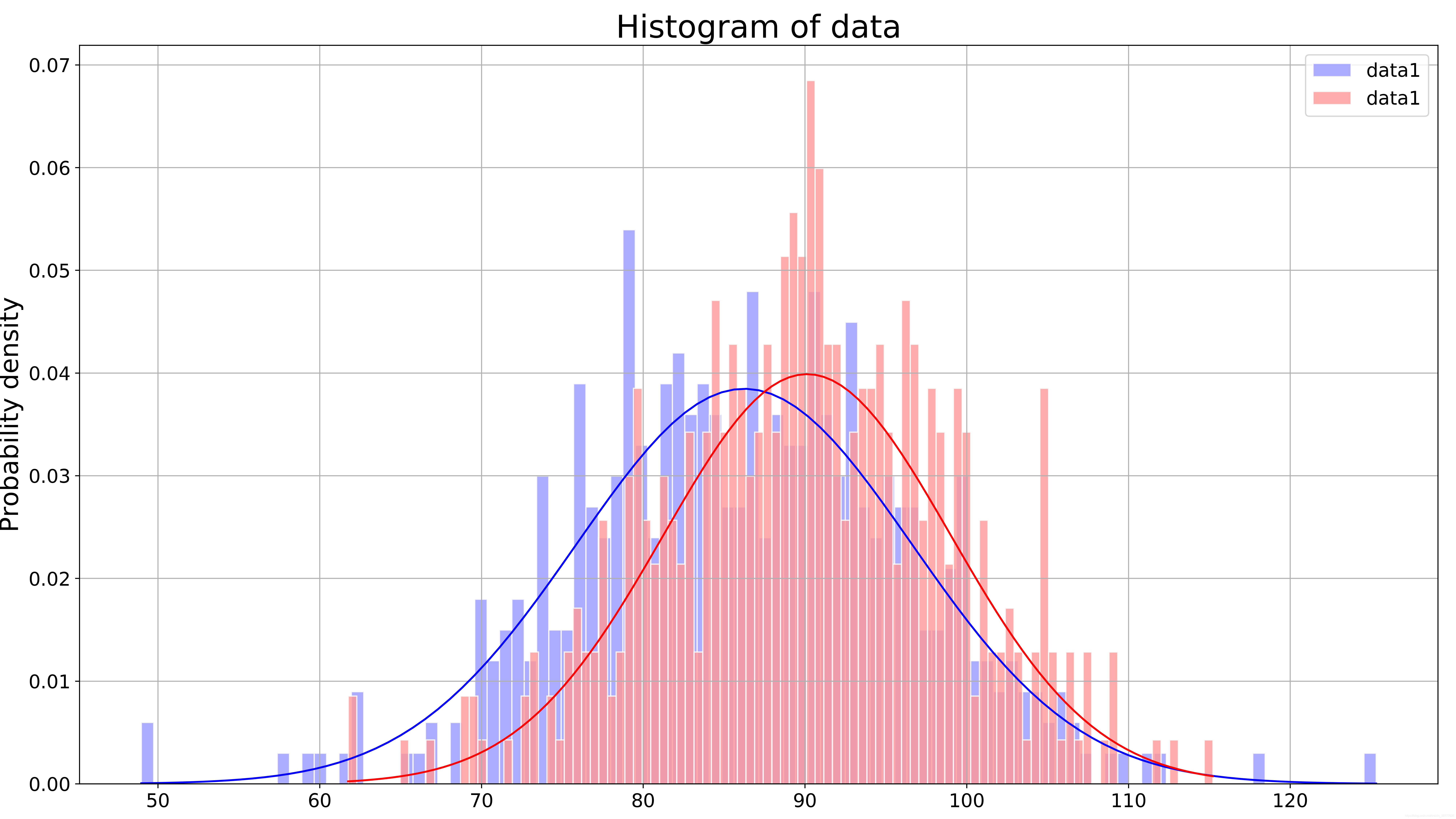
Code
import matplotlib
import pandas as pd
import numpy as np
import matplotlib.pyplot as plt
%matplotlib inline

data=pd.read_csv('I:\data\data2.csv')
x1=data.data1
x2=data.data2
num_bins = 100

fig, ax = plt.subplots(figsize=(16,9))

n1, bins1, patches1 = ax.hist(x1, num_bins, density=1,edgecolor = '#ffffff', color='#9999FF', alpha=0.8, label='data1')
y1 = ((1 / (np.sqrt(2 * np.pi) * x1.std())) *
     np.exp(-0.5 * (1 / x1.std() * (bins1 - x1.mean()))**2))
ax.plot(bins1, y1, color='b')

n2, bins2, patches2 = ax.hist(x2, num_bins, density=1,edgecolor = '#ffffff', color='#FF9898', alpha=0.8, label='data2')
y2 = ((1 / (np.sqrt(2 * np.pi) * x2.std())) *
     np.exp(-0.5 * (1 / x2.std() * (bins2 - x2.mean()))**2))
ax.plot(bins2, y2, color='r')

ax.set_ylabel('Probability density', fontsize=20)
ax.set_title(r'Histogram of data', fontsize=25)
plt.grid(True)
fig.tight_layout()
plt.xticks(fontsize=15)
plt.yticks(fontsize=15)
plt.legend(fontsize=15)
plt.savefig('pic.png', dpi=500)
plt.show()


 被折叠的 条评论
为什么被折叠?
被折叠的 条评论
为什么被折叠?
 到【灌水乐园】发言


