


background-clip定义和用法
background-clip 属性规定背景的绘制区域。
默认值:
border-box
继承性:
no
版本:
CSS3
JavaScript 语法:
object.style.backgroundClip="content-box"
语法
background-clip: border-box|padding-box|content-box;
值
描述
border-box
背景被裁剪到边框盒。
padding-box
背景被裁剪到内边距框。
content-box
背景被裁剪到内容框。
文字镂空效果
除上面几个属性值之外,还有一个属性值:
-webkit-background-clip: text;
描述:裁减掉文字以外的背景。效果如下:
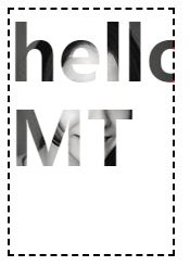
如果只有裁剪,无法实现上图所示效果。搭配上另外一个css属性使的字体透明显现背景图,即可完成。
-webkit-text-fill-color: transparent;//设置文字填充色为透明
//color:transparent;
考虑到color的继承性和应用范围,建议使用-webkit-text-fill-color只作用于字体。
代码如下:
css:
.mt-text {
-webkit-background-clip: text;
-webkit-text-fill-color: transparent;
background-image: url(./img/1.jpg);
background-repeat: no-repeat;
border: 2px dashed;
}
html:
hello MT
同样,将底图颜色设置成渐变,即实现字体颜色渐变效果。
css渐变
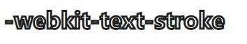
-webkit-text-stroke
.hollow{
-webkit-text-stroke: 3px #000;
color: transparent;
}
遮罩
-webkit-mask-image
html
MARK
css
.lable{
-webkit-mask-image: url(./img/txtpattern.png);
border: 4px solid;
}
效果

底图
或 


 扫一扫
扫一扫


 被折叠的 条评论
为什么被折叠?
被折叠的 条评论
为什么被折叠?
 到【灌水乐园】发言


