


 本文比较了圣杯布局和双飞翼布局在HTML和CSS中的实现,探讨了两者结构简洁度、代码量和优先渲染特点的区别,适合根据实际需求选择使用。
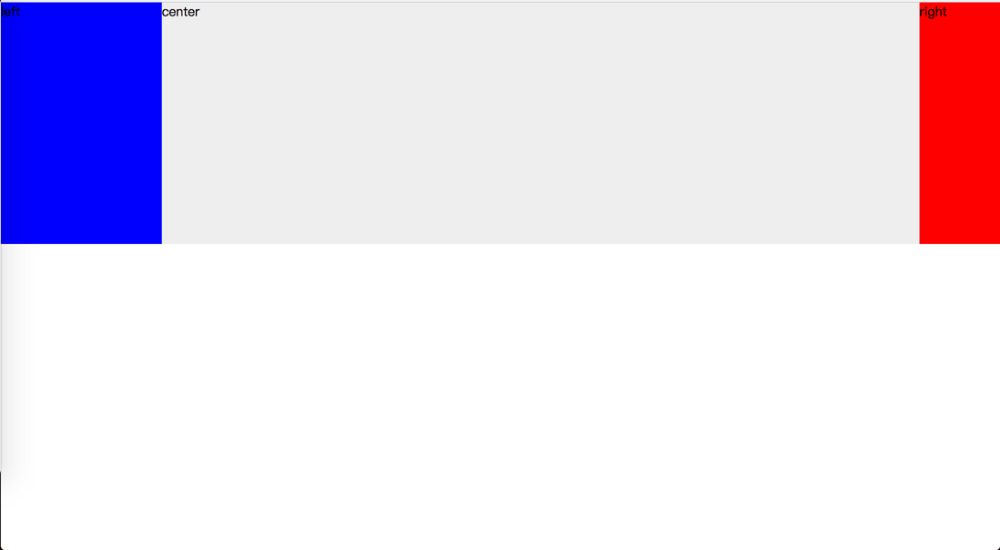
圣杯布局
html:
center
left
right
css:
#container {
padding: 0 100px 0 200px;/*左宽度为200px 右边宽度为100px*/
}
.col {
float: left;
position: relative;
height: 300px;
}
#center {
width: 100%;
background: #eee;
}
#left {
width: 200px;
background: blue;
margin-left: -100%;
right: 200px;
}
#right {
width: 100px;
background: red;
margin-right: -100px;
}
效果如图:

双飞翼布局
html:
center
left
right
css:
.col {
float: left;
height: 300px;
}
#center {
width: 100%;
background: #eee;
}
#left {
width: 200px;
background: blue;
margin-left: -100%;
}
#right {
width: 100px;
background: red;
margin-left: -100px;
}
#center .wrap {
margin: 0 100px 0 200px;
}
效果如图:
两种布局的区别
这两种布局实现的都是两边固定宽度,中间自适应,中间栏放在最前面优先渲染。
不同的是,双飞翼布局多创建一个包裹的div,去掉了相对定位,css相对少写一些。
个人认为圣杯布局结构更简洁,平常工作中就看大家自己的选择了。


 扫一扫
扫一扫


 被折叠的 条评论
为什么被折叠?
被折叠的 条评论
为什么被折叠?
 到【灌水乐园】发言


