


看到下面的代码片段或小提琴的位置>
第一。 .first_section上的填充是一个错误。这就是为什么你的内容定位如此之差,正如你所说:Both text and image seems to have skewed downward.
秒。在.first_section上使用float:left;和width,因此它将继承其内容的高度。
我用width:90%与margin:0 5%,因为我看到你想要有左右边距。
然后在屏幕变小时使用media queries将上方的文本和图像放置在文本下方。屏幕尺寸小于640px时,我使用了media query。但这仅仅是一个例子,不管你想要改变它。
在该媒体查询中添加width:100%到文本和图像,以便他们将一个接一个留下来。
让我知道,如果它可以帮助
.first_section {
background-image:url('http://i347.photobucket.com/albums/p462/jimprince1990/zinc-white_zpsiibjtmdi.jpg');
background-position:center top;
background-size: cover;
float:left;
width:90%;
margin: 0 5%;
padding:15px;
box-sizing:border-box;
font-family: 'Trebuchet MS', 'Helvetica', 'sans-serif';
}
#first_section_text {
float: left;
text-align: left; /*Set everything to the left */
display: block;
width: 50%;
}
#first_section_image {
float: right; /* float property can be used to wrap text around images */
width: 50%;
height: 50%;
display: block;
}
@media only screen and (max-width: 640px) {
#first_section_image { float:left;width:100%;}
#first_section_text{ float:left;width:100%;}
}
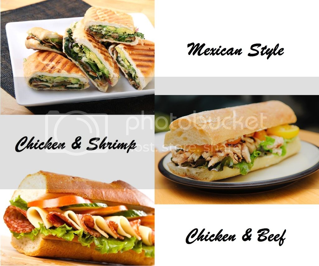
IT'S OFFICIALLY SANDWICHES SEASON
This summer, we've got more sandwiches options than ever. From the new mexican style to our classic chicken and beef sandwich, there's a style to fill you up on any hot day.


 扫一扫
扫一扫


 4220
4220

 被折叠的 条评论
为什么被折叠?
被折叠的 条评论
为什么被折叠?
 到【灌水乐园】发言


