


Material Design Android Library

How to use
If you want use this library, you only have to download MaterialDesign project, import it into your workspace and add the project as a library in your android project settings.
If you prefer it, you can use the gradle dependency, you have to add these lines in your build.gradle file:
repositories {
jcenter()
}
dependencies {
compile ‘com.github.navasmdc:MaterialDesign:[email protected]
}
Some components have custom attributes, if you want use them, you must add this line in your xml file in the first component:
xmlns:materialdesign="http://schemas.android.com/apk/res-auto"
android:layout_width="match_parent"
android:layout_height="match_parent"
>
If you are going to use a ScrollView, it is recommended that you use the CustomScrollView provided in this library to avoid problems with the custom components. To use this component:
xmlns:android="http://schemas.android.com/apk/res/android"
xmlns:materialdesign="http://schemas.android.com/apk/res-auto"
android:id="@+id/scroll"
android:layout_width="match_parent"
android:layout_height="match_parent">
##Components
####Buttons
######Flat Button

android:id="@+id/buttonflat"
android:layout_width="wrap_content"
android:layout_height="wrap_content"
android:background="#1E88E5"
android:text="Button" />
######Rectangle Button

android:id="@+id/button"
android:layout_width="wrap_content"
android:layout_height="wrap_content"
android:background="#1E88E5"
android:text="Button" />
######Float Button

It is recommended to put this component in the right-bottom of the screen. To use this component write this code in your xml file. If you don`t want to start this component with animation set the animate attribute to false. Put your icon in the icon attribute to set the drawable icon for this component.
xmlns:materialdesign="http://schemas.android.com/apk/res-auto"
android:layout_width="match_parent"
android:layout_height="match_parent"
>
android:id="@+id/buttonFloat"
android:layout_width="wrap_content"
android:layout_height="wrap_content"
android:layout_alignParentRight="true"
android:layout_alignParentBottom="true"
android:layout_marginRight="24dp"
android:background="#1E88E5"
materialdesign:animate="true"
materialdesign:iconDrawable="@drawable/ic_action_new" />
######Float small button

android:id="@+id/buttonFloatSmall"
android:layout_width="wrap_content"
android:layout_height="wrap_content"
android:background="#1E88E5"
materialdesign:iconDrawable="@drawable/ic_action_new" />
####Switches
######CheckBox 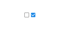
android:id="@+id/checkBox"
android:layout_width="wrap_content"
android:layout_height="wrap_content"
android:background="#1E88E5"
materialdesign:check="true" />
######Switch 
android:id="@+id/switchView"
android:layout_width="wrap_content"
android:layout_height="wrap_content"
android:background="#1E88E5"
materialdesign:check="true" />
####Progress indicators
######Progress bar circular indeterminate 
android:id="@+id/progressBarCircularIndeterminate"
android:layout_width="32dp"
android:layout_height="32dp"
android:background="#1E88E5" />
######Progress bar indeterminate 
android:id="@+id/progressBarIndeterminate"
android:layout_width="fill_parent"
android:layout_height="wrap_content"
android:background="#1E88E5" />
######Progress bar indeterminate determinate 
android:id="@+id/progressBarIndeterminateDeterminate"
android:layout_width="fill_parent"
android:layout_height="wrap_content"
android:background="#1E88E5" />
If you begin progrees, you only have to set progress it
progressBarIndeterminateDeterminate.setProgress(progress);
######Progress bar determinate 
android:id="@+id/progressDeterminate"
android:layout_width="fill_parent"
android:layout_height="wrap_content"
android:background="#1E88E5" />
You can custom max and min progress values with materialdesign:max="50" and materialdesign:min="25" attributes.
######Slider 
android:id="@+id/slider"
android:layout_width="fill_parent"
android:layout_height="wrap_content"
android:background="#1E88E5"
materialdesign:max="50"
materialdesign:min="0"
/>
######Slider with number indicator 
android:id="@+id/slider"
android:layout_width="fill_parent"
android:layout_height="wrap_content"
android:background="#1E88E5"
materialdesign:max="50"
materialdesign:min="0"
materialdesign:showNumberIndicator="true"/>
##Widgets
####SnackBar

SnackBar snackbar = new SnackBar(Activity activity, String text, String buttonText, View.OnClickListener onClickListener);
snackbar.show();
If you don‘t want to show the button, put null in buttonText attribute
####Dialog

Dialog dialog = new Dialog(Context context,String title, String message);
dialog.show();
You can set the accept and cancel button on the event listener or change it‘s text
// Set accept click listenner
dialog.setOnAcceptButtonClickListener(View.OnClickListener onAcceptButtonClickListener);
// Set cancel click listenner
dialog.setOnCancelButtonClickListener(View.OnClickListener onCancelButtonClickListener);
// Acces to accept button
ButtonFlat acceptButton = dialog.getButtonAccept();
// Acces to cancel button
ButtonFlat cancelButton = dialog.getButtonCancel();
####Color selector

ColorSelector colorSelector = new ColorSelector(Context context,int intialColor, OnColorSelectedListener onColorSelectedListener);
colorSelector.show();


 扫一扫
扫一扫


 被折叠的 条评论
为什么被折叠?
被折叠的 条评论
为什么被折叠?
 到【灌水乐园】发言


