


 本文介绍了10种在HTML中实现元素垂直居中和水平居中的方法,包括使用绝对定位、line-height、display: table-cell、CSS3 translate等,覆盖了不同场景和浏览器兼容性需求。
前言
水平且垂直居中方法有哪些?这在实际工作中经常用到,小记一下。
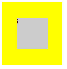
演示HTML结构
i
基本思想
一般的,水平居中相对垂直居中简单很多,对于内联元素(inline、inline-block、inline-table和inline-flex),父级元素设置text-align: center;;对于块级元素,子级元素设置margin: 0 auto;。以下结合水平居中强调实现垂直居中。
1、已知父级元素宽高,父级元素定位非 static ,子级元素定位设为 position: absolute/fixed ,再利用 margin 、 left 和 top 属性居中。
#div1 {
width: 200px;
height: 200px;
position: relative;
background-color: #ffff00;
}
#div2 {
width: 100px;
height: 100px;
position: absolute;
top: 50%;
left: 50%;
margin-left: -50px;
margin-top: -50px;
background-color: #ff00ff;
}
注:需要已知父级元素固定宽高,才能确定 margin-left 和 margin-right 。
2、子级元素是内联元素,父级元素设置 line-height 属性垂直居中。
#div1 {
width: 200px;
height: 200px;
line-height: 120px;
text-align: center;
position: relative;
background-color: #ffff00;
}
#div2 {
width: 100px;
height: 100px;
line-height: normal;
text-align: left;
display: inline-block;
background-color: #ff00ff;
}
注:需要已知父级元素的固定高度,才可以确定line-height。
3、子级元素是内联元素,父级元素用 display: table-cell; 和 vertical-align: middle; 属性实现垂直居中。
#div1 {
width: 200px;
height: 200px;
display: table-cell;
text-align: center;
vertical-align: middle;
background-color: #ffff00;
}
#div2 {
width: 100px;
height: 100px;
display: inline-block;
background-color: #ff00ff;
}
注:无需要确定父级元素的宽高,inline-block 、 table-cell 不兼容ie67
看到还有一种方案,是借助伪元素 ::after 将容器撑高,实现内联元素垂直居中
#div1 {
width: 200px;
height: 200px;
background-color: #ffff00;
text-align: center;
}
#div1::after {
content: "";
display: inline-block;
height: 100%;
vertical-align: middle;
}
#div2 {
width: 100px;
display: inline-block;
background-color: #cccccc;
vertical-align: middle;
}
缺点:较难以理解,只适用于一个子级内联元素(有多个子元素不适用)
4、对于子级是块级元素,父级元素同样用 display: table-cell; 和 vertical-align: middle; 属性实现垂直居中,水平方向居中用 margin: 0 auto; 。
#div1 {
width: 200px;
height: 200px;
display: table-cell;
vertical-align: middle;
background-color: #ffff00;
}
#div2 {
width: 100px;
height: 100px;
margin: 0 auto;
background-color: #ff00ff;
}
注:无需要确定父级元素的宽高,table-cell不兼容ie67
5、利用css3 translate 特性:位移是基于元素宽高的。
#div1 {
width: 200px;
height: 200px;
position: relative;
background-color: #ffff00;
}
#div2 {
width: 100px;
height: 100px;
position: absolute;
top: 50%;
left: 50%;
transform: translate(-50%, -50%);
-webkit-transform: translate(-50%, -50%);
-moz-transform: translate(-50%, -50%);
-ms-transform: translate(-50%, -50%);
background-color: #ff00ff;
}
注:无需要确定父级元素的宽高,translate属性兼容IE9+
6、当父级是浮动的,用 display: table-cell; 会失效,这时需要包三层,第一层 display: table;,第二层 display: table-cell; 第三次居中层
#div1 {
width: 200px;
height: 200px;
position: relative;
display: table;
background-color: #ffff00;
float: left;
}
#div2 {
width: 100%;
height: 100%;
display: table-cell;
vertical-align: middle;
/* text-align: center; */
background-color: #cccccc;
}
#div3 {
width: 100px;
height: 100px;
margin: 0 auto;
/* display: inline-block; */
background-color: #ff00ff;
}
注:无需要确定父级元素的宽高,但HTML标签层数较多。
7、绝对定位加四边定位为0,margin 为 auto。
#div1 {
width: 200px;
height: 200px;
position: relative;
background-color: #ffff00;
}
#div2 {
width: 100px;
height: 100px;
top: 0;
left: 0;
right: 0;
bottom: 0;
margin: auto;
position: absolute;
background-color: #cccccc;
}
注:无需要确定父级元素的宽高,但把定位属性全用上了
8、利用flex布局 justify-content: center; 和 align-items: center; 属性居中。
#div1 {
width: 200px;
height: 200px;
display: flex;
flex-direction: row;
justify-content: center;
align-items: center;
background-color: #ffff00;
}
#div2 {
width: 100px;
height: 100px;
background-color: #cccccc;
}
注:无需要确定父级元素的宽高,兼容IE10+
9、利用grid布局,划分成3x3栅格,第二行第二列格子垂直水平居中
#div1 {
width: 200px;
height: 200px;
display: grid;
background-color: #ffff00;
grid-template-columns: repeat(3, 1fr);
grid-template-rows: repeat(3, 1fr);
}
#div2 {
width: 100px;
height: 100px;
background-color: #cccccc;
grid-row-start: 2;
grid-column-start: 2;
}
注:无需要确定父级元素的宽高,兼容性Firefox 52, Safari 10.1, Chrome 57, Opera 44
10、利用flex或grid布局结合 margin: auto;
#div1 {
width: 200px;
height: 200px;
display: flex;
/* display: grid; */
}
#div2 {
width: 100px;
height: 100px;
margin: auto;
}
注:此方法最简洁, 但是 flex/grid 存在兼容性问题


 扫一扫
扫一扫


 被折叠的 条评论
为什么被折叠?
被折叠的 条评论
为什么被折叠?
 到【灌水乐园】发言


