


 本文介绍如何使用HTML5和CSS3技术绘制机器猫的头像,通过绝对定位、相对定位及浮动布局实现复杂图像。重点展示了背景图像渐变、椭圆边框等技巧的应用。
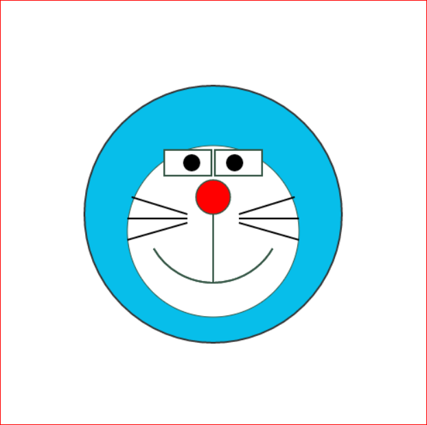
用HTML5+CSS3画一个机器猫的头像,原图如下:
代码实现效果如下:
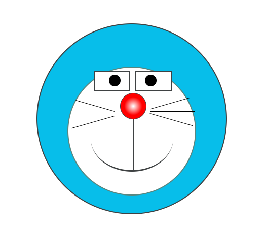
布局使用了绝对定位、相对定位以及浮动,鼻子使用了背景图像渐变的效果, 笑脸的嘴巴使用椭圆的下边框实现,胡须部分的细节处理得还是不够好。
代码如下:
CSS样式:
.cat:hover{
transform: scale(1.5);
transition: all 1s;
}
.cat{
position: relative;
z-index: 1;
}
.faceblue {
width: 372px;
height: 372px;
border-radius: 50%;
border: #3f4243 2px solid;
margin: 0 auto;
background-color: #07beea;
position: relative;
}
.facewhite{
width: 250px;
height: 250px;
border: #598680 solid 2px;
border-radius: 50%;
background-color: #fff;
position: absolute;
bottom: 35px;
left: 16%;
/* position: relative; */
}
.eyeleft,.eyeright{
width: 68px;
height: 37px;
border: #3f4243 2px solid;
background-color: #fff;
position: relative;
left: 50px;
top: 6px;
float: left;
}
.eyeright{
left: 60px;
}
.dotleft,.dotright{
background-color: #000;
width: 23px;
height: 23px;
border-radius: 50%;
position: absolute;
left: 28px;
top:6px;
}
.dotright{
left: auto;
right: 28px;
}
.nose{
width: 50px;
height: 50px;
background-image: radial-gradient(#fff 1%,#f00,#f00);
border-radius: 50%;
border: #3f4243 1px solid;
position: absolute;
left: 102px;
top: 50px;
}
.line{
height: 100px;
width: 2px;
background-color: #3f4243;
position: absolute;
left: 127px;
top: 102px;
}
.smile{
width: 163px;
height: 128px;
border: #3f4243 3px solid;
border-radius: 50%;
border-top:none;
border-right:none;
border-left:none;
position: absolute;
left: 44px;
top: 74px;
}
.beard{
position: relative;
top: 75px;
left: 5px;
}
.beard>div{
margin-bottom: 15px;
position: relative;
z-index: 1;
}
.beard1,.beard2,.beard3{
width: 88px;
height: 1px;
background-color: #000;
}
.beard1,.last .beard1{
transform: rotate(16deg);
margin-left: 8px;
width: 80px;
}
.beard3,.last .beard3{
transform: rotate(164deg);
width: 88px;
/* margin-left: 8px; */
}
.last{
position: relative;
top: 22px;
left: -1px;
transform: rotate(180deg);
}
.last .beard3{
width: 80px;
margin-left:8px;
}
.last .beard1{
width: 88px;
margin-left: 2px;
}
HTML结构:


 扫一扫
扫一扫


 被折叠的 条评论
为什么被折叠?
被折叠的 条评论
为什么被折叠?
 到【灌水乐园】发言


