


CSS3 实现雷达扫描图 demo
CSS3 实现雷达扫描图 demo
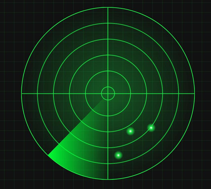
通过css3实现炫酷的雷达扫描图:
直接上代码:
// index.html
雷达扫描图//index.css
* {
box-sizing: border-box;
}
html {
height: 100%;
background-color: #111;
font-size: 10px;
}
body {
background-image:
linear-gradient(0deg, transparent 24%, rgba(32, 255, 77, 0.15) 26%, transparent 27%, transparent 74%, rgba(32, 255, 77, 0.15) 76%, transparent 77%, transparent),
linear-gradient(90deg, transparent 24%, rgba(32, 255, 77, 0.15) 26%, transparent 27%, transparent 74%, rgba(32, 255, 77, 0.15) 76%, transparent 77%, transparent);
background-size: 8rem 8rem;
width: 100%;
height: 100%;
position: relative;
padding: 0;
margin: 0;
font-size: 1.6rem;
}
.radar {
background:
-webkit-radial-gradient(center, rgba(32, 255, 77, 0.3) 0%, rgba(32, 255, 77, 0) 75%),
-webkit-repeating-radial-gradient(rgba(32, 255, 77, 0) 5.8%, rgba(32, 255, 77, 0) 18%, #20ff4d 18.6%, rgba(32, 255, 77, 0) 18.9%),
-webkit-linear-gradient(90deg, rgba(32, 255, 77, 0) 49.5%, #20ff4d 50%, rgba(32, 255, 77, 0) 50.2%),
-webkit-linear-gradient(0deg, rgba(32, 255, 77, 0) 49.5%, #20ff4d 50%, rgba(32, 255, 77, 0) 50.2%);
width: 75vw;
height: 75vw;
max-height: 75vh;
max-width: 75vh;
position: relative;
left: 50%;
top: 50%;
/* 元素居中定位 */
transform: translate(-50%, -50%);
border-radius: 50%;
border: 0.2rem solid #20ff4d;
overflow: hidden;
}
.radar:before {
content: ' ';
display: block;
position: absolute;
width: 100%;
height: 100%;
border-radius: 50%;
animation: blips 5s infinite;
animation-timing-function: linear;
animation-delay: 1.4s;
}
.radar:after {
content: ' ';
display: block;
background-image: linear-gradient(44deg, rgba(0, 255, 51, 0) 50%, #00ff33 100%);
width: 50%;
height: 50%;
position: absolute;
top: 0;
left: 0;
animation: radar-beam 5s infinite;
/* 速度相同 */
animation-timing-function: linear;
transform-origin: bottom right;
border-radius: 100% 0 0 0;
}
@keyframes radar-beam {
0% {
transform: rotate(0deg);
}
100% {
transform: rotate(360deg);
}
}
@keyframes blips {
14% {
background: radial-gradient(2vmin circle at 75% 70%, #ffffff 10%, #20ff4d 30%, rgba(255, 255, 255, 0) 100%);
}
14.0002% {
background: radial-gradient(2vmin circle at 75% 70%, #ffffff 10%, #20ff4d 30%, rgba(255, 255, 255, 0) 100%), radial-gradient(2vmin circle at 63% 72%, #ffffff 10%, #20ff4d 30%, rgba(255, 255, 255, 0) 100%);
}
25% {
background: radial-gradient(2vmin circle at 75% 70%, #ffffff 10%, #20ff4d 30%, rgba(255, 255, 255, 0) 100%), radial-gradient(2vmin circle at 63% 72%, #ffffff 10%, #20ff4d 30%, rgba(255, 255, 255, 0) 100%), radial-gradient(2vmin circle at 56% 86%, #ffffff 10%, #20ff4d 30%, rgba(255, 255, 255, 0) 100%);
}
26% {
background: radial-gradient(2vmin circle at 75% 70%, #ffffff 10%, #20ff4d 30%, rgba(255, 255, 255, 0) 100%), radial-gradient(2vmin circle at 63% 72%, #ffffff 10%, #20ff4d 30%, rgba(255, 255, 255, 0) 100%), radial-gradient(2vmin circle at 56% 86%, #ffffff 10%, #20ff4d 30%, rgba(255, 255, 255, 0) 100%);
opacity: 1;
}
100% {
background: radial-gradient(2vmin circle at 75% 70%, #ffffff 10%, #20ff4d 30%, rgba(255, 255, 255, 0) 100%), radial-gradient(2vmin circle at 63% 72%, #ffffff 10%, #20ff4d 30%, rgba(255, 255, 255, 0) 100%), radial-gradient(2vmin circle at 56% 86%, #ffffff 10%, #20ff4d 30%, rgba(255, 255, 255, 0) 100%);
opacity: 0;
}
}
CSS3 实现雷达扫描图 demo相关教程


 扫一扫
扫一扫


 7923
7923

 被折叠的 条评论
为什么被折叠?
被折叠的 条评论
为什么被折叠?
 到【灌水乐园】发言


