


 本文介绍了一款轻量级且适用于移动设备的HTML5/JavaScript时间选择器,该控件允许用户通过弹出的时间列表或直接在文本框中输入来选择时间值。支持自定义时间格式、禁用特定时间选项、限定时间范围等功能。
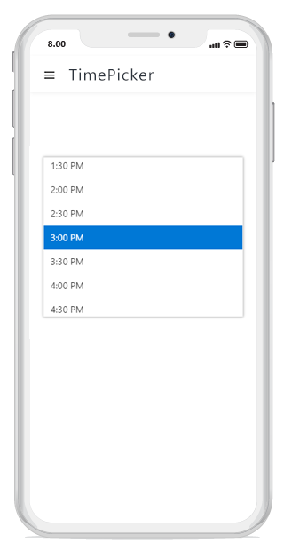
Overview
The HTML5/JavaScript Time Picker is a lightweight and mobile-friendly control that allows end users to select a time value either from a pop-up time list or by entering the value directly in the text box.
Time formatting
The JavaScript TimePicker control has a default, culture-specific time format, but it can be custom formatted.
Disabled time
Disable any of the time values in a pop-up list to prevent the selection of those times.
Time range
Restrict the entry or selection of a time value within a specific range of time by using min and max properties.
Globalization
The JavaScript TimePicker control supports globalization like internationalization and localization that updates the time format value in the pop-up list to match a specified culture.
Time interval
Increment or decrement each time value of the selection list by one step at a time. You can change the steps based on your needs.
UI customization
The appearance of the JavaScript TimePicker control can be customized completely based or your modern web and mobile applications.
Time list with duration
Customize the pop-up list items with time duration.
HTML form validation
HTML form validation allows only a valid value to be entered in the TimePicker control’s text box. Disabled ranges or out-of-range times are validated.
Scroll position
Set the scroll position to a custom time value if no value is selected.
Other supported frameworks
The TimePicker component is also available in Blazor, React, Angular, and Vue frameworks. Check out the different TimePicker platforms from the links below,
Web accessibility
Fully supports WAI-ARIA accessibility that helps the timepicker control be accessed by on-screen readers and assistive devices.
Follows WAI-ARIA best practices for implementing keyboard interaction.
Follows the WCAG 2.0 standard in the design of the UI element visuals such as foreground color, background color, line spacing, text, and images.
•Supports right-to-left (RTL) direction for users working in right-to-left languages like Hebrew and Arabic.
Mobile-friendly UI
The JavaScript TimePicker control’s responsive mode has an adaptive, redesigned UI appearance for mobile devices.
Developer-friendly APIs
End users receive the best experience thanks to the full UI control granted by developer-friendly APIs.
Built-in themes
The JavaScript TimePicker supports several built-in themes such as material, bootstrap, fabric (Office 365), and high contrast.
Users can customize any one of these built-in themes or create new themes to achieve their own desired look and feel either by simply overriding SASS variables or using our Theme Studio application.


 扫一扫
扫一扫


 6万+
6万+

 被折叠的 条评论
为什么被折叠?
被折叠的 条评论
为什么被折叠?
 到【灌水乐园】发言


