


 本文介绍了一种使用CSS实现悬浮提示框的方法,详细解释了.tooltip和.tooltiptext类的使用,以及如何在Vue中应用此布局。通过实例展示了输入框和提示文本的结合,为用户提供更好的交互体验。

/* 悬浮提示框 */
/* Tooltip 容器 */
.tooltip {
	position: relative;
	display: inline-block;
	border-bottom: 1px dotted black; /* 悬停元素上显示点线 */
	cursor: pointer;
}

/* Tooltip 文本 */
.tooltip .tooltiptext {
	visibility: hidden;
	min-width: 120px;
	width: 320px;
	height: auto;
	max-width: 320px;
	margin-top: 20px;
	background-color: rgb(20, 19, 19);
	color: rgb(239, 243, 240);
	white-space: pre-wrap;
	/* word-break: break-all; */
	text-align: left;
	padding: 5px 8px 5px 6px;
	border-radius: 6px;

	/* 定位 */
	position: absolute;
	z-index: 9999;
	top: 100%;
  left: 10%;
  margin-left: -60px;
}

.tooltip .tooltiptext::after {
	content: "";
	position: absolute;
	bottom: 100%;
	left: 50%;
	margin-left: -10px;
	/*  属性指定了箭头的大小。如果你修改它,也要修改 margin-left 值。这样箭头在能居中显示 */
	border-width: 10px;
	border-style: solid;
	border-color: transparent transparent rgb(20, 19, 19) transparent;
}

/* 鼠标移动上去后显示提示框 */
.tooltip:hover .tooltiptext {
	visibility: visible;
}
应用布局,在VUE里
         <div>
            <div class="tooltip">
              鼠标移动到这
              <span class="tooltiptext">提示文本</span>
            </div>
          </div>
          <div>
            <span>业务流程:</span>
            <div class="tooltip">
              <input type="text" v-model="t_businessname" />
              <span class="tooltiptext">{{ t_businessnote }}</span>
            </div>
            <pre-select2
              class="select_role"
              @selectFunc="selectBusi"
              v-bind:searchList="business"
              :selectValue="sel_business"
            />
          </div>
效果
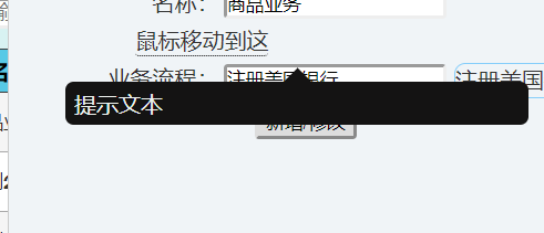
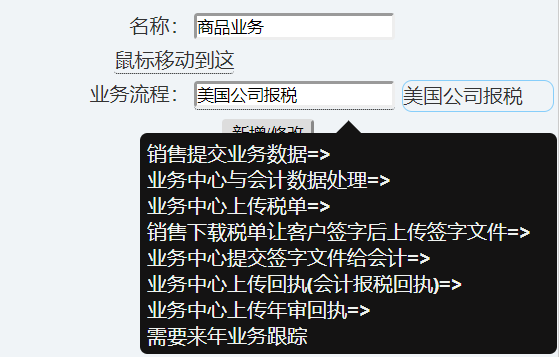
我不是设计,凑合着看吧,呵呵
改自 http://www.runoob.com/css/css-tooltip.html


 扫一扫
扫一扫


 1605
1605

 被折叠的 条评论
为什么被折叠?
被折叠的 条评论
为什么被折叠?
 到【灌水乐园】发言


