


 本文介绍了使用Flexbox实现水平竖直居中布局及如何通过flex-flow属性控制子元素的布局方式。通过实例展示了如何利用justify-content属性使子元素均匀分布。

Flexbox详解 https://segmentfault.com/a/1190000002910324里的两个eg:
eg1:水平竖直居中
<!DOCTYPE html>
<html lang="en">
<head>
	<meta charset="UTF-8">
	<title>flexbox</title>
	<style type="text/css">
body{
    padding: 0;
    margin: 0;
}

.parent {
  display: flex;
  height: 300px; /* Or whatever */
  background-color: black;
}

.child {
  width: 100px;  /* Or whatever */
  height: 100px; /* Or whatever */
  margin: auto;  /* Magic! */
  background-color: white;
}
	</style>
</head>
<body>
	<div class="parent"><div class="child"></div></div>
</body>
</html>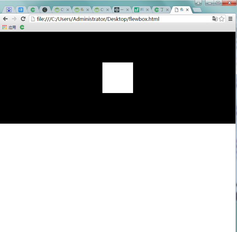
eg2:新增子元素布局
<!DOCTYPE html>
<html lang="en">
<head>
	<meta charset="UTF-8">
	<title>flexbox2</title>
	<style type="text/css">
body{
    margin: 0;
    padding: 0;
}

ul {
    margin: 0;
    padding: 0;
}

li{
    list-style: none;
}

.flex-container {
    /* We first create a flex layout context */
    display: flex;

    /* Then we define the flow direction and if we allow the items to wrap
    * Remember this is the same as:
    * flex-direction: row;
    * flex-wrap: wrap;
    */
    flex-flow: row wrap;
    /*
flex-flow 属性用于设置或检索弹性盒模型对象的子元素排列方式。
	    flex-flow:<' flex-direction '> || <' flex-wrap '>
		默认值:看各分拆属性
		适用于:flex容器
		继承性:无
		动画性:否
		计算值:指定值

		flex-direction:row;:默认值。灵活的项目将水平显示,正如一个行一样。
		flex-wrap:wrap;规定灵活的项目在必要的时候拆行或拆列。
    _________________________
    <' flex-direction '>:
定义弹性盒子元素的排列方向。
<' flex-wrap '>:
控制flex容器是单行或者多行。

     */
    /* Then we define how is distributed the remaining space */
    justify-content: space-around;
    /*
    justify-content 用于设置或检索弹性盒子元素在主轴(横轴)方向上的对齐方式。
    space-around:项目位于各行之前、之间、之后都留有空白的容器内。
     */

      display: -webkit-flex; /* Safari */
    -webkit-justify-content: space-around; /* Safari 6.1+ */
}
.flex-item {
    background: tomato;
    padding: 5px;
    width: 200px;
    height: 150px;
    margin-top: 10px;

    line-height: 150px;
    color: white;
    font-weight: bold;
    font-size: 3em;
    text-align: center;
}
	</style>
</head>
<body>
	 <ul class="flex-container">
        <li class="flex-item">1</li>
        <li class="flex-item">2</li>
        <li class="flex-item">3</li>
        <li class="flex-item">4</li>
        <li class="flex-item">5</li>
        <li class="flex-item">6</li>
        <li class="flex-item">5</li>
        <li class="flex-item">6</li>
    </ul>
</body>
</html>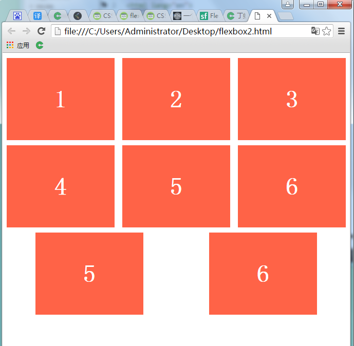


 扫一扫
扫一扫


 被折叠的 条评论
为什么被折叠?
被折叠的 条评论
为什么被折叠?
 到【灌水乐园】发言


