


 本文介绍使用Python库Pandas进行数据绘制的方法,包括散点图、直方图等,并展示了如何通过更改颜色和大小来增强图表的表现力。此外,还深入探讨了Seaborn库的应用,例如核密度估计图、联合分布图等高级图表。
1. Pandas plotting
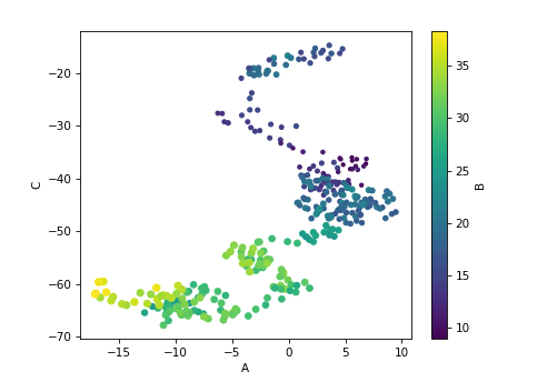
import matplotlib.pyplot as plt import numpy as np import pandas as pd %matplotlib notebook plt.style.use("seaborn-colorblind") np.random.seed(123) # cumsum: add value_of_i + value_of_i+1 = value_of_i+2 df = pd.DataFrame({'A': np.random.randn(365).cumsum(0), 'B': np.random.randn(365).cumsum(0) + 20, 'C': np.random.randn(365).cumsum(0) - 20}, index=pd.date_range('1/1/2017', periods=365)) # create a scatter plot of columns 'A' and 'C', with changing color (c) and size (s) based on column 'B' df.plot.scatter('A', 'C', c='B', s=df['B'], colormap='viridis') #df.plot.box(); #df.plot.hist(alpha=0.7); #df.plot.kde();
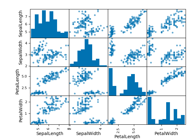
#pd.tools.plotting.scatter_matrix(iris); Create scater plots between the different variables and
#histograms aloing the diagonals to see the obvious patter
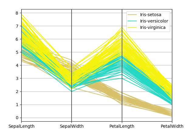
#pd.tools.plotting.parallel_coordinates(iris, 'Name');
#visualizing high dimensional multivariate data, each variable in the data set corresponds to an equally spaced parallel vertical line
Output:
2. Seaborn
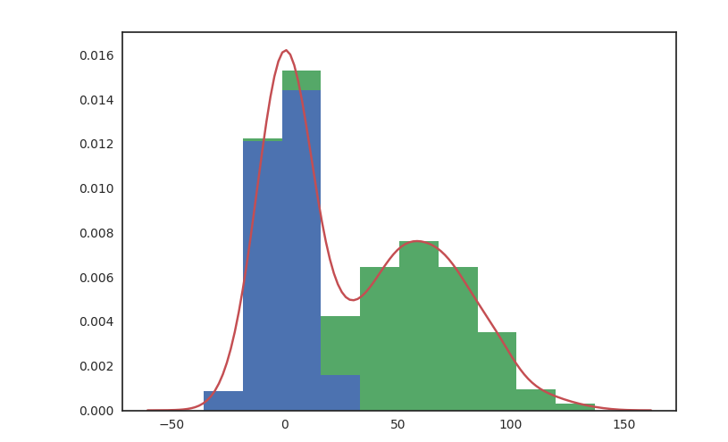
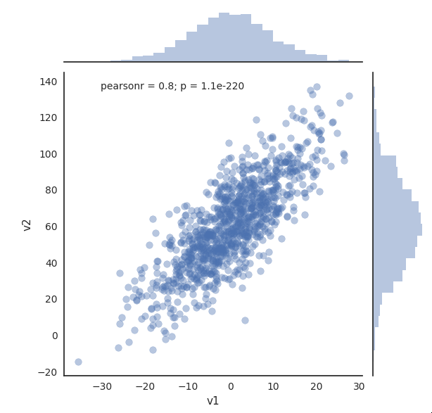
import numpy as np
import pandas as pd
import matplotlib.pyplot as plt
import seaborn as sns

%matplotlib notebook

np.random.seed(1234)

v1 = pd.Series(np.random.normal(0,10,1000), name='v1')
v2 = pd.Series(2*v1 + np.random.normal(60,15,1000), name='v2')

# plot a kernel density estimation over a stacked barchart
plt.figure()
plt.hist([v1, v2], histtype='barstacked', normed=True);
v3 = np.concatenate((v1,v2))
sns.kdeplot(v3);

plt.figure()
# we can pass keyword arguments for each individual component of the plot
sns.distplot(v3, hist_kws={'color': 'Teal'}, kde_kws={'color': 'Navy'});

plt.figure()
# sns.jointplot(v1, v2, alpha=0.4);

# grid = sns.jointplot(v1, v2, alpha=0.4);
# grid.ax_joint.set_aspect('equal')

# sns.jointplot(v1, v2, kind='hex');

# set the seaborn style for all the following plots
# sns.set_style('white')
# sns.jointplot(v1, v2, kind='kde', space=0);# space is used to set the margin of the joint plot
Output:
joint plots
Second example
iris = pd.read_csv('iris.csv')
sns.pairplot(iris, hue='Name', diag_kind='kde', size=2);
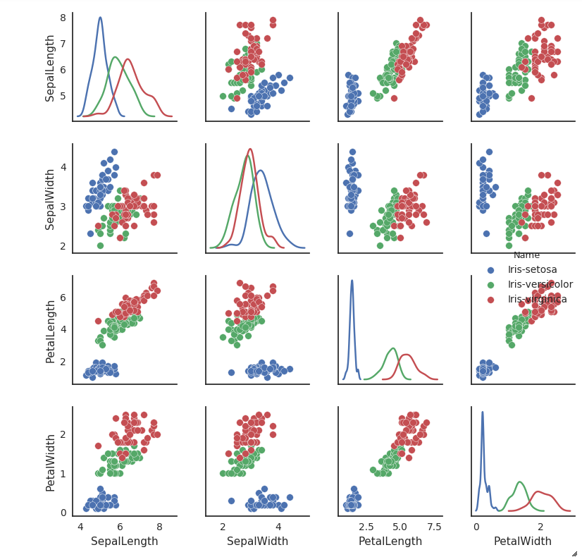
Third example
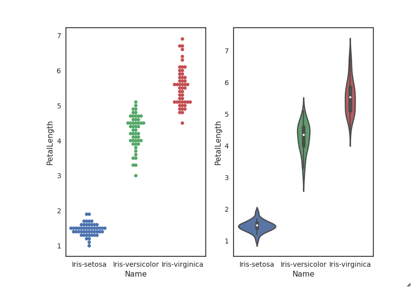
iris = pd.read_csv('iris.csv')
plt.figure(figsize=(8,6))
plt.subplot(121)
sns.swarmplot('Name', 'PetalLength', data=iris);
plt.subplot(122)
sns.violinplot('Name', 'PetalLength', data=iris);
Output:


 被折叠的 条评论
为什么被折叠?
被折叠的 条评论
为什么被折叠?
 到【灌水乐园】发言


